Creating a high-fidelity mockup is a crucial step in designing a landing page.
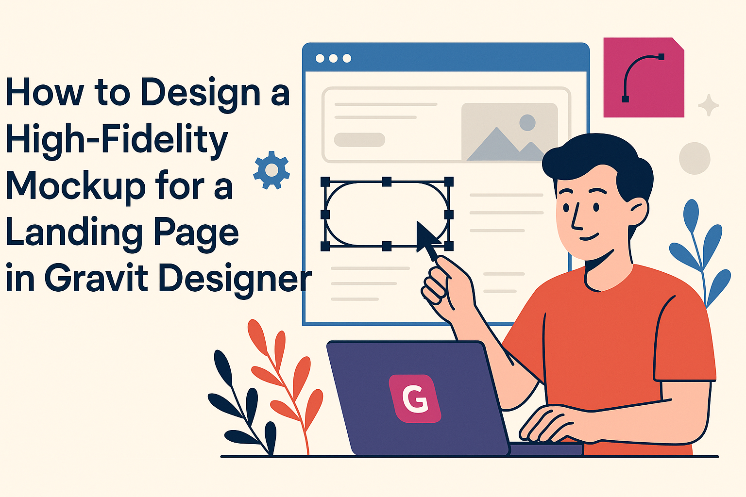
Using Gravit Designer, he can easily craft a detailed and realistic representation of his web design. This tool allows for precise adjustments that make the mockup look polished and ready for review.
In the world of digital design, a high-fidelity mockup serves as a bridge between initial ideas and the final product. It showcases visual elements, such as colors, fonts, and layout, giving a clear picture of how the landing page will function and feel.
This clarity helps convey the designer’s vision to clients and team members alike.
Designing a mockup in Gravit Designer can be both fun and rewarding. It provides the flexibility to experiment with different design concepts while ensuring that the final product captures attention and encourages user interaction.
With the right approach, anyone can transform their ideas into compelling visual designs.
Getting Started with Gravit Designer
To begin designing with Gravit Designer, it is essential to navigate the interface, set up the canvas, and learn about the tools available.
With these steps, anyone can create effective high-fidelity mockups for landing pages.
Understanding the Interface
The Gravit Designer interface is user-friendly and structured for ease of use. When first opened, the screen displays the toolbox on the left, a properties panel on the right, and a canvas in the center where designs come to life.
He or she will find the menu bar at the top, which contains options for file management and design settings. By familiarizing oneself with these areas, it becomes easier to locate essential functions quickly.
Understanding these elements helps streamline the design process and improves productivity.
Setting Up Your Canvas
Setting up the canvas is a critical first step in any design project. To do this, the user should click on “File” and select “New.”
A dialog will appear, allowing the user to choose a canvas size. For landing pages, a common size is 1440×1024 pixels.
Once the canvas is set up, it’s ready for design work. Users can also adjust the background color or add grids for better alignment. This preparation ensures that the workspace fits the project’s needs.
Familiarizing with Tools and Panels
Gravit Designer provides a variety of tools that are crucial for creating detailed mockups. The shape tool, pen tool, and text tool are the most commonly used.
Each tool can be found in the toolbox on the left side. The properties panel allows for further customization, such as adjusting opacity or changing colors.
Exploring each tool and its options leads to more creativity during the design process. Building familiarity with these tools increases efficiency and enhances the quality of the final product.
Designing the Landing Page
Creating an eye-catching landing page requires careful attention to several design elements. A strong color scheme, readable typography, effective visual hierarchy, and engaging images are all key components for success.
Creating a Color Scheme
Selecting a color scheme is vital for setting the tone of the landing page. Colors evoke emotions and can influence user decisions.
It works well to pick a primary color for brand identity and a few secondary colors for accents. For example, a calming blue can be paired with vibrant orange buttons to create contrast.
Using tools like Adobe Color can help generate harmonious palettes. Consistency is key; make sure colors appear in headings, buttons, and backgrounds for a unified look. This strengthens the brand and provides a pleasant visual experience.
Typography and Readability
Typography plays a crucial role in how content is perceived. It’s important to select fonts that are not only stylish but also easy to read.
A mix of a clean sans-serif font for headings and a readable serif font for body text often works well.
Maintain proper font sizes and line spacing. Headings should stand out, while body text should stay legible on all devices. Generally, a font size of 16px for body text and 24px for headings is a safe choice. Avoid using too many different fonts; stick to two or three to keep the design coherent.
Implementing Visual Hierarchy
Visual hierarchy guides users through the content on the landing page. This can be achieved with size, color, and placement.
Larger text for headings attracts attention first, while subheadings can provide context. Utilizing white space between elements helps to create a clean layout.
Group related items together and prioritize important messages by making them larger or bolder. Bullet points can be useful for breaking up text and making key details stand out.
Adding Images and Graphics
Images and graphics enrich the landing page and help communicate the message. It is essential to choose high-quality images that relate to the content.
A hero image or video at the top can immediately draw users in. Icons can also enhance understanding, providing a visual representation of key points.
Be cautious not to overload the page with images, which can distract visitors. Balance is key; images should support the text, not overshadow it.
Prototyping and Interactivity
Prototyping allows designers to create a realistic model of their landing page. It provides insights into how users interact with designs. Interactivity adds another layer to these prototypes, making them more engaging.
Creating Prototypes
To create prototypes in Gravit Designer, start by designing your layout. Use artboards for different sections of the landing page. This helps visualize the flow.
Once the design is complete, select the elements that should be interactive. Gravit Designer allows users to link these elements to other pages or sections.
For example, buttons can navigate to a contact form or product details.
It’s crucial to test the prototype while designing. This testing helps identify usability issues early. Users can provide valuable feedback, guiding necessary changes.
Overall, a well-thought-out prototype ensures the final design meets user needs.
Adding Animations and Transitions
Animations and transitions enhance the user experience. They make interactions feel smooth and intuitive.
In Gravit Designer, adding these effects is simple.
Select an element and explore the animation options in the properties panel. Designers can choose from different animation types, like fading or sliding.
These animations can be triggered by user actions, such as hovering or clicking.
Transitions between pages can also be designed. A smooth transition keeps users engaged and makes navigation pleasant. For example, a fade effect can make moving between sections feel seamless.
By thoughtfully integrating these elements, the landing page becomes more interactive and lively. This attention to detail can improve user satisfaction significantly.
Exporting and Sharing Your Design
Exporting and sharing designs is an essential part of the design process. It allows for collaboration and provides a means to gather feedback for improvements.
Preparing for Export
Before exporting, it’s important to double-check the design. Ensure that all layers are named properly, and all text is converted to outlines if needed. This prevents font issues when others view the design.
Gravit Designer allows users to export designs in various formats, such as PNG, JPG, and SVG.
To export, select the desired artboard or element, then navigate to File > Export.
Users can adjust settings like resolution and background transparency in the export dialog. Once the settings are confirmed, click Export.
The design will be saved to the chosen location, ready for sharing.
Sharing for Feedback
Once the design is exported, sharing for feedback is key.
Sending the design via email or using cloud storage services like Google Drive can be effective.
Users can also share links to files for real-time collaboration.
When requesting feedback, be clear about what aspects need input.
For instance, they can ask for opinions on layout, colors, or functionality.
Providing context helps others understand what to focus on.
Using tools like Figma or InVision allows for easier comment collection.
Feedback can be organized and addressed more efficiently, which fosters a productive design review process.