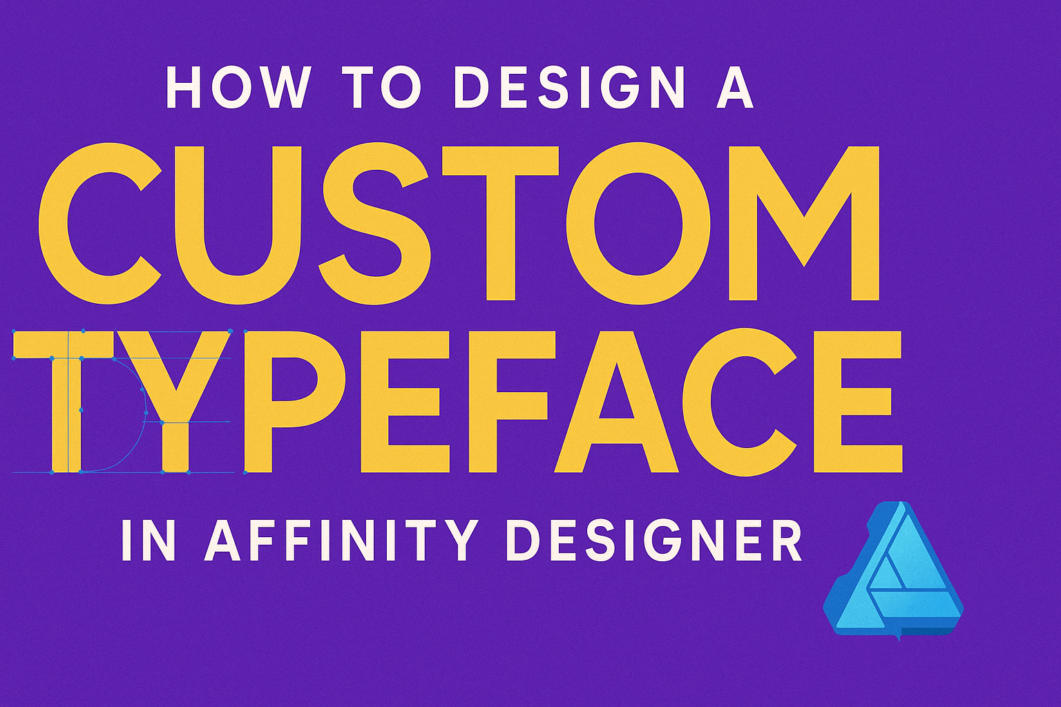
Creating a custom typeface can be an exciting project for designers looking to add a unique touch to their work. By using Affinity Designer, anyone can learn to design a typeface that reflects their personal style and meets their project needs.
This software provides the tools to sketch, refine, and export fonts, making it accessible for both beginners and experienced designers.
When designing a typeface, it’s essential to start with a clear concept and a sketch of letters. This initial step helps in defining the overall look and feel of the typeface.
Once the sketches are ready, Affinity Designer allows users to digitize these designs and adjust them with precision, ensuring that each character aligns with the intended style.
As designers explore the different features of Affinity Designer, they can experiment with various styles, weights, and spacing for their custom font. With practice and creativity, they can create a typeface that stands out, enhances their projects, and leaves a lasting impression on clients and audiences alike.
Understanding Typography
Typography plays a crucial role in design. It involves selecting typefaces, adjusting spacing, and enhancing readability.
Understanding the differences between typefaces and fonts, how they have evolved, and why legibility matters is essential for creating effective designs.
Typeface vs. Font
A typeface is a collection of letters, numbers, and symbols that share a common design. It includes various styles, such as bold or italic. For example, Times New Roman is a typeface.
A font, on the other hand, refers to a specific weight or style within a typeface. For instance, Times New Roman Bold at size 12 is a font. In design, understanding this distinction is important for proper usage.
Choosing the right typeface is key to conveying the desired message in a design. It sets the tone and supports the overall theme. Designers should select typefaces that enhance the project and reflect its purpose.
History and Classification of Typefaces
The history of typefaces dates back to the invention of the printing press in the 15th century. Early typefaces were serif styles, characterized by small lines at the ends of letters. Examples include Garamond and Bodoni.
As printing technologies evolved, so did typefaces. Designers began creating sans-serif types, which lack these embellishments. Popular examples include Arial and Helvetica. This classification helps designers choose the right type for their projects based on their historical context.
Today, typefaces are often classified into categories like serif, sans serif, display, and script. Knowing these classifications aids in selecting the most suitable typeface for a specific purpose.
The Importance of Legibility and Readability
Legibility refers to how easily individual letters can be recognized. Readability, on the other hand, is about how easily a block of text can be read. Both elements are critical in design.
Designers should focus on factors like font size, line spacing, and contrast. For example, using a larger font size increases legibility. In contrast, sufficient line spacing improves readability.
Striking a balance between stylish design and functional text is essential. A beautiful font can fail if it’s hard to read. Thus, keeping legibility and readability at the forefront leads to more effective communication through typography.
Getting Started with Affinity Designer
Affinity Designer is a powerful tool for creating custom typefaces. Knowing how to set up the workspace, utilize the basic tools, and understand the types of graphics will make the design process easier.
Setting Up Your Workspace
To begin with Affinity Designer, it’s important to set up the workspace to fit personal preferences. The workspace can be customized by accessing the “View” menu where users can choose to display different panels and toolbars.
Using the Studio Options allows for adding or removing panels like Layers, Swatches, and Text Styles based on the current design needs.
Arranging the workspace efficiently can enhance productivity by keeping essential tools and options within easy reach. Users should experiment with different layouts until finding one that works best.
Basic Tools and Shortcuts
Affinity Designer offers an array of tools that are essential for typeface design. The Vector Tool is crucial for creating paths and shapes, while the Text Tool allows for the introduction of custom text.
Some basic shortcuts can speed up workflow. For example:
- V for the Move Tool
- T for the Text Tool
- P for the Pen Tool
These shortcuts can significantly reduce mouse movements and improve efficiency. Familiarizing oneself with these tools can help streamline the creative process.
Vector vs. Raster Graphics
Understanding the difference between vector and raster graphics is important for designers.
Vector graphics are created using paths defined by mathematical equations. This makes them scalable without losing quality. They are great for typefaces because they can be resized for various applications.
Raster graphics, on the other hand, are made up of pixel data. They can lose quality when resized, which is not ideal for text design. Knowing when to use each type of graphic will help creators achieve the best results in their design projects.
Creating Your Custom Typeface
Creating a custom typeface involves several key steps, from initial sketches to refining each character. This process ensures that the final design is unique and functional.
Sketching Your Design
The first step is sketching your design ideas on paper. This is where creativity flows freely. Use pencils or markers to explore different letter shapes and styles.
Consider the overall tone of the typeface. Is it playful, serious, modern, or classic? Make a variety of sketches for different letters to see what feels right.
Focus on uppercase and lowercase letters, as well as special characters. Choose the designs that stand out the most. Keep the sketches organized for easy reference during the next stage.
Drawing and Refining Characters
Once the sketches are ready, it’s time to digitize them in Affinity Designer. Start by using the Pen Tool to trace over each character. This step allows for cleaner lines and precise shapes.
As you trace, pay attention to consistency in design. Make sure stroke widths match across all letters. This unity is crucial for a professional look.
After tracing, refine each character. Adjust curves and angles to enhance visual appeal. This is also the stage to make any adjustments based on how the letters look together.
Spacing and Kerning
After drawing the characters, focus on spacing and kerning.
Proper spacing ensures that letters look balanced and readable.
In Affinity Designer, use the Typography panel to adjust these settings.
Kerning is the space between individual letter pairs. It often requires specific adjustments to improve readability.
For example, the letters “A” and “V” might need less space than the letters “L” and “I”.
Use guides to assess spacing visually.
A well-spaced typeface enhances the overall design.
Pay attention to both horizontal and vertical alignment for a polished final product.