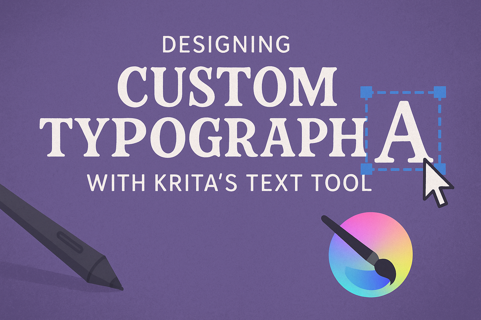
Creating unique and engaging typography can bring your digital art to life, and Krita offers powerful tools to do just that. By using Krita’s Text Tool, artists can add, edit, and customize text, making their creations stand out. This tool allows for personalization in ways that can elevate any project.
For those unfamiliar with adding fonts to Krita, the process is straightforward. Installing new fonts varies slightly depending on your operating system. On Windows, unzip and right-click the font file to “Install.” On a Mac, double-click the font file and choose “Install” in the window that appears.
Once ready with new fonts, designers can explore the possibilities. Krita allows artists to modify text attributes, ensuring their typography aligns with their creative vision. This flexibility helps artists design text that complements their art seamlessly, making each piece truly unique.
Getting Started with Krita
Krita is a powerful tool for digital artists, especially those interested in creating custom typography. To make the most of it, users need to focus on installing the software, understanding its interface, and setting up their canvas correctly.
Installing Krita
To begin, one must download Krita from the official website, which offers versions for Windows, macOS, and Linux. The installation process is straightforward. After choosing the correct version for their operating system, users can execute the downloaded file and follow the prompts.
On Windows, double-click the installer and confirm any prompts. On macOS, drag the Krita icon to the Applications folder.
Once installed, launching Krita should be simple. Click the Krita icon on the desktop or search for it in the applications list. Ensuring the software runs smoothly is key to making the most of Krita’s features in designing custom typography.
Understanding Krita’s Interface
Krita’s interface is user-friendly yet packed with tools. When first opened, the main workspace is surrounded by toolbars, docks, and a canvas area. Users can customize this interface to suit their workflow.
Toolbars provide quick access to frequently used tools. Docks can be moved or resized and contain panels like Layers and Brushes. In the workspace, there is flexibility to arrange these elements based on personal preference.
Navigation controls, found on the side, allow zooming and panning across the canvas. Familiarity with these controls can greatly enhance efficiency when creating detailed designs.
Setting Up Your Canvas
Starting with a new project, it’s crucial to set up the canvas correctly. Users should select File > New to open the document setup dialog. Here, they can define the canvas size, resolution, and color profile.
Selecting appropriate dimensions depends on the project’s needs. For print, higher DPI settings like 300 are recommended. For web graphics, 72 DPI usually suffices.
Color profiles like RGB or CMYK can be chosen based on whether the work will be viewed digitally or printed. Saving these settings as a template can help streamline future projects and maintain consistency in design work.
Exploring Krita’s Text Tool
Krita’s Text Tool offers powerful features for creating and editing text within digital artworks. This section will guide readers through accessing and using the tool for basic text editing.
Accessing the Text Tool
To start using the Text Tool, locate it in the toolbar on the left side of the application. Clicking the Text Tool icon lets users create a text box directly on the canvas. This tool is essential for designing custom typography and can be accessed anytime during the creative process.
The interface is intuitive. Users can click and drag to position the text box where needed. This provides flexibility in designing, allowing for both small annotations and prominent title texts.
For those who use fonts in Krita, they might need to restart the application after installing new fonts. This makes sure the fonts appear in the list.
Basic Text Editing
Once the text box is on the canvas, editing is straightforward. Users can enter their text and make adjustments using the font options available in the tool properties.
Font Styles: Users can choose from a variety of fonts to match their artistic vision. Styling options include bold, italic, and underline.
Alignment and Spacing: Adjust the alignment of the text to left, center, or right. Users can also set line spacing for better readability.
Editing doesn’t stop at simple text changes. The text can be rotated, resized, and transformed using handles around the text box. This gives artists precise control over the design elements within their work.
To edit existing text, click the text with the Shape Selection Tool and press Enter to bring up the text editor. Alternatively, select the text and click the Text Tool for direct editing access.
Creating Custom Typography
Creating custom typography in Krita allows users to add unique textual elements to their art. By selecting the right fonts, manipulating text shapes, and applying various effects, users can achieve a personalized look in their designs.
Choosing Fonts and Styles
Selecting the right font and style is essential for creating standout typography in Krita. Users can add new fonts to Krita by installing font files on their computer. On Windows, right-click the font file and select “Install,” while on Mac, double-click and choose “Install” in the window that opens. After installation, restart Krita to refresh the font list.
Once the fonts are installed, activating the Text Tool in Krita is simple. By clicking on the Font drop-down menu, a wide variety of styles can be selected, ranging from traditional to modern. By experimenting with different combinations, users can find a font style that best matches their artistic vision.
Manipulating Text Shapes
In Krita, users can adjust text shapes to create unique designs. The Shape Selection Tool allows for easy manipulation of text by clicking and dragging to adjust size and alignment. This tool is essential for altering the text to fit the desired layout.
Additionally, Krita offers features like wrapping text around shapes or curving it along a path. This can be done by converting text to a vector and using paths as guidelines. This feature is particularly useful for creating creative and visually appealing text arrangements that stand out in digital art projects.
Applying Text Effects
Text effects can significantly enhance typography designs. Krita provides various tools to apply shadows, glows, or other effects that add depth and interest. By selecting the layer containing the text, users can access filters and blending options to apply these effects.
Creating drop shadows or highlights can give text a more dynamic appearance. Using gradients or color overlays further personalizes the typography, creating a sense of movement or depth. This approach ensures the text not only complements the artwork but also stands out as a feature on its own.
Advanced Typography Techniques
When designing custom typography in Krita, mastering how to work with layers and using paths for text can greatly enhance your design capabilities. These techniques allow for intricate text manipulation, adding depth and creativity to any project.
Working with Layers
In Krita, layers are fundamental to creating complex typography designs. By using layers, users can separate different elements of their design, making it easier to edit and adjust individual components without affecting others. For instance, text can be placed on one layer, while backgrounds or decorative elements occupy separate layers. This separation is crucial for maintaining a clean and organized workspace.
Layers also enable creating effects like shadows or highlights. For example, duplicating a text layer and changing its color or opacity can produce a shadow effect. Users can experiment with blending modes to enhance their text designs. The layer hierarchy feature is another useful tool, allowing layers to be rearranged and grouped for better organization.
Using Paths for Text
Paths open up a range of creative possibilities in Krita. They allow text to follow custom shapes or curves, adding flair to standard text layouts. To create text along a path, users first draw a path with the relevant tool and then use the text tool to type along this path. This can be useful for creating circular text or text that follows a wave or zigzag pattern.
Paths are flexible, so adjustments can be made even after the text is applied. This means real-time editing of text position, orientation, and flow. For designers aiming to achieve a unique or dynamic look in their projects, mastering paths in Krita is essential.
Design Tips and Best Practices
Designing typography requires a mix of creativity and knowledge. It’s important to balance the text with visuals, choose colors wisely, and arrange elements for clarity. These factors make a design both appealing and effective.
Balancing Typography with Visuals
Balancing typography with visuals is crucial in creating engaging designs. One method is to use contrast wisely. This means pairing bold, heavy fonts with lighter, more delicate images, or vice versa. Consistency also plays an important role; using too many different styles can make a design look scattered.
Alignment is key in ensuring text flows well with accompanying images. Center alignment can create a formal feel, while left alignment often feels dynamic and modern. Designers should also be careful with spacing around the text. Proper margins and padding prevent the design from looking cluttered.
Creating a harmonious balance between text and imagery makes designs more inviting and easy to navigate. By focusing on visual harmony, designers can enhance the viewer’s experience and make the message stand out.
Color Theory in Text Design
Color theory is essential in typography design. It influences how readers perceive the text and the emotions it evokes. Complementary colors create striking contrast and can make important text pop. For a calmer look, analogous colors provide a smooth transition.
Color can also indicate hierarchy. More vibrant colors can draw attention to headlines or key points, while subdued shades can support secondary information. It’s also important to consider the background color. Text should have enough contrast to be easily readable against its backdrop.
Colors can have different meanings or associations, so it’s advisable to understand the audience. This ensures that the color palette works effectively within the design’s context, connecting better with the viewer.
Hierarchy and Spatial Arrangement
Good typography design relies on a clear hierarchy. This helps the reader to prioritize and understand the information quickly. Headings should stand out using larger fonts or bold styling to guide the reader’s focus. Subheadings and body text can then follow using smaller sizes and simpler styles.
Spatial arrangement refers to how text is structured on the page. Proper spacing between lines, known as leading, can make text more legible. Maintaining consistent spacing helps achieve a neat and professional appearance. Lists or bullet points can effectively break up blocks of text, making topics easier to digest.
Arrangements that highlight key points without overwhelming the reader improve both the design’s appearance and function.
Exporting Your Work
Exporting designs from Krita involves choosing the right file format for your project’s needs and optimizing the output for different uses. Whether for web or print, understanding these aspects will ensure your work shines.
Saving in Different Formats
Krita offers various file formats to save your work. The Krita Document (.kra) format is perfect for storing editable files with layers and metadata intact. This format is best for ongoing projects since it preserves all design elements.
For sharing or posting online, PNG and JPEG formats are popular. PNG is suitable for images that require transparent backgrounds, while JPEG is a good choice for detailed images that can handle some compression loss. Krita also supports TIFF, a format ideal for print because it maintains high image quality without compression. Users must navigate to “File” > “Export” and select their preferred file type.
Optimizing for Web and Print
When preparing images for the web, file size is crucial. Large files can slow down page load times. JPEG with medium compression is often a good balance; however, make sure the image retains acceptable quality. Alternatively, PNG is better when transparency is needed.
For print, resolution matters. Krita allows users to set a minimum of 300 DPI (dots per inch) to ensure clarity. CMYK color mode is also recommended for print, which can be adjusted through the image settings. A combination of TIFF files and high resolution will help ensure vibrant, sharp print results. Always confirm sizing and color settings with your printer’s specifications for the best results.