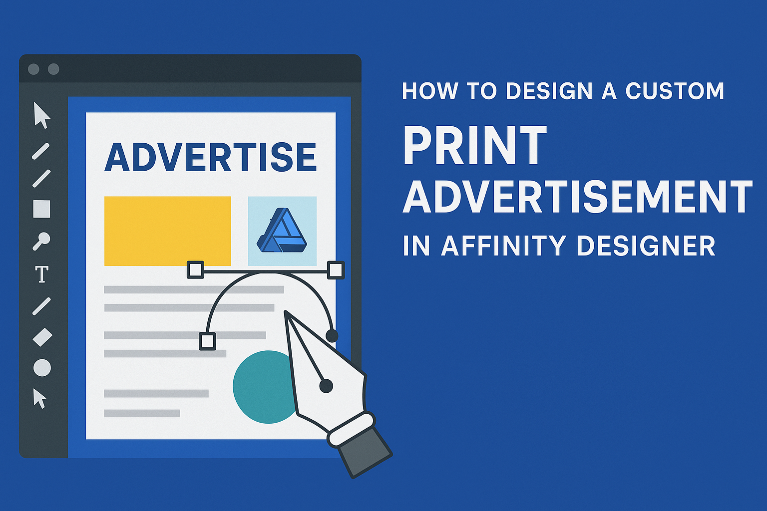
Creating a custom print advertisement can be both fun and rewarding. Using Affinity Designer allows designers to take full control of their creative vision while producing high-quality graphics. This software combines powerful tools with an intuitive interface, making it accessible for both beginners and experienced graphic designers.
When designing an advertisement, it’s important to focus on elements like color, typography, and imagery to attract attention.
With Affinity Designer, one can easily incorporate these elements and establish a brand identity that stands out. As they dive into the design process, they will discover how to transform their ideas into eye-catching ads that effectively communicate their message.
This article will guide readers through the essential steps needed to craft a stunning print advertisement in Affinity Designer. By the end, they will feel confident in their ability to produce a design that not only looks professional but also engages their audience.
Understanding Print Advertisement Essentials
Creating an effective print advertisement requires careful planning and attention to detail.
Key elements include knowing the target audience, crafting a clear message, and understanding the specific requirements for print materials. These aspects ensure that the advertisement resonates with viewers and achieves its intended purpose.
Defining Your Target Audience
Identifying the target audience is crucial for any print advertisement. It guides the design, language, and content used.
Marketers should consider factors like age, gender, interests, and location. To refine this further, they can create a persona representing their ideal customer.
This tool helps shape the tone and style of the ad. For example, a modern tech product may appeal more to younger audiences, influencing the design choices significantly.
Developing a Clear Message
A clear and concise message is vital in print advertising. It should communicate the core idea in a way that grabs attention quickly.
Using simple language ensures that the message is easily understood. Incorporating a strong call to action can prompt the audience to take the next step, such as visiting a website or making a purchase.
Organizing the message into key points can enhance clarity. A catchy tagline can also make the advertisement memorable.
Understanding Print Specifications
The technical aspects of print advertisements cannot be overlooked. Knowledge of print specifications ensures that designs translate well from screen to print.
Important factors include resolution, color modes, and bleed settings. Typically, images should be at least 300 DPI for sharp quality.
Choosing the right paper stock can affect the advertisement’s feel and effectiveness. Glossy, matte, and textured surfaces each convey different messages.
By keeping these specifications in mind, designers can create visually appealing ads that stand out.
Getting Started with Affinity Designer
Before diving into design, it’s essential to set up the workspace in Affinity Designer. Familiarity with the tools and panels will also help make the design process smoother and more efficient.
Setting Up Your Workspace
When starting Affinity Designer, choosing the right workspace is key.
He should go to the View menu, then select Studio, to enable essential panels. Useful panels include Layers, Color, and Text.
He can also customize the layout. Simply drag panels to different locations or dock them together. This flexibility helps keep tools handy and organized.
For those who prefer a clean workspace, minimizing unused panels can make the interface less cluttered. Experimenting with different arrangements can lead to a setup that suits individual needs.
Familiarizing With Tools and Panels
Affinity Designer features a user-friendly toolbox that offers various tools.
The main tools include the Selection Tool, Pen Tool, and Text Tool. Each tool has specific functions crucial for different design tasks.
He should take time to explore the Context Toolbar. This bar updates based on the selected tool, providing relevant options for quick access.
Understanding the Layers Panel is important too. It helps manage different design elements. He can easily reorder, lock, or hide layers for better control.
Knowing key shortcuts can also speed up workflow. For example, pressing V selects the Move Tool quickly. Such familiarity with tools and panels lays the foundation for effective design.
Designing Your Print Advertisement
Creating an effective print advertisement requires careful planning and design. Key aspects include layout structure, typography, graphics, and color choices. Each plays a crucial role in delivering the right message and grabbing attention.
Creating a Layout Structure
A strong layout is the backbone of any print ad. It organizes visual elements to guide the viewer’s eye seamlessly.
Start by choosing a grid system that fits the content size. When planning the layout, use the rule of thirds to position key elements. This makes the ad more visually appealing. Keep ample white space around text and images to avoid clutter.
Remember to include a clear call-to-action that stands out. This invites readers to take the next step, like visiting a website or calling a number.
Working With Text and Typography
Selecting the right fonts is essential for communication. Choose a main typeface that matches your brand identity. This helps create a consistent look.
Pair it with complementary fonts for headings and body text. Ensure the fonts are easy to read from a distance.
Consider font size and spacing. Headings should grab attention, while body text must be clear. Use varying sizes to create a visual hierarchy, making important information pop.
Lastly, keep text concise and to-the-point. Short and impactful phrases convey the message effectively.
Incorporating Graphics and Images
High-quality graphics and images can elevate an advertisement. They should convey the message quickly and clearly.
Choose images that resonate with the target audience. Using stock photos or custom illustrations can boost creativity.
Make sure any images used are sharp and relevant. Blurry images can hurt credibility.
In Affinity Designer, layers make it easy to arrange graphics. Consider adding unique shapes or icons to enhance the design. This can draw attention to key points and add interest.
Applying Color Theory
Color plays an important role in design. It defines the mood and message of the advertisement.
Understanding basic color theory can help choose a suitable palette. Select colors that align with your brand’s identity.
Use color psychology to evoke specific emotions. For example, blue may convey trust, while red can signal urgency.
Maintain a balanced color scheme with a few main colors and additional accents. Use contrasting colors for important elements like calls-to-action. This enhances visibility and encourages engagement.
Finalizing and Exporting Your Design
Before sending a design to print, it’s essential to carefully proof and export the work to ensure everything looks perfect. This process includes making necessary revisions and selecting the right export settings.
Proofing and Revisions
Proofing is a crucial step in the design process. It involves reviewing the advertisement for any errors or changes needed.
Designers should check for spelling mistakes, alignment issues, and color accuracy. It is helpful to print a test version or view it on different screens. This can highlight any problems not visible on the original document.
It’s also useful to get feedback from others, as fresh eyes can catch mistakes the designer might overlook.
After gathering feedback, the designer can make the necessary revisions. They can adjust fonts, colors, or images to improve the overall appeal of the ad. Keeping organized and noting down all changes can streamline this process.
Exporting Your Design for Print
Once the design is finalized, it’s time to export it. The most suitable format for print is usually PDF. This format retains high-quality images and vector properties.
In Affinity Designer, the designer should go to the “File” menu and select “Export.”
From there, choosing “PDF (Press Ready)” is ideal. It’s essential to check settings like “Raster DPI,” ensuring it is set to 0 for the best quality.
Additionally, designers should pay attention to bleed settings.
A bleed of at least 3mm on each edge is common. This ensures no important content is cut off during printing.
Before finalizing, ensuring that all layers are properly organized can also help in the printing process.