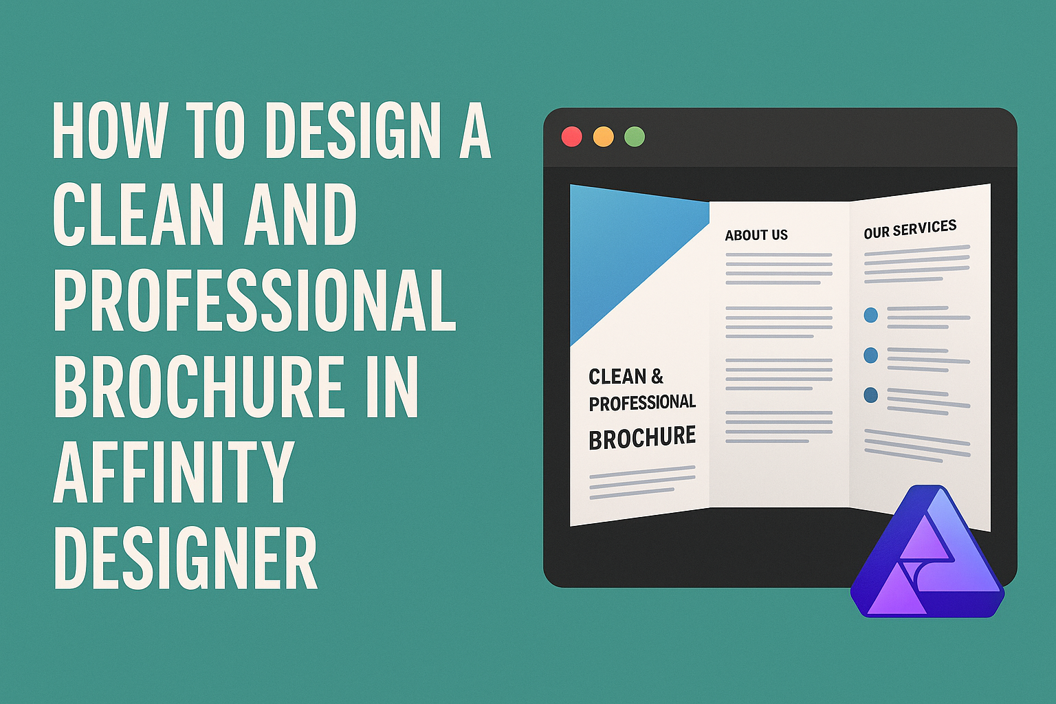
Creating a brochure that looks clean and professional can significantly impact how information is presented. Using Affinity Designer makes this task easier, as it offers powerful tools and features designed for graphic design.
From selecting the right layout to using appealing colors and fonts, every detail matters when crafting the perfect brochure.
By following straightforward steps, anyone can design a brochure that not only conveys information effectively but also captures attention.
With the right techniques, such as utilizing templates and understanding the principles of design, anyone can create a polished piece that stands out.
Affinity Designer allows users to unleash their creativity while maintaining a professional look. Whether for a small business, an event, or a personal project, knowing how to design a brochure can make a lasting impression.
Getting Started with Affinity Designer
Affinity Designer is a powerful tool for creating professional brochures.
Understanding the workspace, setting up your document, and choosing a color scheme are important steps to achieve a clean design.
Understanding the Workspace
When starting with Affinity Designer, it is essential to familiarize oneself with the workspace. The main area is the canvas, where the design comes to life.
On the left, there is a toolbar with various tools like the selection and shape tools.
The right side holds the context toolbar, which changes based on the selected tool. This allows quick access to settings unique to that tool.
Layers are displayed on the right, helping to manage different elements of the design easily.
Tip: Take time to explore and customize workspace settings to improve efficiency.
Setting Up Your Document
To design a brochure, begin by setting up a new document.
Select ‘File’ and then ‘New’ to open the document settings.
It is important to choose the correct dimensions, usually standard sizes like A4 or letter format.
He or she should also set the resolution to at least 300 DPI for print quality. Consider setting up margins to keep text and images within the safe area.
Quick Steps:
- Open the ‘New Document’ dialogue.
- Select dimensions.
- Set resolution and margins.
Choosing a Color Scheme
A cohesive color scheme is crucial for a professional brochure.
Start by selecting a primary color that reflects the brand or purpose of the brochure.
Next, add complementary colors that make the design visually appealing. Tools like color palettes or color wheel can assist in this process.
Suggestions:
- Use 3-5 colors for a balanced look.
- Consider color psychology to evoke certain feelings.
By carefully choosing colors, designers can create a striking and memorable brochure.
Design Elements and Principles
Creating a clean and professional brochure in Affinity Designer involves understanding key design elements and principles. These components form the foundation of effective visual communication and help convey the intended message clearly.
Working with Layers and Shapes
Layers are essential in Affinity Designer. They allow for organization and flexibility in design.
By using layers, a designer can easily edit elements without affecting others. This means they can shift text, images, or shapes around quickly.
Shapes are also crucial. They can help create a visual hierarchy.
Using simple geometric shapes can draw attention to important information. Adding color to shapes enhances their impact. Keeping shapes consistent throughout the brochure maintains a unified look.
Incorporating Text and Typography
Text plays a vital role in brochures. Choosing the right font can set the tone.
It’s essential to select fonts that are readable and match the brochure’s purpose. Combining different font styles can create a distinct look, but they should complement each other.
Hierarchy in typography is important. Use different sizes and weights to emphasize headings and subheadings. Maintaining a consistent font size for body text helps readability. Additionally, positioning text nicely within the design boosts the overall appearance.
Using Grids and Alignment
Grids help structure the layout effectively. They guide the placement of text, images, and other elements.
By using a grid system, a designer can ensure everything aligns properly. This creates a polished and professional look.
Alignment is just as important. Proper alignment of text and images helps to create balance in the design. A well-aligned layout is easier for the reader to follow. It also enhances visual flow, making the brochure more inviting to engage with.
Creating the Brochure Layout
Designing a clean and professional brochure layout requires thoughtful planning. Key components include setting margins and bleed, incorporating images and graphics, and finalizing the overall design. Each step is essential to create an attractive and functional brochure.
Defining Margins and Bleed
When designing a brochure, defining margins is crucial. Margins ensure that text and images do not get cut off during printing. A standard margin of at least 0.25 inches is advisable.
Bleed is the area outside the final design that allows for trimming. This prevents any white edges from appearing on the finished brochure. A common bleed size is 0.125 inches.
Setting both margins and bleed in Affinity Designer can be done in the document setup. This setup guarantees a polished and professional look.
Adding Images and Graphics
Images and graphics significantly enhance the visual appeal of a brochure.
It’s important to choose high-quality images that reflect the brochure’s theme. Using images that are at least 300 DPI will ensure they print clearly.
Icons and graphics can also convey information quickly. These elements should align with the text and overall design.
Placing images near relevant text helps in guiding the reader’s eye. Remember to ensure there is some white space around images to avoid a cluttered appearance.
Finalizing the Layout Design
Finalizing the layout is the last step before printing. This includes checking the alignment and ensuring everything is balanced.
It’s helpful to view the design on different devices to see how it appears.
Make sure all text is readable, with sufficient contrast against the background. Choosing fonts that are clean and professional enhances readability.
Before exporting the file, double-check the margins and bleed settings. This ensures that the final product looks as intended.
Exporting and Printing
To create a professional brochure, proper exporting and printing are crucial steps. This section covers how to prepare the design right for print and the export options available in Affinity Designer.
Preparing for Print
Before exporting, it’s essential to ensure that the design is print-ready.
First, check the document size. It should match the final dimensions of the brochure, typically A4 or letter size.
Next, use the CMYK color model for print materials. CMYK stands for Cyan, Magenta, Yellow, and Key (Black). This model is used in professional printing to ensure accurate color reproduction.
Additionally, include a bleed area of at least 3mm around your design. This prevents white edges from appearing after cutting. Set margins to at least 5mm to maintain text and important elements away from the edges.
Exporting Your Brochure
Once the design is ready, explore the export options in Affinity Designer.
Click on File and then choose Export.
In the dialog box, select the PDF (Press Ready) option. This format retains the quality and allows for proper printing.
Check the settings to ensure the Raster DPI is set to 300 for high-quality images.
Avoid activating the Embed ICC Profile option, which can interfere with color management.
After adjusting the settings, click Export.
Save the file in a dedicated folder for easy access.
This file is now ready to be sent to a printing service for production.