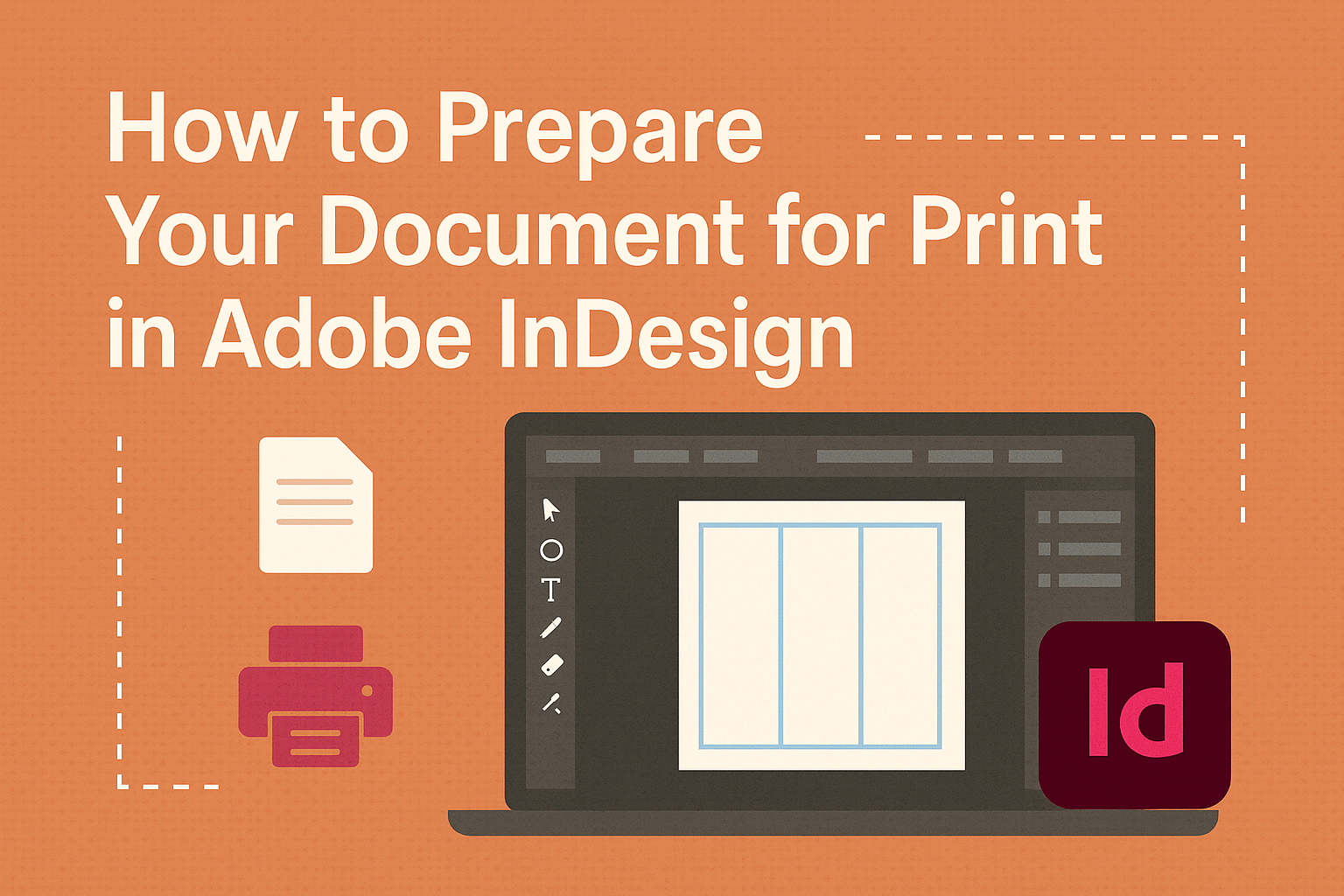
Creating print-ready documents in Adobe InDesign doesn’t have to be complicated. Understanding the essential steps can make the printing process smooth and effective. This guide will walk both beginners and seasoned designers through setting up documents to ensure high-quality prints.
One of the first things to consider is setting the right document specifications. This includes choosing the correct print size, incorporating bleed areas, and selecting CMYK color mode, which is typically used for print. These steps are crucial to prevent unwanted surprises during the printing process.
Equipping yourself with knowledge about colors and optimizing them for print ensures that the final product matches your vision. The article will also offer tips on exporting your file correctly, guiding you through how to create a print-ready PDF.
Understanding InDesign’s Interface
Adobe InDesign’s interface is intuitive and packed with tools that make design efficient. Key areas to focus on include navigating the workspace, mastering the control panel, and proficiently using panels and tools.
Navigating the Workspace
The InDesign workspace is customizable. Users can adjust the layout to suit their workflow, starting with the Application bar at the top, which provides easy access to menu items and a workspace switcher. The toolbar on the left gives quick reach to essential tools, while the Control panel at the top focuses on customization options for selected items.
On the right, panels like Pages, Links, and Layers can be shown or hidden. These panels offer extra control over your document and streamline the creative process. Dragging and docking panels allows for a clean workspace, ensuring that designers can focus on their tasks without distraction.
Mastering the Control Panel
The Control panel in InDesign adapts to the current task. When items are selected, the panel offers precise options for adjustment. For instance, when working with text, users can adjust font style, size, and alignment here. With objects, the panel changes to provide options for resizing, rotation, and positioning.
Ensuring visibility of the Control panel is essential for a smooth workflow. If it’s not visible, go to the Window menu and select Control. By regularly using the Control panel, designers can save time by avoiding extra clicks through menus, leading to a faster and more efficient design process.
Working with Panels and Tools
Panels are vital for managing various aspects of a project. The Layers panel lets designers organize and arrange project elements. By locking or hiding layers, they can prevent unwanted changes and focus on specific components. The Pages panel is key for working with multi-page documents, offering a thumbnail view that simplifies navigation.
Tools in the toolbar handle actions like selecting, drawing, and typing. Each tool has specific functions, and mastering them enhances creativity. For example, the Type tool allows text edits, while the Pen tool is ideal for creating custom paths. Familiarity and practice with these tools can greatly improve design workflow.
Setting Up Your Document
When setting up a document in Adobe InDesign for print, several key factors need attention. These include selecting the right document size, properly setting up margins and bleeds, and creating master pages for consistency.
Choosing the Right Document Size
Choosing the correct size for your document is crucial. Begin by determining the final size your printed project should be. Common sizes include letter (8.5 x 11 inches) and A4 (210 x 297 mm), but custom sizes might be needed for specific projects. The size impacts the overall look and feel of your printed material, and it’s essential to match it with your intended use.
Once you have decided on the size, configure your InDesign document accordingly. Access the “New Document” dialog, where you can input width and height to set the dimensions. Double-check the units of measurement to ensure they align with your regional printing standards.
Margins and Bleeds Explained
Margins act as a buffer zone around your content, preventing text and images from getting trimmed. While margins are flexible, common practice involves setting them to at least 0.5 inches. Margins create breathing space and contribute to an attractive layout.
Bleeds are equally vital, especially for designs with elements that touch the edge of a page. A bleed of 3mm to 5mm ensures that minor cutting errors don’t affect the appearance. Setting up bleeds involves extending content slightly beyond the document’s edge. This can be done in the “Bleed and Slug” section of the New Document dialog.
Creating and Using Master Pages
Master pages help maintain a consistent design across multiple pages. They act as templates where you can place repeating elements such as headers, footers, and page numbers. By designing a master page with all the common features, changes become easier, as you only need to update the master rather than each individual page.
Creating a master page involves navigating to the “Pages” panel and selecting “New Master” from the menu. Once created, apply it to your document pages for uniformity. Modifications made to the master pages reflect immediately on all associated pages, saving time and ensuring a cohesive design.
Working with Text and Typography
Creating a professional look in Adobe InDesign involves proper text formatting, using styles effectively, and applying typography tips. These strategies ensure consistency and enhance the visual appeal of your document.
Formatting Text for Consistency
Consistency in text formatting is key for a polished document. You should start by choosing a uniform font size and style for body text. Common choices include serif fonts for print like Times New Roman or Garamond.
Aligning text consistently, whether left, right, or justified, helps in guiding the reader’s eye and makes the document look more organized. Setting up proper line spacing, usually 1.15 to 1.5, improves readability and creates enough white space. Additionally, standardizing headers with bold or italics can distinctly separate sections.
Adopting a uniform format for lists, such as bullets or numbering, can maintain a clean look. Using the same indentations for paragraphs ensures neatness and improves the document structure.
Using Styles: Paragraph and Character
Using styles is an efficient way to apply consistent formatting. Paragraph styles allow you to format entire sections of text with a single click. You can set line spacing, alignment, and indentation within these styles. Modifying the style later will update all paragraphs using it, saving time.
Character styles are ideal for formatting specific text parts like bolding key terms. They can be applied to individual words or phrases without altering the entire paragraph style. This approach provides flexibility but maintains consistency in font and style choices.
InDesign lets you nest character styles within paragraph styles. This feature is handy for automated formatting, such as changing the first line of each paragraph to italics.
Typography Tips for Professional Layouts
Choosing the right typography can make documents stand out. They should select a complementary set of fonts for headers and body text to boost visual interest. Sticking to two or three font families prevents clutter and ensures a more cohesive look.
Adjusting kerning and tracking enhances text spacing, making it visually appealing. Kerning adjusts the space between individual letters, while tracking shifts the spacing across a range of text.
InDesign’s optical margin alignment feature can refine the appearance of justified text by subtly adjusting the positioning of letters along the margins. These typography techniques contribute to a polished and professional document presentation.
Incorporating Graphics and Images
To ensure the quality of printed materials, it is crucial to correctly handle images and graphics in Adobe InDesign. Readers will learn how to efficiently place and format images, grasp the concept of image resolution, and understand the differences between vector and raster graphics.
Placing and Formatting Images
Adding images in InDesign involves using the Place command, which can be done by selecting “File” and then “Place” or by pressing Ctrl+D (Windows) or Cmd+D (Mac). This allows the user to insert graphics into their document seamlessly. Once placed, images can be resized and positioned by dragging the corners while holding the Shift key to maintain the aspect ratio.
Formatting options, like adjusting brightness, contrast, or adding effects, can enhance visual appeal. Users should make use of the Links panel to manage images and ensure they’re updated if the source file changes. InDesign also provides the ability to wrap text around images, which can be modified in the Text Wrap panel.
Understanding Image Resolution
Resolution is crucial for print quality. It refers to the number of dots per inch (dpi) in an image. The standard for high-quality print is typically 300 dpi. Lower resolution might lead to pixelated or blurry images when printed. It’s essential to check image resolution before placing it in the document.
Users can verify and adjust resolution through image editing software before importing it into InDesign. This step ensures that images are crisp and clear in the final printed piece. Additionally, images should be saved in formats like TIFF, JPEG, or PNG, as these are widely accepted in printing.
Working with Vector and Raster Graphics
InDesign supports both vector and raster graphics. Vector graphics are composed of paths, making them scalable without losing quality. This makes them ideal for logos and illustrations. Common vector formats include AI and EPS files.
Raster graphics are made up of pixels and are best for detailed images, such as photographs. Since they lose quality when scaled up, it’s essential to use high-resolution raster images. InDesign supports formats like JPEG and PNG for raster graphics. Knowing when to use each type ensures the best outcomes for printed media.
Color Management in Print
Color management in print ensures that the colors you see on your screen are accurately reproduced on paper. This involves understanding color theory, choosing the right color modes, and considering special inks like Pantone colors for spot printing.
Applying Color Theory
Understanding color theory is essential when working with printed materials. It involves knowing how colors interact and complement each other. Designers often use the color wheel to create harmonious and visually appealing designs. Complementary colors, which are opposite each other on the color wheel, can create striking contrasts or bold visual effects.
Color harmony can be achieved by using analogous colors, which sit next to each other on the color wheel. This approach results in a more subtle and unified appearance. Designers should also consider factors like cultural meanings of colors or how different hues can evoke specific emotions. This is particularly important in marketing materials, where colors can influence consumer behavior.
Tools such as Adobe Color can help designers choose effective color schemes. These tools provide a range of palettes based on established color principles, making it easier to apply color theory to print design.
Using CMYK vs. RGB
When preparing documents for print, choosing between CMYK and RGB color modes is crucial. CMYK, which stands for Cyan, Magenta, Yellow, and Key (Black), is the standard for printing processes. This mode mixes these four ink colors to produce a wide range of hues, making it ideal for print materials.
RGB, or Red, Green, Blue, is used primarily for digital screens. While RGB offers a broader spectrum of colors, it’s less reliable for printing. Images created in RGB often appear more vibrant than they will in print. Converting RGB to CMYK ensures that printed colors match the intended design.
Always start your InDesign projects in CMYK if you plan for print. This minimizes the chances of color shifts and ensures consistency across different print platforms.
Pantone Colors and Spot Color Printing
Pantone colors are standardized inks used in spot color printing. Instead of mixing primary inks to create colors, Pantone provides pre-mixed inks. This ensures precise color matching, which is vital for maintaining brand consistency.
Spot colors are often used in packaging, logos, or any design element where specific color accuracy is crucial. Unlike process colors, spot colors can produce vibrant hues that CMYK cannot replicate.
For InDesign projects, specifying Pantone colors can be done through the swatches panel. This allows designers to preview how spot colors will appear in the final print. While spot printing is more costly, it is invaluable for high-quality projects that demand exact color reproduction.
Using Layers and Objects
Using layers and objects in Adobe InDesign helps organize and manage different elements in a document easily. This ensures a smoother workflow and a well-structured final print.
Organizing Content with Layers
Layers allow users to separate and manage different parts of their design. Each new document starts with a single layer, but more can be added as needed. This flexibility means users can place text on one layer, images on another, and additional design elements on others. To add a new layer, choose Window > Layers and click the Create New Layer button. Layers can be reordered by dragging them in the Layers panel, providing control over what appears on top of the design. Additionally, layers can be renamed for clarity and better management, facilitating a more organized workspace.
Manipulating Objects and Frames
Adobe InDesign offers a variety of tools to manipulate objects and frames within a document. Users can adjust the size, position, and rotation of objects with the Selection Tool. Frames, which hold text and images, can be edited by selecting the frame and choosing Object > Transform options to make changes such as scaling or rotating. It’s also possible to align objects using the Align panel, which offers alignment and distribution options. Grouping objects by selecting them and hitting Ctrl+G (Windows) or Command+G (Mac OS) helps in moving them together as a single unit. This ensures accurate placement and ease of handling multiple elements.
Linking and Unlinking Content
Links in InDesign provide a way to manage placed files like images. When an image is placed in a document, it’s linked to the original file. This keeps the file size small and allows for easy updates. If the original file changes, InDesign prompts to update it in the document. Users can view and manage these links through the Links panel. To unlink content, simply select the link in the Links panel and use the options menu to choose Unlink. This breaks the connection with the original file but embeds the graphic in the document. Proper use of linking maintains design integrity and ensures documents remain up-to-date with the latest versions of linked content.
Finalizing Your Design
Preparing your document for print involves crucial last steps like checking for errors, exporting correctly, and ensuring all files are ready for your printer. These steps help in achieving a professional and error-free print job.
Proofing and Pre-Flight Checks
Proofing is essential to catch mistakes before printing. It involves reviewing the entire document for issues like spelling errors, incorrect colors, and missing graphics. InDesign offers a Pre-flight tool that alerts users to potential problems, such as font issues or low-resolution images.
A thorough proofread by a fresh set of eyes can be invaluable. It helps catch mistakes the designer might miss. Set aside some time for this important task, as it minimizes the chances of costly mistakes later on.
Exporting Your Document for Print
When the design is complete, the next step is exporting it as a print-ready PDF. In InDesign, go to the File menu and select “Export.” Choose “Adobe PDF (Print)” as this format maintains high quality and includes necessary settings for printing.
Adhering to PDF/X standards ensures compatibility with print services. This includes setting the right color profile, typically CMYK, and embedding all fonts and images. Doing this avoids surprises in the final print, maintaining the integrity of the design.
Packaging Files for a Print Service Provider
Packaging ensures that all file elements, such as fonts and linked images, are included for the print service provider. InDesign’s package feature collects these elements into a single folder. This step prevents missing assets that can delay printing.
Provide clear instructions to the printer, including project specifications and any special requirements. Share the package with the provider using a method that supports large files, like cloud services or a USB drive. This way, the printer has everything they need to begin the job immediately.