Creating business cards in Procreate offers both creativity and convenience. With Procreate, anyone can design professional-quality business cards right on their iPad. This method lets users customize every detail, from colors and fonts to unique illustrations, making each card truly personal.
Using Procreate also means you have access to a wide range of tools and brushes. This flexibility allows for designs that stand out and make a lasting impression. Plus, you can easily export your design to share with professional printing services.
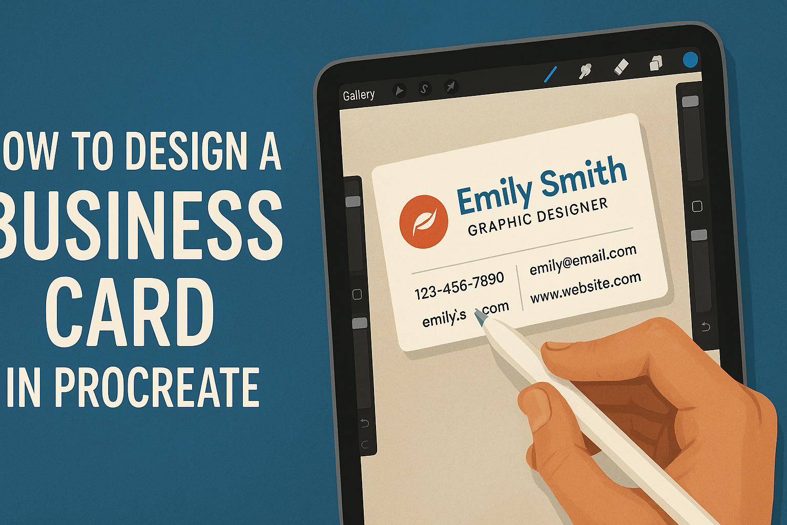
If you’ve ever wondered how to get started, the process is simpler than you might think. By following some straightforward steps, anyone can create eye-catching cards that reflect their style and brand. Procreate makes the task both fun and efficient, turning a creative idea into a finished product.
Understanding Procreate for Business Card Design
Procreate is a popular digital art app for the iPad. It’s a versatile tool that artists and designers use to create high-quality visuals. When it comes to business card design, Procreate stands out for its flexibility and ease of use.
Users can start by creating a new canvas with dimensions suitable for a business card. A standard size might be 3.5 x 2 inches. Using a high resolution like 300 DPI ensures that the design looks sharp when printed.
Tools and Features to Explore:
-
Brushes: Procreate offers a variety of brushes that mimic traditional art tools. This allows for unique textures and styles.
-
Layers: Designers can use layers to separate elements of the card. This helps in making adjustments without affecting other parts of the design.
-
Text Tool: While Procreate is mainly for drawing, it includes a handy text tool. This ensures that important information like name and contact details stand out clearly.
Procreate also supports custom color palettes. This is helpful for matching brand colors or creating a consistent look. Designers can experiment with color schemes until they find the perfect combination.
Another benefit is Procreate’s timelapse feature. This automatically records the design process, which can be helpful for reviewing steps or sharing with clients. For a demonstration, you can refer to this video tutorial.
Setting Up Your Canvas
Setting up your canvas in Procreate is an important step in designing business cards. By choosing the right size and adjusting DPI settings, you’ll set a strong foundation for your design.
Choosing the Right Size
Most standard business cards are 3.5 x 2 inches. When setting up your canvas in Procreate, converting these dimensions to pixels can help maintain quality. Common resolutions for this size are around 1050 x 600 pixels at 300 DPI.
Using these dimensions ensures the design prints crisply. The pixel dimensions might seem large but allow room for details. If designing a different size, check the requirements of your printer or service to ensure compatibility. Depending on your needs, the orientation can be either landscape or portrait. Each offers a different visual appeal, so think about what suits your layout best.
Working with DPI Settings
DPI, or dots per inch, influences the quality of your printed design. For business cards, a DPI of 300 is usually recommended. This setting ensures your design prints clearly and looks professional.
Procreate allows you to adjust the DPI when setting up your canvas. Higher DPI settings lead to larger file sizes, which may slow down the app if your device’s hardware is limited.
Choose a DPI that balances quality with performance. If your device struggles with large files, consider simplifying your design or spacing out layers to optimize performance. Adjusting your DPI appropriately will achieve a high-quality print without straining your device.
Selecting a Color Scheme
Choosing the right color scheme is crucial for making a business card attractive and memorable. This involves selecting colors that match the brand’s personality and message, using Procreate’s tools efficiently.
Using the Color Picker
The Color Picker is a handy tool in Procreate for choosing precise colors. Users can tap on the color circle in the top right corner to access the picker. From there, they can select from a wheel, sliders, or values, allowing for precise control over shades and hues. For those who want to match colors from an image, Procreate allows sampling. Simply hold a finger on the desired area within the image to use the eyedropper tool. This makes it easy to incorporate colors from a logo or a favorite photo, ensuring a cohesive design. To view more details on selecting colors from an image, refer to this guide on selecting colors from an image in Procreate.
Saving Your Palette
After choosing the perfect colors, saving them as a palette is essential for consistent use across designs.
In Procreate, head to the color palettes section, accessed by tapping the color dot and selecting “Palettes” at the bottom. Users can create a new palette by clicking the “+” icon. From here, they can manually add colors or import them from images. This feature is useful for maintaining brand consistency and quickly accessing favorite colors for future projects. Managing and sharing palettes, whether personal or for a team, can greatly streamline the design process. For more in-depth guidance on creating and managing palettes, explore the Procreate Handbook’s section on palettes.
Adding Text Elements
Adding text to a business card in Procreate involves choosing the right fonts, placing text correctly, and adjusting size and spacing for balance. These steps help ensure the card is functional and visually appealing.
Choosing Fonts
The choice of font is crucial for a business card. It should reflect the brand’s personality. Serif fonts are classic and professional, while sans-serif fonts feel modern and clean. Decorative fonts can be eye-catching but should be used sparingly.
When using Procreate, users can access various fonts in the app. They can also import custom fonts for more personalized choices. It’s important to keep consistency by choosing no more than two fonts. This helps maintain readability and a cohesive design.
Text Placement Tips
Text placement is key to maintaining visual balance. Important information should stand out and be easy to locate. Typically, names and titles go on the front, ideally centered.
Contact details can be placed at the bottom or back. Procreate’s grid guides can assist in lining up text accurately. Overlapping text with graphics should be avoided as it affects readability.
Aligning text elements to the grid helps keep the design clean. It’s important to leave some white space for a neat appearance.
Adjusting Text Size and Spacing
Text size ensures readability in different lighting conditions. The critical information, like a name or company, should be slightly larger than other text. This draws attention to essential details.
In Procreate, the spacing between letters (kerning) and lines (leading) can be adjusted to improve clarity. Kerning should be tight enough for legibility but loose enough to avoid crowding.
Leading helps separate sections without breaking the flow. Paying attention to these adjustments ensures that the business card remains professional and easy to read.
Incorporating Graphics and Logo
In Procreate, you can blend graphics and logos to make business cards more engaging. Key tasks include importing images, sketching logos, and organizing elements with layers. Each part plays a critical role in making the design look professional and eye-catching.
Importing Images
To begin, Procreate allows the import of images that can enhance the business card design. Users can select high-resolution images from their photo library or external sources.
Bringing in these images is simple: tap the wrench icon, choose “Insert a Photo,” and select the desired image.
Align the image to fit the card’s layout without compromising its quality. Adjusting the image size and position is important to ensure it complements the design. They can use Procreate’s transform tool for precise alterations.
Users can blend images into the card’s background or use them as focal points. Experimenting with the opacity can help balance how the imported image interacts with other card elements.
Drawing Logos
Procreate offers a creative space for drawing custom logos directly on the business card. Users can start by sketching initial ideas using the brush tool, selecting different brushes to achieve various effects. The app’s extensive brush library provides numerous options for diverse styles.
Refining the sketch is crucial. Users must apply steady strokes and might need to redraw parts to achieve crisp and clean logos. Incorporating distinctive shapes or letters can make the logo memorable.
To maintain a professional look, users can apply symmetry tools in Procreate, ensuring balanced and even designs. Keeping the logo simple yet striking can enhance brand recognition and fit well within the card design.
Using Layers for Composition
Layers are a powerful feature in Procreate that helps manage and organize card elements. Users can add multiple layers for images, text, and graphics, maintaining individual control over each component.
Arranging elements on separate layers makes editing easier. If they want to move or adjust an item, they can do so without affecting others. This flexibility is helpful in arranging complex designs where precision is needed.
Using layers, users can experiment with layering effects, like blending modes and opacity changes, to create dynamic compositions. This layered approach ensures a neat and efficient design, making it easier to focus on each visual element.
Utilizing Brushes and Effects
When designing a business card in Procreate, the right brushes and effects can elevate your design. Discovering various brush types helps create unique lines and textures, while applying texture effects adds depth to your work.
Exploring Brush Types
Procreate offers a wide array of brushes, each serving a unique purpose. For sharp, defined shapes, the Hard Brush is ideal. It provides clean edges perfect for outlining or creating crisp lines. In contrast, the Soft Brush has smoother edges, useful for shading or blending colors.
Experimentation is key. Procreate allows users to customize brushes, offering the flexibility to adjust settings like size and opacity. Creating a duplicate of a brush before making changes ensures that the original settings can be preserved.
The combination of different brush types can add variety and interest to a business card design. Try mixing brush types to find what works best for the specific elements you’re working on.
Applying Texture Effects
Texture effects in Procreate can bring a flat design to life. By using Procreate’s special effects tools, users can introduce elements like gritty textures or smooth gradients. These effects add a tactile feel, making digital designs appear more tangible.
Adding texture can highlight key features on a business card, such as the name or logo. For example, using a subtle grain effect can differentiate the background from the foreground. Exploring various effects helps to find combinations that fit the desired aesthetic.
When applying effects, remember that less can often be more. Aim for a balance to enhance the design without overwhelming the viewer.
Finalizing Your Design
After creating your design for a business card in Procreate, it’s time to prepare it for printing. This involves two important steps: trimming to the correct size and ensuring it’s in the right format. Both actions help maintain the quality and accuracy of the final product.
Trimming and Cropping
Trimming your business card design ensures it meets standard sizes, which are usually 3.5 x 2 inches in the US. It’s essential to keep all important elements like text and logos within a “safe area” to prevent them from being cut off during printing.
To crop in Procreate, use the canvas size settings. Adjust the dimensions carefully to match the standard card size. Use guides to help align elements and maintain balance. Make sure to check the resolution to ensure that everything is clear and crisp after cropping. This attention to detail helps avoid any unwanted surprises when the card is printed.
Exporting for Print
Exporting the design correctly is crucial for achieving high-quality prints. Procreate offers multiple export options, but for printing, it’s best to choose a high-resolution file type like PDF or TIFF. These file types preserve clarity and color details.
In the export settings, choose a resolution of at least 300 DPI (dots per inch) to ensure sharpness. Double-check the color profile settings, opting for CMYK since it’s the standard for print color. Save the file with a descriptive name for easy access.