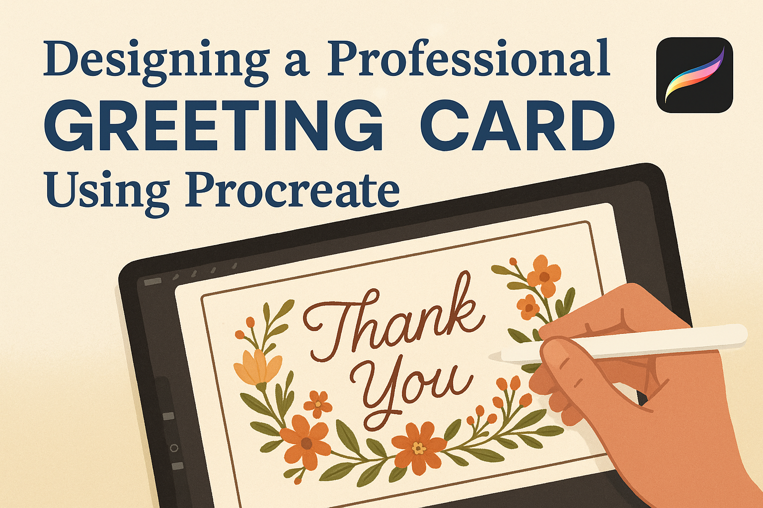
Creating a professional greeting card often involves creativity and the right tools. With the help of apps like Procreate, anyone can design beautiful and unique cards with ease. Procreate offers a range of digital tools that can help artists bring their card designs to life, making the process both fun and rewarding.
For those eager to design their own cards, Procreate provides features like layering, custom brushes, and rich-text options. These tools allow users to craft everything from simple designs to intricate artworks. Learning to utilize these options can turn a simple idea into a stunning finished product.
Engaging in this creative process not only results in a one-of-a-kind card but also enhances one’s digital art skills. By using resources like a free card template, even beginners can start designing with confidence. Through this journey, anyone can discover the joys and possibilities of digital design.
Getting Started with Procreate
To create a professional greeting card using Procreate, it’s essential to know the interface, set up the canvas correctly, and choose the right brushes. These basics will help in creating a design that stands out.
Understanding the Procreate Interface
Procreate’s interface is user-friendly and designed for artists. The main area is the canvas where you draw. On the left, there are tools like brushes, erasers, and other editing tools. The layer panel on the right lets users manage different elements of their artwork.
Knowing where tools are can save time. The top bar offers options like undo, redo, and a helpful color picker. There’s a section for actions too, which is crucial for managing projects. Understanding these parts helps in navigating Procreate efficiently.
Setting Up Your Canvas
Setting up the canvas is crucial for greeting card design. Users can start by deciding the card size. For example, creating a card in an A2 size can be done by importing a Print-at-Home template specifically for that size.
The canvas should match the intended print dimensions. Adjusting the grid is also important, providing guidance for positioning elements correctly. It’s best to ensure the resolution is high enough to maintain quality when printed.
Exploring Brushes and Tools
Procreate offers a variety of brushes and tools suited for different art styles. The brush library contains many textures, from pencil-like to watercolor effects. Artists can adjust settings like size and opacity to get the desired effect.
Tools like erasers and smudge can add finesse to details. Experimenting with brushes helps find the perfect style for a project. Combining different brushes allows for unique textures and finishes, vital in crafting an eye-catching greeting card.
Planning Your Design
Creating a professional greeting card in Procreate starts with careful planning. Key aspects include choosing a theme and purpose for the card, understanding color theory, and selecting typography to ensure readability.
Selecting a Theme and Purpose
The foundation of every great greeting card is a clear theme and purpose. When deciding on a theme, consider the occasion. Is it a birthday, holiday, or thank-you card? Understanding the purpose helps tailor the design to the recipient.
Think about the emotions you want to convey. A birthday card might be playful, while a sympathy card should reflect sensitivity. Make a list of keywords or phrases that capture the feeling of the card. It can guide the rest of the design process, helping ensure the final product aligns with your initial vision.
Color Theory Basics
Color plays a vital role in any design, setting the mood and drawing attention. In greeting card design, it’s important to use colors that complement the theme. For instance, warm colors like reds and oranges can convey excitement and energy. Cooler tones like blues and greens evoke calmness.
Using a color wheel can help identify harmonious color schemes. Complementary colors, those opposite each other on the wheel, create a high contrast look. Additionally, consider the psychological effects of colors. Red often symbolizes love or passion, whereas green can indicate growth or tranquility. Keeping these aspects in mind ensures that the colors enhance rather than compete with the card’s message.
Typography and Readability
Typography is crucial for making sure the text on a greeting card is clear and impactful. Choose a font that reflects the card’s theme and is easy to read. A playful card might benefit from a casual handwritten font, whereas a formal invitation may require a classic serif font.
Font size matters too. Headlines should be bold and noticeable, while body text remains readable at a glance. Pay attention to spacing, known as kerning, which affects clarity. Maintaining a balance between text and imagery ensures neither overwhelms the other, allowing the card’s message to shine.
Creating Your Artwork
Designing a professional greeting card in Procreate requires thoughtful planning and skillful technique. This involves brainstorming ideas, setting up layers, and applying digital art methods to create a captivating design.
Sketching Your Ideas
Before jumping into the digital workspace, sketching ideas on paper or digitally can be incredibly helpful. This initial step is all about exploring different concepts.
Using Procreate’s sketching tools can bring your visions to life. Users can take advantage of various brushes to mimic traditional pencil textures. Starting with a rough outline, he or she can focus on the card’s layout and main elements. It’s crucial to refine these sketches to capture the design’s essentials.
Developing several thumbnails can provide a clearer direction. This approach helps to settle on the best composition and overall flow.
Using Layers Effectively
Layers are vital in digital art, and utilizing them wisely can enhance the workflow. In Procreate, layers allow designers to separate different elements of their designs.
By assigning each part of the artwork, such as text, borders, and images, to different layers, users gain flexibility. This setup makes it easier to edit or adjust individual components without affecting the entire piece.
Additionally, using layer masks can add depth and detail. Layer groups help organize related elements, keeping the workspace clean and efficient. Naming and color-coding these layers can further streamline the creative process.
Digital Illustration Techniques
Digital illustration in Procreate offers a wide range of techniques to polish greeting card designs. Understanding these methods can enhance the artwork’s quality.
Brush customization allows the artist to match the desired style, whether it’s smooth paint strokes or textured effects. Utilizing blending modes can create striking visual effects by adjusting how different layers interact with each other.
Moreover, experimenting with digital textures and patterns can add a unique feel to the card. It’s important to maintain a balance between details and clarity to ensure that the final design is both eye-catching and coherent. These techniques provide the foundation for a professional and appealing greeting card.
Adding Text to Your Greeting Card
In creating a professional greeting card using Procreate, adding text plays a crucial role. Key factors include choosing suitable fonts, integrating the text with imagery, and refining its placement for an attractive look.
Choosing Fonts and Styles
Selecting the right fonts and styles is essential for setting the tone of your greeting card. Consider the occasion you’re designing for—whether it’s a birthday, wedding, or holiday card. Elegant fonts such as scripts work well for formal events, while playful and bold fonts could be great for casual greetings.
Experiment with different font styles and sizes. You can mix fonts within the same card, but keep it balanced. A good rule of thumb is to limit your choices to two complementary fonts. This approach maintains a clean and cohesive design. Bold or italic fonts can help accentuate key phrases, giving them prominence in your design.
Integrating Text and Imagery
Integrating text with imagery ensures your card feels as a unified piece. Begin by considering the overall theme or message of your card. You want the text and images to complement each other, creating harmony rather than competition.
Aligning text to follow the flow of images can be pleasing to the eye. For instance, wrapping text around circular shapes or positioning it along the curve of an illustration can add visual interest. Explore different layering techniques, allowing text to interact seamlessly with images. Use color to either make the text stand out or blend in, depending on the effect you want to achieve.
Fine-Tuning Text Placement
Proper text placement enhances readability and aesthetic appeal. Before finalizing, review each text element’s position on the card. Centering text gives a formal look, while offset placements can feel dynamic and modern.
Create guides within Procreate to help align your text precisely. Tools such as grids and rulers are handy for this. Aim for balance—if your card feels lopsided, consider moving some elements to create a stable composition.
Remember to check the spacing between lines and letters. Adequate spacing improves legibility and overall attractiveness. Such small adjustments can make a significant difference in how professional your final card appears.
Finalizing Your Design
Finalizing a greeting card in Procreate involves adding final touches to enhance its appeal, proofreading for errors, and preparing the design for printing. Each step ensures that the card looks professional and ready for use.
Applying Final Touches
When it’s time to add final touches, pay attention to details like colors and textures. Small adjustments can have a big impact. Consider adding shadows or highlights to make elements pop. Using the blend tool in Procreate can help achieve smooth transitions between colors.
Adding decorative elements like borders or embellishments can also make the design stand out. Shapes and lines can guide the viewer’s eye across the card. Careful use of textures, like watercolor or pencil, can also add a unique feel to the design.
It’s important to make sure everything looks balanced. Too many additions can overwhelm the card. Consider taking a break and then coming back to the design. Fresh eyes can help see what needs tweaking.
Proofreading Your Card
Before finalizing the design, carefully check all the text elements for mistakes. Spelling errors or typos can make a professional card look unprofessional. Consider reading the text out loud or asking a friend to look it over. Different perspectives can catch mistakes you might miss.
Formatting is another crucial aspect of proofreading. Ensure that fonts are consistent and readable. This includes checking that text alignment is uniform. Using contrasting colors for text and background can improve readability.
Take note of any dates or names to ensure they’re accurate. Errors in these areas can be particularly embarrassing, especially if the card is intended for an event or person.
Preparing for Printing
When preparing your design for printing, make sure to set the correct resolution. A typical print resolution is 300 DPI (dots per inch) for high-quality prints. This ensures the card looks crisp and clear.
Check the dimensions of the design to fit the intended card size. Adjusting canvas size in Procreate is simple: go to Actions > Canvas > Crop and Resize. Make sure your design fits within these specifications.
It’s also helpful to print a test copy at home if possible. This can reveal unexpected issues, such as colors appearing different in print compared to on-screen. Using a template from Art Maker’s Club can simplify this step.
Sharing and Exporting
After designing a stunning greeting card in Procreate, the next step is to export your work in the right format and share it with the world. Knowing the right file formats ensures quality is preserved, and sharing options allow for broader audience reach.
Exporting File Formats
When exporting from Procreate, choosing the correct file format is crucial. The PNG format is ideal for maintaining high-quality images with transparency. It’s perfect for digital designs where clarity matters. For printed cards, the PDF format is recommended as it retains the design integrity and prints smoothly at the required resolution.
Another popular format is JPEG. It is good for sharing quickly where high resolution isn’t as critical. Keep in mind that JPEGs are compressed, which can slightly reduce quality. PSD files are also an option for those who want to further edit their designs in programs like Adobe Photoshop. Always check printer specifications to ensure compatibility with the selected format.
Sharing Your Designs Online
Once exported, sharing designs online can be rewarding. Social media platforms like Instagram and Pinterest are popular for showcasing artwork. Use enticing previews and hashtags to reach a larger audience. Instagram Stories or Reels can add engaging previews of the card design process.
Consider using digital portfolio websites such as Behance or Dribbble for professional exposure. For personal sharing, direct uploads to cloud storage like Google Drive or Dropbox can simplify collaboration with clients or friends. With these platforms, sharing a link allows easy access to high-quality files. Remember to consider privacy settings when sharing to protect your design work.