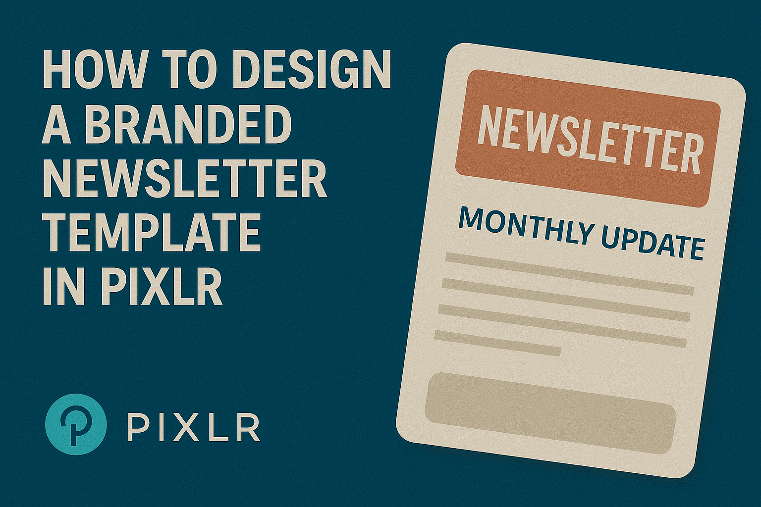
Creating a branded newsletter template can significantly enhance a business’s communication strategy. Using Pixlr, anyone can design a custom template that reflects their brand’s personality and attracts readers. With easy-to-use tools, even those without a design background can make stunning newsletters.
In today’s digital age, newsletters are essential for keeping customers informed and engaged. A professionally designed template not only saves time but also ensures consistency in branding.
By following simple steps, users can produce eye-catching newsletters that stand out in crowded inboxes.
Readers will discover how to utilize Pixlr’s features effectively to create a template that can be reused for various campaigns. This process empowers businesses to maintain their branding while focusing on content. Embracing these tips can lead to more impactful and visually appealing newsletters.
Getting Started with Pixlr
To begin designing with Pixlr, it’s important to choose the right tool and set up a workspace that makes the process easier.
Each Pixlr tool has unique features, and a well-organized workspace can enhance creativity and efficiency.
Choosing the Right Pixlr Tool
Pixlr offers different tools to cater to various design needs. Pixlr X is ideal for quick edits and beginners. It provides intuitive features and simple navigation.
For more advanced users, Pixlr E is recommended. It has more complex editing options and tools, which allow for greater customization.
Users can access both tools through the Pixlr website, making it easy to switch between them based on their project needs.
Choosing the right tool depends on the user’s experience and the complexity of the design. Beginners might prefer starting with Pixlr X before moving on to Pixlr E as their skills grow.
Setting Up Your Workspace
Setting up a friendly workspace can make a big difference in productivity.
First, launch the chosen Pixlr tool and familiarize yourself with the layout.
Users should open a new project by selecting a blank canvas or using a template. They can choose the dimensions suited for a newsletter.
To customize the workspace further, users should arrange panels and tools for easy access. They can drag and drop elements to create an efficient design environment.
Using features like layers and grids helps streamline the design process, allowing for better organization of elements. A well-set workspace fosters creativity and helps users stay focused on their projects.
Designing Your Newsletter
Creating a newsletter template requires careful thought about the theme, layout, and branding. Each element plays a significant role in attracting and engaging readers. Here are some essential steps to follow when designing a newsletter in Pixlr.
Selecting a Theme and Layout
Choosing a theme helps set the mood for the newsletter. It reflects the brand’s personality and appeals to the target audience. Users can find various themes in Pixlr that cater to different styles—from modern to classic.
When it comes to layout, it’s vital to think about how the information will flow. A clean and organized layout makes it easier for readers to navigate.
Include sections for articles, images, and calls to action. It can be helpful to create a grid system to ensure alignment and balance in the design. This way, the newsletter will be visually appealing and effective.
Adding Your Branding Elements
Branding gives the newsletter its unique identity. Incorporating elements like the company logo, color scheme, and fonts builds recognition.
Users can easily upload their logos into Pixlr and place them prominently.
Color schemes should align with the brand, using 2-3 colors for consistency. This creates harmony and makes the newsletter visually cohesive. Fonts should be easy to read; using 1-2 font styles helps maintain clarity without overwhelming the reader.
Customizing with Images and Text
Images and text work together to tell the newsletter’s story. Users can upload high-quality images that resonate with the content.
Pixlr offers tools for adjusting image size and placement, ensuring they complement the text.
Text should be engaging and concise. Using bullet points or short paragraphs enhances readability.
Incorporating headers and subheaders also makes it easier for readers to skim through the content. This approach not only keeps interest but also reinforces the message effectively.
Enhancing the Visual Appeal
Creating a visually appealing newsletter is vital for grabbing readers’ attention. Color schemes and typography play a key role in establishing a polished and professional look.
Working with Color Schemes
Choosing the right color scheme can elevate a newsletter’s design. A consistent palette helps to reinforce the brand identity.
It’s best to select 2-3 primary colors that reflect the brand’s personality.
For instance, a tech company might use cool blues and grays for a modern feel, while a food blog could opt for warm reds and yellows.
When applying colors, stick to the same shades for headings and backgrounds. This creates harmony in the design. Using colors from the logo can further maintain consistency.
It’s also essential to ensure there is enough contrast between text and background colors. This enhances readability. Tools like color contrast checkers can help ensure the text stands out.
Incorporating Fonts and Typography
Fonts greatly influence how a newsletter is perceived. Choosing the right fonts can express the brand’s tone.
To maintain clarity, select 1-2 font families for use throughout the newsletter.
Headings should be bold and easy to read, while body text should be simple and legible. Sans-serif fonts often work well for digital content due to their clean appearance.
Using various font sizes can help differentiate sections. For example, a larger font size for the title will immediately attract attention.
It’s important to maintain a consistent style. Avoid using too many different fonts, as it can create a chaotic look. Aim for a balance between aesthetics and functionality to keep readers engaged.
Exporting and Sharing
Once the newsletter design is complete, it’s important to export it correctly to maintain quality and ensure it works well for different uses. Sharing the design effectively can make a significant difference in how the newsletter is received.
Saving the Design in Different Formats
When using Pixlr, there are various formats available for saving a design. The most common formats include PNG, JPG, and PDF.
- PNG is excellent for images that require transparency and retains high quality.
- JPG is good for photographs and images where file size matters more than perfect quality.
- PDF is ideal for printing, as it preserves formatting.
To save, navigate to the ‘File’ menu and choose ‘Export’. From there, select the format that best suits the intended use. Remember that the file format can affect how the design looks when shared or printed.
Tips for Emailing and Printing
When emailing a newsletter, it’s crucial to consider the file size. A large file may not be easily received.
Aim to keep file sizes under 1 MB when possible.
- Use a PNG for images with logos or graphics for clarity.
- For text-heavy designs, a PDF is often better as it maintains the layout.
For printing, ensure the design has a resolution of at least 300 DPI for crisp output.
Always preview the newsletter to check for any layout issues.
Using the right format and size can help deliver a polished final product.