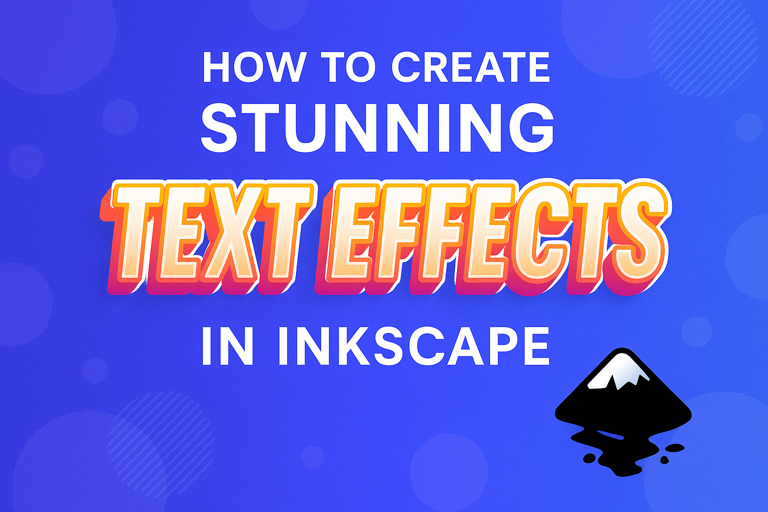
Creating text effects in Inkscape can take your designs to a whole new level, whether you’re working on a personal project or a professional one. To create stunning text effects in Inkscape, you can explore various features like wavy text or relief print effects that add depth and style. This software is perfect for bringing imagination and creativity to life without needing extensive design experience.
Inkscape provides a wide range of tools and effects that let users transform simple text into eye-catching visuals. From wavy designs to textured or distressed effects, each technique offers its own unique touch. Users can enhance their skills and make their creations pop by experimenting with these options.
Learning to use the different paths and nodes is key to mastering text effects in Inkscape. By understanding how to manipulate these elements, designers can achieve more dynamic and engaging results. With each step, from selecting a path to adjusting colors, there’s an opportunity to refine your design skills while having fun with endless possibilities.
Getting Started with Inkscape
To create amazing text effects in Inkscape, one must first set up the software appropriately. This includes downloading and installing it, getting familiar with the interface, and preparing the document for work.
Downloading and Installing Inkscape
Inkscape is a free and open-source vector graphics editor. To begin, visit the official Inkscape website to download the latest version. Pick the version that matches your operating system—Windows, macOS, or Linux.
Once downloaded, open the installer. Follow the on-screen instructions to complete the process. For Windows users, this involves selecting installation preferences, such as the destination folder. On macOS, you might need to drag the application to your Applications folder.
After installation, launch Inkscape to ensure it opens correctly. For new users, exploring introductory tutorials can be beneficial. This sets a strong foundation for your creative projects, ensuring all the tools are available from the start.
Understanding the Inkscape Interface
The Inkscape interface consists of several key components. Toolbars line the edges of the window, offering various functions like selection, drawing, and shape tools. The menu bar at the top grants access to file commands, view options, and extensions.
The canvas is in the center, where the design work happens. To the right, the palette offers quick access to colors. You can customize this setup by rearranging toolbars and panels to match your workflow preferences.
Each tool in Inkscape has its settings, accessible on the top context toolbar when a tool is selected. This area is crucial for modification, as it adjusts stroke patterns, object paths, and other elements. Understanding these fundamentals helps navigate the interface with ease.
Setting Up Your Document for Text Effects
Before applying text effects, the document needs proper setup. Start by opening a new file. Set the dimensions suitable for your project, such as A4 for print or custom settings for web use. This is done through ‘File’ > ‘Document Properties.’
Adjust the units to a familiar measurement, like pixels or inches. This aids in precise control over text size and layout. For text effects, ensure the color mode is set to RGB for digital media or CMYK if preparing for print.
Organize the document using layers. This not only separates elements but also makes complex designs easier to manage. With these preparations, your design journey in Inkscape becomes smoother, letting creativity flow more effectively.
Basic Text Editing Techniques
Inkscape offers various options for basic text editing. Users can easily add text to their designs, customize the font and style, and adjust spacing and alignment to create visually appealing text.
Adding Text to Your Document
Inkscape allows users to add text by selecting the Text tool from the toolbar. After choosing the tool, click anywhere on the canvas to create a text box. This is where you start typing the desired text. Users can adjust the size of the text box by clicking and dragging the corners, giving more room for longer text.
Text can also be edited anytime by double-clicking inside the text box. This feature is handy for making quick changes. Users may also use the Tool Controls Bar to modify the text’s position or direction. With these simple steps, adding text becomes straightforward, allowing more focus on creativity.
Modifying Font and Style
Once text is added, Inkscape provides many options for adjusting font and style. The Text and Font dialog box offers a wide range of fonts to choose from. Users can access this dialog by navigating to Text > Text and Font in the menu. Here, they can change the font family, style, and size.
This dialog also includes bold, italic, and other style options. Changes appear instantly on the canvas, so users can see how different looks complement their designs. For more effects, users may apply text outlines or shadows, enhancing the text’s visual appeal. Inkscape’s versatility ensures that anyone can find the right style for their project.
Adjusting Text Spacing and Alignment
Proper text spacing and alignment can significantly impact the overall design. Inkscape offers tools to adjust these elements with precision. Users can find text alignment options in the Align and Distribute panel, accessible through Object > Align and Distribute. This panel ensures that text can be centered, left, or right aligned within its text box or relative to other objects.
For spacing, the Text and Font dialog allows adjustments to letter and line spacing. These options enable users to control the distance between characters and lines, aiding in readability. Fine-tuning these aspects can lead to more balanced and harmonious designs, showcasing the text effectively.
Creating Custom Text Effects
Creating custom text effects in Inkscape involves using various features to make text stand out. This includes adding colorful gradients, textured patterns, shadows, and glows to enhance the look of your text.
Applying Gradient and Pattern Fills
Inkscape offers powerful tools to apply gradients and patterns to text. Users can select the text and choose the Fill and Stroke panel. From there, they can apply a linear or radial gradient. Adjusting the directional nodes allows for creating unique effects.
Patterns can also be applied by selecting a pattern fill option. This method creates an interesting texture on the text, making it more visually appealing. The flexibility of combining both gradients and patterns leads to creative possibilities.
Creating Drop Shadows and Glows
Creating shadows and glows can give text a 3D effect. Inkscape allows users to add these by first duplicating the text and converting it to a path. The duplicate is given a darker fill color and offset slightly to create a shadow effect.
For a glow, the duplicated path can be blurred and placed behind the main text. Experimenting with opacity and blur levels will lead to stunning results. This technique is great for making text pop on different backgrounds.
Using the Path Effect Editor for Text
The Path Effect Editor in Inkscape is another tool for customizing text. It allows for adding effects like bends and twists, making text appear in unique styles. To use this, the text must first be converted to a path.
Once in the Path Effect Editor, various effects such as bend or pattern along the path can be added. This tool is perfect for users wanting to create dynamic text shapes. Simple adjustments can lead to dramatic transformations in text appearance.
Advanced Text Techniques
Advanced text effects in Inkscape include creating dynamic designs by manipulating text paths, outlining text, and using clipping and masking. These techniques can elevate designs to a professional level, offering flexibility and creativity.
Working with Text on a Path
In Inkscape, text can be aligned along a path for interesting designs. To start, type the desired text, then create a path using the Pen or Pencil tool. Select both the text and the path, then choose Text > Put on Path. This aligns the text with the path shape.
Adjusting the path changes the text flow. Transform the path into curves, circles, or any custom shape. Release the text by selecting Text > Remove from Path if needed. This technique is great for circular logos or wavy text designs, adding unique stylistic elements.
Text Outlines and Strokes
Creating outlines around text gives boldness and emphasis. Inkscape allows users to convert text to paths with Path > Object to Path. This feature turns each letter into an independent object, editable with the Node tool.
To apply strokes, style the outline using the Stroke paint tab in the Fill and Stroke panel. Adjust the thickness, color, and style to enhance the text’s visual impact. Use this technique to make text pop against complex backgrounds, ensuring readability. Remember, once converted to paths, text characters are no longer editable as text.
Clipping and Masking Text
Clipping and masking effects offer creative ways to blend text with images. To clip text, position the text above the desired image, select both, and apply Object > Clip > Set. This keeps the image visible only within the text’s bounds.
For masking, arrange elements similar to clipping but choose Object > Mask > Set. This technique can incorporate gradients and varying opacities for more dynamic visuals. Both methods combine text with images seamlessly, making striking headlines or branded graphics.
Creative Text Design Ideas
Creating stunning text effects in Inkscape allows designers to bring their artistic visions to life. From 3D effects to detailed textures, the possibilities are endless. Here’s a look at inventive techniques you can use to make your text pop.
Creating 3D Text Effects
To create eye-catching 3D text effects in Inkscape, one must start by converting the text into a path. This allows for more detailed adjustments. Next, users can use the “Extrude” feature to add depth, giving the illusion of three dimensions.
After adding depth, adjusting lighting and shadows enhances the 3D appearance. Playing with gradient fills can also add realism, making the text appear more dynamic and lifelike.
Experimenting with different perspectives and angles can make the design more engaging. By customizing the shape and orientation of each character, designers create a more personalized and attractive look.
Adding Textures and Details to Text
Adding textures can significantly enhance text designs in Inkscape. Using the “Pattern” and “Texture” tools, various patterns can be applied to text elements. This creates a more tactile experience.
Textures could include anything from metallic finishes to wood grains. They give depth and interest to the text, helping it stand out.
Details such as outlines and drop shadows contribute to the text’s uniqueness. By incorporating these elements, designers can achieve a more polished and professional look. Customizing these details ensures that each text effect is unique.
Innovative Use of Typography in Design
Typography plays a crucial role in creative text design. Choosing the right font is essential to convey the message effectively. Inkscape offers a wide range of fonts and adjustments to produce unique typographic styles.
Combining different fonts can enhance the visual appeal of a design. By pairing contrasting typefaces, a designer can create a more dynamic and interesting composition.
Kinetic typography can provide movement to static text. By adjusting spacing, alignment, and size, designers breathe life into their creations, resulting in engaging and innovative designs. Utilizing these techniques ensures the text captures attention and communicates effectively.
Optimizing Your Text Artwork
When creating text effects in Inkscape, it’s crucial to ensure your artwork is polished and ready for use. Properly exporting designs and maintaining scalability are key aspects.
Finalizing and Exporting Your Text Design
Before exporting, make sure the text aligns well. Inkscape allows users to distribute and align text objects with ease. Once that’s done, choose an appropriate file format. For web use, SVG is preferred since it retains quality and is scalable. For print, consider exporting as PDF or high-resolution PNG files.
To export, navigate to File > Export and select your preferred settings. Preview the file to check for any errors like missing fonts or misaligned elements. Address these issues before the final export.
Tips for Clean and Scalable Text
Keeping text clean and scalable is vital for design flexibility. Use vector-based text as it maintains quality at any size. Adjust the node settings in Inkscape to smooth out edges, ensuring the text looks polished.
Avoid using too many effects that pixelate when scaled. Instead, rely on vector effects available in Inkscape. Using simple gradients and shadows can add depth without sacrificing scalability. Additionally, converting text to paths can prevent font issues when sharing designs. By focusing on these elements, text artwork remains clear and adaptable for different uses.