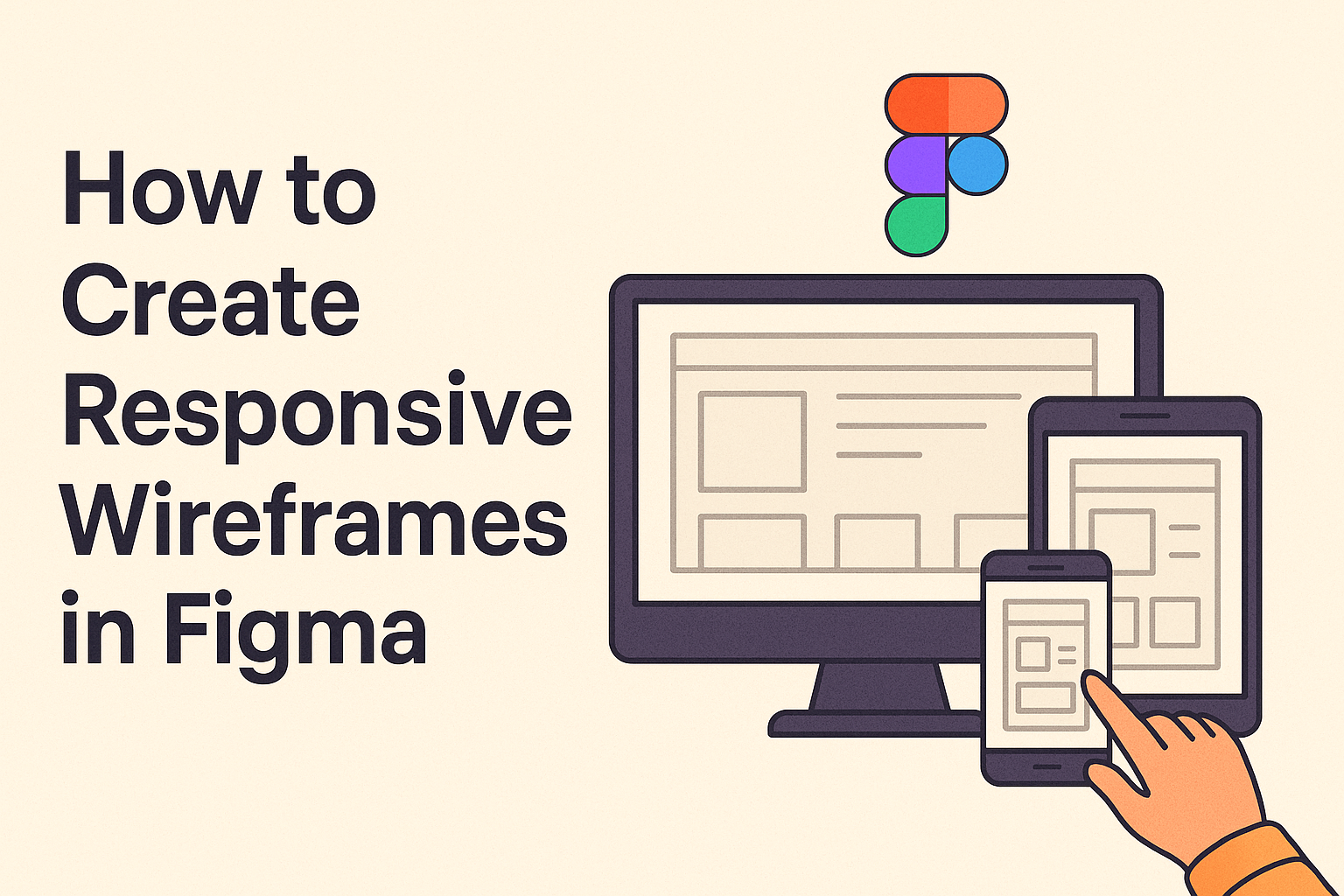
Creating responsive wireframes in Figma is essential for designing flexible layouts that adapt to various screen sizes. Figma offers powerful tools like auto layout and frames, making it a popular choice for designers. This guide will walk readers through the process of building fluid wireframes using Figma’s responsive design features.
Getting started in Figma is easy, allowing designers to organize their projects effectively. By setting up a main container frame and using auto layout options, users can create responsive designs that adjust seamlessly. Learning the basics of wireframing ensures a solid foundation for impressive design work.
Wireframing not only helps visualize ideas but also allows for quick testing and adjustments. Designers will find this guide invaluable for building wireframes that look great on any device. With step-by-step instructions, the process of creating responsive wireframes becomes clear and accessible.
Understanding Responsive Design
Responsive design is crucial to ensure that web content looks great on any device, from mobile phones to desktops. This approach involves adapting layouts, images, and text to different screen sizes, ensuring a seamless user experience across all platforms.
Principles of Responsiveness
At the core of responsive design are principles that guide how a website or application should adjust its appearance and functionality on various devices. The most critical aspect is flexible grids and layouts. This involves using relative units, like percentages, instead of fixed pixels, to define widths. This flexibility ensures that elements stretch or shrink according to the screen size they are viewed on.
Media queries are another essential component. They help developers apply different styles based on the device’s characteristics, such as its width or orientation. This way, specific adjustments can be made, such as changing font sizes on smaller screens. Additionally, images should be sized in a way that they remain attractive and functional at any scale.
Benefits of Responsive Wireframes
Responsive wireframes offer several benefits that can significantly impact the success of a design project. First, they provide a visual blueprint that helps teams anticipate how a design will adapt to various screen sizes. This foresight allows for proactive adjustments, reducing the need for extensive changes later on.
Improved collaboration is another advantage. Designers, developers, and stakeholders can better communicate and align their understanding of a project when they have a clear model to reference. It simplifies discussions about layout transitions and interactive elements.
Finally, using responsive wireframes can lead to cost savings. By addressing potential issues early in the design process, teams can avoid expensive fixes that might arise if problems are only noticed in the development or testing phases. This efficiency makes it a valuable tool in delivering timely, successful projects.
Getting Started with Figma
Figma is a powerful tool for creating responsive wireframes. It’s user-friendly and offers a range of features that make designing seamless and efficient. Understanding its interface, setting up an account, and exploring its tools are crucial first steps.
Overview of Figma Interface
When first opening Figma, users are greeted with a clean and organized workspace. The interface is designed for ease of use with panels arranged on the left, center, and right.
On the left side, the layers panel displays all the elements in the current project. The center is the canvas where designs come to life. The right-hand panel holds the Properties Inspector, where properties of selected items can be adjusted.
Quick navigation: Users can quickly switch between design and prototype modes using tabs at the top. This feature helps in seamlessly transitioning from designing elements to creating interactive prototypes.
Setting Up Your Figma Account
Creating an account is straightforward and necessary for saving and sharing designs. Users can sign up by visiting Figma’s website and choosing to sign in with Google or by creating a unique username and password.
Figma offers both free and paid subscription plans. Beginners can start with the free plan, which provides basic features and up to three projects. This is suitable for exploring and testing its capabilities. Paid plans unlock advanced tools and collaboration features.
Once registered, Figma provides an onboarding tutorial to guide new users through essential functions. Completing this tutorial is helpful for gaining initial experience with the tool.
Exploring Figma Tools and Features
Figma equips designers with a variety of tools essential for wireframing. The Frame Tool allows the creation of design frames tailored to different devices, which is crucial for responsive design. The Pen Tool can be used for creating custom shapes or paths.
Auto Layout is a notable feature for responsive designs. It enables dynamic arrangement of elements based on the frame size, simplifying the adaptation to various screen sizes as seen in responsive wireframe templates.
Designers can also collaborate in real-time, thanks to Figma’s cloud-based setup. This means feedback and changes are instantly available to all team members, enhancing efficiency.
Creating Your First Wireframe
To start creating a wireframe in Figma, it is essential to define the layout structure, use grids and guides, and insert basic shapes and placeholders. These steps ensure a smooth and organized process.
Defining the Layout Structure
The first step in creating a wireframe is to define the layout structure. This involves deciding how different sections of the website or app will be organized. It helps to sketch a rough outline on paper to visualize the arrangement.
Once a rough sketch is ready, open Figma and create a new file. Use the Frame Tool by pressing “F” to set up the digital workspace. Choose a frame size that suits the project requirements. Common sizes include web, mobile, or tablet formats.
It’s important to consider user flow. Arrange major elements like headers, footers, and main content areas, focusing on usability and functionality. Keeping elements simple at this stage helps in making changes easily later on.
Adding Grids and Guides
After setting the initial structure, incorporating grids and guides helps in aligning elements. Grids serve as a foundation for placing components neatly.
In Figma, grids can be added by selecting the frame and navigating to the grid settings panel. Set the grid type to columns or rows, depending on the design needs. Defining a grid helps maintain consistency and balance across the wireframe, ensuring elements are spaced appropriately.
Guides are useful for aligning specific items. They can be added by dragging from the rulers at the top or side of the frame area. This adds precision, ensuring alignment across various elements. Guides are especially helpful when working with text or buttons to keep everything in order.
Inserting Basic Shapes and Placeholders
The next step is to insert basic shapes and placeholders, representing different content types. Figma’s shape tools allow the creation of rectangles, circles, and lines. These shapes can act as placeholders for images, text, or buttons.
Start by placing rectangles where large content will go, like images or banners. Circles are great for profile pictures or icons. Lines can divide sections or guide the visual flow. Using these tools, design a skeletal layout that represents all major components of the final design.
Placeholders are often labeled with text to indicate their function, like “Header” or “Social Media Icons.” This practice ensures clarity, helping anyone reviewing the wireframe to understand the layout intentions.
Making Wireframes Responsive
Creating responsive wireframes in Figma involves a few key strategies. It’s all about using constraints, employing auto layout, and adapting designs for various screen sizes. These techniques help design teams build flexible and user-friendly layouts.
Working with Constraints
Constraints in Figma are essential for maintaining your design’s adaptability across different screen sizes. These constraints determine how elements in a wireframe respond when the frame is resized.
Using constraints, designers can pin elements to the top, bottom, left, or right, ensuring consistent spacing and alignment. This feature enables items to remain fixed in place or move along with the frame.
By properly applying constraints, wireframes become more intuitive and versatile. Designers gain confidence that their layouts will hold up under different conditions without breaking. This method helps teams prepare for real-world application as devices and screens continue to evolve.
Utilizing Auto Layout
Figma’s auto layout feature simplifies the process of creating responsive designs by automating the arrangement of UI components. It allows elements to dynamically adjust based on content size, making layouts easier to manage.
With auto layout, designers can build frames that automatically adapt to different screen setups while maintaining alignment and spacing. This makes modifications and iterations straightforward and efficient, saving time and reducing errors.
Designers set padding, direction, and spacing between items, which helps in building scalable wireframes. Auto layout helps create designs that look great and work smoothly on various devices without needing constant manual adjustments.
Adapting to Different Screen Sizes
Responsive design requires adapting wireframes to fit different screen sizes and orientations. Figma provides tools to preview how designs appear on devices with varying dimensions.
To achieve this, designers create multiple versions of wireframes tailored for specific breakpoints. These versions help visualize how elements resize, stack, or shift based on screen dimensions.
Utilizing responsive wireframes helps anticipate how users might interact with the design on different devices. Testing and iterating on these designs ensure a seamless user experience across desktops, tablets, and smartphones. This adaptability is crucial for achieving a truly responsive design.
Advanced Techniques in Figma
Mastering advanced techniques in Figma involves using components to keep designs consistent, employing variants to boost design efficiency, and applying interactive prototyping for dynamic presentations. These methods streamline workflows and improve design outcomes.
Using Components for Consistency
Components in Figma are reusable design elements. They enable consistent designs across a project, which saves time. When a component is updated, all instances of that component are automatically updated too. This is useful for repetitive elements such as buttons or icons.
Designers create a main component by selecting an element and then clicking on “Create Component.” This becomes the template for future instances. Components can be nested within other components to form complex elements, promoting uniformity and ease of updates.
Organizing components in a centralized file enhances teamwork and makes editing more straightforward. Using components effectively keeps a design system cohesive and easily manageable.
Implementing Variants for Efficiency
Variants allow designers to create different states for a component, like buttons with hover and click states, within a single framework. They reduce clutter and make managing different component states much simpler.
To create variants, designers add a component to a frame and click “Add Variant.” This duplicates the component, where differences can be adjusted, such as color or text. Variants can be linked with interactions to evolve a component’s behavior dynamically.
Using variants cuts down on duplication in design files and streamlines updates. Changes in the main component affect all variants, ensuring consistent alteration across the board. This feature is invaluable for maintaining a high level of efficiency across projects.
Applying Interactive Prototyping
Interactive prototyping in Figma allows designers to connect static frames with dynamic interactions. It brings designs to life and provides an interactive experience similar to the final product.
To start, entry points are selected, and connections between frames are made using interactions. These can simulate user actions like clicking or hovering. Adjust transition animations and durations for a smooth user experience.
This provides stakeholders and team members a clear picture of the user journey and interaction flow. Prototypes are shared and tested directly within Figma. Interactive prototyping creates an engaging preview of the design, helping align the team and make informed decisions.
Collaboration and Feedback
In Figma, working together and getting feedback is easy. You can share your wireframes with others, gather opinions, and make necessary changes. Version control helps keep everyone’s ideas organized and track changes.
Sharing Wireframes with Stakeholders
To involve everyone in the design process, sharing wireframes with stakeholders is essential. Figma allows users to share a link directly, making it easy for anyone to view the work. The link can be set to “Can View” or “Can Edit,” depending on the level of interaction needed. By using comments, stakeholders can leave notes directly on the design, ensuring that feedback is specific and contextual. This real-time collaboration cuts down on long email chains and helps align everyone’s vision quickly.
Gathering and Implementing Feedback
Feedback is crucial for creating effective wireframes. In Figma, comments can be left by clicking on any part of the design. This makes feedback precise and actionable. Designers should actively encourage stakeholders to give detailed feedback. Once the feedback is collected, it is important to prioritize the changes needed. Implementing feedback should be an ongoing process, not just a one-time step, ensuring the project meets all set goals.
Version Control and Iteration
Managing changes efficiently requires good version control. Figma offers a version history feature that allows designers to save different iterations of their work. This makes it easier to revisit previous versions and understand how the design evolved. With version history, teams can test new ideas without losing the existing design. Keeping track of iterations helps in identifying what works best, allowing smooth progress in the design process.
Best Practices for Responsive Wireframes
Creating responsive wireframes involves balancing design elements to ensure flexibility, performance, and accessibility. This section breaks down each aspect to guide those looking to enhance their workflow with best practices.
Maintaining Flexibility and Scalability
When designing responsive wireframes, flexibility is key. Designers should structure components to adjust easily across different screen sizes. Using relative units like percentages instead of fixed units like pixels can help achieve this.
Scalability ensures design components maintain proportion and usability. It’s beneficial to incorporate breakpoints for different devices, allowing seamless adjustments. Tools such as Figma’s Auto Layout feature can aid in creating elements that resize automatically. By focusing on fluid designs, the wireframe can adapt to changing needs without major rework.
Performance Considerations
Responsive wireframes should not only look good but also perform well. High performance is crucial for user satisfaction. Consider the load time of elements and prioritize efficiency. Avoid overly complex components that may slow down the application or website.
To keep performance optimal, streamline assets and limit the use of large files. This is especially important for mobile devices with limited processing power. Consider how assets are loaded and adopt lazy loading techniques if necessary.
Accessibility and Usability Tips
Accessibility and usability play significant roles in effective wireframes. Designers need to make sure their wireframes are inclusive and cater to diverse users. Including features like keyboard navigation and screen reader compatibility improves accessibility.
Designers should also follow contrast guidelines to ensure text is readable against background colors, enhancing usability. User testing and feedback are essential in identifying potential issues early in the design process. Leveraging these practices will create products that are both accessible and easy to use for everyone, regardless of their abilities or circumstances.
Maintaining these best practices in creating responsive wireframes will lead to designs that are adaptable, efficient, and user-friendly.