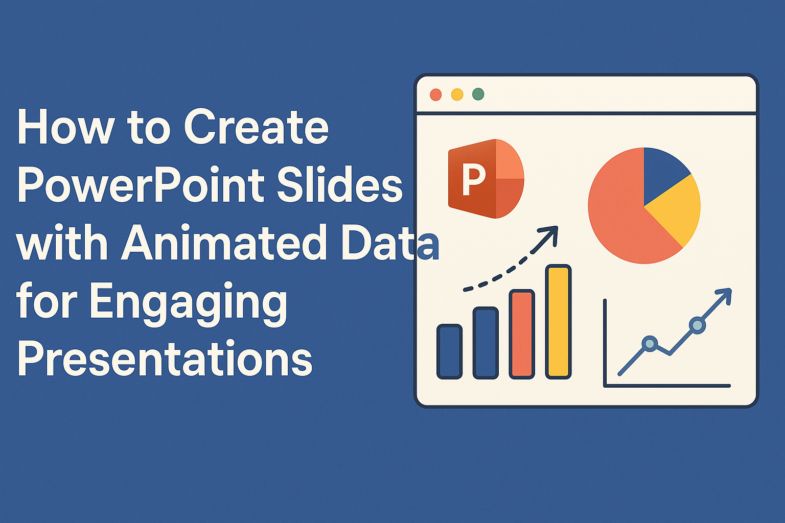
Creating engaging PowerPoint slides with animated data can transform a standard presentation into an exciting experience.
By using smart animations and clear visuals, anyone can effectively highlight key information and keep their audience’s attention. This approach helps make complex data easier to understand and remember.
With several simple techniques, presenters can learn to animate text, charts, and graphs seamlessly.
By strategically adding movement, they can emphasize important points and create a dynamic flow throughout their presentation. Animated slides not only enhance clarity but also make the presentation feel more professional.
Understanding PowerPoint Animation Features
PowerPoint offers various animation features to enhance presentations, making them more engaging. These tools help users animate text, images, and charts effectively while maintaining clarity and focus.
Types of Animations
PowerPoint provides several types of animations, each serving different purposes. The three main categories are Entrance, Emphasis, and Exit animations.
- Entrance animations make an object appear on the slide. Examples include “Fade In” and “Fly In”.
- Emphasis animations highlight an object that is already visible. For example, “Pulse” makes an object appear to throb.
- Exit animations cause an object to leave the slide. Options like “Fade Out” or “Fly Out” can creatively dismiss information.
Each type can add visual interest and keep the audience engaged. Users can choose which animation best suits their message.
Animation Pane Overview
The Animation Pane is a vital tool for managing animations in PowerPoint. It displays a list of all animations applied to slide elements in chronological order.
Users can select individual animations to reveal various options, such as ordering and timing.
- Reorder Animations: Drag animations to change their sequence.
- Adjust Timing: Set how long each animation lasts and when it starts.
- Preview Animations: Quickly view how the slide will look during the presentation.
The Animation Pane simplifies working with complex animations by allowing users to see everything at a glance.
Customizing Animation Effects
Customizing animation effects enhances the overall presentation. After selecting an animation, users can adjust its settings.
- Duration: This controls how fast or slow the animation runs. A longer duration proves smoother, while a shorter one captures attention quickly.
- Delay: Adding a delay can help with timing, making animations appear at the right moment during a presentation.
- Effect Options: Certain animations have specific settings, like direction or style. For example, a “Fly In” animation allows users to choose if it comes from the left, right, top, or bottom.
By customizing these aspects, they can make the presentation more captivating and suitable for the audience’s needs.
Preparing Your Data for Animation
Before adding animations to slides, it’s essential to prepare data effectively. Well-organized data ensures clarity and visual impact. Understanding how to import data and apply best practices in visualization can make a significant difference in engaging the audience.
Importing Data into PowerPoint
To begin, users can easily import data from various sources into PowerPoint. One common method is to copy data from Excel spreadsheets.
After selecting the desired cells in Excel, they can paste them directly into PowerPoint. This method preserves formatting and allows for immediate integration.
PowerPoint also provides a way to create charts from the data. By clicking on the “Insert” tab and selecting “Chart,” users can choose from different types of charts.
This feature enables quick visualization of data, which can then be animated for effect.
Data Visualization Best Practices
For effective data visualization, clarity is key. Users should focus on simplicity by avoiding clutter.
They can choose a consistent color scheme and limit the use of fonts to enhance readability.
In addition, labeling axes and data points clearly helps the audience understand the information.
Using visuals like charts and graphs can show trends or comparisons effectively. Keeping animations subtle ensures the data remains the focus. Consistency in style across slides can further strengthen the presentation’s overall impact.
Creating Animated Charts and Graphs
Animated charts and graphs can make data presentations more engaging. They help convey important information clearly and keep the audience focused.
Animating Bar Charts
To animate a bar chart, first select the chart on your slide. Then, go to the Animations tab.
From there, click on Add Animation and choose an effect such as Appear or Fade.
To make the animation more lively, adjust the Effect Options. This setting lets the user choose the direction from which the bars appear, like flying in from the left or right.
It is common to animate each bar separately by selecting By Category or By Series, allowing the audience to absorb information one bar at a time. This method is great for emphasizing differences between categories clearly.
Animating Line Charts
Animating a line chart is straightforward. Click on the line chart, then go to the Animations tab.
Select Add Animation and choose an entrance effect like Wipe.
For greater impact, modify the Effect Options to control how the line draws itself. It can be set to reveal the line gradually from left to right or trace over specific data points only.
Using Animation Pane, users can control the timing and order of the animations. This enhances the storytelling aspect of the data, guiding viewers through trends and key points.
Using Animation to Highlight Data
Animation can be beneficial for highlighting specific data points. First, select the chart and navigate to the Animations tab.
Choose to add an emphasis effect, like Grow/Shrink or Pulse, to draw attention to particular elements.
For instance, a key data point in a line or bar chart can be animated to stand out. This technique helps maintain focus on critical figures and trends.
Using subtle animations strategically can improve the audience’s ability to grasp complex information quickly. It keeps the presentation dynamic and engaging without overwhelming the viewer.
Incorporating Animated Infographics
Animated infographics can enhance PowerPoint presentations by making complex data easier to understand. They combine visuals with motion to keep the audience engaged and interested.
Designing Infographics with PowerPoint
When designing infographics, start with a clear layout. Use shapes and icons to represent data visually.
PowerPoint offers built-in tools for creating graphics like pie charts, bar charts, and diagrams.
Choosing the right color scheme is essential. Use contrasting colors to highlight important data points. Consistent fonts and sizes will make the presentation look polished.
Incorporate text sparingly. Bullet points and short phrases work better than large blocks of text. This keeps the audience focused on visual elements rather than reading long paragraphs.
Animating Infographics for Impact
Animation can bring infographics to life. Start by selecting an infographic element, such as an icon or chart.
Go to the Animations tab in PowerPoint to choose from various effects.
Using entrance animations can make elements appear as needed. This allows for a dynamic flow of information. For instance, pie slices can animate in as their data is discussed.
Consider the timing of animations. Using timing settings can help coordinate when elements appear. This keeps the audience’s attention on specific points without overwhelming them with too much information at once.
Advanced Animation Techniques
In PowerPoint, advanced animation techniques can bring data and presentations to life. By animating individual data series, creating complex trigger-driven animations, and synchronizing these effects with audio or video, presenters can enhance their storytelling and engage their audience effectively.
Animating Data Series Individually
Animating data series individually allows for clear and focused storytelling. For example, in a bar chart, each bar can be animated to appear one after the other. This helps highlight trends rather than overwhelming the audience with all information at once.
To achieve this, select the chart and open the Animation Pane.
Then, apply an entrance effect to the chart. Next, adjust the animation settings. Use the “By Series” option to control how each data series appears separately.
Complex Animations Using Trigger Effects
Trigger effects can create dynamic presentations by making animations respond to specific actions. A presenter can click on a shape to reveal related data, creating an interactive experience.
To set this up, first apply an animation to an object. Then, access the trigger settings in the Animation Pane.
Select an action, such as clicking a specific shape, to start the animation. This technique keeps the audience engaged and emphasizes key points effectively.
Synchronizing Animations with Audio and Video
Synchronizing animations with audio and video enhances the overall impact of the presentation. This technique ensures that visuals align perfectly with spoken content or background music.
To do this in PowerPoint, choose the audio or video clip first. Then, go to the Animation Pane and set the timing for each animation to match the audio cues.
Adjust the start options, such as “With Previous” or “After Previous,” to create a seamless flow. This coordination captivates the audience, allowing them to absorb the message more easily.
Interactive Data Presentation
Creating an engaging and interactive presentation can significantly enhance how data is viewed and understood. This section explores ways to use interactive graphs, hyperlinks, and multimedia elements in PowerPoint. These tools help capture the audience’s attention and make complex information easy to digest.
Creating Interactive Graphs
Interactive graphs allow viewers to engage directly with data. They can explore different aspects by interacting with charts or tables.
PowerPoint offers options like embedded Excel charts, which can be updated in real-time.
With features such as tooltips, users can hover over data points to see more details. This creates a “hands-on” experience that encourages participation.
To add interactive graphs, simply insert a chart and then use the formatting options to customize it.
Using animations can also bring graphs to life. She can set up the chart to reveal data points one at a time, making it easier for the audience to follow along.
Using Hyperlinks in Animated Presentations
Hyperlinks can make presentations more dynamic. They link to additional information, other slides, or external resources. This allows users to choose their path through the content.
In PowerPoint, hyperlinks can be added to shapes, images, or text.
For example, when she wants to explain a complex topic, she can link to a detailed slide with more information. This keeps the main presentation clutter-free while offering in-depth insights.
To add a hyperlink, simply right-click on an element and select “Hyperlink.” This tool empowers the presenter to craft a tailored experience based on audience interest.
Integrating Multimedia Elements
Multimedia adds richness to presentations. Incorporating videos, audio clips, or animations can enhance understanding and retention.
For example, a short video explaining a data trend can capture attention better than text alone.
PowerPoint allows seamless integration of multimedia files.
By including relevant audio clips, she can provide commentary that highlights key data findings. Additionally, animations can demonstrate changes over time, making statistics more relatable.
Careful selection of multimedia elements helps ensure they complement the data. Keeping them relevant keeps the audience focused and engaged throughout the presentation.
Tips for Effective Slide Design
Effective slide design plays a crucial role in making information engaging and clear. By focusing on color schemes, text imagery balance, and readability, presenters can create slides that capture attention and communicate ideas effectively.
Choosing the Right Color Scheme
Selecting the right color scheme can greatly impact how an audience perceives a presentation. It is helpful to choose colors that not only match the theme but are also pleasing to the eye.
A common practice is to use a complementary color palette.
This includes two colors that enhance each other, such as blue and orange.
Additionally, using neutral backgrounds with vibrant text can make key points stand out.
Avoid using too many bright colors, as this can be distracting. Keeping it simple with two to three main colors will maintain a professional look while ensuring the content is visible.
Balancing Text and Imagery
Balancing text and imagery is essential for engaging slides. Too much text can overwhelm viewers and make slides hard to read.
A good rule of thumb is to use the “6 by 6” rule, which suggests six bullet points per slide with no more than six words per point.
Incorporating relevant images can help enhance understanding.
Images should support the text and not replace it.
For instance, using a graph to show data trends is better than just explaining the trends in text.
Using high-quality visuals also adds professionalism to the presentation.
Ensuring Readability
Readability is key for effective communication in any presentation. Choosing fonts that are clear and easy to read is important. Sans-serif fonts like Arial or Helvetica are often recommended for their legibility.
Moreover, the font size should be large enough to be read from a distance, typically 24 points or larger for body text.
Using high contrast between text and background colors also improves visibility.
Keeping text aligned and spaced properly also makes it easier to follow.
Limit the use of all caps, as it can be harder to read.
By focusing on these aspects, slides can convey messages more effectively.
Practicing Your Presentation
Practicing a presentation is crucial for delivering an effective PowerPoint show. Attention to details, like animations and timing, enhances the overall impact. Here are some essential steps to ensure a smooth performance.
Previewing Animations
Before presenting, it’s important to preview animations. This allows the presenter to see how each animation flows. Transitions can make a big difference in keeping the audience engaged.
To preview animations, go to the “Slide Show” tab and click on “From Current Slide.” This feature shows how slides transition and highlights animations.
Adjust timing if something feels off.
It’s also helpful to check for any errors in animations. If an item appears too late or too early, adjust it in the Animation pane.
This step ensures a cohesive look, keeping the audience focused.
Timing Your Slides
Timing is a key factor in a successful presentation. Each slide should be displayed long enough for the audience to absorb the information. On average, 20-30 seconds per slide is a good rule of thumb.
To practice timing, use the “Rehearse Timings” feature. This function records how long each slide remains on the screen.
After rehearsal, the software can automatically adjust durations.
Presenters should note areas where they rush or linger. Adjustments can help maintain audience interest.
Balanced timing creates a smooth flow that enhances comprehension.
Rehearsing with Speaker Notes
Using speaker notes effectively is vital for a confident presentation. Notes serve as a guide for what to say and when. This strategy helps the presenter stay on track without memorizing every line.
To prepare, presenters should write concise bullet points for each slide. Bullet points should highlight key messages.
Avoid lengthy paragraphs; they can be hard to follow during a presentation.
During practice, speakers can read their notes aloud. This method helps them get comfortable with the material.
Rehearsing with notes also allows for adjustments, ensuring the speech aligns with the slideshow.
PowerPoint Design Resources
Accessing the right design resources can significantly enhance the quality of PowerPoint presentations. Great templates and engaging communities can provide the support and inspiration needed to create stunning slides.
Recommended Templates and Themes
Using high-quality templates can save time and improve presentation visuals. Many platforms offer customizable PowerPoint templates that cater to various themes and styles.
- SlideModel provides a vast collection of professional templates, including animated options.
- Envato Elements features themes that allow complete customization.
- GraphicRiver offers unique single templates for specific needs.
These resources can make presentations more engaging and visually appealing. Choosing the right template sets the tone and enhances the message.
Online Communities and Forums
Joining online communities and forums focused on PowerPoint can be beneficial. These spaces allow users to share tips, ask questions, and gain new insights.
- Reddit’s PowerPoint subreddit is active, where members share ideas and solutions.
- Microsoft’s PowerPoint Community offers official support and expert advice.
Participating in these communities can lead to discovering useful techniques and trends in presentation design. It connects users with others facing similar challenges.