Creating a visually appealing user interface can be straightforward and fun.
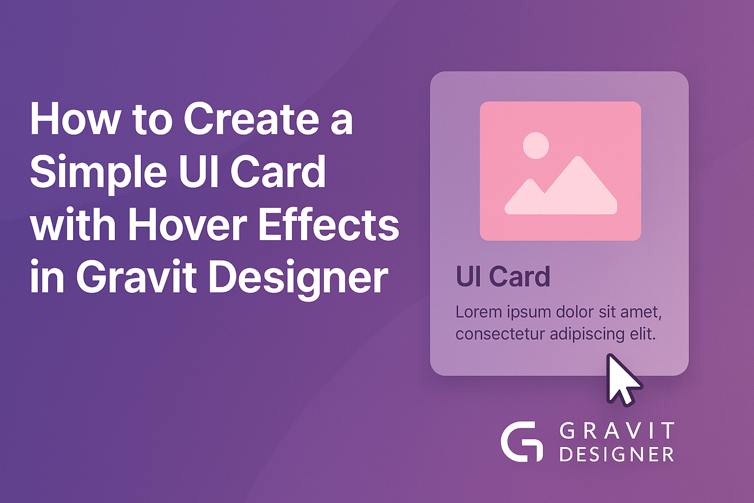
By using Gravit Designer, anyone can design a simple UI card that stands out with hover effects. This process helps bring interactivity to the design, making it more engaging for users.
In this article, readers will learn step-by-step how to make a UI card in Gravit Designer. The focus will be on adding hover effects that enhance the card’s appearance when users mouse over it. This approach not only improves aesthetics but also boosts user experience, making the card more dynamic.
With easy-to-follow tips and techniques, anyone can create a professional-looking UI card. Whether for a website or an app, these skills will be valuable in developing interfaces that capture attention.
Let’s dive into the exciting world of design and get started!
Getting Started with Gravit Designer
Gravit Designer is a powerful tool for creating designs with ease. This section explores its main features and how to kickstart your projects effectively.
Overview of Gravit Designer
Gravit Designer is a vector design application that allows users to create graphics for web and print.
It offers various features, including shape tools, text tools, and an easy-to-use interface.
Users can create everything from logos to full UI kits. The application is cloud-based, which means designs can be accessed from any device. This flexibility makes it ideal for collaborative work and design revisions.
Setting Up Your Project
To set up a new project in Gravit Designer, users should first create an account and log in.
Once in, they can start a new design by selecting File > New Design.
Next, users can choose a canvas size based on their project needs. Common sizes include dimensions for web or mobile interfaces.
Following this, they can name their project for easy access later. It’s helpful to keep the design organized, especially for larger projects.
After setting up, the workspace displays tools on the left, options on the top, and layers on the right. Familiarizing oneself with these areas is crucial for effective use of the application.
Designing the UI Card
Creating an effective UI card begins with the right dimensions and the choice of text and images. These elements work together to make a card visually appealing and functional.
Choosing the Right Dimensions
When designing a UI card, size matters.
Start by selecting dimensions that fit well within your layout. A common size is 300×400 pixels, but this can vary.
Consider the context where the card will be used. For example, a social media app may require smaller cards, while an e-commerce site might need larger ones.
Maintain a good balance of space. Ensure there is enough padding around the edges to prevent the content from feeling cramped. Consistent margins help create a clean look.
Adding Text and Images
Text and images are key components of a UI card.
Use clear, readable fonts for titles and descriptions. It’s essential to choose font sizes that are easy to read, typically between 14 and 18 points for body text.
Images should be relevant and high-quality. They are often the first thing users notice.
Use a single large image or a combination of smaller images to create visual interest.
Remember to maintain balance. Too much text or too many images can overwhelm users. Aim for a harmonious layout where each element complements the other.
Creating Hover Effects
Hover effects add interactivity and visual interest to UI cards. By applying basic interactivity and animating elements, designers can enhance user engagement and provide feedback when users interact with the card.
Applying Basic Interactivity
To start, a designer can create basic hover effects using Gravit Designer’s built-in features.
They should select the card element and then go to the Interaction panel.
Here, the designer can choose to change the fill color, border, or shadow when a user hovers over the card.
For example, changing the background color to a lighter shade can create a welcoming effect.
Designers can use the Opacity settings to make the card slightly transparent upon hover, giving it a modern feel.
Another approach is to add a subtle transformation. Designers can increase the scale of the card slightly, making it appear as though it’s lifting off the screen. This adds dimension without overwhelming the user.
Animating UI Elements
Adding animations can elevate the user experience even further.
In Gravit Designer, animations can be implemented through the Animation tab.
Designers should select the card and apply a simple fade or slide effect.
For instance, setting a smooth transition for a background color change creates a visually pleasing experience.
Designers can choose an easing function for the animation, such as ease-in-out, which makes the action feel natural.
Creating a seamless animation flow can involve timing as well.
Designers should adjust the duration of the animation, typically around 0.3 seconds for subtle effects.
Combining these techniques allows for a lively interaction when users hover, making the card more engaging and intuitive.
Tips and Tricks
Creating a beautiful UI card with hover effects in Gravit Designer can be made easier with a few smart strategies.
By focusing on efficient workflows and learning useful shortcuts, designers can enhance their skills and speed up their process.
Efficient Design Workflow
An efficient workflow is key for any designer.
Starting with a clear layout helps establish the card’s structure. He or she should sketch ideas on paper or use wireframes to visualize the design.
Using Gravit Designer’s layers wisely allows for better organization. Group similar elements to keep the workspace tidy. This makes it easier to edit items later on.
Regularly saving work is crucial. Designers can avoid losing progress by using the “Save” function frequently.
Setting up a naming convention for files can also help when revisiting projects.
Additionally, testing the design often can reveal how hover effects respond. It’s better to tweak the design early than later in the process.
Utilizing Gravit Designer Shortcuts
Gravit Designer offers numerous shortcuts that can significantly speed up the design process.
Learning these shortcuts can save time and reduce frustration. For instance, using “Ctrl + D” duplicates selected elements quickly.
Navigating the interface with keyboard shortcuts helps maintain focus.
For example, pressing “Tab” hides or shows panels, allowing designers to see the canvas clearly.
Customization of shortcuts is also possible. This way, each designer can personalize their experience based on their workflow.
Finally, utilizing grid and alignment tools ensures that designs are neat.
Using shortcuts to align objects and distribute spacing creates a professional appearance effortlessly.