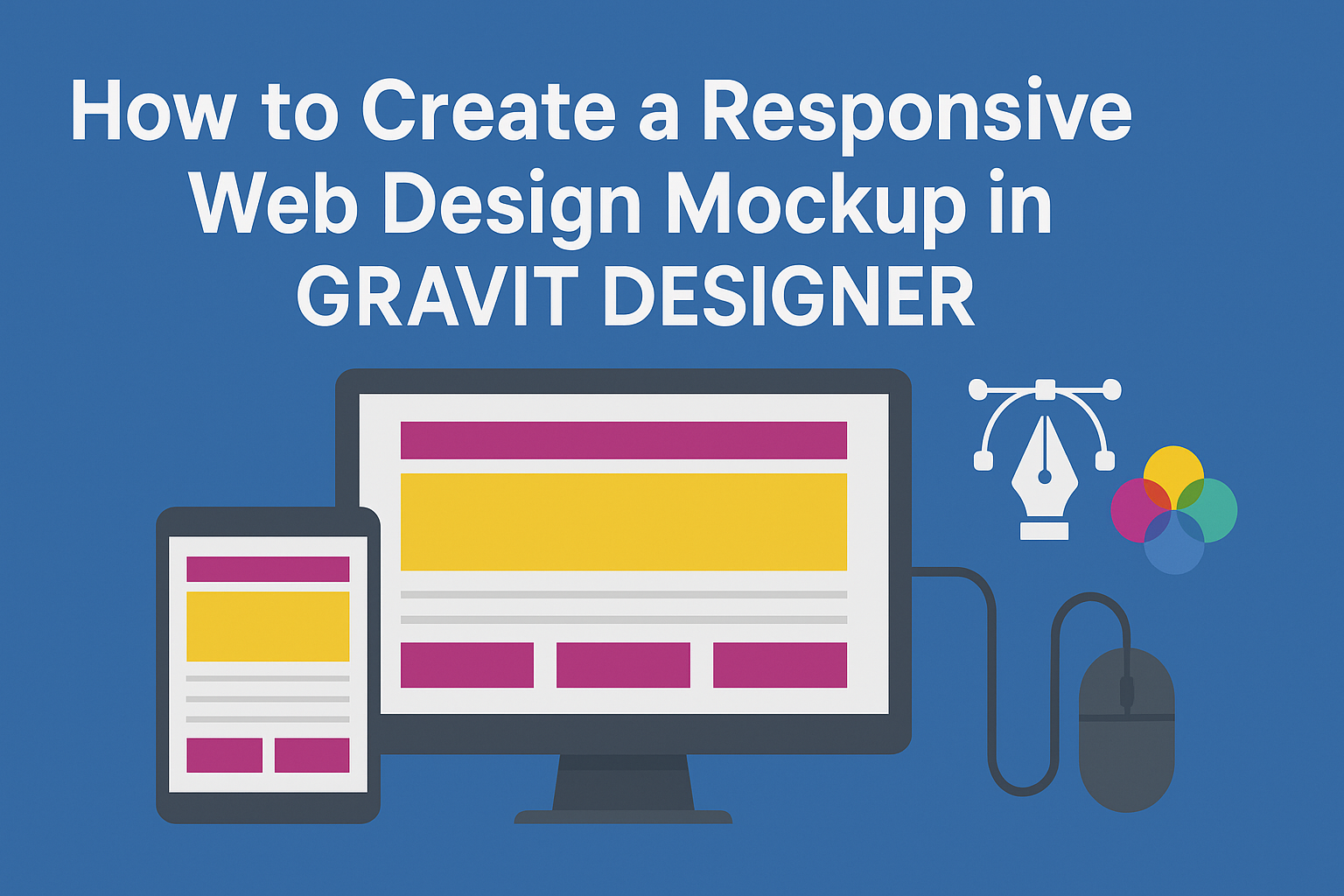
Creating a responsive web design mockup is essential for designers today.
Using Gravit Designer allows them to easily visualize how their designs will adapt across different devices and screen sizes. This tool offers a user-friendly interface that helps streamline the design process.
In this blog post, readers will learn practical steps to develop a stunning mockup that looks great on any screen.
From setting up the grid system to using layers effectively, each step will guide designers through the essential elements of responsive design.
By the end, they will be equipped with the skills to create designs that impress clients and users alike.
Whether someone is new to design or looking to refine their skills, this article is packed with tips and insights.
It will inspire confidence and creativity in the design journey, making it easier to bring ideas to life.
Getting Started with Gravit Designer
Gravit Designer is a powerful tool for creating web design mockups. It’s user-friendly and features a clean interface that makes it easy to dive into design projects. Understanding how to navigate this software is essential for starting any design.
Overview of Gravit Designer Interface
The Gravit Designer interface is designed to be intuitive. Upon opening the app, users see the canvas in the center, where designs come to life.
On the left side, there’s a toolbar containing various tools such as the select tool, shape tools, and text tools.
The right side houses the properties panel, where users can adjust colors, sizes, and other settings.
At the top, the menu bar offers access to file options, export settings, and help resources. Gravit Designer also allows for layer management and alignment features, making it easier to organize designs.
Setting Up Your Gravit Designer Account
Creating an account on Gravit Designer is the first step to accessing all its features. Users can visit the Gravit Designer website to sign up.
The registration process is straightforward. Users need to provide a valid email and create a password.
Once signed up, they can choose between free and paid plans, depending on their design needs.
After setting up an account, users can access cloud storage, which saves designs automatically. This feature is useful for working on projects from different devices.
Users can also explore community resources and tutorials, enhancing their design skills effectively.
Designing for Responsiveness
Creating a responsive web design mockup is essential for ensuring that websites look great on all devices. The following key points will help in understanding the fundamentals of responsive design, using tools effectively, and distinguishing between different design approaches.
Understanding Responsive Web Design
Responsive web design allows a website to adjust its layout and elements based on the screen size. This ensures that users have a great experience, whether they are using a desktop, tablet, or mobile device.
Key principles include using flexible grids and layouts, scalable images, and CSS media queries. These tools help ensure that elements resize appropriately.
For instance, a navigation menu may change from a horizontal layout on a desktop to a hamburger menu on smaller screens.
Responsive design improves accessibility and user satisfaction. If a website adapts well, visitors are more likely to stay and explore.
Using Gravit Designer’s Layout Grid
Gravit Designer offers a Layout Grid feature that helps in creating responsive mockups. This tool provides a solid foundation for designing flexible layouts.
To utilize the grid, start by enabling the layout under the “View” menu.
Designers can set up columns and gutters, which allow for a more organized and scalable design. This is particularly useful when creating more complex layouts that require precise alignment.
Using the Layout Grid makes it easier to visualize how elements will adjust on different screens. Designers can tweak their designs in real-time, making adjustments without needing to switch tools.
Adaptive vs. Responsive Design
Adaptive and responsive design are two approaches to web design. They each have their strengths and weaknesses.
Responsive design uses a fluid layout. This means that elements resize based on the screen dimensions. It’s flexible and works well on various devices.
Adaptive design, on the other hand, uses fixed layouts for specific screen sizes. This approach allows for tailored experiences but can lead to more work, as multiple designs need to be created.
Choosing between these methods depends on project needs. Responsive design is often favored for its versatility, while adaptive design may be better for specific applications or audiences.
Creating Your Mockup
Creating a web design mockup requires careful planning and execution. The process involves defining the layout, adding elements, and applying responsive design techniques to ensure the mockup looks great on any device.
Defining Your Layout Structure
To start, the designer should outline the basic structure of the layout. This includes deciding how many columns will be used and where key elements will be placed.
Using a grid system can help create a balanced design. A common approach is to use a 12-column grid, allowing for flexible layouts.
The designer can sketch a rough draft on paper or directly in Gravit Designer. He or she should focus on positioning headers, footers, and sidebars. This plan sets the stage for a clean and organized mockup.
Adding Elements to Your Mockup
Once the layout is defined, it’s time to add elements such as buttons, images, and text. Each element should serve a purpose and align with the overall design concept.
Gravit Designer has a variety of tools for inserting shapes and text. The designer should use high-quality images that represent the final product well.
It’s helpful to create a style guide that defines font sizes, colors, and spacing. Consistency in element design helps the mockup appear more professional.
Applying Responsive Constraints
After adding elements, the designer needs to apply responsive constraints. This means ensuring that the mockup adjusts smoothly when viewed on different screen sizes.
Gravit Designer allows for setting constraints on each element. This ensures they resize or reposition correctly.
For example, a button might stay aligned to the right margin as the screen shrinks. Testing the mockup on various devices helps identify any issues and refine the design.
Previewing and Testing
Testing the responsiveness of a design is crucial. It helps ensure that the website looks and works well on various devices. Here, the focus will be on how to preview designs on multiple devices and the best ways to export for sharing.
Previewing Designs on Different Devices
To see how a mockup appears on different devices, Gravit Designer offers an easy way to preview designs. Users can utilize the built-in preview feature, allowing them to view how the layout adapts to different screen sizes.
Using this feature, designers can check for issues like misaligned elements or font sizes that are too small.
They can select device presets, such as smartphones, tablets, and desktops, to get an accurate representation.
Additionally, it’s important to test the design on actual devices if possible. This can reveal practical issues that might not be evident on the computer screen.
Export Options for Sharing and Feedback
Gravit Designer makes it simple to share mockups with others for feedback.
Designers can export their work in various formats, such as PNG, JPG, or PDF. This flexibility allows for easy sharing via email or direct uploads.
Feedback is crucial to improving design quality.
By sharing a link to the mockup or exporting it, designers can gather input from clients or team members.
Also, interactive prototypes can provide a realistic feel of how users will interact with the final design.
Users should consider including annotations or comments when sharing mockups.
This practice helps clarify design choices and gather more targeted feedback.