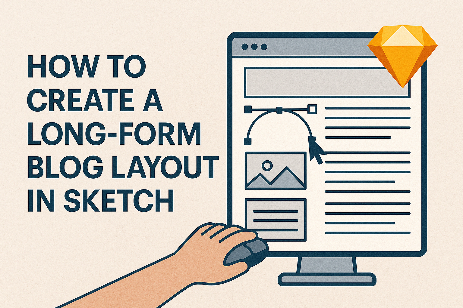
Creating a long-form blog layout in Sketch can be a rewarding experience for any designer. It allows them to produce visually appealing content that keeps readers engaged and makes complex information easy to digest.
With the right tools and guidance, anyone can master this layout style and elevate their blog’s design.
Sketch offers a variety of features that simplify the design process, making it accessible for both beginners and experienced users.
By utilizing grids, typography, and layout settings effectively, designers will find that crafting a professional-looking blog becomes straightforward and fun.
In this article, readers will discover practical steps to design a long-form blog layout that stands out. They will learn how to harness the power of Sketch tools to create an inviting reading experience that captivates their audience from start to finish.
Setting Up Your Workspace in Sketch
Creating an effective workspace is key to maximizing creativity and efficiency. Here are essential steps that help establish a solid foundation in Sketch.
Downloading and Installing Sketch
To start, download Sketch from the official website. It’s available for Mac users, so he or she should check system requirements before proceeding.
After downloading, simply drag the Sketch app into the Applications folder.
Once installed, open Sketch and sign up for a Sketch account if one doesn’t exist. This will help in saving projects and collaborating online.
Users can explore a 30-day trial period to test features without any obligations.
Familiarizing Yourself with the Interface
When he or she launches Sketch, the interface will feel intuitive. The main areas include the toolbar, Inspector, and document canvas.
The toolbar at the top provides essential tools like shapes, text, and artboard options.
To the right, the Inspector panel shows properties and settings for selected items. Each area helps streamline the design process.
He or she can click around and try different tools to understand their functions better.
Sketch also offers quick access to help resources. Users can explore these guides to navigate features more efficiently.
Customizing the Canvas Settings
Customizing the canvas is vital for a long-form blog layout. He or she can set specific dimensions for the artboard based on the design requirements.
To create an artboard, select the Artboard tool from the toolbar.
Next, choose a preset size or enter custom dimensions in the Inspector panel.
Setting up grid layouts is also helpful. Access the layout settings from the top menu and adjust options like grid size and color.
These adjustments will guide spacing and alignment, making it easier to design a clean and organized blog layout. Taking the time to customize the canvas will save time in the long run.
Designing the Blog Structure
Creating a solid structure is vital for a long-form blog layout. It sets the foundation for readability and visual appeal. This section covers key elements that impact the design, including grid systems, typography, color schemes, and visual hierarchy.
Creating a Grid System
A grid system helps organize content neatly. It allows designers to align text, images, and other elements consistently across the page.
A common choice is a 12-column grid, which offers flexibility for various layouts.
Using a grid encourages balance and spacing. It aids in creating margins and padding, making content easy to digest.
Designers should consider breakpoints for responsiveness, ensuring the blog looks good on all devices.
Here’s a simple table showing common grid layouts:
| Columns | Purpose |
|---|---|
| 1 | Full-width content |
| 2 | Side-by-side elements |
| 3 | Multi-column layouts |
A well-defined grid can enhance user experience, guiding readers through the text seamlessly.
Defining Typography and Color Schemes
Typography and color play a major role in how readers perceive information. Selecting readable fonts is essential.
It’s often best to choose no more than two or three complementary typefaces.
For body text, a sans-serif font like Arial or Helvetica is a safe choice. Headings can be styled with a bolder and more decorative font to create contrast.
Size matters too; typical body text should be around 16px for comfort.
Color schemes should also match the blog’s theme. Choosing a primary color and a few accent shades creates harmony.
Utilizing tools like Adobe Color can help designers visualize color combinations.
Establishing a Visual Hierarchy
Visual hierarchy guides readers through the content, highlighting what’s important. Designers can create emphasis using size, color, and positioning.
Large headings stand out, drawing attention. Subheadings that are slightly smaller help organize sections clearly.
Bullet points and lists can break down information efficiently, making it scannable.
Using images strategically can also enhance hierarchy. They can add interest and lead readers to important text.
By focusing on these elements, designers can create a compelling structure that enhances the overall blog experience.
Adding Content and Multimedia Elements
Creating engaging blog posts requires a mix of text, images, and other media. Effectively combining these elements enhances the reader’s experience and keeps them engaged.
Inserting Text and Headings
When adding text to the blog layout, clarity is vital. Start with a catchy headline that grabs attention.
Using H1, H2, and H3 tags helps structure the content, making it easy for readers to follow.
For body text, choose a legible font and maintain a size of at least 16 pixels. This ensures comfortable reading, especially on mobile devices.
Break text into short paragraphs, each with a compelling point. This keeps the audience’s attention and improves readability.
Bullet points can highlight key details, making the content scannable. Additionally, incorporating relevant links enriches the text and provides extra resources for interested readers.
Embedding Images and Videos
Images and videos can significantly enhance a blog post. They help illustrate points and create visual interest.
Ensure images are high-quality and relevant to the content. He or she should always include alt text for accessibility and search engine optimization.
To embed videos, use platforms like YouTube or Vimeo.
It’s best to place videos strategically within the text to maintain flow. A well-placed video helps explain complex ideas and keeps readers engaged longer.
Remember to optimize media files to reduce loading times. Fast-loading pages improve user experience and keep readers from leaving in frustration.
Using Icons and Vector Graphics
Icons and vector graphics are excellent for adding visual flair without cluttering the layout. They can represent ideas quickly and efficiently.
Use them to support text, like highlighting features or benefits in a list.
Keep a cohesive style across all graphics. This helps maintain brand identity and professionalism.
Tools like Sketch make it easy to customize or create icons that match the blog’s theme.
Incorporating icons helps break up text-heavy sections. This leads to a more balanced design that directs the reader’s focus.
Such elements enhance the overall look and feel of the blog while making it more engaging.