Creating a custom color picker in Gravit Designer can greatly enhance any design project.
With just a few simple steps, users can easily build a color palette that reflects their unique style and needs. This tool not only streamlines the design process but also allows for greater creativity and customization.
Many designers enjoy the freedom of personalizing their tools to achieve the best results.
By setting up a custom color picker, individuals can save time and ensure consistency across their work. Whether working on graphics for a business or a personal project, this skill can significantly improve efficiency.
In this blog post, readers will discover the straightforward process to create their own color picker in Gravit Designer. From selecting base colors to saving palettes, each step is designed to help them make the most of this powerful design tool.
Getting Started with Gravit Designer
Gravit Designer is a powerful tool for creating vector graphics and custom designs.
To begin, it’s important to understand the interface and how to set up the workspace effectively.
Overview of Gravit Designer Interface
The Gravit Designer interface is designed to be user-friendly. It features a clean layout with essential tools easily accessible.
On the left side, there’s a toolbar with tools for selection, shapes, text, and more. The right side has panels for properties, layers, and styles. Users can quickly navigate through different options.
At the top, there’s a menu bar with file options, edit commands, and view settings. This set-up allows for efficient design work.
The central canvas is where all the magic happens, as users can visualize their creations in real time.
Setting Up Your Workspace
Setting up the workspace in Gravit Designer is an essential first step. Users can customize their environment according to their project needs.
To start, adjust the size of the canvas by using the options in the menu bar. Users can select from standard dimensions or create a custom size.
Next, arrange the panels. Drag them around to prioritize the tools and properties that matter most for the current task.
Users can also create color palettes for easy access, ensuring a smooth design process.
Utilizing keyboard shortcuts can speed up workflow.
Gravit Designer allows for many shortcuts that make common actions quicker and more intuitive. By tailoring the workspace, users will find it easier to focus on their design goals.
Understanding Color Theory
Color theory is essential for creating appealing designs. It covers primary colors, complementary colors, and harmony. Knowing how colors work together helps in making effective design choices.
Primary Colors and Complementary Colors
Primary colors are the foundation of all other colors. They include red, blue, and yellow. These colors cannot be made by mixing other colors.
Complementary colors are located directly opposite each other on the color wheel. For instance, red and green are complementary, as well as blue and orange. These pairs create a strong contrast, adding vibrancy to designs.
When combined, they can make each color seem more intense. Using these principles can enhance visual interest in any project.
Color Harmony Basics
Color harmony involves selecting colors that look good together. It creates a sense of balance and unity in designs. There are several methods to achieve color harmony.
One common method is using analogous colors. This includes colors that are next to each other on the color wheel, like blue, blue-green, and green. This combination produces a calming effect.
Another approach is the triadic scheme, which involves three colors evenly spaced on the wheel, like red, yellow, and blue. This creates a vibrant and dynamic look. Understanding these concepts enables better design choices and more impactful artwork.
Designing Your Custom Color Picker
Creating a custom color picker involves thoughtful design to make it user-friendly and effective. Key elements include defining functionality, establishing a selection area, and incorporating sliders for precise adjustments.
Defining Color Picker Functionality
First, it is essential to outline how the color picker will operate. Users should be able to select colors with ease. Think about features such as color history, where past selections are saved, or a reset option for convenience.
Key Features to Consider:
- Color History: Allows users to revisit chosen colors quickly.
- Reset Button: Clears selections to start fresh.
- Input Fields: Let users enter exact color codes for accuracy.
These elements enhance the user experience by providing flexibility in color selection.
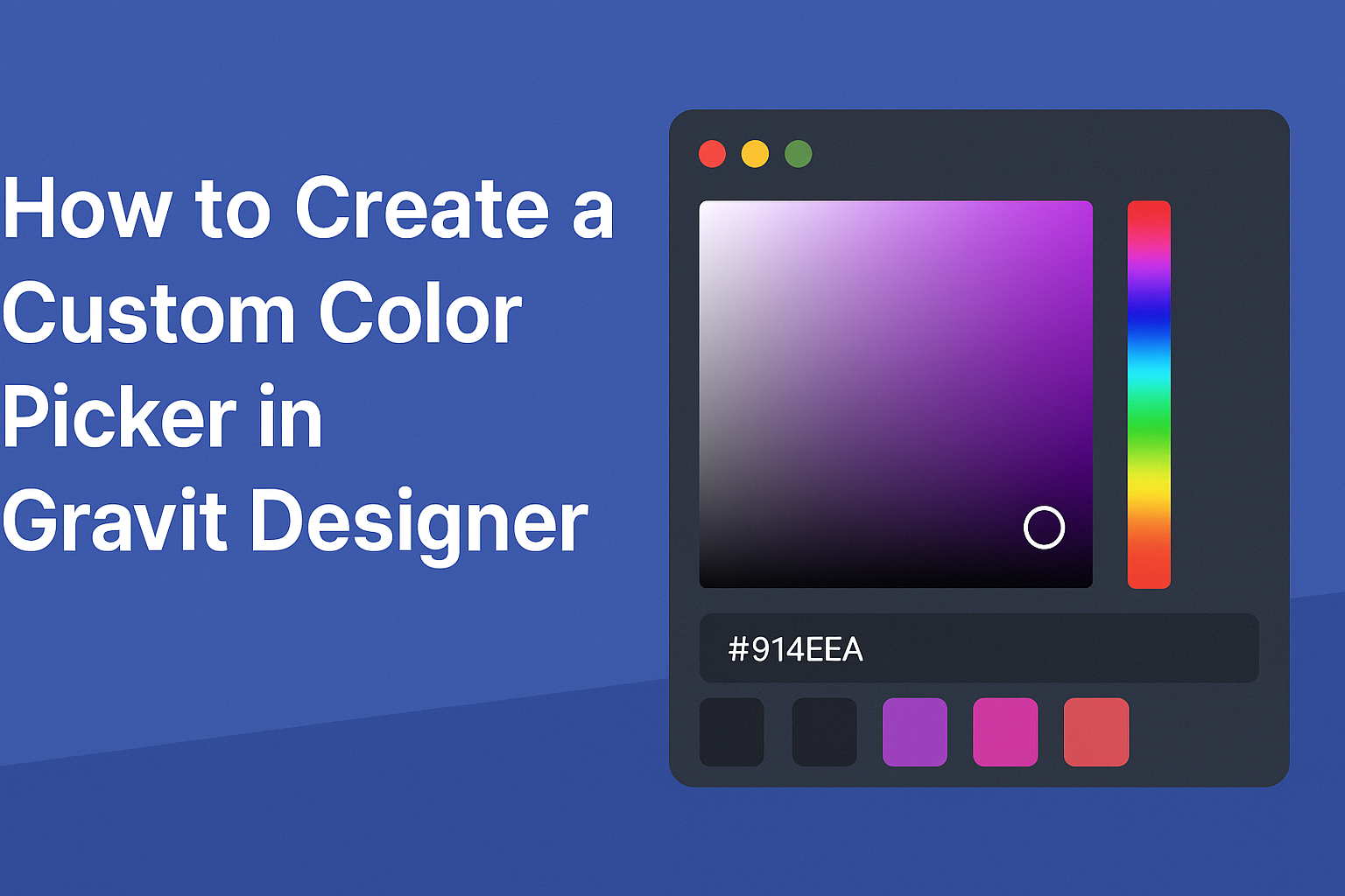
Creating the Color Selection Area
Next, the color selection area serves as the heart of the color picker. He can utilize a color wheel or a gradient slider.
To create a color wheel, use a circular layout that displays a full spectrum of colors. This allows users to visually pick a color and see the result in real time.
Layout Tips:
- Circular Color Wheel: For broad color selection.
- Gradient Slider: For fine-tuning specific shades.
- Preview Box: Displays the selected color instantly, helping users confirm their choice.
This design approach ensures that users can navigate through colors quickly and efficiently.
Adding Sliders for Fine-Tuning
Incorporating sliders is crucial for users wanting more control over their color choices. Sliders can adjust properties like hue, saturation, and brightness.
Slider Specifications:
- Hue Slider: Adjusts the color spectrum.
- Saturation Slider: Changes the vividness of the selected color.
- Brightness Slider: Modifies the lightness or darkness.
Each slider should be clearly labeled and responsive in real time. This allows for immediate visual feedback, enhancing the overall user interaction.
By focusing on these design elements, the color picker transforms into a practical and enjoyable tool for users.
Using the Custom Color Picker in Design Elements
After integration, the next step is to utilize the custom color picker in various design elements. This feature is essential for maintaining color consistency across a project.
Application Tips:
- Apply Colors: Click on the elements such as shapes or text to assign colors from the picker.
- Save Frequently Used Colors: Save preferred colors for quick access later. This is especially useful for branding projects.
- Experiment with Color Combinations: Use the color picker to mix and match colors, enhancing the overall design appeal.
Utilizing the color picker effectively can streamline the design process and improve productivity.