Creating a mobile app UI mockup can seem daunting, but it doesn’t have to be. With Vectr, anyone can easily design a user interface that looks professional and is functional.
By following a few simple steps and using the right tools, users can develop a clear vision of their app’s layout without a steep learning curve.
Vectr offers a user-friendly platform that is perfect for beginners and experienced designers alike. It allows users to create intuitive designs quickly, helping them visualize how their app will look and function. This means that with just a little bit of guidance, anyone can bring their mobile app ideas to life.
This article will guide readers through the process of building a simple mobile app UI mockup in Vectr. From basic design principles to utilizing the platform’s features, it provides valuable insights to help create an effective mockup. Get ready to dive into the world of design and unlock the potential of your ideas!
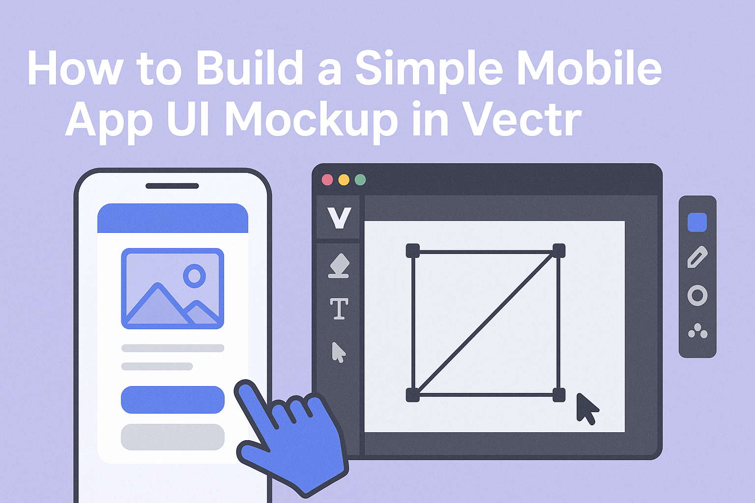
Getting Started with Vectr
Vectr is a user-friendly tool that allows users to create stunning mockups easily. Understanding the interface and setting up your canvas properly are the first steps to a smooth design process.
Understanding the Vectr Interface
When someone first opens Vectr, they encounter a clean and intuitive interface. The dashboard features a menu bar, side bar, and workspace.
The menu bar at the top includes options for creating new files, saving, and exporting designs.
The side bar contains key tools for designing, such as shapes, text, and layers. Each tool is easily accessible and simple to use. Familiarizing oneself with these tools will help in quickly building mockups.
Navigating between the menu and side bar is seamless. This allows for quick adjustments and enables users to focus more on creativity and less on finding options.
Setting Up Your Canvas
To get started, the first step is to create a new file. This can be done by clicking on Create File in the top left corner of the menu bar. Once clicked, the user will be directed into the workspace, ready for design.
Next, setting the canvas size is crucial. Vectr allows users to define custom dimensions to suit the project needs.
It’s best to consider the device specifications for which the app is being designed. This ensures that the mockup will display correctly on the intended device.
After setting the size, users can easily move and resize their canvas later if needed. This flexibility makes it comfortable for designers to adjust as they develop their ideas.
Designing the Basic Structure
Creating a mobile app UI mockup starts with a solid foundational design. This includes defining key vector shapes and incorporating text elements effectively.
Creating Vector Shapes
To create the basic layout in Vectr, start with vector shapes. These shapes form the critical components of the UI.
-
Use Rectangles and Circles: Use rectangles for buttons and navigation bars. Circles can be useful for circular buttons or icons.
-
Alignment and Spacing: Pay attention to alignment and spacing. Keeping elements evenly spaced helps maintain a clean look.
-
Layering: Utilize layering to overlap shapes. This can create depth and an organized structure.
-
Color and Fill Options: Choose appropriate colors that fit the app’s theme. Utilize fill options to add texture or patterns to shapes.
Adding Text and Typography
Text plays a key role in guiding users through the app. Proper typography enhances readability and sets the tone.
-
Select the Right Font: Start with a font that matches the app’s style. Simple, sans-serif fonts work well for mobile interfaces.
-
Font Size and Weight: Use larger font sizes for headings and smaller for body text. Bold text can highlight important information.
-
Consistency: Ensure consistent use of fonts throughout the mockup. This reinforces branding and helps with navigation.
-
Text Alignment: Choose left or center alignment based on the design flow. Keep text aligned with other elements for better coherence.
Enhancing Your UI Mockup
When building a mobile app UI mockup, the right aesthetic elements can make a significant difference. Key areas to focus on include color schemes, gradients and textures, as well as effects and filters that add depth to the design.
Incorporating Color Schemes
Choosing the right color scheme is essential for an appealing UI. Colors influence emotions and can guide user actions.
- Define the Mood: Decide what feelings the app should evoke. For example, blue often communicates trust, while red can invoke excitement.
- Use Color Palettes: Tools like Adobe Color or Coolors can help in selecting complementary colors.
- Contrast is Key: Ensure text stands out against the background. High contrast enhances readability and guides navigation.
Utilizing Gradients and Textures
Gradients and textures can bring life to the UI mockup. They add visual interest without overwhelming the user.
- Subtle Gradients: A smooth gradient can provide depth. For instance, a light blue fading into a darker shade can create an inviting feel.
- Textures for Depth: Incorporating a slight texture gives a familiar touch. For example, a soft paper-like texture can contribute to a cozy aesthetic.
- Balance is Important: Avoid using too many textures or busy patterns that can distract from core functionalities.
Applying Effects and Filters
Effects and filters serve to enhance specific features in the design. They can help in guiding users’ focus and elevating visual appeal.
- Shadow Effects: Adding shadows under buttons can create a sense of depth. This simple effect makes the buttons appear clickable.
- Image Filters: Using a consistent filter on images can unify the look. For example, a warm filter can give a friendly vibe to photos.
- Animation Effects: Subtle animations can improve interaction. For instance, having a button slightly enlarge when pressed engages users.
Exporting and Sharing
Exporting and sharing a mobile app UI mockup is essential for collaboration and presentation. Understanding the steps involved can help users effectively communicate their design ideas.
Exporting Files for Different Platforms
When users are ready to export their mockups, it’s important to choose the right file format. Vectr offers several formats like PNG, JPG, and SVG.
- PNG is great for clear, high-resolution images.
- JPG works well for smaller file sizes but with some loss in image quality.
- SVG is ideal for scalable graphics, especially for websites and apps.
To export, users can click the “Export” button in Vectr, choose the desired format, and adjust settings like resolution. This flexibility ensures that designs look their best across different devices and platforms.
Sharing Your Mockup with Collaborators
Sharing the mockup allows for valuable feedback and collaboration.
Vectr makes this easy through its sharing features.
Users can click the “Share” button to generate a public link.
This link can be sent to friends, colleagues, or clients, allowing them to view the design without needing an account.
Moreover, for direct collaboration, users can invite others by entering their email addresses.
This invites them to edit the mockup in real-time.
It’s a great way to brainstorm and refine ideas together, making the design process more interactive and efficient.