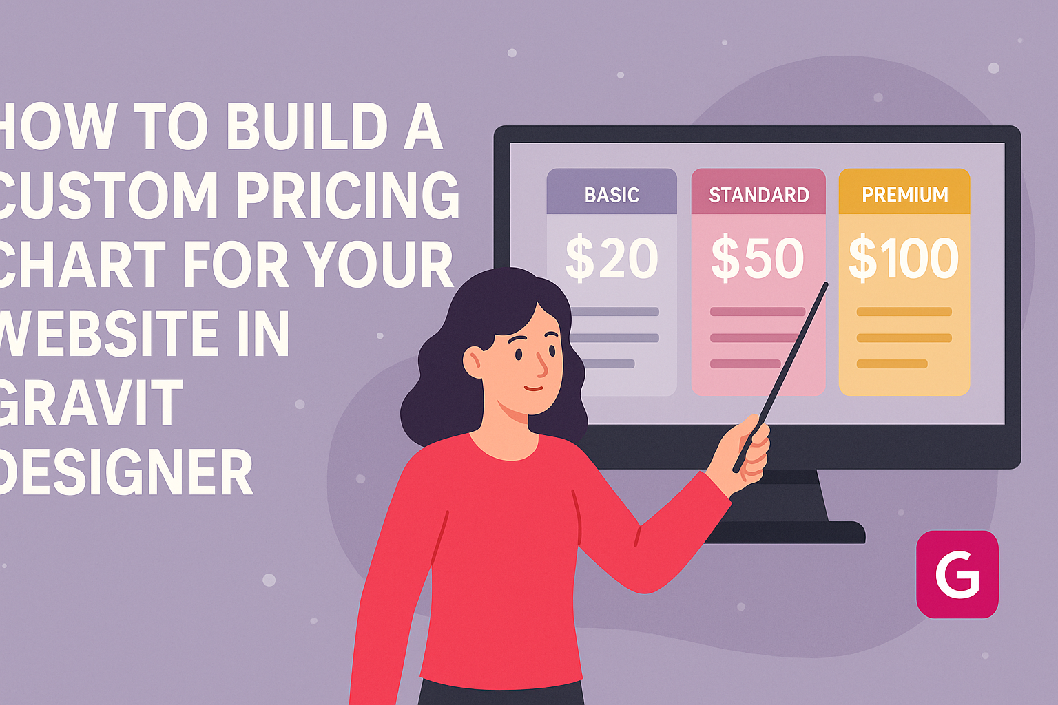
Creating a custom pricing chart can enhance any website, making it clearer for visitors to understand pricing options.
Using Gravit Designer, users can easily build interactive and visually appealing pricing tables that fit their brand’s style. This tool allows for flexibility and creativity, ensuring the chart not only informs but also engages potential customers.
As more businesses move online, having a well-designed pricing chart becomes crucial. It serves as a vital element to highlight offerings, making it easier for customers to compare plans.
With the right techniques, anyone can craft an effective pricing chart that boosts conversions and improves user experience.
In this blog post, the process of building a pricing chart in Gravit Designer will be broken down step-by-step. Readers will gain insight into best practices and creative ideas that make their designs stand out. By the end, they will be equipped with the skills needed to create an impactful pricing chart for their website.
Getting Started with Gravit Designer
Gravit Designer is a powerful design tool that helps users create stunning graphics for their websites. By knowing the essentials, anyone can start designing quickly and efficiently.
Overview of Gravit Designer
Gravit Designer is a versatile design application that works on various platforms, including web and desktop versions. It offers a range of features such as vector editing, design templates, and collaboration tools.
With Gravit, users can design anything from logos to illustrations to complex layouts. The interface is user-friendly, making it accessible for beginners while providing advanced features for experienced designers.
Users can also explore numerous tutorials and resources available online to help them get started. The community around Gravit Designer is supportive, offering inspiration and guidance.
Setting Up Your Workspace
Setting up your workspace is crucial for a smooth design experience in Gravit Designer. After installing the app or accessing it online, the first step is to choose a new document size.
Users can select from presets like A4, A3, or custom sizes based on their project needs.
It’s helpful to organize the workspace by adding panels for layers, styles, and other tools that will be frequently used.
Additionally, setting up shortcuts can improve efficiency while working. Customizing the interface allows users to focus more on creativity.
Remember to save your workspace settings for future projects to maintain consistency in design work.
Designing the Pricing Chart
Creating a pricing chart involves selecting the ideal template, customizing the layout, and adding clear text and pricing information. Each step is important to ensure that the chart is attractive and easy to understand.
Selecting The Right Template
The first step in designing a pricing chart is to choose a template that fits the brand’s style. Many design tools, like Gravit Designer, offer a variety of templates tailored for different types of businesses.
It is crucial to pick a template that highlights the pricing options clearly. A good template will have defined sections for each pricing tier. This helps customers quickly identify their choices.
Additionally, consider checking sites like Canva and Venngage for inspiration, as they provide many free and customizable templates for pricing lists.
Customizing the Layout
Once a template is selected, it’s time to customize the layout. The layout should be visually appealing and organized. Gravit Designer allows users to adjust elements easily.
Using a grid layout can help in aligning the information neatly. Ensure there is enough whitespace between sections to avoid clutter.
Also, different pricing tiers should be visually distinctive. Using contrasting colors or borders can guide the eye effectively.
Focusing on simplicity in design will enhance readability. Each section should flow logically, and the chart should maintain a balanced look.
Adding Text and Pricing Information
After finalizing the layout, it’s important to add the text and pricing information. Each pricing tier needs a clear title and a short description of what is included. This detail helps customers quickly evaluate their options.
Pricing should be bold and easy to find, using a larger font size. Each description should outline features or benefits briefly. Avoid lengthy paragraphs; use bullet points for clarity.
Finally, ensure all information is accurate and up-to-date. Regular updates are key to maintaining trust with customers. An inviting layout filled with clear information will make the pricing chart effective and user-friendly.
Enhancing Your Pricing Chart
A well-designed pricing chart can significantly impact user experience and conversion rates. It’s essential to make it visually appealing while still communicating valuable information. This section explores ways to enhance the pricing chart using brand elements, colors, fonts, and visual effects.
Incorporating Brand Elements
To make a pricing chart truly stand out, integrating brand elements is key. This includes the logo, specific icons, and images that reflect the business’s identity. Consistent use of these elements helps to foster brand recognition.
When adding the logo, position it prominently at the top. Using brand colors for headings or borders reinforces the brand identity. Custom icons can effectively represent different pricing tiers, making it clear which plan includes which features.
Utilizing Colors and Fonts Effectively
Colors play a crucial role in attracting attention and conveying emotions. Choose colors that not only match the brand but also highlight pricing areas effectively. For example, using a brighter color for the highlighted plan can draw users’ eyes.
Fonts should be selected carefully to maintain readability. A combination of a bold font for headings and a simpler font for descriptions works well. Consistent font sizes will create a clean look. Utilizing contrast between text and background colors ensures clarity.
Adding Visual Effects
Visual effects can elevate a standard pricing chart into an engaging experience. Simple hover effects create interactivity that encourages exploration. For instance, making the price larger or changing the background color when a user hovers over a pricing option adds interest.
Animations can also enhance user engagement. A subtle slide-in effect for the chart elements can draw attention without being overwhelming. Remember that consistency in visual effects keeps the design professional and appealing.
Finalizing and Exporting
Before completing the pricing chart, it is important to conduct a thorough review of the design. This ensures everything is accurate and visually appealing. After reviewing, exporting the chart correctly for web use is essential to maintain quality.
Reviewing the Design
In this stage, the designer should inspect every detail of the pricing chart. They should check for consistency in fonts, colors, and overall layout.
It’s crucial to ensure that all prices are accurate and that any features or benefits are clearly listed.
Using a checklist can help streamline this process. For example:
- Verify all text for typos.
- Ensure color contrast is accessible.
- Confirm the alignment of all elements.
Having another set of eyes on the design can also be beneficial. A fresh perspective may catch issues that the designer overlooked. This step is key to delivering a polished, professional look.
Exporting the Chart for Web
Once the design is final, exporting is the next step. Gravit Designer allows users to export in various formats.
For web use, PNG or SVG formats are often the best choices.
To export, the designer should:
- Go to the “File” menu.
- Select “Export” and choose the preferred format.
- Adjust the settings, ensuring optimal resolution for web display.
Choosing the right resolution is important for loading speed. A resolution of 72 DPI (dots per inch) is typical for web images.
After exporting, they should test the chart on multiple devices to ensure it appears as intended.