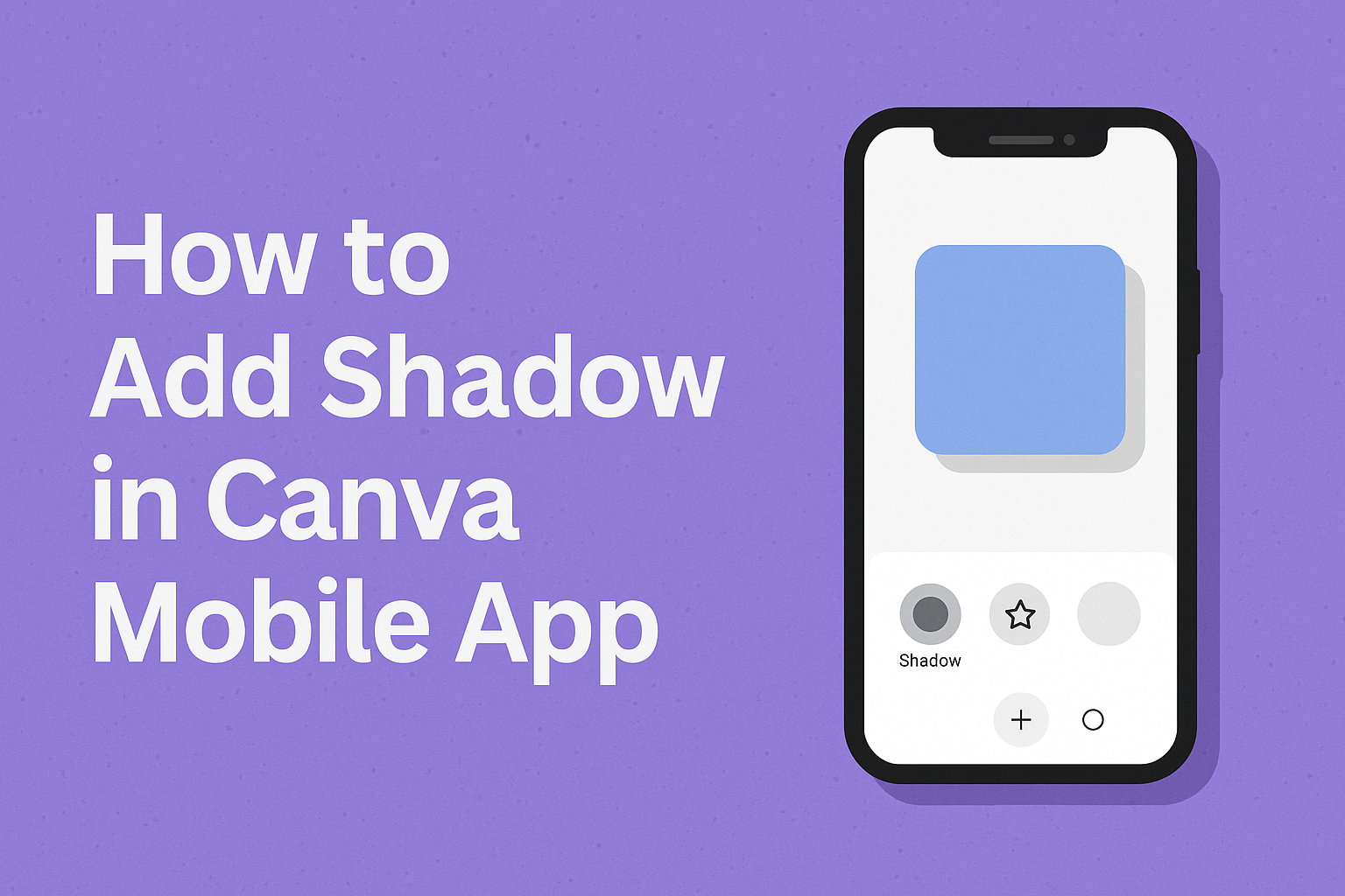
Adding shadows to designs can transform flat, ordinary graphics into eye-catching visuals with depth and dimension. To add shadow in Canva mobile app, users simply select their text, image, or shape, tap the “Effects” button, choose “Shadow” from the menu, and adjust the settings to achieve their desired look. This powerful feature helps designs stand out on social media and creates a more professional appearance.
Shadow effects work by creating the illusion that elements are floating above the background or casting realistic shadows onto surfaces. The Canva mobile app makes adding shadows straightforward with built-in tools that let users customize opacity, blur, angle, and distance. Whether working with text, photos, or graphic elements, shadows can add visual interest and guide viewers’ attention to important parts of the design.
Learning to use shadow effects opens up creative possibilities for making designs more engaging and memorable. Users can apply subtle shadows for elegant looks or dramatic shadows for bold statements. The mobile app provides flexibility to experiment with different shadow styles and customize them to match any design vision.
Understanding Shadow Effects in Canva Mobile
Shadow effects create depth and dimension in digital designs by simulating how light casts shadows behind objects. These effects range from subtle drop shadows to dramatic lighting that makes elements appear to float above the canvas.
What Is a Shadow Effect?
A shadow effect is a graphic design technique that adds depth and realism to flat digital elements. The effect mimics natural lighting by placing a darkened area behind text, images, or shapes.
Drop shadows are the most common type of shadow effect. They appear behind an object and slightly offset from it. This creates the illusion that the element is floating above the background.
Shadow effects work by duplicating the original element and transforming it into a darker, blurred version. The shadow sits behind the main element at a specific angle and distance. Users can control the opacity, blur amount, and positioning of these shadows.
The mobile app makes creating these effects simple through built-in tools. Designers don’t need complex software knowledge to add professional-looking shadows to their work.
Benefits of Adding Shadows to Designs
Enhanced Visual Hierarchy – Shadows help important elements stand out from backgrounds and other design components. They guide viewers’ eyes to key information like headlines or call-to-action buttons.
Professional Appearance – Adding shadows makes designs look more polished and sophisticated. Even simple graphics appear more refined with well-placed shadow effects.
Improved Readability – Text with shadows becomes easier to read against busy backgrounds. The shadow creates contrast that separates letters from underlying images or patterns.
Three-Dimensional Feel – Flat designs gain depth and dimension through strategic shadow placement. Elements appear to lift off the page, creating visual interest and engagement.
Shadows also help separate overlapping elements in complex layouts. They prevent designs from looking cluttered by clearly defining boundaries between different components.
Types of Shadow Effects Available
Canva Mobile offers several shadow effect options for different design needs. Each type creates unique visual results and serves specific purposes.
Drop Shadow – The standard shadow that appears behind elements at customizable angles. Users can adjust the blur, opacity, and distance to match their design style.
Curved Shadow – Creates shadows that follow curved paths, perfect for adding organic movement to designs. This type works well with flowing layouts and creative compositions.
Perspective Shadow – Mimics shadows cast by objects viewed from specific angles. This effect adds realistic depth that makes elements appear three-dimensional.
Inner Shadow – Places shadows inside elements rather than behind them. This creates a recessed or carved appearance that’s useful for buttons and text effects.
Each shadow type includes adjustable settings for opacity, blur, and positioning. The mobile interface provides sliders and controls that make customization quick and intuitive.
How to Add Shadow to Text in Canva Mobile App
Adding shadows to text elements in the Canva mobile app involves selecting your text, accessing the effects menu, and customizing shadow settings like color and transparency to achieve your desired look.
Selecting and Editing Text Elements
Users need to tap on existing text or create new text before they can apply shadow effects. When working with a blank design, they should tap the + icon at the bottom of the screen to access design elements.
After tapping the plus icon, they select Text from the menu options. This opens the text library where they can choose from pre-designed text templates or add plain text.
To edit existing text in a template, users simply tap directly on the text element they want to modify. The text becomes highlighted with selection handles around it.
Once text is selected, editing options appear at the bottom of the screen. These include font changes, color adjustments, and the Effects option which looks like a magic wand icon.
Applying the Shadow Effect to Text
The Effects menu contains various text styling options including shadows. Users need to scroll through the bottom toolbar to locate the Effects button after selecting their text.
When they tap Effects, a new menu opens showing different styling options. The Shadow option appears among these choices and can be easily identified by its preview icon.
Tapping on Shadow immediately applies a basic drop shadow to the selected text. The shadow appears behind the text with default settings that users can customize further.
Multiple shadow styles may be available depending on the Canva version. Users can tap different shadow variations to see how they look on their text before making a final choice.
Customizing Shadow Settings for Text
After applying a shadow effect, users can access advanced customization options. A small menu icon appears on the shadow effect button that allows deeper editing control.
The customization menu includes several shadow settings with slider controls:
| Setting | Function |
|---|---|
| Offset | Controls shadow distance from text |
| Direction | Changes shadow angle and position |
| Blur | Adjusts shadow edge softness |
| Transparency | Controls shadow opacity level |
Users can change the shadow color by tapping the color picker option. This opens a color wheel where they can select any color that matches their design theme.
The transparency slider helps create subtle or bold shadow effects. Moving it left makes shadows more transparent, while moving right makes them more solid and prominent.
Direction controls let users position shadows above, below, or to either side of their text. This flexibility helps create different visual effects depending on the design needs.
How to Add Shadow to Images in Canva Mobile
Adding shadows to images in Canva mobile creates depth and makes designs look more professional. The process involves selecting an image, applying a shadow effect, and customizing the settings to get the perfect look.
Choosing an Image to Edit
Users need to select the image they want to edit before they can add any shadow effects. They should tap directly on the image in their Canva design to select it. A blue border will appear around the image when it’s properly selected.
The image must be fully loaded and visible on the canvas. Users can choose from uploaded photos, stock images from Canva’s library, or any image element already in their design. Once selected, the editing options will become available at the bottom of the screen.
It’s important to choose images that will benefit from shadow effects. Photos with clear subjects work best because the shadow helps separate them from the background.
Applying Drop Shadow to Images
After selecting the image, users should look for the Effects button at the bottom of their screen. Tapping on Effects opens a menu with various visual options. They need to scroll down until they find the Shadow section.
Canva offers several shadow options that users can choose from. Each shadow style creates a different visual effect. Users should tap on their preferred shadow option to apply it instantly.
The drop shadow to image effect appears immediately after selection. Users will see their image now has a shadow behind it. They can try different shadow styles by tapping on other options in the shadow menu.
Adjusting Blur Amount and Other Settings
Once the shadow is applied, users can customize it by tapping on the shadow effect again. This opens adjustment controls for fine-tuning the appearance. The main settings include opacity, blur amount, angle, and distance.
The blur amount controls how soft or sharp the shadow edges look. Higher blur values create softer, more natural shadows. Lower values make crisp, defined shadow edges.
Users can adjust the shadow direction by changing the angle setting. This controls where the shadow falls relative to the image. They can also modify the shadow color if they want something other than the default gray.
The opacity slider controls how dark or light the shadow appears. Distance settings determine how far the shadow extends from the original image. Users should experiment with these settings until they achieve their desired look.
How to Create Shadows for Shapes and Elements
Canva mobile doesn’t offer direct shadow options for all shapes and elements. Users can work around this limitation by using creative techniques and existing shadow graphics to achieve the desired 3d shadow effect.
Workarounds for Adding Shadows to Shapes
When the built-in shadow effects aren’t available for shapes, users can create realistic shadows manually using Canva’s editing tools. The first step involves removing the background from the shape using Canva’s background remover tool.
After isolating the shape, users should duplicate the element to create a shadow copy. They can access the “Edit” menu and select “Duotone” from the options. The duotone effect allows them to set both highlight and shadow colors to black.
Next, users apply a blur effect to soften the duplicated shape. The blur intensity should be adjusted until it looks natural and realistic. They can find this option in the same “Edit” menu.
The final step involves lowering the transparency of the blurred element. This creates a convincing shadow that mimics real lighting conditions. Users can position this shadow layer behind the original shape for the best 3d shadow effect.
Using Shadow Overlays and Graphics
Shadow overlays provide another effective method for creating shadows when direct shadow settings aren’t available. Users can search for “shadow” or “drop shadow” graphics in Canva’s elements library. These pre-made shadows come in various shapes and intensities.
After selecting an appropriate shadow graphic, users can resize and position it behind their main element. The shadow should align with the shape’s edges for a realistic appearance. Black or gray shadows work best for most design projects.
Users can adjust the transparency of these shadow graphics to match their design needs. Lower opacity creates subtle shadows, while higher opacity produces more dramatic effects. They can also rotate or stretch the shadow overlay to match different lighting angles.
This method works particularly well for complex shapes where manual shadow creation would be difficult. It provides consistent results and saves time during the design process.
Customizing and Fine-Tuning Shadow Settings
Once you add a shadow to an element in the Canva mobile app, you can adjust the color, transparency, blur amount, and direction to create the perfect shadow effect. These settings help you match your design style and make shadows look natural.
Changing Shadow Color
The default shadow color is usually black or gray, but you can change it to any color you want. Tap on the shadow effect you applied to your element to open the settings menu.
Look for the color picker or color option in the shadow settings. Tap on it to see different color choices. You can pick from the preset colors or use the color wheel for custom colors.
Popular shadow color choices:
- Black or dark gray – Classic and natural looking
- Blue or purple – Modern and cool tone effects
- Warm colors – Orange or red for dramatic looks
- Matching colors – Colors that match your design theme
Colored shadows work well for creative designs but can look unnatural if overdone. Test different colors to see what looks best with your specific design.
Adjusting Transparency and Intensity
Transparency controls how see-through your shadow appears. Lower transparency makes shadows darker and more solid. Higher transparency makes them lighter and more subtle.
Most natural shadows have medium transparency between 30-70%. Very dark shadows can overwhelm your design. Very light shadows might not be visible enough.
The intensity or blur amount affects how sharp or soft the shadow edge looks. Sharp shadows create clean, graphic effects. Soft, blurred shadows look more realistic and natural.
Transparency guidelines:
- 10-30% – Very subtle, barely visible shadows
- 40-60% – Natural looking shadows for most designs
- 70-90% – Strong, dramatic shadow effects
Use the slider in the shadow settings to adjust both transparency and blur. Preview your changes as you make them to get the right balance.
Controlling Shadow Direction and Angle
Shadow direction determines where the shadow appears around your element. Most natural shadows fall below and slightly to one side of objects. This matches how real light sources work.
You can adjust the shadow angle using the direction controls in the settings menu. Common angles include straight down, diagonal bottom-right, or bottom-left positions.
Effective shadow directions:
- Bottom-right – Most common and natural looking
- Straight down – Clean, minimal shadow effect
- Bottom-left – Alternative natural direction
- Custom angles – Creative effects for specific designs
The distance setting controls how far the shadow extends from your element. Closer shadows suggest the object is near the surface. Farther shadows make objects appear to float higher.
Keep shadow direction consistent across all elements in your design. Mixed shadow directions can make your design look messy and unrealistic.
Creative Applications of Shadow Effects in Canva
Shadow effects transform ordinary designs into professional-looking graphics that grab attention and create visual depth. These techniques work especially well for social media posts, product photography, and promotional materials.
Enhancing Social Media Graphics
Social media designers use shadows to make text and images pop off busy feeds. Drop shadows behind quote graphics help separate the text from colorful backgrounds.
Instagram story creators often add subtle shadow effects to make their content stand out. The shadow creates contrast that makes text easier to read on mobile screens.
Facebook post designers use angle shadows on call-to-action buttons. This makes the buttons look clickable and draws the viewer’s eye to important information.
Popular shadow techniques for social media:
- Light drop shadows on text overlays
- Inner shadows on background shapes
- Curved shadows for profile picture frames
- Glow effects for highlighting key messages
Twitter graphics benefit from minimal shadow effects that don’t compete with the platform’s clean design. A small blur setting keeps the shadow professional while adding just enough depth.
Making Product Photos Stand Out
Product photographers use shadows to create the illusion that items are floating above the background. This technique makes products look more premium and professional.
E-commerce designers add realistic shadows beneath product images to ground them in space. The shadow makes the product appear three-dimensional rather than flat.
Online store owners use shadow effects to enhance mobile designs for their product catalogs. Mobile shoppers respond better to images that have visual depth and dimension.
Effective product shadow settings:
- Opacity: 20-40% for subtle realism
- Blur: Medium setting for natural softness
- Distance: Small offset to avoid distraction
- Angle: Consistent lighting direction
Jewelry and small item photography benefits from soft shadows that don’t overpower delicate details. Fashion products work well with longer shadows that create drama and style.
Designing Eye-Catching Posters
Event posters use bold shadows to create hierarchy and guide the viewer’s eye to important information. Large shadows behind titles make them impossible to ignore.
Concert and festival designers layer multiple shadow effects to build visual excitement. They combine drop shadows with glow effects to match the energetic mood of their events.
Business poster designers use conservative shadow settings to maintain professionalism while adding visual interest.
Poster shadow strategies:
- Heavy shadows for concert and party promotions
- Light shadows for business and educational events
- Colored shadows that match the event theme
- Multiple shadow layers for complex designs
Restaurant menu designers use shadows to separate food sections and highlight daily specials. The shadows help organize information without adding extra design elements that clutter the layout.