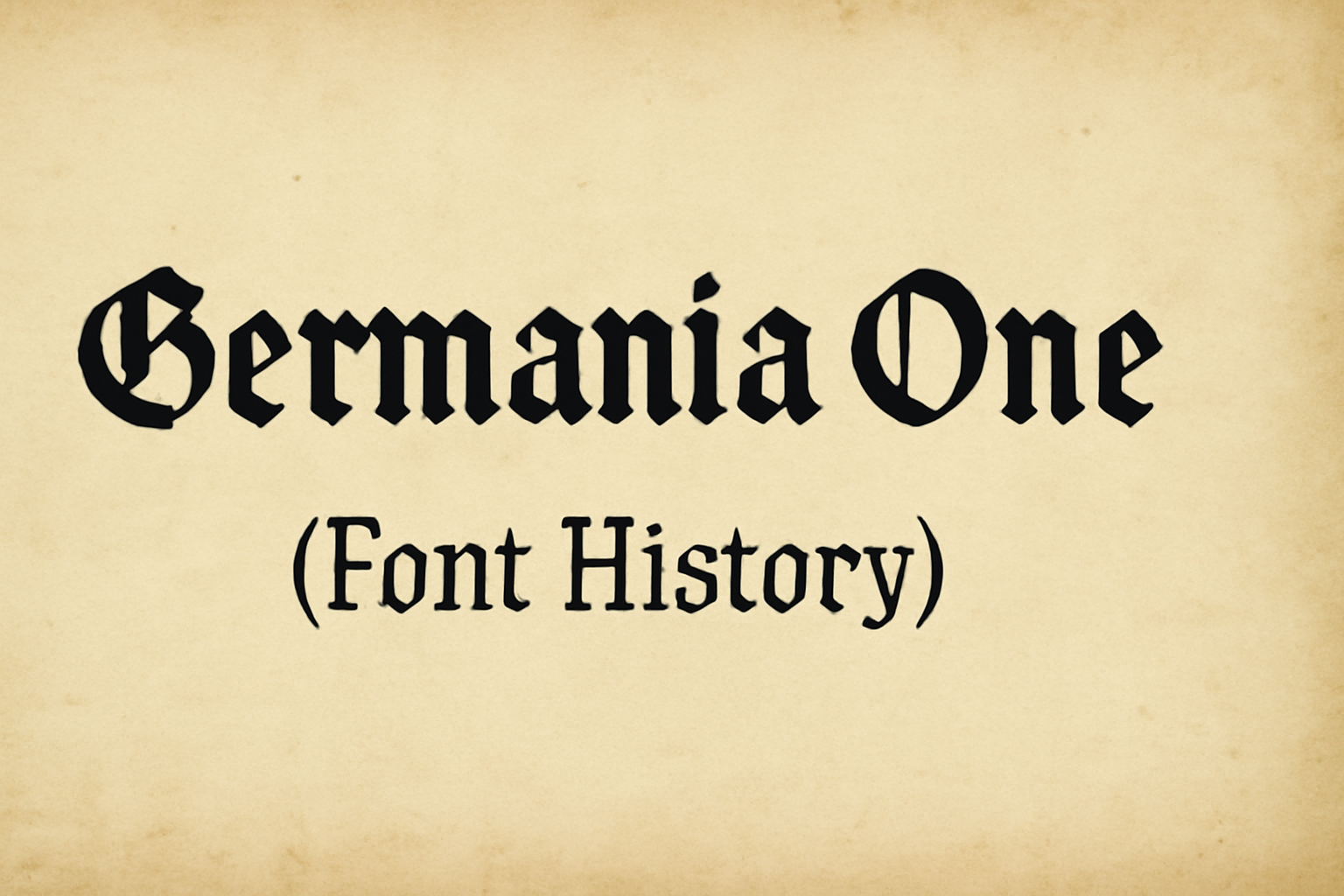
Germania One is a unique font that blends two historical styles, drawing inspiration from both the old fraktur and the geometric sans serif forms from the Bauhaus era. Designed by John Vargas Beltrán, Germania One stands out because of its striking angles and clean lines.
The font reflects early 20th-century German poster art and type design. This blend makes it suitable for those who appreciate a mix of traditional and contemporary aesthetics. The appeal of Germania One lies in its ability to convey history and style.
Google Fonts and Adobe Fonts both offer Germania One, making it accessible for web and design projects. Its widespread availability ensures that designers can easily incorporate this font into their work, adding a touch of Germanic flair to any piece.
Origins of Germania One
Germania One is a unique typeface that blends historical influences with modern design elements. The sections below explore the creator’s background, the inspiration for the typeface, and the design philosophy that guided its development.
Creator Background
John Vargas Beltrán is the designer behind Germania One. With a background in typography, he has a strong appreciation for both traditional and modern design techniques. His work often reflects a deep understanding of historical typefaces, with a focus on bringing them into contemporary contexts.
Beltrán has collaborated with various font platforms, including Google Fonts and Adobe Fonts, highlighting his expertise in typeface development. His passion for combining historical influences with modern aesthetics is evident in projects like Germania One, where he seeks to bridge past and present.
This fusion of traditional skills and modern sensibilities places Beltrán among notable type designers. His dedication to creating timeless yet fresh typefaces appeals to a wide range of designers and typographers who appreciate this harmonious blend.
Inspiration Behind the Typeface
Germania One draws its inspiration from two prominent sources: the old fraktur typefaces and the simplified geometric forms of the Bauhaus movement. These influences represent distinct moments in German typography and art history, each with its own style and cultural significance.
The choice of fraktur brings in a historical dimension with its intricate and traditional elements. Meanwhile, the geometric forms from Bauhaus contribute a modern and clean aesthetic. This unique mix aimed to create a typeface that feels both classic and contemporary, resonating with audiences who appreciate depth and simplicity.
By merging these ideas, Germania One offers a typeface that stands out in its ability to be both decorative and functional. This balance makes it versatile for various design needs, appealing to creative professionals and casual users alike.
Design Philosophy
The design philosophy of Germania One centers around the idea of bridging eras with typography. The goal was to create a typeface that could hold onto its historical roots while also fitting seamlessly into modern designs. This thinking reflects a desire to maintain a sense of tradition while embracing modernity.
John Vargas Beltrán approached the design with a focus on keeping the typeface readable and adaptable. By reworking geometric forms within a traditional framework, Germania One maintains its functionality across various platforms and uses.
Ultimately, Germania One reflects a thoughtful process where historical virtue meets contemporary style, showcasing how type design can evolve without losing its essence. The typeface stands as a testament to skillful blending and visionary design thinking.
Technical Characteristics
Germania One is a unique typeface that combines historical influences with modern design. It features elements from both old fraktur and geometric sans serif styles. This section highlights the specific aspects that define its technical profile.
Font Family and Weights
Germania One is characterized by its singular style and weight, making it easy to use while ensuring visual impact. Designed by John Vargas Beltrán, the typeface is a blackletter design with distinct characteristics. The lack of multiple weights might limit its versatility, but it provides a strong, consistent look. This makes Germania One ideal for headers or short texts where emphasis is needed. The typeface’s bold appearance draws attention and gives a unique flair to any design.
Notable Glyphs and Ligatures
The typeface includes several notable glyphs and ligatures that contribute to its distinctive look. Its design merges geometric forms with the sharp angles typical of early 20th-century German typography. These elements help create a cohesive style that is both striking and functional. Germania One’s ligatures maintain readability while offering an artistic twist. The letters’ clean lines and unique structure make them stand out, adding personality to the text. These features are particularly effective in branding and display scenarios.
Readability and Legibility
Despite its bold and intricate design, Germania One maintains a level of readability that suits various applications. Its geometric-and-blackletter hybrid nature ensures that while the font is artistic, it is not overly complex. The typeface’s readability remains intact due to its clear letterforms and spacing. Though primarily designed for display, it can be used in smaller text sizes without losing clarity. The font’s balance between style and legibility makes it suitable for projects requiring both aesthetic appeal and easy comprehension.
Usage and Applications
Germania One is a versatile typeface drawing from both historical and modern influences. Its mix of bold features and readability makes it suitable for various projects, from eye-catching headlines to memorable branding.
Common Uses in Design
Germania One is often chosen for its striking appearance. Designers frequently use it for headlines in magazines and advertising campaigns. Its bold weight ensures that titles grab attention and remain easily readable, even from a distance.
In poster design, Germania One stands out, providing a mix of classic and contemporary styles. These qualities also make it a favorite for logos and other graphic elements where making a strong first impression is crucial.
Brand Identity and Germania One
A brand’s identity depends on creating memorable visuals. Germania One helps achieve this with its unique blend of blackletter and modern geometric styles. By combining these influences, the font conveys both tradition and innovation, making it ideal for businesses wanting to communicate a rich heritage while staying modern.
Using Germania One in branding elements like logos and business cards allows companies to create a cohesive and recognizable look, enhancing the overall brand image. Its visual distinctiveness helps brands stand out in competitive markets.
Digital vs. Print Media
Germania One excels in both digital and print media. On screens, its clean lines ensure readability on websites or social media posts. Digital campaigns benefit from its impactful design, attracting attention in crowded online spaces.
In print, the font’s robust structure maintains clarity on various materials. Whether used in brochures or product packaging, Germania One’s sharp and precise shapes stand out, making printed materials memorable and effective. Designers appreciate its adaptability, allowing for seamless transitions between digital and print applications.
Typographic Influence
Germania One blends historical styles to create something fresh. Its design is shaped by both the fraktur style and the geometric sans serif forms, which give it a distinctive look. These influences allow the font to stand out in modern typography and make comparisons with other fonts interesting.
Impact on Modern Typography
Germania One has significantly impacted modern typography with its unique mix of styles. Designers appreciate its combination of traditional and contemporary elements. This makes it versatile for various projects. It is often used in branding and advertising, where a strong and striking font is needed.
The font’s geometric shapes give it a clean and organized look. This appeals to those aiming for a modern aesthetic. Its bold characters make it effective in grabbing attention and conveying clear messages.
Comparison with Other Fonts
When compared to other fonts, Germania One stands out for its blend of historical and modern influences. While many fonts focus on either traditional or modern styles, Germania One combines both.
Fonts like Helvetica or Times New Roman have clear historical backgrounds. Germania One, however, merges the fraktur tradition with Bauhaus geometric elements.
This fusion results in a font that is not only unique but also adaptable. It offers a fresh perspective for designers looking for something beyond standard options. This versatility is what sets it apart from other typefaces.
Access and Licensing
Germania One is an intriguing typeface that blends historical styles with modern aesthetics. Accessing and using this font involves understanding how to obtain it and recognizing the applicable licensing terms.
Obtaining Germania One
Germania One can be easily accessed online through several platforms. Users can download it from Google Fonts at no cost. This platform allows easy integration for both desktop and web use, making it convenient for designers and developers. Another reliable platform is Adobe Fonts, where it is available for sync and web use. Users with a subscription to Adobe’s services can access and use Germania One effortlessly. The font is also listed on FontForge, further expanding the options available for download.
License Types and Restrictions
The font is mainly distributed under the Open Font License (OFL), which is very flexible. The OFL permits users to use, modify, and share Germania One almost freely. The major restriction is that the font itself cannot be sold. If users share the font, they are required to include the license information. This ensures that the creators’ rights are respected while still promoting wide usage and distribution. Numerous platforms adhere to the OFL terms, providing users with a clear guide on their rights and obligations when utilizing the font.
Critiques and Reviews
Germania One has been met with mixed feedback from both design professionals and online communities. While some appreciate its blend of historical styles, others have raised concerns regarding its associations.
Professional Opinions
Graphic designers often note the unique blend of historical and modern styles in Germania One. Its combination of Fraktur and Bauhaus elements is admired for adding depth to design projects. Some professionals, however, voice concerns about using a font so reminiscent of the past, given its strong ties to German history. They caution designers to consider its context to avoid misunderstandings.
Despite these concerns, many designers praise its craftsmanship. They find Germania One useful for projects needing a vintage yet contemporary aesthetic.
Community Reception
Feedback within online communities shows a mix of admiration and caution. Some users are drawn to Germania One’s bold presence and nostalgic feel, seeing it as a creative tool with lots of potential.
Others worry about its visual similarity to old scripts used in propaganda. This is especially true in discussions on platforms like Reddit. People express concerns about its potential to unintentionally offend, especially in projects tied to German culture or history.
Overall, the community values the expressive design possibilities it offers while being mindful of its historical connotations.
Updates and Variations
The Germania One font has seen several updates and transformations over time. These changes reflect both historical shifts and modern adaptations.
Historical Updates
Germania One began as a hybrid font, blending traditional fraktur with geometric sans serif styles associated with the Bauhaus movement. This unique approach created a typeface that felt both contemporary and nostalgic. Over the years, updates to the design have focused on improving legibility and adaptability across different mediums. These historical updates have helped preserve its classic appeal while meeting modern design needs.
The open-source availability has allowed it to be modified and improved by a broad community of designers. This collective effort ensures that Germania One remains relevant and evolves with changing design trends. Its adaptability makes it a preferred choice for both personal and commercial projects.
Evolution of the Typeface
The evolution of Germania One has made it more versatile and functional for a wide range of uses. It now includes support for multiple languages, which broadens its applicability in global projects. Designers have also incorporated more OpenType features, enhancing its usability in digital formats.
New variations, such as specific weights and styles, have been introduced to meet diverse design requirements. This flexibility allows designers to experiment with it in different contexts, fostering creative uses. Its modern adaptations ensure it complements various styles while maintaining its distinctive character, a perfect balance of old and new.