Creating a modern data report can seem daunting, especially for those not intimately familiar with design software. Visme simplifies this process by offering easy-to-use visual tools that allow anyone to craft detailed and visually appealing reports. These tools are perfect for transforming raw data into engaging charts and infographics.
Visme’s platform is designed with non-designers in mind. With features like drag-and-drop templates and customizable options, users can create professional-grade reports without extensive training. There are even specific templates for various report needs, making the process straightforward and accessible.
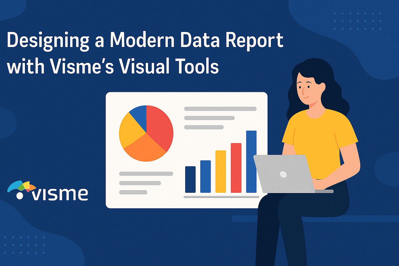
By using Visme’s data visualization tools, users can efficiently bring their data to life. Options such as charts, graphs, and maps make it simple to present data clearly. For more details on these features, explore how their data visualization tools can benefit your projects.
Getting Started with Visme
Visme offers a user-friendly platform designed to make data presentation easy and visually appealing. Discover how to create an account, navigate its dashboard, and use its powerful tools.
Creating Your Visme Account
To start using Visme, visit their website and sign up for an account. New users can choose between free and paid plans, which offer additional features and templates. Signing up requires basic information like your name, email, and password.
Once registered, users receive access to various templates, ideal for presentations, reports, and more. For teams, Visme offers collaboration tools, ensuring everyone stays aligned on projects. It’s this blend of customization and collaboration that sets Visme apart.
Setting up a profile helps personalize the experience. Users can upload logos, select brand colors, and set preferences, creating a tailored workspace perfect for any professional need.
Navigating the Dashboard
After logging in, users land on the dashboard, the control center for all Visme projects. The left menu provides quick access to different sections including recent projects, shared files, and team folders. The dashboard is intuitive, designed to minimize the learning curve for new users.
Creating a new project is simple. Click on “Create New” to explore a wide array of templates suited for various presentation needs. Users can browse through categories like business, education, or marketing to find the best fit for their purpose.
Team collaboration is supported through shared folders and comments, making it easy to work with colleagues no matter where they are. This setup keeps projects organized and accessible, contributing to a more efficient workflow.
Understanding Visme’s Toolset
Visme’s toolset offers diverse options for creating stunning visual content. Users can access the editor to customize templates with their own text, images, and brand elements. Built-in design elements like shapes, icons, charts, and widgets allow users to present data in a clear and engaging manner.
Animation and interactivity features make content come alive. Adding video, audio, or interactive links can captivate an audience’s attention. For businesses, this means delivering more effective presentations.
Users can download finished projects in several formats such as PDF, JPG, or HTML5. Flexibility in design and function makes Visme a robust choice for anyone looking to enhance their data presentation capabilities.
Planning Your Data Report
When creating a data report, it is essential to set clear objectives, understand the audience, and organize data efficiently. Each step helps in building a report that is informative and engaging.
Defining Report Objectives
Setting objectives is the starting point for any successful data report. Objectives outline what the report aims to achieve, guiding the structure and content. It helps the creator focus on key messages or findings that need to be communicated.
Clear objectives also assist in determining the data that should be included. For instance, if the goal is to report quarterly sales progress, then sales data by region might be critical. It helps in prioritizing valuable information over irrelevant details.
Additionally, well-defined goals can lead to a more coherent and concise report. By focusing on specific objectives, the report can cover important areas without unnecessary content. This clarity aids the reader’s comprehension, making the report more impactful.
Identifying Your Audience
Understanding the audience is crucial for an effective data report. Different audiences may seek different insights, which affects how data should be presented. For instance, executives might prefer a high-level overview of key metrics, while analysts require detailed data.
Knowing the audience helps in selecting the right visual elements. Use Visme’s tools to add charts or infographics that match their expertise level. Visual elements ensure the data is easily digestible and engaging.
Additionally, tone and language need adjustment based on audience understanding. For a technical audience, more in-depth analysis and jargon could be suitable. For a general audience, simpler explanations and visuals might be more effective. Tailoring the report to fit the audience leads to better engagement and user experience.
Gathering and Organizing Data
Gathering relevant data is a pivotal step in report preparation. Data should be accurate, current, and aligned with the report’s objectives. Organizing data in a logical structure helps in creating a flow that is easy to follow.
Data can be categorized by type or theme, such as sales figures, market trends, or customer feedback. Using tools like Visme’s templates can simplify the organization process, providing a structured layout to display data effectively.
Once data is gathered, review it for errors or inconsistencies. It’s important that data is verified to maintain credibility. Organize data in charts, tables, or graphs to convey information clearly. Properly structured data aids understanding and highlights key points effectively.
Designing with Data Widgets
Designing with data widgets is a key part of creating visually appealing reports. These tools help transform raw data into clear, engaging visuals that enhance comprehension and retention.
Selecting the Right Charts
Choosing appropriate charts is crucial for effective data presentation. Different types of data require different chart types. For instance, pie charts work well for illustrating proportions, while bar charts are great for comparisons.
Users should consider the audience’s familiarity with chart types. Simple charts might be easier for a general audience, while more complex visuals like scatter plots might suit a technical audience.
Clarity and simplicity should be guiding principles. Too much information in one chart can overwhelm viewers. Therefore, it’s often better to use multiple simple charts rather than one complicated one.
Customizing Data Widgets
Customization brings out the best in data widgets. Users can adjust colors, fonts, and labels to match their brand’s look and feel. This not only makes the report aesthetically pleasing but also ensures consistency in branding.
Visme offers a range of customizable options. Users can select from a variety of styles and apply changes to fit their needs. They can also add elements like icons or images to enhance the visual appeal.
It’s important to maintain readability and accessibility. Text size should be large enough to read easily, and color choices should provide strong contrast, especially for those with color blindness.
Utilizing Real-Time Data
Incorporating real-time data makes reports dynamic and current. With real-time data widgets, users can integrate live data feeds directly into their reports, ensuring the information is always up-to-date.
This is particularly useful for data that changes frequently, such as stock prices or website analytics. Real-time data keeps the audience engaged, as they can see changes as they happen.
Security of data feeds is essential. Users should ensure that any connected data sources are secure and that only authorized personnel have access to modify the data presented.
Visual Enhancement Techniques
Creating visually appealing data reports is crucial in making information understandable and engaging. Using techniques such as color theory, icons, and alignment in Visme can enhance the clarity and attractiveness of your reports.
Incorporating Color Theory
Color plays a vital role in guiding the reader’s attention and conveying meaning. Utilizing complementary colors can highlight differences or contrasts in data. A palette of analogous colors can create harmony and make the report soothing to the eyes.
Consider using bold hues for highlighting key data points. Pastel colors may be used for background elements to maintain focus on important information. Applying these strategies ensures effective communication in data visuals, making reports not only informative but also visually engaging.
Using Icons and Images
Icons and images can significantly enhance the comprehension and appeal of data reports. Icons act as visual cues, providing quick insight into complex information. By choosing appropriate icons that align with the content, the data becomes easier to understand.
Images can add context and depth. For instance, using relevant images next to textual content can strengthen the reader’s connection to the data. These visual elements should be crafted for clarity and relevance. When used judiciously, they can greatly improve how data is perceived and remembered.
Applying Grids and Alignment
Grids and alignment help in organizing content in a structured fashion. Grids allow for a consistent layout, ensuring that elements are placed logically and neatly. This improves readability by guiding the viewer’s eye through the report in an orderly manner.
Alignment ensures that all parts of the report are properly laid out. Aligning headings, text, and visuals creates a clean, professional look. This is essential for maintaining a cohesive design in complex data visualizations. These practices help maintain balance and prevent the report from appearing cluttered or disorganized.
Interactivity and Animation
Modern data reports are more engaging with interactive features and animations. These elements help in making complex data more understandable by actively involving the reader and visually enhancing the presentation.
Making Interactive Reports
Creating interactive reports allows users to engage directly with the data. Tools like Visme offer features such as click-to-reveal and zoom and pan options. These let users dive into specifics by clicking through detailed layers of information. Interactive filters can tailor the view according to user preferences, making reports more personalized and useful.
In Visme, it’s straightforward to incorporate such features. By selecting objects and using the Actions menu, any part of the report can become a hotspot. This means users can trigger pop-ups and additional information seamlessly. This level of interactivity makes data exploration more enjoyable and insightful.
Animating Your Visual Elements
Animations add life to static data by making transitions smooth and captivating. In Visme, users can animate objects to enter and exit in various ways. These animations can guide the viewer’s attention precisely where it’s needed, ensuring important data isn’t overlooked.
To add animations, select the object and use the Animate option in the editor window. Choose different styles to match the report’s tone. Whether it’s a simple fade-in or a more dynamic slide, animations can make charts and graphs look more professional and engaging. Properly applied, animations not only engage readers but also reinforce the message through visual storytelling.
Publishing and Sharing Your Report
Creating a modern data report with Visme is just the beginning. Once the report is ready, users have several options to export, share, and collaborate with others. These features are crucial for presenting the report on different platforms and working with team members effectively.
Export Options in Visme
Visme provides various ways to export your reports. Reports can be downloaded in multiple formats, including PDF, PNG, JPG, and even as an offline HTML file. This flexibility allows users to choose the best format for their audience, whether they need high-quality images for presentations or compact PDFs for emailing.
Additionally, there are settings to adjust the quality and size of the exported files, ensuring that the content looks professional. For reports that require editing in other software, exporting to PowerPoint can be a handy option.
Sharing Online and Embedding
Sharing online is a breeze with Visme. Users can generate a shareable link directly from the platform to distribute the report easily. This link can be customized with a unique URL, making it memorable and professional.
For those looking to integrate reports into websites or online platforms, embedding is another feature to explore. The report can be embedded with just a few lines of HTML code, displaying it directly on a webpage. This ensures that the audience can interact with the content without leaving the site.
Collaboration Features
Visme also supports teamwork with strong collaboration features. Users can share their reports with colleagues or team members for feedback, allowing others to add comments directly on the platform. This feature is ideal for refining reports and ensuring all stakeholders can provide input before finalizing.
Additionally, permission settings allow the report owner to control who can view or edit the report, maintaining privacy and security. These collaboration tools streamline the process, making it easier to produce high-quality reports with input from all relevant parties.
Harnessing Advanced Visme Features
Visme offers a variety of advanced features that make designing data reports both efficient and visually appealing. Key features include options for custom branding, versatile content blocks, and a wide selection of templates and themes.
Using Custom Branding
With Visme, users can easily add custom branding to their projects. This feature allows businesses to maintain consistency across all visual content. Companies can upload their logos, set brand colors, and use custom fonts to ensure that every data report aligns with their brand identity.
This is particularly useful for businesses aiming to create professional and cohesive visuals. Maintaining a consistent brand image can help strengthen recognition and trustworthiness among clients and stakeholders. Visme simplifies this by saving brand elements, so they remain accessible for all future projects, ensuring every piece of content looks unified.
Exploring Content Blocks
Content blocks in Visme offer a flexible way to build detailed reports. They allow users to drag and drop pre-designed elements, such as charts, infographics, and images, directly into their reports. This modular approach makes it easy to add or remove sections depending on the needs of the report.
These blocks are designed to be simple to use, requiring no advanced design skills. They provide an efficient way to organize information and create visually engaging data reports without starting from scratch. By using content blocks, users can produce polished reports more quickly, ensuring that important information is communicated clearly and effectively.
Leveraging Templates and Themes
Visme features a wide array of templates and themes that can be adapted to fit any reporting needs. Whether users are designing a financial report or a marketing presentation, they can choose from numerous pre-made templates that suit their purpose. These templates are fully customizable, allowing for adjustments in style, layout, and color scheme.
The use of templates not only saves time but also helps ensure the professionalism of the final product. Themes help maintain a consistent look throughout a report by unifying visual elements across different sections. Using Visme’s templates and themes can make the creation process smoother, enabling users to focus more on content rather than design intricacies.
Performance Tracking
Performance tracking in Visme involves using its analytics tools to gain insightful data and measure engagement effectively. These tools allow users to assess how well their content is performing and identify areas for improvement.
Visme Analytics Overview
Visme’s analytics feature is a powerful tool for tracking project performance. Users can access this feature from the Visme dashboard by clicking on the “Data” tab. This offers a quick glance at project statistics, helping users monitor traffic and engagement levels.
The dashboard provides detailed insights, such as views and interactions. These data points allow users to evaluate the effectiveness of their projects. Having access to this data means users can make informed decisions to enhance their presentations or reports. For more information on Visme’s Analytics, visit Visme’s page on tracking traffic and statistics.
Measuring Engagement
Understanding engagement is key to improving content performance. Visme provides several metrics to help users measure this engagement effectively. The tool tracks aspects like page views, average time spent, and specific areas where users interacted.
These insights help identify what content resonates most with the audience. Knowing which parts of the presentation or report get the most attention can guide future content creation. Visme’s intuitive design enhances these insights by offering visual aids that are easy to interpret. This ensures users can optimize their content for better engagement. For practical steps on how to visualize data, check out Visme’s guide on visualizing data using data widgets.