Creating designs in Canva can be a lot of fun, especially when getting creative with transparent elements.
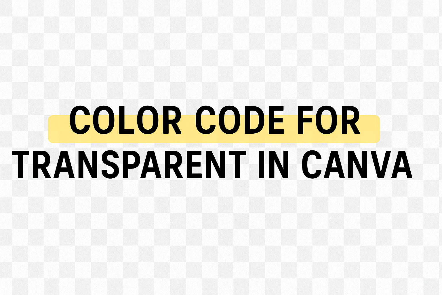
The color code for transparent in Canva is #00000000. This code is essential for crafting designs with a see-through effect, allowing layers to blend seamlessly.
Whether you’re a beginner or seasoned designer, understanding how to use transparency can elevate your work.
Transparency lets users highlight certain parts of their design or make text pop without altering the entire image.
For those eager to explore more, getting hands-on with Canva’s tools could unlock new design possibilities.
The steps to adjust transparency are straightforward and learning them can help bring a fresh and professional look to your creations.
Understanding Canva and Transparency
Canva is a tool that makes design easy, especially for those new to the field.
Transparency plays a significant role in making designs standout by adjusting the visibility of elements to create engaging and sophisticated visuals.
Basics of Design on Canva
Canva provides a simple way to create professional graphics without needing advanced skills. It’s user-friendly, offering many templates and drag-and-drop features to customize images, text, and more.
Users can choose from numerous layouts and elements, tailoring them by altering sizes and colors. There are precise color codes such as RGB and HEX, which allow for consistent colors across various design parts.
Canva’s design tools include text styling, image editing, and element alignment to make sure every creation is visually appealing.
What Transparency Means in Design
In graphic design on Canva, transparency involves adjusting the opacity of elements to affect their visibility.
A transparency slider allows users to fine-tune how much of an element shows through.
Transparency helps create layers in design, making some parts more subtle and others more prominent.
For example, users might add a transparent color overlay to a photo to soften the background or adjust the opacity of text to make it blend seamlessly. This technique can add depth and interest to any design project. For more tips, check out Canva’s guide on transparency.
Navigating Canva’s User Interface
Canva’s user interface is designed to be simple yet powerful, making it accessible for both beginners and experienced users. Two essential features that help in creating standout designs include the color selection tool and the elements tab.
Finding the Color Selection Tool
Discovering the color selection tool in Canva is straightforward. On the main editing screen, users can access this tool by selecting any element, such as text or shapes.
As soon as an item is clicked, a toolbar appears at the top of the canvas.
Within this toolbar, there is a palette icon. By clicking on this icon, users can open the color selection menu. Here, it is easy to choose from a wide range of colors or input custom hex codes for specific color needs.
Additionally, Canva allows the use of the transparency tool to adjust the visibility of colors.
By opening the color menu, users have the option to set how transparent they want an element to be. This feature is useful for creating layered effects or semi-transparent designs, which can add depth to any project.
Using the Elements Tab
The elements tab in Canva is another key feature for design creation. Located on the left side of the screen, users can easily find an extensive library of graphics, shapes, lines, and more.
This tab allows for quick access to various materials needed for any design project.
Browsing the elements is simple. Users can scroll through categories or use the search bar to find specific graphics.
Once an element is chosen, a simple drag-and-drop action places it into the design.
For those wanting to manipulate their selected elements, Canva provides options to resize, rotate, and layer them. These tools help in achieving precise positioning and effects. This flexibility gives users the freedom to create visually appealing designs tailored to their unique visions.
Setting Transparency in Canva
Adjusting transparency in Canva is a simple yet effective way to enhance designs. This section explores how to modify the transparency of individual elements and backgrounds to create visually appealing compositions.
Adjusting Transparency of Elements
To change the transparency of elements in Canva, first select the element.
If you want to work with multiple items, hold down the Shift key and click on each element you want to include.
Once selected, look for the Transparency option on the toolbar above the editor.
By clicking on the transparency icon, a slider will appear, allowing adjustments.
Move the slider to the left to increase transparency, making the element more see-through. On the other hand, sliding it to the right will make the element more solid.
You can also input a specific number if you desire precise adjustments. This feature is useful for layering, letting different design components interact in a harmonious way.
Mastering this tool can lead to more engaging and dynamic visual designs.
Setting Transparency for Backgrounds
Altering background transparency involves a similar process.
Select the background by clicking on it. If a specific color is applied, the transparency tool becomes active in the top toolbar.
For backgrounds created using images or patterns, the transparency feature helps blend the main subject with the backdrop, creating a cohesive look.
Use the slider to adjust how transparent the background becomes.
A higher level of transparency can bring focus to other elements in your design, while lower transparency can create a bold, solid background.
These adjustments can help your overall design stand out, adding depth and texture while allowing key components to shine. Understanding these settings lets users create more nuanced and sophisticated designs in Canva.
Color Codes and Transparency
Color codes help designers choose specific colors, while transparency settings allow elements to blend smoothly with backgrounds. Both are essential in producing eye-catching designs on platforms like Canva.
Understanding Color Codes
Color codes provide a way to select exact colors in digital design. They usually come in formats like HEX, RGB, and HSL.
HEX codes are composed of a hashtag followed by six alphanumeric characters, e.g., #FFFFFF for white. RGB codes define colors through combinations of red, green, and blue, using a format like rgb(255, 255, 255). HSL codes describe colors based on hue, saturation, and lightness, such as hsl(0, 0%, 100%) for white.
These codes enable precise color choices that are consistent across different devices and platforms.
Identifying the Transparency Code
Transparency in design is adjusted by layer opacity, which can be set from 0% (fully transparent) to 100% (completely opaque).
In Canva, users can click on an element and use a slider to change its transparency.
This feature is especially useful in adjusting the prominence of images or text over backgrounds. For a more specific setting, users can input a numerical value to achieve the desired transparency level.
Blending elements seamlessly with their backgrounds creates appealing and professional designs.
Applying Transparency to Designs
When working with transparency in design, it allows for creative layering and unique visual effects. This lets designers emphasize certain elements or achieve a desired look with subtle detail.
Creating Transparent Overlays
Transparent overlays can add a new dimension to any design. By adjusting the transparency of elements, images or text can gently merge with the background, creating a softer appearance.
This technique works well for highlighting text or creating backgrounds that are not too overpowering.
Designers can use tools to adjust the opacity level, customizing layers until the desired transparency effect is achieved.
Simple overlays can help balance a design by reducing areas of high contrast, drawing attention to focus points without distraction. When setting up overlays, it’s crucial to check the transparency tool in the design software to ensure it enhances the composition.
Layering with Transparency
Layering with transparency is a valuable design strategy to add depth and movement.
Combining solid and transparent elements creates visual interest. For instance, placing a transparent color box under text can improve readability while maintaining a stylish look. This can be particularly useful in situations where using contrasting colors might be too bold.
By strategically adjusting transparency, different elements can coexist without clashing. It can also allow for thoughtful background designs that complement rather than overshadow the main subject.
When layering, consideration of color and opacity levels is essential to maintain a harmonious design balance. This method helps guide the viewer’s eye smoothly across the design, accentuating key features without overwhelming them.
Tips for Using Transparent Colors
Transparent colors can add depth and sophistication to designs. They allow elements to blend seamlessly or highlight specific areas without overpowering the entire design. Knowing how to use them effectively can enhance any visual project.
Best Practices for Transparency
Using transparency in design requires a balance.
Designers should use transparent elements to guide the viewer’s eye without causing confusion. It’s important to consider the context in which transparency is being used.
For instance, overlaying transparent text on busy backgrounds can be tricky. To ensure readability, use contrasting colors or a subtle shadow effect.
The use of transparency can also make elements look softer and more appealing. When designing with layers, adjust transparency levels to create harmony between different elements.
It provides a sense of depth and can draw attention to specific parts of the design.
For beginners, starting with small transparency levels and gradually increasing can help in achieving the desired effect. Practicing with various elements and settings will build skill and confidence.
Common Mistakes to Avoid
One mistake is overusing transparency, which can lead to a design that looks washed out or messy.
It’s also common to place transparent elements against backgrounds that don’t contrast enough, making the elements hard to see.
Another pitfall is ignoring how transparent colors appear on different devices.
Check the design on multiple screens to ensure that the colors and transparency levels remain consistent.
Finally, neglecting to test various transparency values can lead to subtle but significant issues, such as elements losing their intended impact.
By regularly reviewing and adjusting transparency settings, designers can maintain clarity and effectiveness in their work.
Advanced Techniques
Exploring advanced techniques in Canva can enhance how designs are presented. By incorporating transparency into branding and creating dynamic visual effects, creators can make their work stand out.
Incorporating Transparency into Branding
Incorporating transparency in branding adds a unique touch to designs.
By using transparent elements, brands can create a memorable look. For example, logos with transparent backgrounds can seamlessly blend into various platforms.
Transparent graphics allow for flexibility. Brands can use the same logo across different media without worrying about clashing colors.
This adaptability ensures that the logo remains consistent, whether on a website, social media, or printed materials.
Additionally, transparent overlays help highlight brand colors.
Designers can use a transparent color overlay on images to create a brand’s signature look. This approach strengthens brand identity and leaves a lasting impression on the audience.
Creating Dynamic Visual Effects
Transparent elements in designs can lead to engaging visual effects.
Designers can manipulate transparency to create eye-catching layers and effects in Canva projects.
One method is layering multiple images to develop depth and dimension.
By adjusting the transparency slider, designers can control how much of each layer is visible. This creates a sense of movement or depth in static images.
Moreover, using transparency in grids or frames can add interest.
Designers can emphasize certain parts of an image by making other sections transparent. This technique can guide viewers’ eyes to key focus areas.
Transparent elements can also help blend images smoothly with their backgrounds.
This tactic is useful in web design to create seamless transitions and integrations between different visual elements, enhancing viewer engagement.