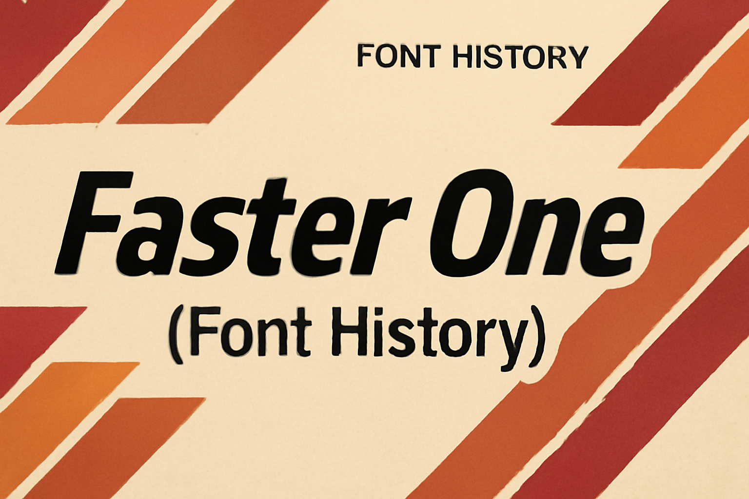
The “Faster One” font is a striking typeface known for its bold and energetic appearance. Created to evoke a sense of speed and movement, it’s perfect for grabbing attention in headlines or marketing materials. Its design is rooted in a sans serif style with italic influences, which contributes to its dynamic look. This font stands …
Font Tutorials
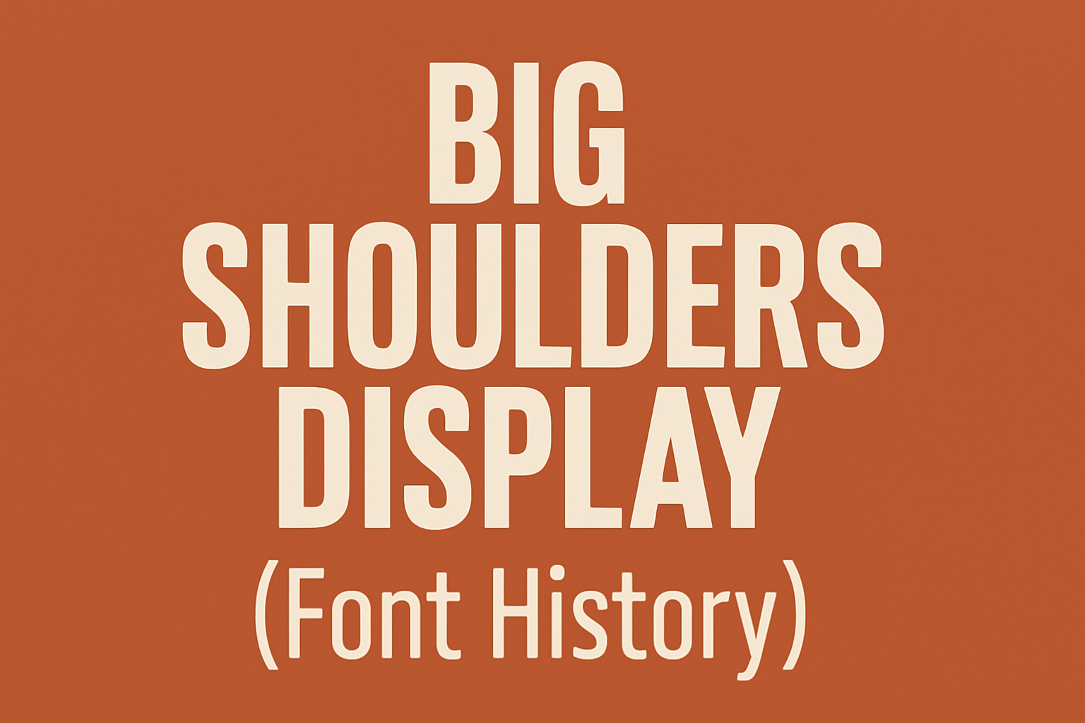
Big Shoulders Display is an intriguing font family rich in history and purpose. This typeface, known for its tall, sans-serif letters, draws inspiration from Chicago’s diverse heritage. From railway transport to public political action, its design tells a story. Big Shoulders Display was crafted for the Chicago Design System, celebrating the city and its people. …
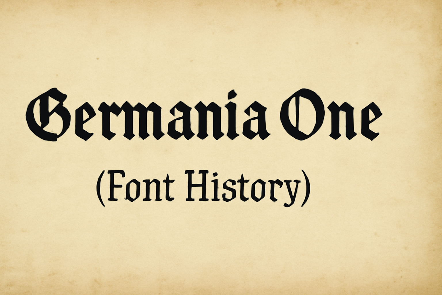
Germania One is a unique font that blends two historical styles, drawing inspiration from both the old fraktur and the geometric sans serif forms from the Bauhaus era. Designed by John Vargas Beltrán, Germania One stands out because of its striking angles and clean lines. The font reflects early 20th-century German poster art and type …
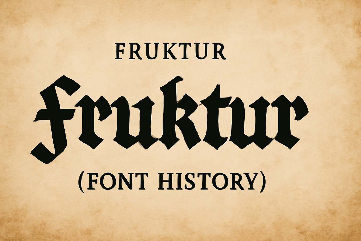
Fraktur is a typeface with a rich history and unique design. Originating in the early 16th century, it was commissioned by Emperor Maximilian I. This font is notable for its intricate and bold style, which captures the cultural heritage of its time. Fraktur is often associated with historical documents and books printed in Germany. Its …
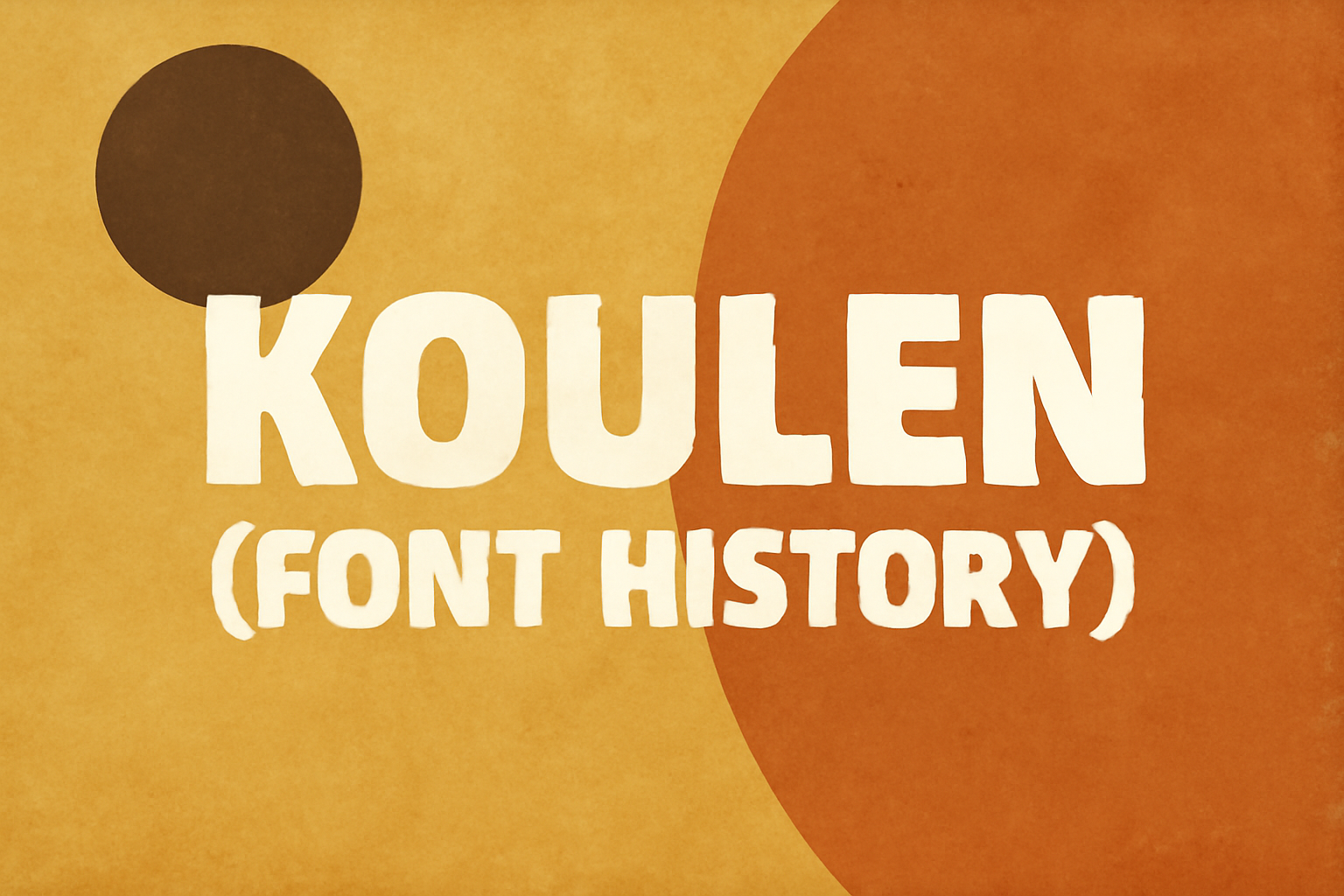
Discovering the story behind a font can be as captivating as the design itself. Koulen, a Khmer font, was first introduced in 2006. Designed by Danh Hong, it was part of the KhmerOS project to provide high-quality fonts for the Cambodian language. Koulen stands out for its bold appearance, making it perfect for headlines and …
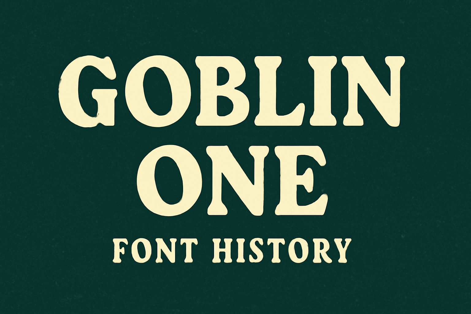
Goblin One is a fascinating font with a unique history. This playful sans-serif typeface was designed by Sorkin Type Co., combining quirky and playful elements with inspiration from vintage signage. Its wide design and large x-height make it stand out, making it ideal for headlines and attention-grabbing text. The font draws people in with its …
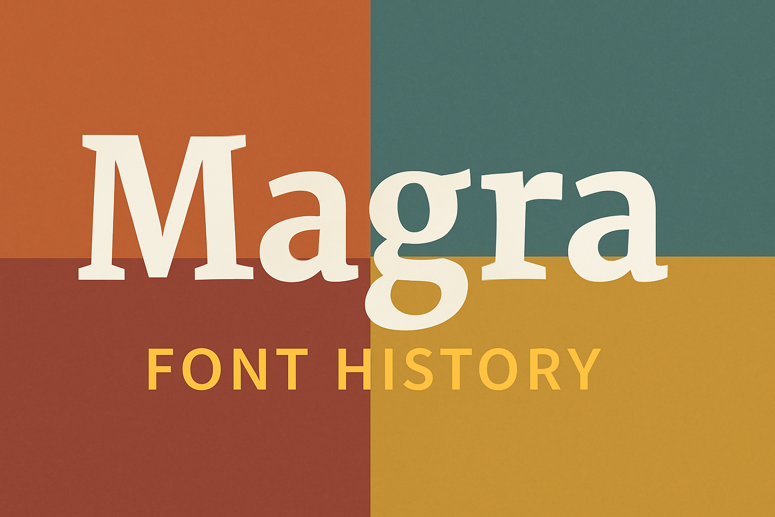
Magra is a sans serif typeface that stands out for its versatility and clear design. Created by Argentine designer Eduardo Tunni, the typeface is known for its readability, making it ideal for both digital screens and print. Its large x-height and robust stems give it excellent legibility, especially in smaller sizes, offering a balance of …
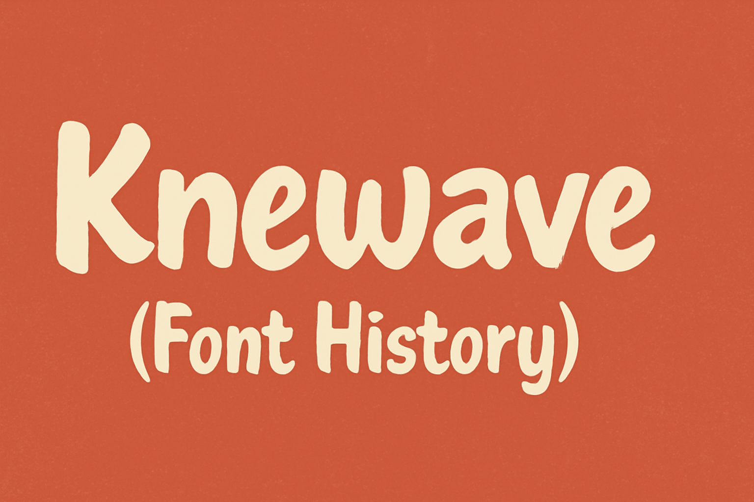
Knewave is not just a font; it’s a piece of art created by Tyler Finck. Born out of inspiration to capture a casual and energetic style, Knewave stands out with its hand-drawn feel, marked by irregular strokes and a playful design. This font offers a lively impression with characters bouncing across your screen, perfect for …
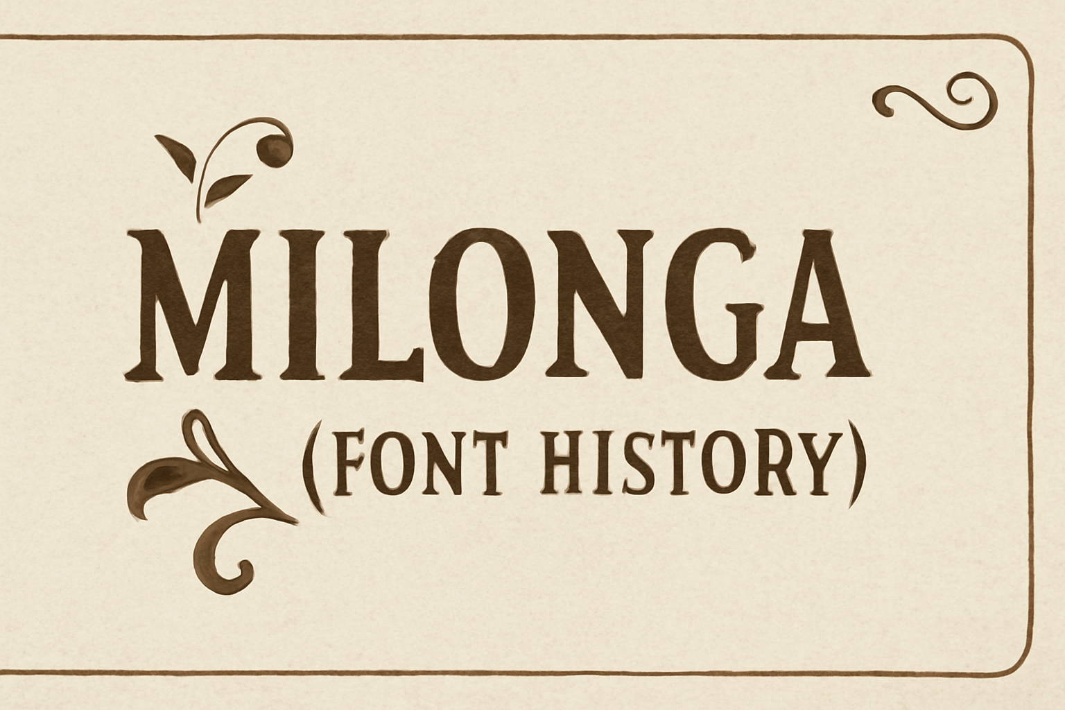
Milonga is a fascinating font inspired by the art of “tangueros.” Rooted deeply in the colorful and complex culture of the Rioplatense region, this font embraces the vibrant history of Argentine folk music genres like Tangos and Milongas. The unique charm of Milonga lies in its ability to blend graphic elegance with cultural storytelling. Designed …
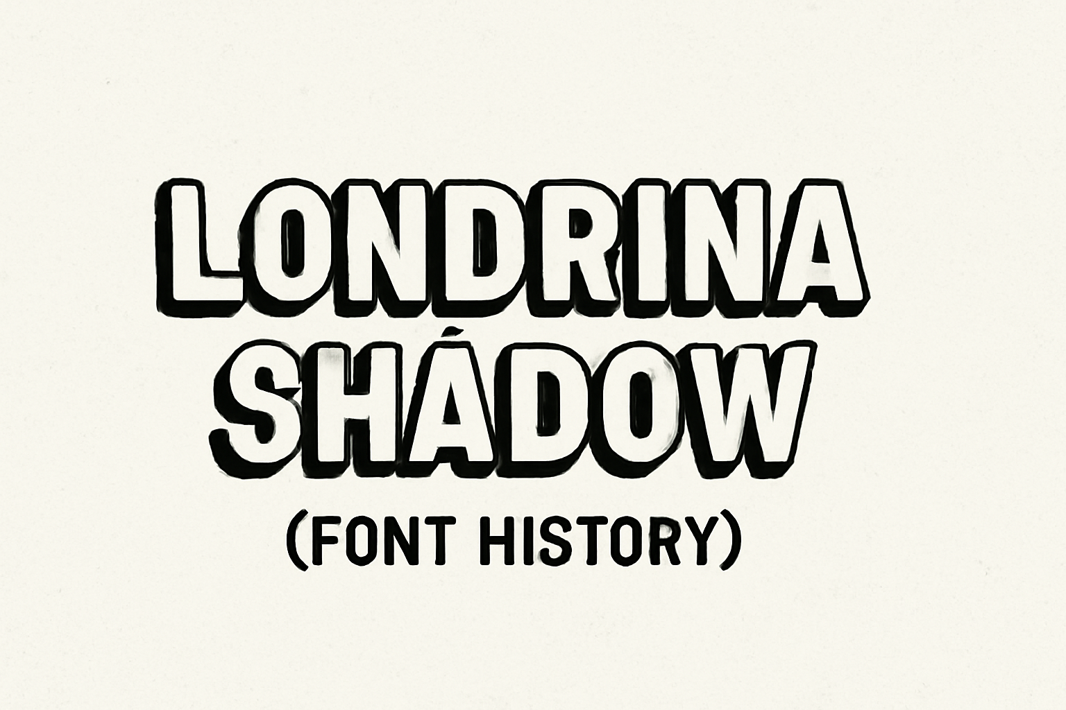
Londrina Shadow is a unique typeface with origins that trace back to the bustling streets of São Paulo, Brazil. This font is part of a larger super-family that includes styles like Solid, Outline, and Sketch. The hand-drawn letters of Londrina Shadow were inspired by everyday signs typically seen in street markets and cafes. Designed by …