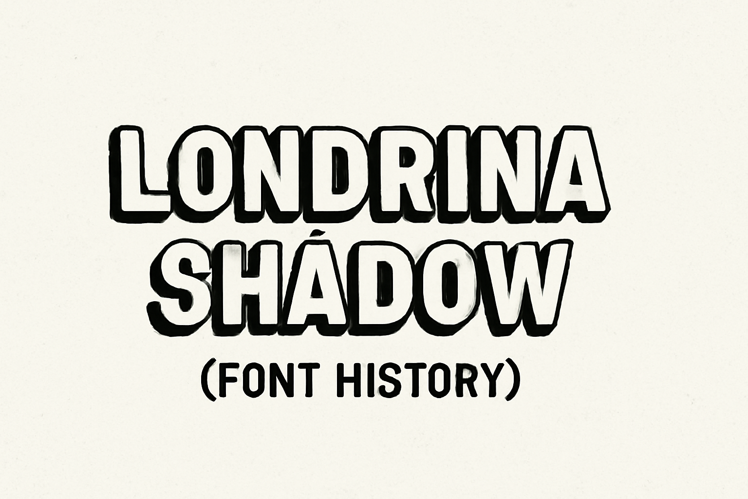
Londrina Shadow is a unique typeface with origins that trace back to the bustling streets of São Paulo, Brazil. This font is part of a larger super-family that includes styles like Solid, Outline, and Sketch. The hand-drawn letters of Londrina Shadow were inspired by everyday signs typically seen in street markets and cafes.
Designed by Marcelo Magalhães, Londrina Shadow allows for a creative blend with its sister fonts, offering a variety of artistic effects. This versatility makes it a popular choice for designers looking to add a touch of urban flair to their projects. The typeface captures the spirit of a vibrant, ever-changing city.
With its playful and edgy appearance, Londrina Shadow has captured the interest of graphic designers around the world. Its ability to mix and match with other styles in the Londrina family enhances its appeal, providing endless design possibilities. For more details on its development, you can explore further about the Londrina Typeface on GitHub.
Origins of Londrina Shadow
Londrina Shadow is a typeface filled with character and history. Its origins are deeply rooted in the personal journey of its creator, the influence of a distinct art style, and a thoughtful design evolution.
Creator Background
Londrina Shadow was created by Marcelo Magalhães, a designer with a passion for capturing the spirit of urban environments. Raised in the bustling streets of São Paulo, Marcelo found inspiration in the vibrant cityscape. His background in street art and graphic design gave him a unique perspective. Marcelo’s work often reflects the energy and chaos of city life. He drew on this experience to craft the Londrina super-family, which includes Londrina Shadow. His goal was to create a typeface that embodies the lively and eclectic feel of São Paulo’s streets.
Influence of Art Deco
The design of Londrina Shadow is notably influenced by the Art Deco movement. This style, popular in the early 20th century, is characterized by bold geometric shapes and rich ornamentation. Marcelo incorporated these elements to give Londrina Shadow its eye-catching look. The playful and layered appearance of the font nods to Art Deco’s emphasis on elegance and modernism. This influence makes Londrina Shadow stand out as a decorative and functional typeface. The Art Deco inspiration can be seen in the angular forms and unique shadowing that define the font’s style.
Evolution of the Font Design
The Londrina typeface project began with manually drawn letters on squared paper, as noted on GitHub. Marcelo refined these sketches into a cohesive design by retracing them on paper. Through experimentation, he developed various styles within the Londrina family: Solid, Shadow, Outline, and Sketch. Each variant provides a different effect and can be layered for added depth. Londrina Shadow, with its distinctive shadowing and singular weight, offers a striking display option. Over time, Londrina Shadow has gained popularity for its versatility and artistic flair, finding its place in various design projects worldwide.
Characteristics of Londrina Shadow
Londrina Shadow is a unique font known for its bold, playful look and three-dimensional shadow effect. Its design elements and versatility make it a popular choice for creative projects.
Font Aesthetics and Style
Londrina Shadow is well known for its playful and bold design. Created as part of the Londrina font super-family, it delivers a distinct visual experience through its three-dimensional shadow effect. This effect adds depth and intrigue, making Londrina Shadow perfect for eye-catching titles and headings. The font’s origins in the urban environment of São Paulo, Brazil, contribute to its vibrant and dynamic character. Designed to stand out, Londrina Shadow brings an energetic and youthful vibe to any project.
Typography Elements
The Londrina Shadow font is part of a versatile family that includes styles like Solid, Outline, and Sketch. Its letterforms are characterized by thick lines and contrasting shadows, making each character seem like it’s jumping off the page. The font offers a single weight of 400 and maintains clarity despite its complex appearance. Combining different styles from the Londrina family allows designers to create layered effects or highlight specific sections of text. The consistency in its stroke thickness helps in maintaining legibility while offering a unique touch.
Usage and Readability
Londrina Shadow is commonly used in display text due to its striking visual style. It’s especially effective for titles, logos, posters, and creative projects where a bold statement is needed. While it excels in grabbing attention, it may not be the best choice for body text or extended reading, as its shadow effect can strain the eyes in large amounts. Designers often choose this typeface for projects that need a playful and engaging tone. The font can be easily downloaded and used for free, making it accessible for web design and print media, enhancing both typography and user experience.
Application of Londrina Shadow
Londrina Shadow is a bold and eye-catching font style, often used in creative fields. Its unique look makes it popular in graphic design projects, brand identity creation, and digital media. This section explores how Londrina Shadow can be effectively used in each of these areas.
Graphic Design
In graphic design, Londrina Shadow stands out due to its playful and distinct appearance. Designers often use it in posters, book covers, and advertisements to capture attention. The shadows in the font add depth, making images more dynamic.
It’s not just for print materials. On digital platforms, this font can help design eye-catching web visuals. By combining Londrina Shadow with other styles from the Londrina super-family, designers have the flexibility to create varied effects.
Using contrasting colors can further enhance its visual impact. This approach creates a memorable impression.
Brand Identity
Building a brand often requires a font that conveys a unique personality. Londrina Shadow offers this by providing a balance of creativity and readability. When used in logos or taglines, it gives brands a modern, urban feel that can appeal to younger audiences.
Its roots in the vibrant streets of São Paulo mean it carries an energetic vibe. Companies related to arts, entertainment, or street fashion might find this font aligns well with their ethos.
Because it’s part of a larger font family, customization is easy. Brands can mix and match different styles like Solid or Outline to create a distinctive look.
Digital Media
In the world of digital media, Londrina Shadow works well for creating engaging social media graphics and website headers. Its bold appearance ensures text remains readable across devices, an important factor in maintaining a consistent digital presence.
Its license allows for free use, making it accessible for various projects. This can be particularly beneficial for startups or creatives working with limited budgets.
Additionally, the font is compatible with web standards, ensuring rapid load times and smooth user experiences. By leveraging its versatility, brands can stand out in the crowded digital space.
Technical Aspects
The Londrina Shadow font has distinct features in its structure and usage. Important points include the available formats and file types, licensing terms under which it can be used, and compatibility with various design software.
Font Formats and Files
Londrina Shadow is typically available in popular formats such as OTF and TTF, making it easy to use across different platforms. These formats ensure that the font displays correctly on both print and digital media. A specific version offers a single weight of 400, which caters to basic design needs without cluttering choices.
The font can be downloaded and self-hosted, providing options for users who prefer local storage for performance reasons. This flexibility is particularly beneficial for website design, as it enhances loading times and preserves user privacy by avoiding third-party servers.
Licensing and Distribution
Londrina Shadow is distributed under the SIL Open Font License (OFL), allowing broad usage rights. Individuals can use, study, modify, and redistribute the font free of charge. This open licensing is advantageous for various projects, including personal, academic, and commercial uses.
Users must adhere to some conditions, like not selling the font on its own. However, modified versions can be distributed, supporting creative innovation. Such licensing models are ideal for designers who wish to incorporate unique elements into their work while respecting the original creator’s rights.
Software Compatibility
This font is compatible with most graphic design software, including Adobe Illustrator and Photoshop. Given its popularity, it can also be easily embedded in web design projects. Users can access it via font hosting services like Google Fonts, ensuring wide-ranging accessibility.
Compatibility with various design environments makes Londrina Shadow a versatile choice for designers. Whether creating a website or a print design, professionals can integrate it seamlessly into their projects. This broad support helps in maintaining consistent visuals across different media.
Community and Reception
The Londrina Shadow font has gained attention for its unique style and versatility. It has a significant user base that appreciates its urban-inspired design and ease of use. The font’s popularity has spurred various contributions and variations from the community.
User Reviews and Feedback
Users often praise Londrina Shadow for its eye-catching design. They find it particularly effective for creating standout headlines and posters. Many enjoy how its playful vibe adds character to designs without overwhelming them. Some users mention the font’s readability as a positive feature, while a few suggest that it can be limiting due to having only one weight.
Overall, the feedback within design communities is largely positive. People appreciate how the font draws inspiration from Sao Paulo’s urban landscape.
Popularity Trends
Londrina Shadow has become popular among graphic designers and web developers. Its availability on platforms like Google Fonts makes it easy to access and use across various projects. Its trendy and bold style appeals to designers looking to create modern and engaging visuals.
The font often appears in projects that require a strong visual impact. It is commonly used in advertising, event posters, and websites aimed at a younger audience. The font’s urban art inspiration, coupled with ease of use, keeps it relevant in the design world.
Contributions and Variations
The active community around Londrina Shadow has led to different contributions. Designers often create new variations to explore different creative possibilities. Some have experimented by pairing it with other fonts to achieve innovative visual combinations.
Londrina Shadow is open-source, which encourages collaboration and modification. This openness attracts those who want to adapt the font for specific needs. Contributors continue to explore ways to expand its usability, making it a versatile option in the design toolkit.
Preservation and Legacy
Londrina Shadow’s charm and urban influence have led to efforts to preserve its uniqueness. Maintaining this font involves careful documentation, educational endeavors, and consideration for its future development and use.
Archive and Documentation
Preserving Londrina Shadow begins with archiving its design and use cases. Efforts are made to store digital files and maintain detailed records of its history and variations. This includes the Londrina super-family, which consists of styles like Solid, Shadow, and Outline. By organizing these records, designers and historians can better understand the font’s evolution and impact on typography.
Documentation provides a comprehensive look at the font’s application in urban settings. This is crucial since Londrina originates from the streets of São Paulo. Detailed notes and visual records of Londonrina in various media highlight its utility and influence in design contexts.
Educational Resources
Schools and design programs offer courses and workshops on using and understanding Londrina Shadow. These resources emphasize the development of typefaces and how they reflect cultural influences. By learning about Londrina in an academic setting, students gain practical skills in typography and a deeper appreciation for design rooted in real-world environments.
Educational initiatives might include online tutorials, lectures, and access to font resources. By providing these tools, educators ensure that the next generation of designers can creatively incorporate Londrina Shadow into their work, keeping the font alive and relevant.
Future Prospects
Looking ahead, the future of Londrina Shadow involves potential upgrades and increased accessibility. Designers can explore ways to adapt it for new technologies and digital platforms.
Plans might include developing additional weights or styles to expand its versatility. The widespread use of Londrina Shadow on websites and applications is facilitated by easy download and integration options, such as through Fontsource.
By embracing innovation, Londrina Shadow’s legacy endures, evolving with design trends while retaining its original charm.