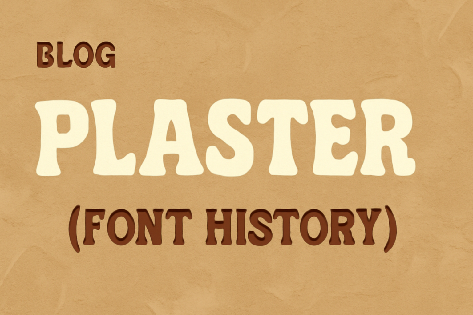
Plaster is a unique font that draws inspiration from the geometric designs of Joseph Albers. It stands out for its low contrast and geometric structure, making it ideal for use in medium to large sizes such as headlines. This design deviates from similar fonts because it has wider spacing between letters, giving it a distinctive look. The combination of historical art influences and modern design elements makes Plaster an intriguing choice for those interested in typography.
Created with flexibility in mind, Plaster is freely available under the SIL Open Font License. This means anyone can use, modify, and share this font without restrictions, making it accessible for both personal and commercial projects. This open accessibility allows designers to explore their creativity while sticking to budgets.
For those curious about typography’s evolution, Plaster offers a blend of classic and contemporary features. By understanding its roots in past designs and its modern adaptations, one can appreciate its place in today’s digital world. If you’re eager to experiment with new fonts, Plaster’s unique characteristics might provide the fresh look you need for your next project.
Origins of Plaster Typeface
Plaster is a unique typeface known for its bold, geometric design. It was created by Pablo Impallari, an accomplished type designer. The font’s design draws inspiration from vintage ads and posters, focusing on strength and clarity through simple shapes and lines.
Design Philosophy
Plaster’s design philosophy centers around using bold, geometric shapes. These features give the typeface a sense of solidity and strength, making it excellent for headlines and medium to large-sized text. Its large letter spacing sets it apart from similar fonts, enhancing readability and impact. The typeface reflects the essence of mid-20th-century advertising, where boldness was key in grabbing attention. The geometric style relies on clean lines and forms, reminiscent of classic poster art and vintage typography.
Creator Background
Pablo Impallari is the creative mind behind the Plaster typeface. Known for his passion for typography, he has worked on numerous projects creating fonts with diverse styles. His work often emphasizes clarity and function while maintaining a unique visual flair. Plaster, released in 2010, showcases Impallari’s interest in bold, impactful designs. His dedication to typography shines through in the typeface’s clean, geometric approach, offering a modern take on vintage inspiration.
Characteristics and Features
Plaster is recognized for its prominent design elements and specific letter features that make it a standout choice for designers. It is well-suited for headlines due to its noticeable style and typographic adjustments, differentiating it from more standard fonts.
Visual Style
Plaster’s visual style is characterized by large letter spacing and low contrast. This design helps enhance readability and provides a modern look, making it suitable for bold signage and headlines. Its origins can be traced back to the work of Joseph Albers, although Plaster includes variations in its design that add a unique aesthetic touch. Designers often appreciate its clean and impactful appearance, which makes it easy to read from a distance and helps convey messages with clarity. This type of font can be an effective choice when looking to capture attention with strong visuals, offering a balance between simplicity and impact.
Unique Glyphs and Ligatures
The distinctive look of Plaster is further enhanced by unique glyphs and ligatures. These elements bring a sense of originality while maintaining harmony within the font family. Special attention is given to how letters connect and align, ensuring that each glyph maintains consistency. This design aspect focuses on providing an aesthetic that stands out while remaining functional. Additionally, Plaster’s variations in glyph design cater to creative layouts, allowing designers to play with text dynamics without losing the font’s underlying characteristics. This enriches its usability in various design projects, especially where distinguishing between content areas is critical. For more details about Plaster, visit its Google Fonts page.
Usage and Applications
The Plaster font stands out with its unique large letter spacing, making it ideal for headlines and visual impact. Its geometric design suits both digital and print media, allowing creative applications across platforms.
Digital Media
Plaster is excellent for creating striking headlines on websites. Its large letter spacing helps it stand out on screens, especially in banners or hero sections. Designers often choose it for interfaces where readability at larger sizes is crucial.
In digital presentations, Plaster enhances slides by drawing attention without overwhelming other content. Its unique look can also be beneficial in online ads, capturing viewers’ eyes in crowded spaces. This font’s distinct style works well in app designs, adding an artistic flair to text elements.
Print Media
For print, Plaster is a strong choice for posters, brochures, and flyers. It catches the eye from a distance, making it suitable for promotional materials. The font’s large spacing is an advantage when used for headers, as it remains clear when printed on various media types.
Book covers and magazine titles also benefit from Plaster’s bold appearance. The style of the font enables it to convey creativity, aligning well with artistic publications. When utilized in branding materials like business cards or stationery, Plaster provides a modern and fresh look that sets designs apart.
Typographic Comparisons
Plaster is a unique font that stands out in the world of typography. To appreciate its qualities, it is helpful to compare it with other typefaces and understand what makes it distinct.
Similar Typefaces
Plaster shares similarities with typefaces like Impact and Futura in terms of boldness and geometric shapes. Impact is widely recognized for its thick and heavy strokes, which are similar to those in Plaster. This common trait gives both fonts a robust and confident presence, perfect for headlines and attention-grabbing text.
Another similar typeface is Futura, recognized for its clean, modern look and straightforward geometric shapes. Like Plaster, Futura avoids ornamental elements, focusing instead on simplicity and clarity. Plaster, though less well-known, evokes a similar sense of streamlined design with its bold, striking characters.
Distinguishing Factors
Though Plaster shares some traits with other fonts, it has unique features that set it apart. One of the key differences is its slightly rounded corners, which give Plaster a softer appearance compared to the sharpness of fonts like Impact. This characteristic adds a hint of warmth and approachability to an otherwise strong typeface.
Another distinguishing factor is Plaster’s versatility in various design applications. It manages to blend a sense of boldness with playfulness, making it suitable for both professional and creative contexts. This adaptability is not as pronounced in other similar fonts, highlighting Plaster’s uniqueness in the typography landscape.
Technical Specifications
Plaster, known for its unique style and readability, has specific technical characteristics that are important for designers and developers. Understanding the file formats and licensing options is crucial for the proper use of this font in various projects.
File Formats
Plaster is available in multiple file formats to ensure compatibility with different systems and software. Common formats include TTF (TrueType Font) and OTF (OpenType Font), both widely used in digital and print media. These formats enable smooth scaling and rendering on various platforms. Additionally, WOFF (Web Open Font Format) and WOFF2 are available for web use, optimizing loading speeds and compatibility across browsers.
These formats ensure that Plaster maintains its legibility and aesthetic on all devices. Designers should choose the format based on their specific needs, considering factors like platform compatibility and file size.
Font Licensing
When using Plaster, understanding its licensing terms is essential. Font licensing dictates how and where the font can be used. Plaster is available under the SIL Open Font License, which allows for both personal and commercial use. This license supports modification and redistribution, making it flexible for various projects.
Users can freely incorporate Plaster into design work, as long as they adhere to the license terms. It’s important for users to review the specific conditions to ensure compliance with legal requirements while maximizing the font’s potential in their projects.
Cultural Impact and Legacy
Plaster, the playful and bold typeface, has made waves in the design world. Its unique style has influenced design trends and has been utilized in historic contexts, leaving a lasting legacy.
Influence on Design Trends
Plaster’s bold, retro charm has often inspired designers to experiment with playful and unconventional layouts. This typeface stands out for its eye-catching and expressive qualities. It encourages creativity and allows designers to infuse energy and personality into their projects. Plaster is commonly used in posters, advertising, and branding where a statement is desired. Its approachable style has also found a place in digital media, appealing to audiences looking for something fresh and vibrant. Designers appreciate its versatility and how it elevates visual communication, making it a go-to choice in modern design landscapes.
Historic Uses
In the past, typefaces like Plaster were used to convey a sense of novelty and excitement. Its robust character was featured prominently in mid-20th century advertising campaigns, where bold typefaces were popular. These fonts communicated enthusiasm and innovation in various media forms. Plaster’s style is linked to art movements that celebrated boldness and creativity. It drew inspiration from design elements such as mid-century modern aesthetics, which continue to resonate with contemporary audiences. This connection to history highlights its role in bridging past and present design sensibilities.
Updates and Variations
Plaster has evolved with time to suit modern design needs. Key updates include expanded character sets and revised editions to cater to diverse user requirements.
Expanded Character Sets
Initially designed with a basic set of characters, Plaster has seen updates to include more symbols and accents. This expansion makes it ideal for designers who require flexibility across different languages and contexts. By adding additional characters, Plaster becomes more versatile and accessible.
Design improvements have also focused on enhancing readability. Larger letter spacing helps in maintaining clarity in both print and digital formats. This makes it useful for a wide range of applications, from headlines to web design, emphasizing its adaptability.
Revised Editions
Plaster has undergone several revisions to keep it relevant. Each edition aims to address previous limitations while adding new features. For instance, updated versions focus on balancing the geometric design with usability.
These editions also explore different styles within the Plaster family, offering designers more variety. Adjustments to contrast and weight allow for better customization, ensuring Plaster fits various design landscapes. This continuous revision process ensures that the font remains both functional and aesthetically pleasing across numerous projects.