The “Faster One” font is a striking typeface known for its bold and energetic appearance. Created to evoke a sense of speed and movement, it’s perfect for grabbing attention in headlines or marketing materials. Its design is rooted in a sans serif style with italic influences, which contributes to its dynamic look.
This font stands out due to its thick letterforms and unique square-like interiors, such as those found in the letter O. These features communicate strength and energy, making “Faster One” a favorite choice for those seeking impact. Display fonts like this are crafted not just to convey words, but to make a statement.
Developed for creative purposes, “Faster One” aligns with the needs of modern design, where efficiency and visual punch are key. Whether used in advertising or digital media, it brings a sense of excitement and freshness. If you’re looking to explore this font further, you can find more information on platforms like Google Fonts and 1001 Fonts.
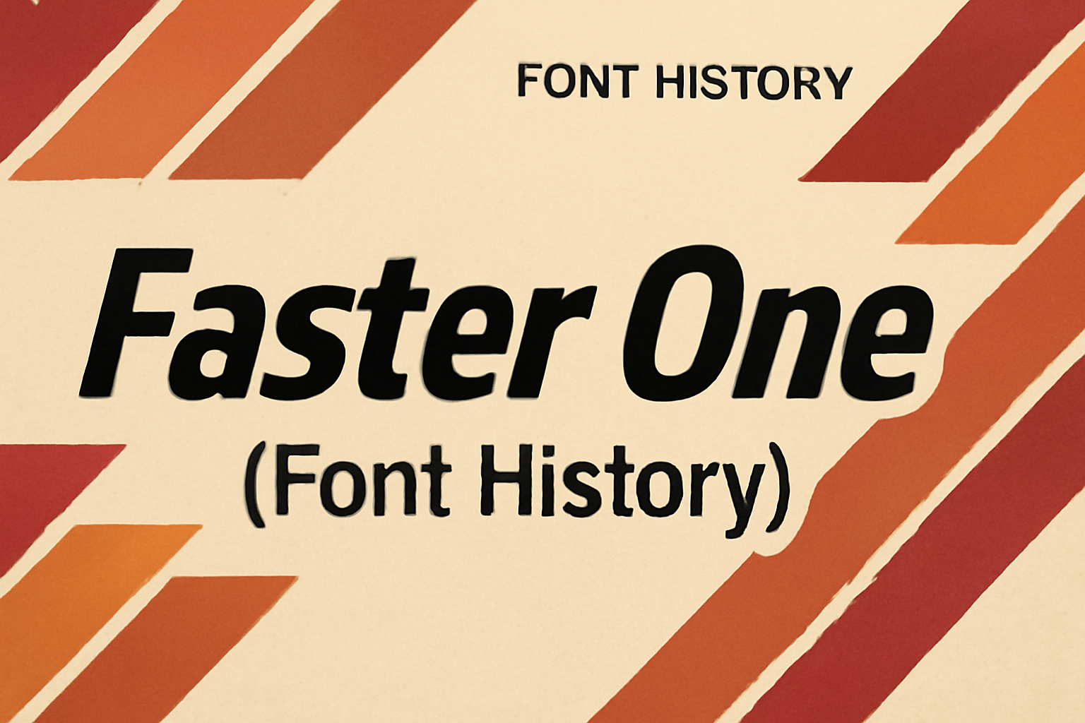
Origin of ‘Faster One’
Faster One is a unique typeface that stands out with its dynamic and sporty look. Designed to communicate speed and energy, it is ideal for headlines and attention-grabbing typography.
Creator and Design Philosophy
Faster One was created by Eduardo Tunni, a talented designer known for his modern approach to fonts. Tunni aimed to craft a typeface that captures a sense of motion and vitality. He achieved this through bold, italicized letterforms that suggest movement and speed. The horizontal and gradual lines in the design were inspired by the image of the wind, creating a feeling of swiftness and efficiency. Tunni’s design philosophy focuses on functionality while pushing creative boundaries, making Faster One both visually appealing and practical.
Initial Release and Reception
Faster One made its debut in the design world as a display font, perfect for settings where a powerful impression is needed. Upon its release, the font garnered attention for its thick, bold shapes which conveyed strength and motion. The reception was positive, especially among designers who valued its ability to convey a sporty, energetic feel in their projects. It was initially popular for headlines and titles, where its unique features could truly shine. Over time, Faster One became recognized for its role in dynamic typography, integrating seamlessly into varied design applications.
Design Characteristics
Faster One is known for its unique design features that convey speed and readability. From its slanted, elongated letterforms to its broad strokes, this font is crafted to stand out and make text easy to read, even in small sizes.
Typography and Style Attributes
Faster One was originally developed from sans serif italics. Its design aims to create a sense of speed and movement. The slanted and elongated letterforms mimic the appearance of fast-moving objects, giving it a dynamic look. The strokes are thick and consistent, which not only supports readability but also gives the font a bold presence. These characteristics make Faster One an excellent choice for headlines where efficiency and impact are key.
Script and Language Support
This font is mainly intended for use in languages that use the Latin script. It supports a wide range of characters typically used in Western languages. This includes letters, numbers, and basic punctuation. While it excels in contexts where English and other Latin-based languages are used, its functionality might be limited in regions where complex script systems are prevalent. As such, it is an ideal option for projects targeting audiences that read English and other similar languages. For more on its design and applications, check its features on Google Fonts.
Usage and Applications
Faster One is a striking display font known for its bold shapes and expressive design. It’s ideal for headlines, logos, and captions where visual impact is key. Let’s explore how this font has been adopted and recognized in various industries.
Prominent Adoptions
Faster One has captured attention in the advertising industry due to its eye-catching characteristics. Its design conveys energy and speed, making it a favorite for sports brands and dynamic product lines. Companies looking to communicate a sense of motion often choose Faster One for their marketing materials.
You’ll find Faster One used in digital campaigns and websites where quick, engaging visuals are important. Designers use it for attention-grabbing headlines in both print and online media. This has allowed brands to create memorable impressions quickly.
Industry Recognition
Faster One has gained praise from design communities for its unique ability to combine boldness with readability. Typography experts highlight its innovation in typeface design. This font often appears in discussions on design forums like Reddit’s typography community, where it is recognized for its bold shapes that communicate strength.
Moreover, platforms like Google Fonts have featured it as an ideal choice for impactful, efficient communication. The font’s popularity has been driven by its ability to stand out while maintaining a professional appearance, making it a staple choice for designers.
Technical Specifications
Faster One is a unique font known for its bold, energetic design. This section delves into the technical aspects, focusing on file compatibility and licensing.
File Formats and Compatibility
Faster One is available in several file formats to ensure broad compatibility. The most common formats include TrueType (.ttf) and OpenType (.otf). Each format has its benefits. TrueType is widely supported and offers excellent quality on different platforms. OpenType, on the other hand, offers advanced typographic features, like ligatures and alternate glyphs.
Both formats can be used on popular operating systems like Windows, macOS, and Linux. Faster One can also be integrated into web projects, making it a flexible choice for both digital and print media. Designers often appreciate the versatility that these file formats provide.
Licensing and Distribution
Faster One is typically available under open-source licenses. This means that users can often download and use it for free, even in commercial projects. However, it’s important to check the specific terms provided by platforms like Google Fonts to ensure compliance.
The open licensing model encourages widespread use and distribution while still offering flexibility for modifications. The distribution channels often include popular font resources online, making Faster One accessible to a wide audience. Users should always verify the current licensing agreements to understand their rights for using and distributing the font.
Evolution Over Time
The development of Faster One reflects significant changes in typography, influenced by updates to its style and its impact on other fonts.
Updates and Versioning
Faster One has gone through several updates that reflect advancements in digital font technology. Initially, it was a basic design focusing on readability and style. Over time, new versions incorporated changes like improved kerning and added character sets, making it more versatile for various languages. Designers have optimized it for better display on both web and print mediums. These updates have allowed it to maintain its appeal and relevance in modern design projects, ensuring compatibility across different platforms. The focus on user feedback has also fueled continuous improvement, keeping the font fresh and well-suited for diverse applications.
Influence on Other Fonts
Faster One’s stylistic choices have inspired the creation of other dynamic and efficient fonts. Its unique characteristics can be seen in newer designs that prioritize speed and legibility in the digital space. Fonts influenced by Faster One often feature bold strokes and streamlined characters, making them suitable for impactful headlines and online content. Its influence extends beyond aesthetics, also shaping the approach to font design in terms of usability and functionality. The emphasis on clarity and efficiency has pushed other designers to create fonts that are both visually appealing and highly readable, setting new standards in the field of typography.
Case Studies
Faster One is a unique font that impacts both branding identity and user experience. Its dynamic design brings a fresh look to various projects while enhancing brand communication and user interaction.
Branding and Identity
Faster One stands out in branding projects by adding a vibrant and energetic feel. Companies use it in logos and marketing materials to convey speed and innovation. For instance, tech startups or sports brands often choose it to reflect agility and forward-thinking. The font’s bold strokes and geometric shapes make logos memorable and distinctive.
Its design catches attention and leaves a lasting impression. This helps brands establish themselves as modern and dynamic. By using Faster One, brands align their visual identity with concepts of speed and excitement.
User Experience Enhancements
Faster One enhances user experience by making headlines and key information stand out. Websites and apps utilize it in interfaces to guide user attention swiftly to crucial areas. Its clear and powerful style grabs the user’s gaze effectively.
In digital design, readability and quick comprehension are vital. Faster One achieves this with its strong letterforms. Designers implement it to maintain a balance between flair and functionality. This ensures users enjoy an engaging yet intuitive interaction with digital content.
Faster One’s influence in user interface design offers both aesthetic appeal and practical benefits.
Future Prospects
Faster One has unique characteristics and offers potential for growth in design and technology. These aspects create opportunities for innovation and new ways to utilize the font.
Technological Advancements
With ongoing advances in technology, typeface adaptations allow for better integration into digital spaces. Faster One could benefit from improvements in screen rendering, ensuring clarity on all devices. Developers may also enhance its compatibility with virtual and augmented reality applications.
As font technology evolves, features like variable font technology could be adapted, allowing for dynamic changes in weight and style. This makes Faster One more versatile for designers seeking flexibility. Machine learning could also play a role in improving how the font is used within automated design tools.
Potential for New Uses
Faster One is perfect for areas prioritizing speed and impact. Its bold and energetic style suits sports branding, urban designs, and fast-paced digital media.
Innovative uses can be found through creative marketing approaches, enhancing brand identities with its distinct look. As digital spaces evolve, eSports and gaming platforms could benefit from Faster One, highlighting its ability to capture attention.
Industries focused on quick communication, like transportation and tech startups, might explore its application further. Its versatility in various settings shows potential for broader use. The unique design characteristics lend themselves well to both traditional and digital mediums, making it adaptable to changing trends.