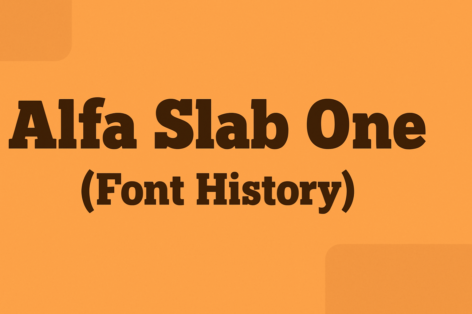
Alfa Slab One stands out as a bold and creative font choice that captures the essence of vintage typography with a modern twist. Designed by JM Solé, it is a contemporary adaptation of the Six-lines Pica Egyptian style originally crafted by Robert Thorne in 1921. This font combines extreme stem weight, large serifs, and subtle …
Font Tutorials
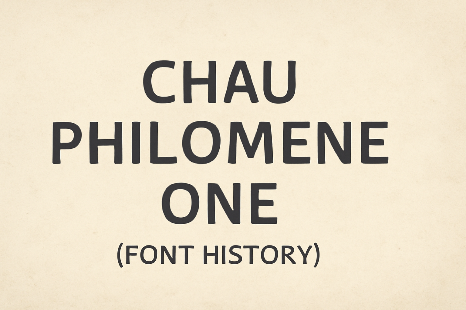
Chau Philomene One is a font known for its distinctive personality, combining narrow letters with sharp angles. Designed to stand out, it is ideal for headings and highlighted text. This unique typeface is part of the Chau superfamily, which offers a range of styles to fit various design needs. The font was created by Vicente …
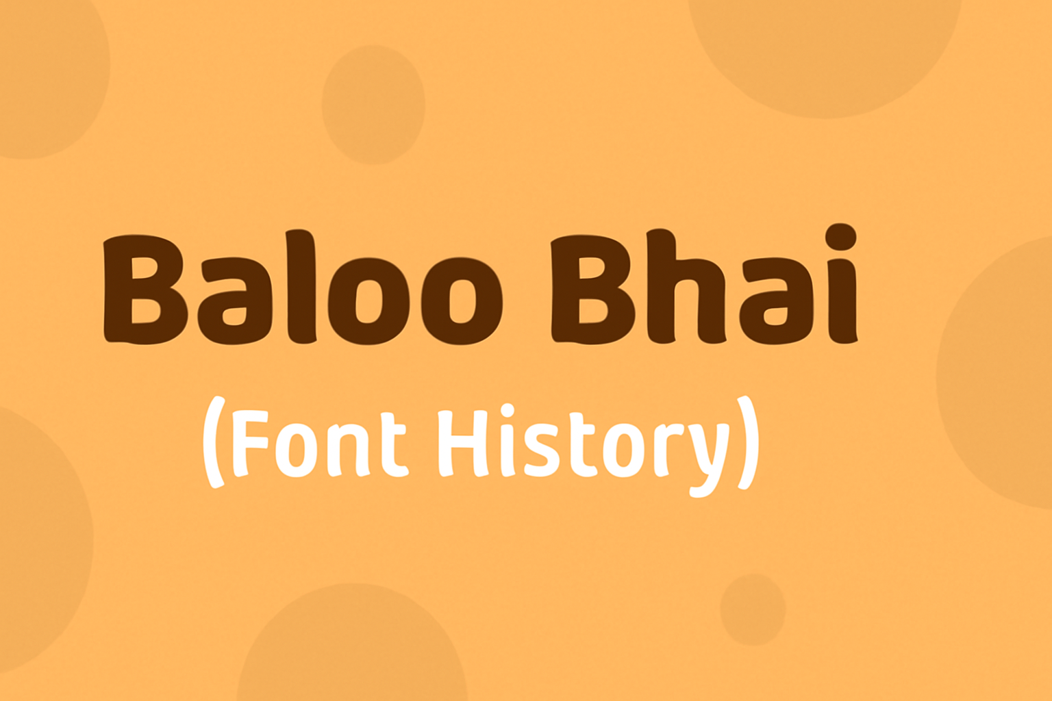
Baloo Bhai is a fascinating typeface with roots that intertwine cultural significance and modern design. Created by Ek Type, this font family is part of a broader collection that supports multiple Indian scripts, making it a versatile choice for content in various languages. Baloo Bhai attracts attention with its bold appearance, while also offering a …
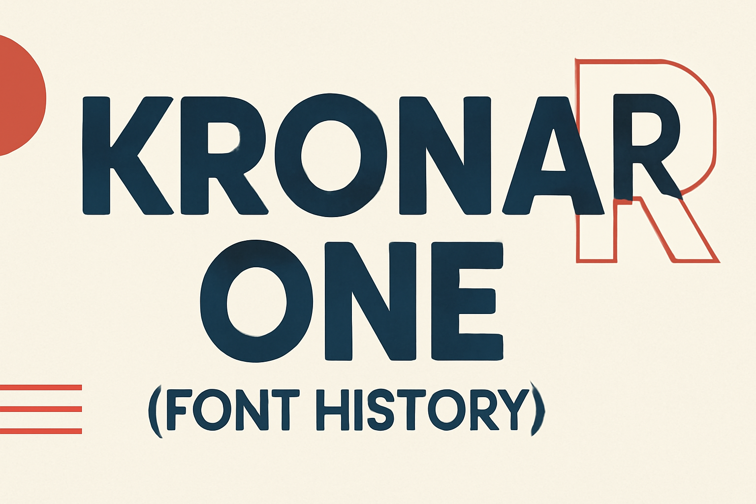
Krona One is a sans serif font full of personality, making it a standout choice for a variety of design needs. Created by Yvonne Schüttler, it draws inspiration from hand lettering on early 20th-century Swedish posters, combining nostalgia with modern readability. This unique blend makes Krona One both readable and memorable, suitable for both small …
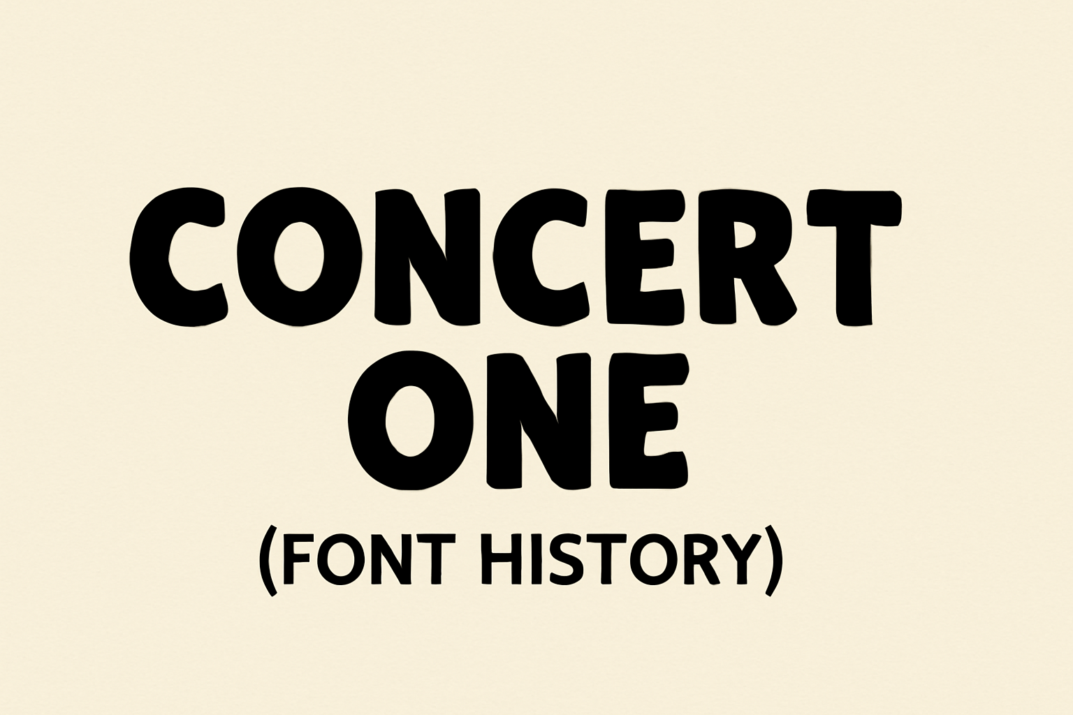
Concert One is a typeface that brings a fresh twist to traditional designs. It is a rounded grotesque typeface inspired by 19th-century 3D lettering from a leaflet announcing a chamber concert. This unique origin story makes Concert One stand out in the world of fonts. The creators of Concert One, Johan Kallas and Mihkel Virkus, …
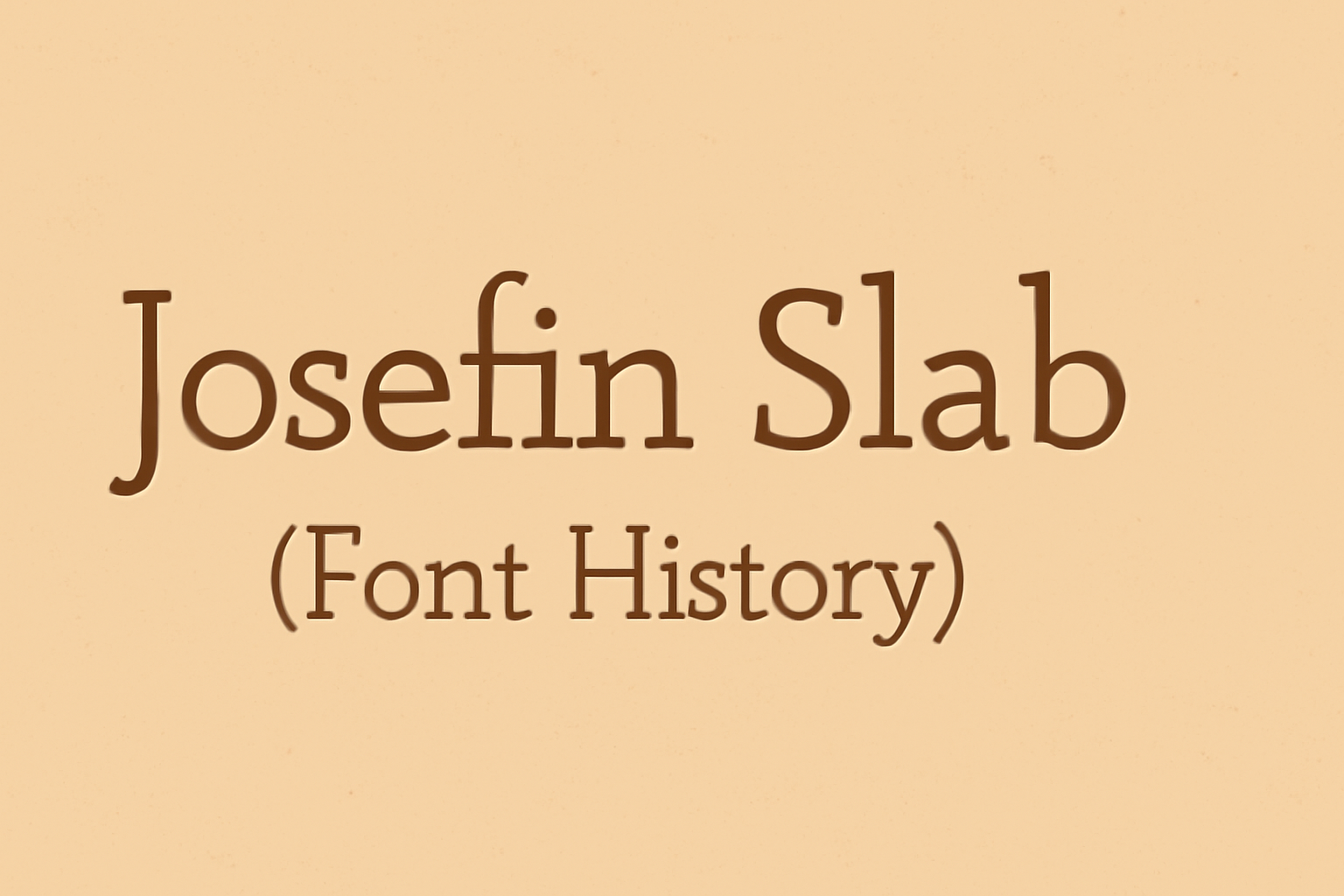
Josefin Slab is a font that combines vintage aesthetics with a modern twist. Inspired by the geometric sans-serifs of the 1930s, it offers a distinctive look with its blend of sharp and rounded edges. Created by Santiago Orozco, it aims to capture the elegant feel of that era. This typeface has gained popularity due to …
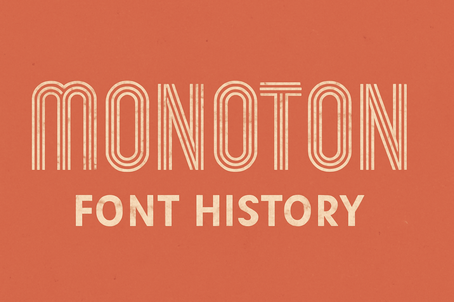
Monoton is a font that attracts attention with its bold and unique style. Its design is inspired by metalpress fonts like Prisma, which was crafted by Rudolf Koch in 1931. Monoton is ideal for large headings or logos due to its striking, geometric lines. This font boasts thick, parallel lines that give it a distinct …
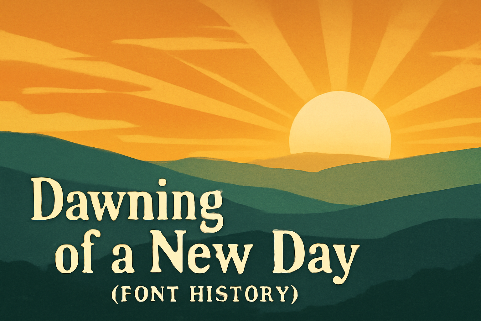
The story behind the Dawning of a New Day font is both personal and meaningful. Designed by Kimberly Geswein, it is inspired by the handwriting of a friend. This font brings a sense of freshness and new beginnings with its light and fluid script, inviting users to start each day with optimism. Dawning of a …
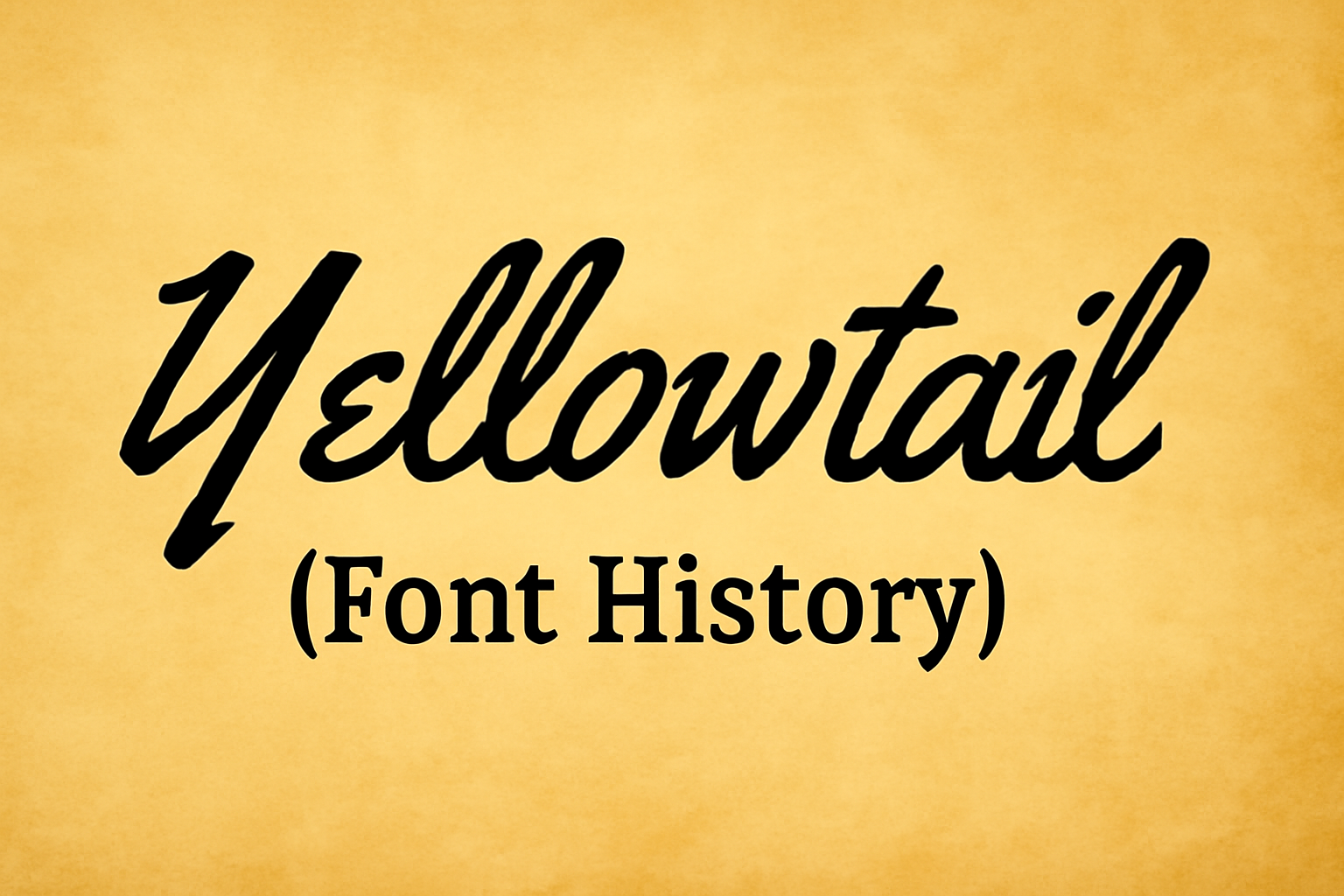
Yellowtail captures the spirit of vintage American signage with its unique blend of connecting and non-connecting letterforms. It was designed by Brian J. Bonislawsky in 2010, reflecting the charm of mid-20th-century scripts. This font’s balance between casual and formal styles makes it perfect for a wide range of design projects, from advertisements to personal invitations. …
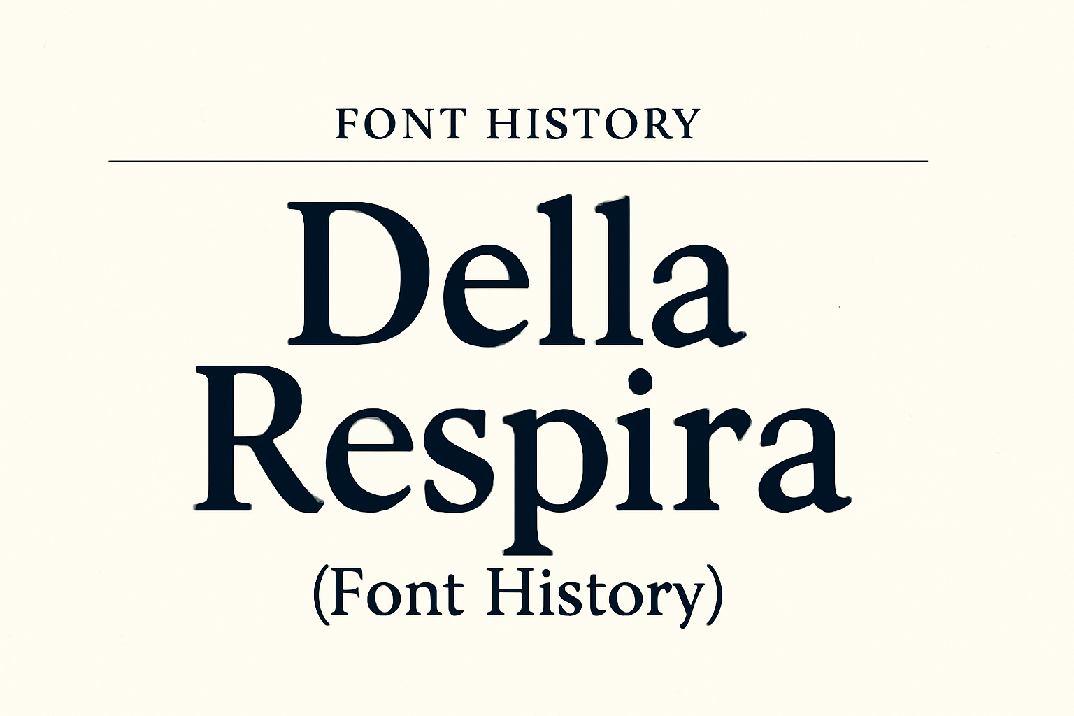
In the world of typography, Della Respira stands out with its unique blend of historical charm and modern utility. Originally a revival of the 1913 Della Robbia typeface by American Type Founders, it offers a timeless design that’s as relevant now as it was over a century ago. This font family supports multiple Latin script …