The Nova Slim font, a modern and elegant typeface, captures the eye with its slender, refined design. This font started as NovaCut, initially used for inscriptions on stone around 14-15 years ago. Nova Slim is particularly valued for its sleek and contemporary aesthetic, making it ideal for projects that call for style and sophistication.
In 2010, Nova Slim was transformed from its original form to a digital version, expanding beyond capitals and numbers to include lowercase letters. This evolution opened up new possibilities for designers seeking a unique look. Its delicate and elongated letterforms draw attention and add a sense of refinement to any text.
This unique transformation has made Nova Slim stand out in the world of typography. Designers appreciate its high stroke contrast and elegant style. Whether used in logos or creative projects, Nova Slim consistently provides that touch of class and sophistication that many seek today.
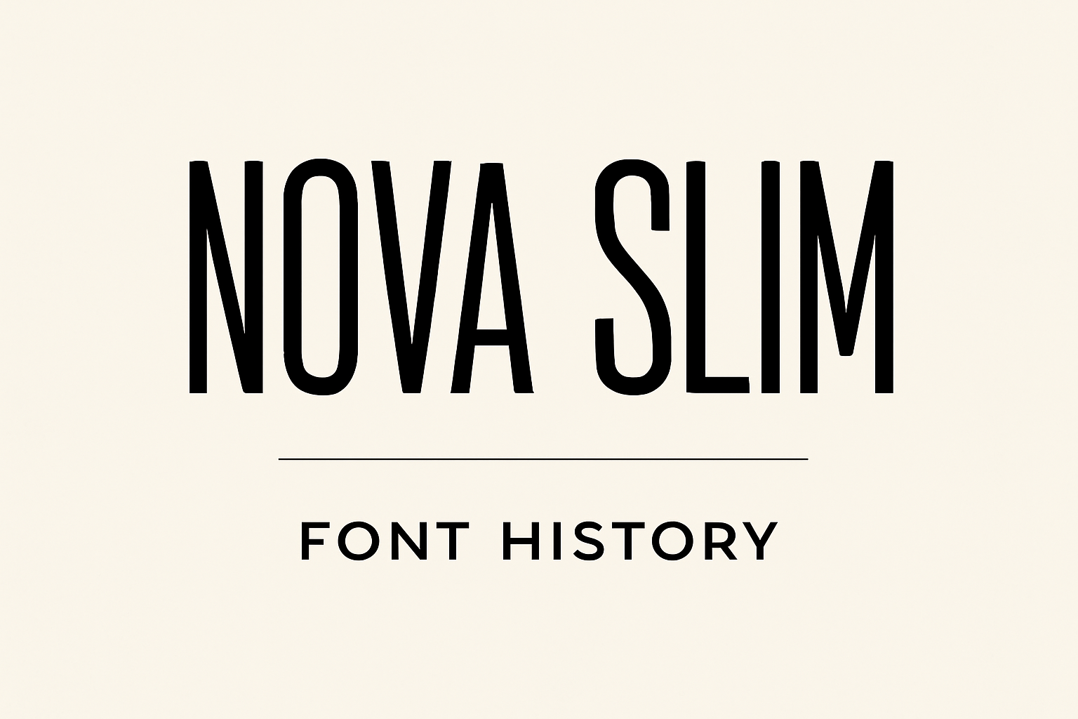
Origins of Nova Slim
Nova Slim is a modern sans-serif typeface known for its narrow and elongated look. Designed by Wojciech Kalinowski, it stems from a rich history of font evolution, shaped by the designer’s background and motivation for creating clean and sleek typography.
Creator Background
Wojciech Kalinowski is a gifted typeface designer who contributed significantly to the world of fonts. His expertise lies in crafting clean and minimalistic designs. Before creating Nova Slim, he developed a font called NovaCut about 14-15 years ago, originally used for inscriptions on stone. His journey in font design demonstrates a strong passion for blending traditional art with modern digital formats.
Inspiration for the Design
Kalinowski found inspiration in creating a font that seamlessly combines elegance with simplicity. He envisioned a typeface featuring thin lines and minimalistic details that suit both personal and commercial use. This led to the birth of Nova Slim, where the elongated letterforms offer a sleek and modern appearance. The font stands out in the Nova family, reflecting Kalinowski’s desire for aesthetic harmony and utility.
Initial Release and Adoption
Nova Slim was first made available when Kalinowski decided to transfer his original design to the digital realm in 2010. The font was initially named Gothica and included lowercase letters and basic symbols. It is now freely available under the SIL Open Font License, which permits personal and commercial use. This accessibility has contributed to its popularity among designers who appreciate its stylish and functional design.
Design Characteristics
Nova Slim is known for its sleek and modern appearance, emphasized by narrow and elongated letterforms. This design choice influences its typography, unique styling, and readability. Such features make Nova Slim a versatile typeface choice for various scenarios.
Typography and Geometry
Nova Slim’s typography is defined by thin lines and minimalistic details. The font’s geometric shape gives it a clean and structured look. It embodies a sans-serif style, embracing simplicity with its straight lines and limited decorative elements. The proportions of each character are carefully balanced, contributing to its overall sleekness.
This geometry makes it stand out, providing a modern touch that can enhance contemporary designs.
Unique Letterforms and Styling
The distinctive feature of Nova Slim is its narrow and elongated letterforms. These unique shapes give the font a stylish edge, allowing it to capture attention easily. The letterforms are carefully crafted, showing both elegance and clarity.
This styling aligns with modern design trends, making it ideal for use in branding or logos where a fresh look is desired. Its sleek styling adds a sophisticated flair without detracting from its readability.
Readability and Usage Scenarios
Despite its unique and slender design, Nova Slim maintains excellent readability. The thin lines and clear shapes ensure that text remains legible even at smaller sizes. This makes it suitable for both print and digital applications.
Its modern and minimalistic style works well for headlines, posters, and advertisements. While it shines in display settings, its readability ensures it can also be used effectively in body text when paired with compatible fonts, broadening its potential usage scenarios.
Evolution Over Time
Over the years, the Nova Slim font has undergone significant changes that have refined its style and expanded its versatility. The design itself has been updated, the family has been broadened, and advancements in technology have played a role.
Major Updates and Revisions
Nova Slim started as a simple design, focusing on capital letters and numbers. Initially, its creation was intended for stone inscriptions, which gave it a distinct and bold appearance.
Later on, as the font was transferred to a digital format, designers expanded it to include lowercase letters and basic symbols. These updates have allowed Nova Slim to become more versatile, appealing to a larger audience.
Changes made over the years have improved its functionality while preserving its original charm.
Expansion of the Nova Slim Family
The Nova Slim family has grown beyond its initial design, including variations that cater to different aesthetic needs. This expansion allows designers to choose from a range of styles, from narrow to more bold versions.
Different weights and styles have been introduced to the family. This has made it possible to use Nova Slim in a variety of contexts and applications. Designers now have greater flexibility when incorporating Nova Slim into projects.
It retains its distinct characteristics while adapting to modern design needs.
Technological Advancements Influence
The transition of Nova Slim from paper and stone to digital was a turning point. With the rise of software tools and digital design platforms, the font has benefited from increased precision and customization.
Technological advancements have also enabled the font’s use in various digital media formats, making it accessible across platforms.
As technology continues to advance, the potential for Nova Slim to evolve further increases. The font remains relevant, embracing both its historical roots and the possibilities of the digital age.
Usage and Applications
Nova Slim is a versatile typeface favored for its sleek look and modern style. This font shines in both digital and print settings, offering a unique aesthetic that stands out. It is also important to consider licensing options and how accessible this font is for various uses.
Popular Brands and Campaigns
Nova Slim has been adopted by various brands seeking a contemporary and minimalistic look. Companies use it in advertising campaigns to create stylish and sophisticated visuals. The narrow lines and elongated shapes of the font make it perfect for luxury and technology brands. It provides a clean and elegant appearance that can effectively communicate a modern brand image.
Digital vs. Print Environments
In the digital realm, Nova Slim is well-suited to web design, especially in places where space efficiency is important. Its slim design helps in preserving space without sacrificing readability. In print, the typeface can be used on posters, flyers, and packaging. The clear and simple lines make it easy to read and appealing in both small and large sizes.
Licensing and Accessibility
Nova Slim is available through platforms like Google Fonts, making it accessible for both personal and commercial use. Users should check the licensing details to ensure compliance with use cases. Its availability on popular font libraries ensures that designers can easily include it in projects without extensive legal concerns, enhancing its usability.
Reception and Critiques
Nova Slim has garnered attention for its distinct style, marked by narrow and elongated letterforms. The font’s design has evoked varied responses from the design community, while its place among contemporary fonts has been a topic of discussion.
Design Community Feedback
Designers appreciate Nova Slim for its unique and modern look. Many feel that its slim and narrow characters offer a sleek appearance suitable for digital media. The font’s readability on screens has been praised, making it a favorite for web and app designers.
Some critics point out that the font’s unique shape makes it less versatile for print media. In specific contexts, its narrow style might not work as well with other fonts. Still, its distinct look often makes it stand out when applied correctly.
Comparison to Contemporary Fonts
When compared to other fonts, Nova Slim often stands out due to its slender and elongated letterforms. Similar sans-serif fonts might not capture the same level of elegance that Nova Slim offers. Its design is distinctive, making it a preferred choice in projects where a modern and chic appearance is desired.
However, some designers note that while Nova Slim fares well on digital platforms, it might not pair easily with some other popular fonts. Its niche appeal requires careful pairing. Design projects focusing on minimalism often benefit from including Nova Slim, as it adds a touch of sophistication.
Cultural Impact and Legacy
Nova Slim has made a mark in design with its clean, modern look. Designers admire the typeface for its narrow and elongated letterforms, which make it ideal for contemporary projects. This distinctive style contributes to visual storytelling, helping to create sleek and appealing designs.
The typeface is part of the bigger Nova family, which is known for its minimalistic details. Because of its unique design, Nova Slim is often used in branding, advertising, and web design, giving projects a fresh and stylish appearance. Its adaptiveness makes it perfect for companies looking to project a modern vibe.
By simplifying how text can be presented, Nova Slim has also influenced the way people approach digital typography. Its streamlined appearance makes it suitable for a wide range of applications, from logos to headlines. As a result, Nova Slim continues to shape design spaces, proving its lasting relevance in the world of typography.
Tutorials and Resources
Nova Slim is a popular choice for designers looking for a sleek and modern typeface. Understanding its features can enable more creative and effective use in projects, from digital media to print.
Learning to Use Nova Slim
For those new to Nova Slim, starting with tutorials is a great idea. Many online guides explain how to best use this font in different software programs. Websites like Fonts Ninja often have useful tips and detailed instructions.
Video platforms like YouTube offer tutorials that walk through using Nova Slim in design software. These videos can be especially helpful for visual learners who want to see Nova Slim in action.
Creative Projects Featuring Nova Slim
Nova Slim is often used in creative projects such as logos, websites, and digital art. Artists and designers share their work in online communities, showcasing how they’ve used the font to achieve clean, modern designs.
For inspiration, the Font Meme site showcases Nova Slim in various creative projects, from TV shows to book covers. This can provide ideas about different ways to use the font in personal or professional projects.