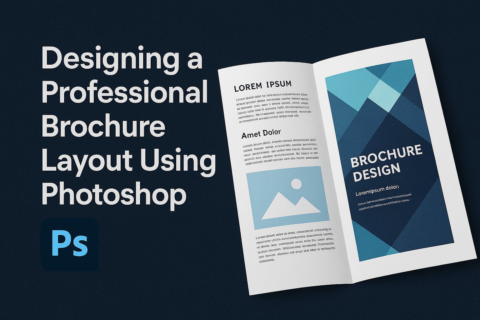
Creating a standout brochure can help a business make a strong impression. With the right tools, anyone can design a professional brochure that catches attention and shares important information clearly. Using Photoshop, designers can craft layouts that not only look appealing but also communicate effectively. Photoshop offers endless possibilities for creativity. Whether the brochure is …
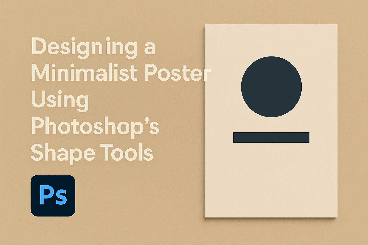
Creating minimalist posters using Photoshop’s shape tools can transform your design process and result in sleek, eye-catching visuals. Mastering minimalist design involves understanding how to use shapes and space effectively to draw viewers’ attention to what’s important. This approach emphasizes simplicity and focus, making it easier for the message to stand out. In this guide, …
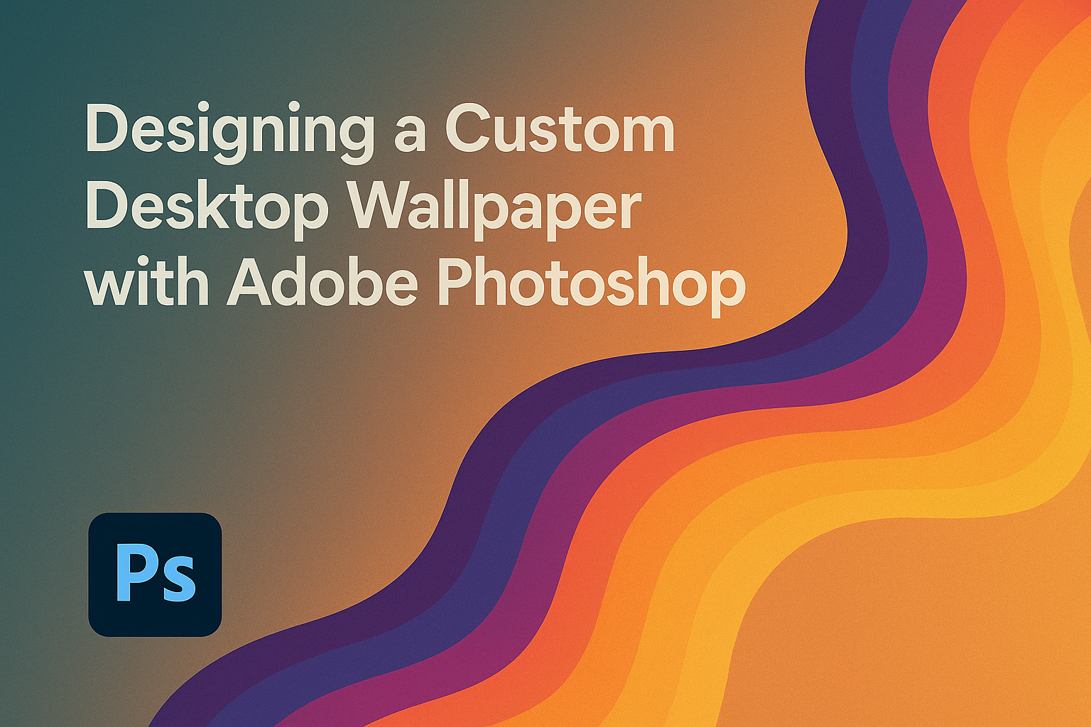
Creating a custom desktop wallpaper with Adobe Photoshop offers a personal touch to your computer screen. Instead of settling for generic designs, anyone can craft something unique that reflects their personality and style. By following a few simple steps, users can design a wallpaper that not only looks great but also showcases their creativity. Adobe …
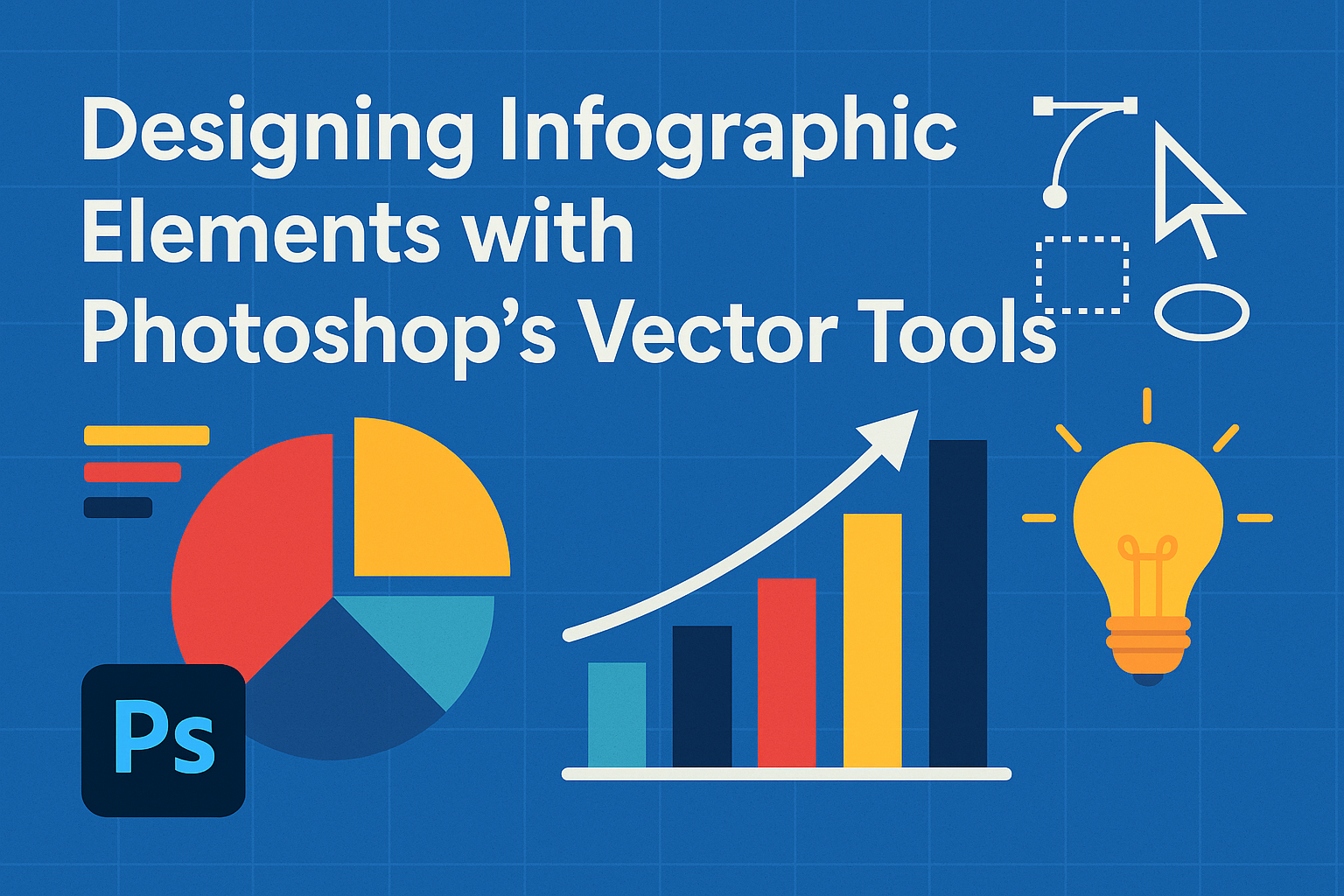
Photoshop offers a powerful toolkit for creating engaging infographics. One of its standout features is the ability to use vector tools to design scalable and precise elements. With Photoshop’s vector tools, designers can craft infographic elements that remain crisp and clear, no matter the size or resolution. Anyone interested in making professional-looking infographics will find …
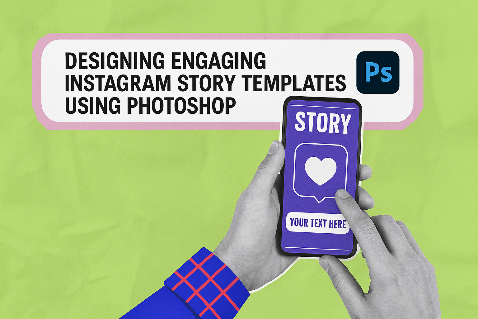
Creating captivating Instagram Stories can significantly boost audience engagement, and Adobe Photoshop offers powerful tools to design eye-catching templates. By using Photoshop, users can craft tailored and unique templates that stand out on social media. Whether you are new to Photoshop or an experienced designer, there are key techniques you can employ to enhance your …
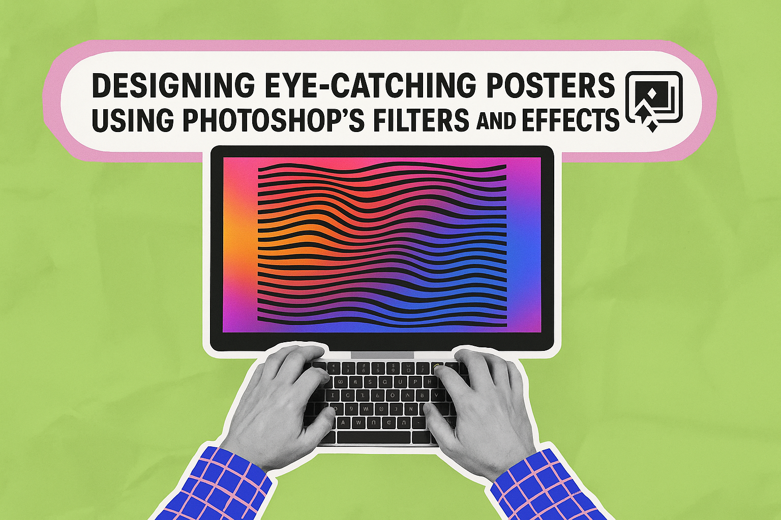
Creating posters that grab attention requires a blend of creativity and technical know-how. Photoshop provides a vast array of tools to help designers bring their ideas to life. Among these tools, Photoshop’s filters and effects stand out as powerful features to enhance visual impact. These features allow designers to add depth and dimension, making a …
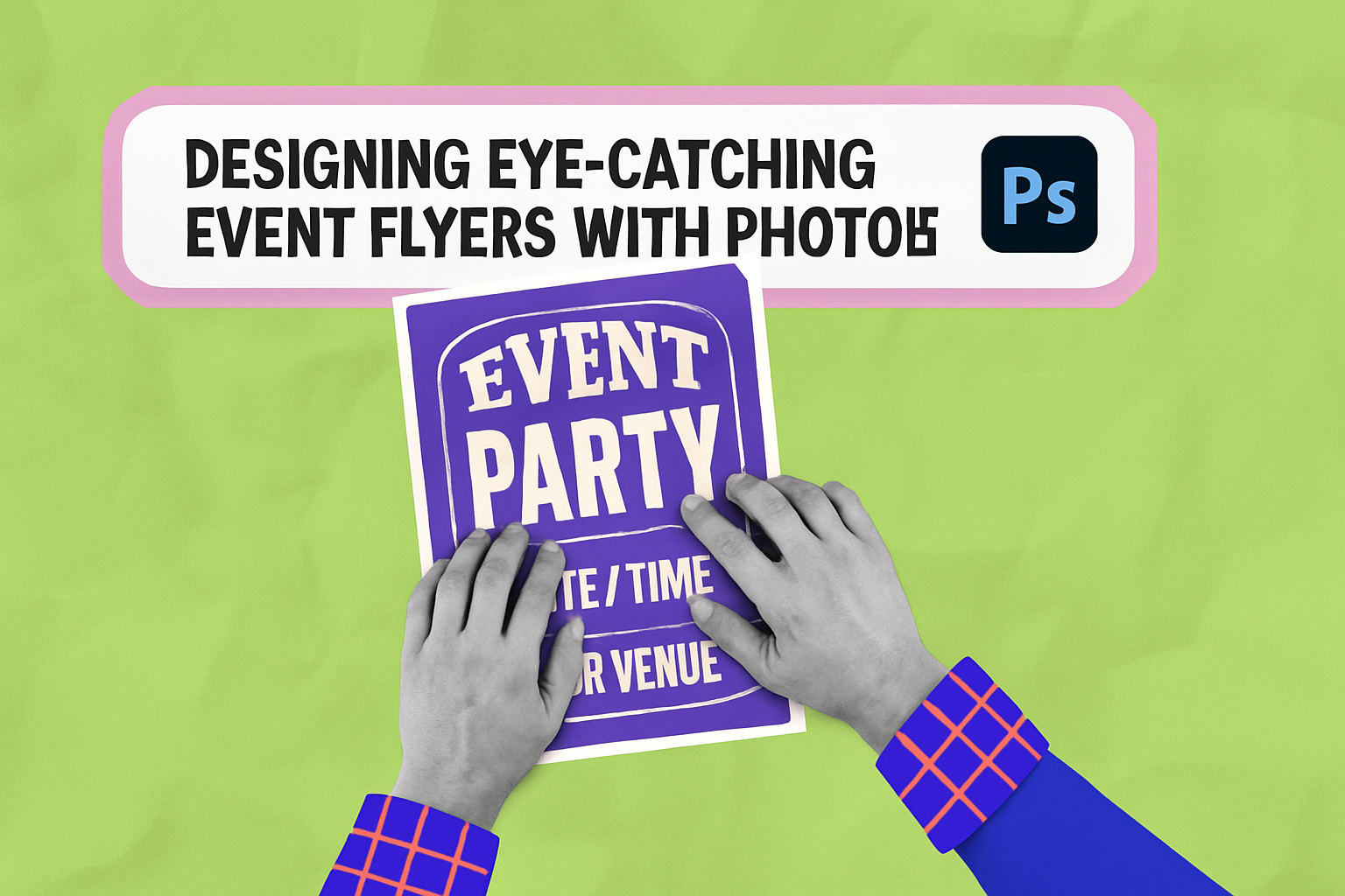
Creating an eye-catching event flyer can make a huge difference in drawing attendees to any event. With the powerful tools available in Adobe Photoshop, designing a flyer that stands out is within anyone’s reach. Using Photoshop, individuals can craft visually appealing flyers that capture attention and convey important event details. Photoshop offers countless features that …
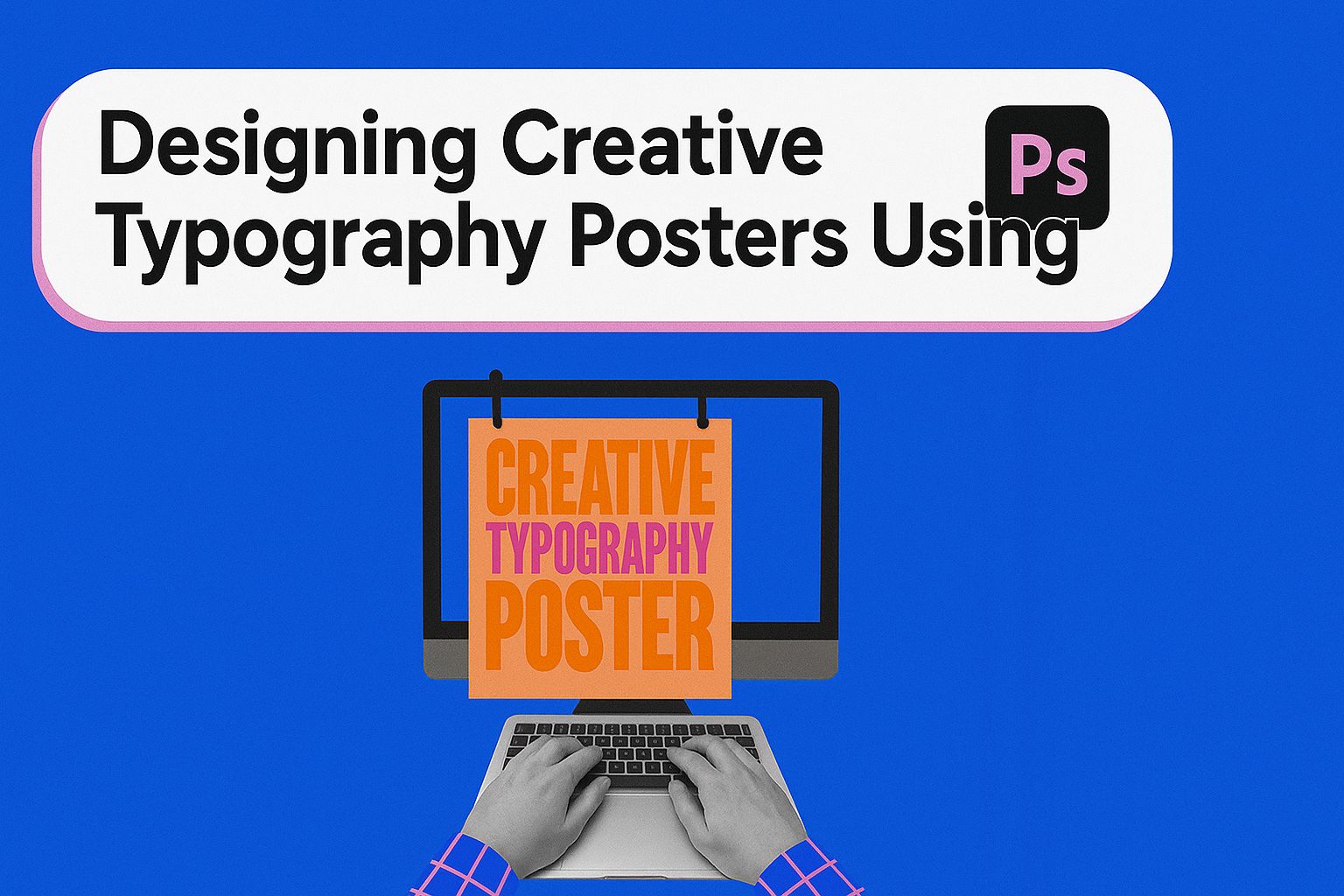
Creating eye-catching typography posters has become a popular way to express creativity and make a statement, whether for print or digital media. Adobe Photoshop is a valuable tool for artists and designers looking to craft unique and engaging designs. This article will guide readers through the essentials of designing captivating typography posters using Photoshop. Typography …
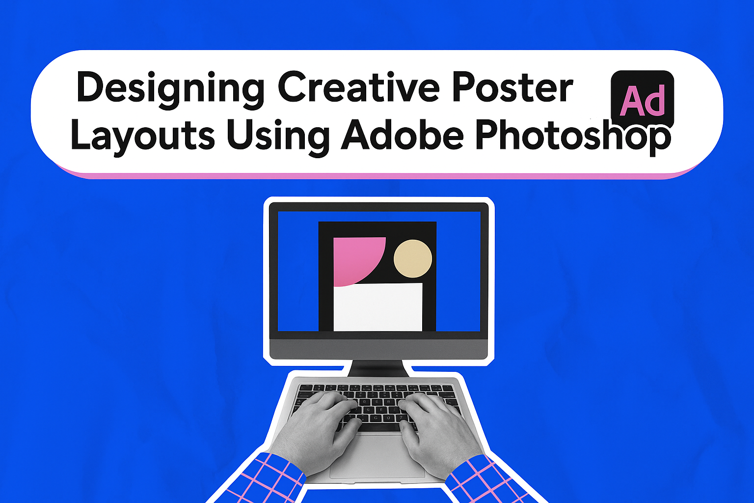
Designing creative poster layouts using Adobe Photoshop can transform a simple idea into a captivating piece of art. Posters are a powerful medium for expressing ideas, promoting events, or showcasing products. Adobe Photoshop offers a wide range of tools and techniques that make it easier to bring vibrant, eye-catching designs to life. Many resources are …
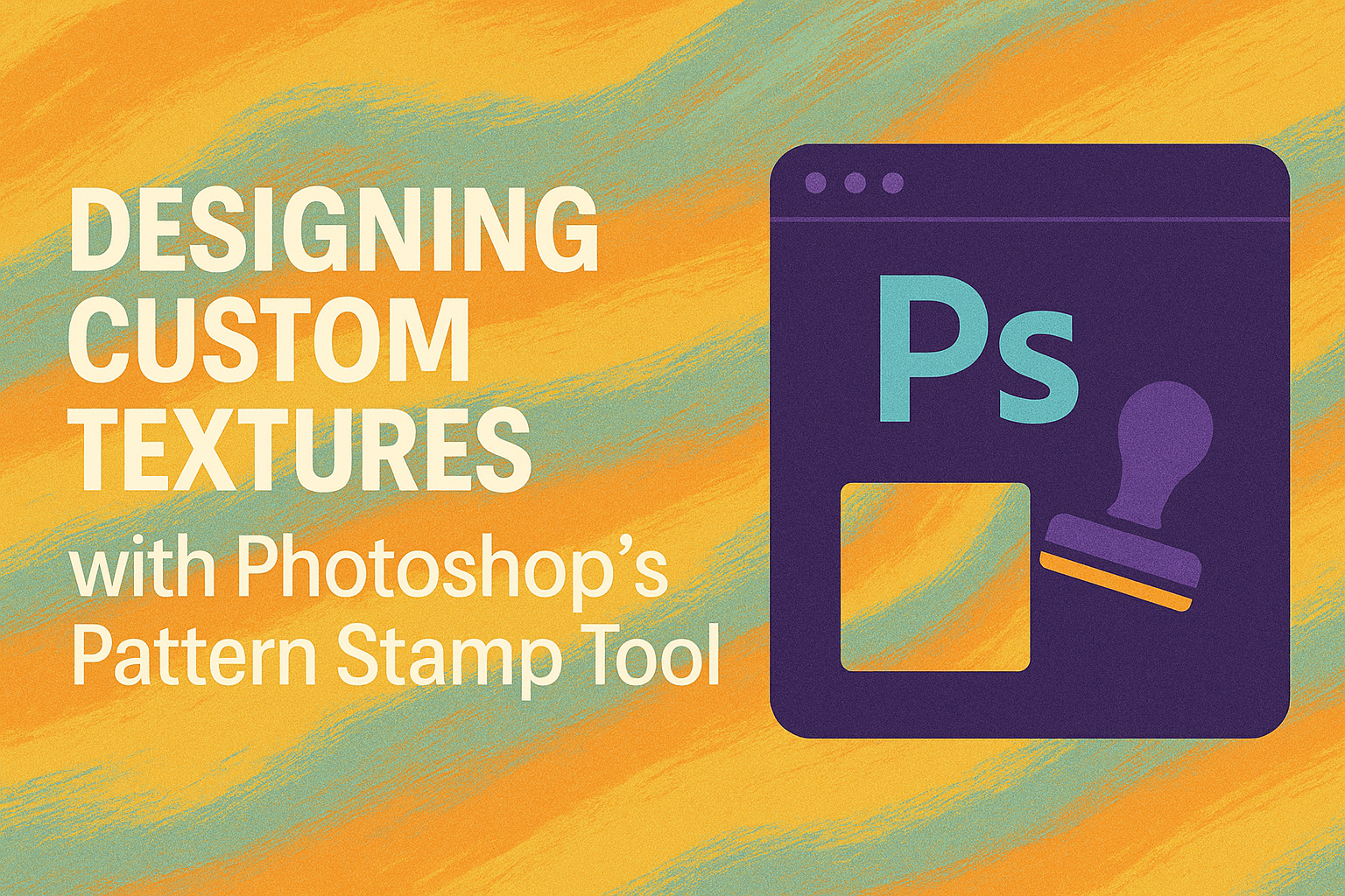
Photoshop offers powerful tools for creating unique designs, and the Pattern Stamp Tool is one of the most versatile for adding custom textures. This tool allows artists to paint textures and patterns onto images, offering endless possibilities for creativity. Beginners and professionals alike can achieve professional results by mastering the Pattern Stamp Tool. By choosing …