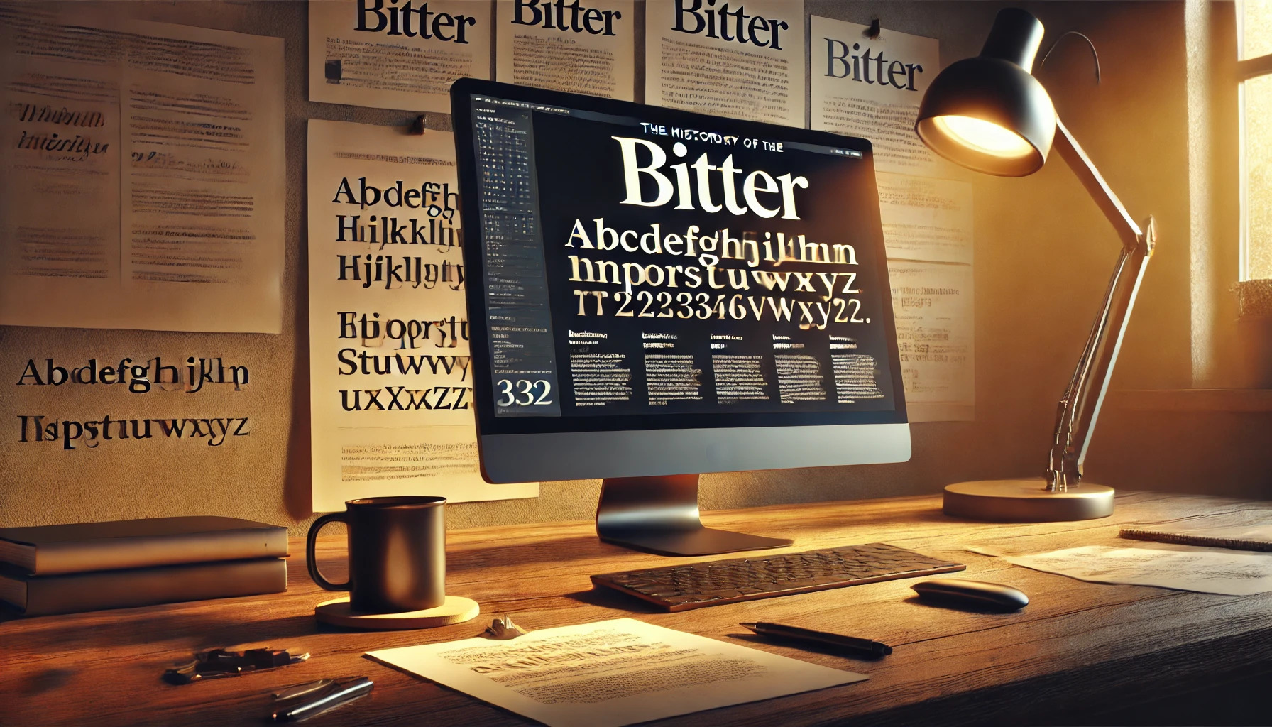
Bitter is a versatile slab serif font designed specifically for digital screens. Its large x-height and minimal contrast in stroke weight enhance readability, making it perfect for reading online. Designed by Sol Matas, Bitter is available in several styles, including regular, bold, and italic, catering to various digital needs.
The design of Bitter focuses on practicality and functionality rather than just aesthetics. This approach ensures a consistent texture and balanced spacing, qualities that make it suitable for a wide range of digital applications. One of its unique features is the thicker-than-usual regular style, which generates a striking look in paragraphs.
Readers and designers alike appreciate Bitter for its adaptability and clean visual appeal. Its thoughtful design details help maintain a smooth reading experience across different screen sizes, capturing the interests of both casual readers and professional typographers. The rising trend of digital media makes Bitter a valuable tool for anyone involved in content creation.
Origins of Bitter Font
The Bitter font was created with a focus on screen readability, drawing inspiration from traditional slab serif designs. Its development involved the expertise of a talented designer and was guided by a clear design philosophy. The font has made a mark in digital typography.
Creator’s Background
Sol Matas is the creative force behind the Bitter font. She is a skilled designer known for her ability to adapt traditional font styles for modern uses. Originally from Argentina, Sol has a strong foundation in graphic design, which she combines with an interest in technology. Her work often focuses on enhancing readability on digital screens, ensuring text is clear and pleasing to the eye. This background influenced her approach when designing Bitter, bringing a contemporary touch to classic typography elements.
Design Philosophy
Bitter was designed with the modern reader in mind. Sol Matas wanted to create a typeface that would perform well on digital screens. The font features large x-heights and subtle characteristics to improve legibility. The design is based on a pixel grid, making it ideal for web and digital use. The slab serif style, known for its sturdiness, adds a formal touch while maintaining readability. This thoughtfulness in design allows Bitter to be both functional and visually appealing for a wide range of digital applications, from articles to web interfaces.
Initial Release Date
Bitter was first introduced in the early 2010s. It became available under the SIL Open Font License, allowing wide usage and modification in both personal and commercial projects. This openness contributed to its quick adoption in digital projects around the world. The accessibility of Bitter as a free, open-source font made it a popular choice for designers looking for a robust and elegant typeface for digital environments. Its release marked a significant point in the evolution of fonts designed specifically for screen readability.
Typography and Features
Bitter is designed for a smooth reading experience, combining thick serifs with an optimized texture for digital displays. The following sections will cover its serif characteristics, readability factors, and available font variations.
Serif Type Characteristics
Bitter is a slab serif typeface, which means it has thick, block-like serifs. These serifs contribute to its sturdy and formal look. The serifs in Bitter are as thick as the strokes, providing a consistent and solid appearance. This design choice enhances the font’s readability, especially in longer texts, because it helps the eyes move smoothly from one character to the next.
The square terminals of Bitter’s serifs give it a modern feel while maintaining traditional elements of serif fonts. This blend of modern and classic styles makes it versatile for various design projects, from websites to printed materials. Overall, its serif characteristics offer both a distinctive look and practical readability.
Readability Factors
Bitter excels in on-screen readability due to its balanced texture and optimized spacing and kerning. This ensures clear and comfortable reading on digital devices, which is critical in today’s digital-first world. The consistent stroke weight helps in maintaining uniform appearance across paragraphs, reducing eye strain over long reading sessions.
The font is designed with excellent curve quality, contributing to smooth letterforms that are easy on the eye. It also includes ligatures, which connect certain letter combinations for improved visual flow. These features make Bitter perfect for reading online, where clear and accessible typography is essential.
Font Variations
Bitter offers multiple styles and weights, including regular, bold, and italic. These variations provide flexibility to creators, allowing them to use the font in different contexts like headings, body text, or quotes. The lighter styles, such as Thin and ExtraLight, work well for decorative texts or to create a subtle visual effect on a page.
Each style maintains Bitter’s core qualities, ensuring consistency across all documents. This range of weights and styles helps to emphasize content hierarchy, guiding the reader’s attention through different pieces of text. Whether used in an article or a web page, Bitter’s variations support diverse typographic needs.
Usage and Applications
Bitter is a slab serif font known for its clarity and readability on screens. Its design makes it ideal for various uses, from digital publications to brand identities.
Print Media Examples
Bitter’s distinct style and consistent stroke weight make it a great choice for printed materials. The thick regular style creates strong contrasts, ideal for books, brochures, and flyers. When used in print, Bitter often serves as body text or headings, providing a clean and professional appearance.
The font’s square terminals add a modern edge, making text both noticeable and easy to read. In addition to books and brochures, magazines and newspapers also benefit from Bitter’s balanced style, providing readers with a pleasant reading experience.
Digital Platforms
For digital applications, Bitter is highly valued for its screen optimization. It is designed with focused consideration for online readability, often used for websites and e-books. Bitter’s minimal contrast in stroke width ensures text is sharp and easily readable on various devices.
Its ability to support multiple languages makes it a favorite for global websites. The font’s balance between boldness and simplicity suits long text passages, enhancing the reader’s comfort and focus on screens.
Brand Identities
Bitter is often chosen for brand identities due to its versatility and strong presence. Companies looking for a reliable and professional look will find Bitter to be a suitable option. It balances modern digital design trends with classic serif features.
This font is an effective part of a corporate identity package, from logos to business cards and official documents. The refined elegance of Bitter provides brands with a cohesive and polished image, ensuring that their messaging remains clear and impactful.
Technical Aspects
Bitter is a versatile font featuring robust design elements and expanded compatibility. It supports various modern file types, provides a wide array of glyphs and ligatures, and offers extensive language support.
File Formats
Bitter can be used in different file formats, making it a flexible choice for digital projects. It supports common formats like OTF (OpenType Font) and TTF (TrueType Font), which ensure compatibility across different platforms and devices. OpenType is widely favored for its advanced typographic features. Additionally, Bitter may also be available in WOFF (Web Open Font Format), specifically crafted for web usage, optimizing file size without losing quality.
Glyphs and Ligatures
Bitter offers a rich assortment of glyphs and ligatures, enhancing its usability in typographic design. It includes numerous standard characters, punctuation marks, and math symbols. The font is designed with carefully crafted ligatures that improve readability and aesthetic appeal. This attention to detail in each glyph ensures a polished appearance, whether in headlines or body text. The consistent weight and form aid in creating a harmonious look, vital for professional digital layouts.
Language Support
Bitter provides extensive language support, catering to diverse linguistic needs. It includes a wide range of characters that support multiple languages, making it suitable for international communications. This attribute is particularly beneficial for global web and print projects, as it ensures text consistency across different alphabets and scripts. Bitter’s broad coverage of languages allows designers and developers to maintain uniform style without switching fonts, preserving a cohesive visual identity.
Evolution and Updates
Bitter has seen many changes, from its initial design to the present-day versions. This section explores the significant revisions, how the community has shaped this typeface, and the recent updates that enhance its usability.
Major Revisions
Bitter started as a serif font with a focus on screen readability. The earlier versions had a strong emphasis on maintaining consistent weight across the font, with an extended weight distribution adjustment. This update improved how the font appeared in digital formats, particularly on various screen sizes. A significant change was also the introduction of a new ‘Pro’ version, which included more Latin characters, small caps, and a wider range of symbols for increased versatility.
Another important revision was making the Regular style thicker than usual, leading to a unique visual texture. This decision aimed to create a rich color in paragraphs and enhance the aesthetic appearance on digital platforms, ensuring that the font retains its characteristic style even as trends in digital presentation evolve.
Community Feedback
Feedback from the design community has been crucial in shaping Bitter’s evolution. Users of the font, from graphic designers to web developers, have provided valuable insights. Their input has led to the development of Bitter Pro, which includes features that enhance readability and broaden its appeal across different platforms.
Community interest in enhancing readability led to the development of features such as large x-heights and optimized spacing. This increased the font’s functionality for on-screen usage and supported a diverse range of projects. The feedback loop with the community remains an essential part of Bitter’s ongoing development, allowing room for further updates and alterations based on real-world applications.
Recent Changes
Recent updates to Bitter focus on broadening its usability in today’s digital landscape. The addition of new weights such as bold and italic, along with improved kerning and spacing settings, ensure that the font adapts well to modern design requirements. It offers a balanced texture suitable for different digital applications.
Adjustments in these areas respond directly to the needs of modern designers. These changes help maintain Bitter’s relevance and effectiveness in diverse uses, offering not just aesthetic appeal but also functional superiority. The recent projects show how the font has adapted to the latest technological advancements while retaining its original charm and utility.
Cultural Impact
The Bitter font holds a significant place in the design world due to its unique style and history. Its cultural impact can be observed through its presence in exhibitions, scholarly research, and popularity.
Inclusion in Design Exhibitions
Bitter has been featured in various design exhibitions that celebrate typography. Its thick strokes and distinct serifs make it a favorite among designers. These exhibitions showcase its versatility in different media. Exhibitions highlight how Bitter’s style can adapt to both traditional print and digital formats. Using it in design shows helps the font gain recognition and appreciation from a diverse audience. Designers often display projects that demonstrate Bitter’s impact, emphasizing its role in modern design.
Academic Studies
Academic research often explores Bitter for its unique characteristics. Scholars analyze its stroke weight and square terminals for their role in readability experiments. Studies focus on how Bitter compares to other serif fonts in terms of visual aesthetics and legibility. These analyses often include comparisons with other fonts like Baskerville, known for its credibility in communication. Researchers discuss Bitter’s ability to balance classic elements with modern functionality, enhancing its reputation in academic circles.
Popularity Metrics
Bitter’s popularity has steadily increased due to its adaptability and uniqueness. Its thicker style appeals to designers looking for robust fonts that stand out. The font’s use in various media and platforms contributes to its growing presence. Bitter’s popularity can also be measured by downloads from font libraries, where users seek fonts that blend tradition with modern design. Its recognition among designers reflects its success in meeting diverse design needs.
The font’s impact goes beyond mere numbers. Bitter continues to influence modern typography, becoming a go-to choice for many professionals. Its role in shaping modern styles highlights its importance in contemporary design.
Accessing Bitter Font
Bitter is a versatile font choice available through several platforms and licensed for various uses. These include websites like Google Fonts and Adobe Fonts, which provide different options depending on user needs.
Official Distribution Channels
Bitter is accessible through popular font distribution websites. One of the main sources is Google Fonts, where users can download and use it for free. This platform makes it easy to integrate Bitter into web projects directly or download it for offline use.
Adobe Fonts also offers Bitter, making it a convenient choice for those already using Adobe’s Creative Cloud. On these platforms, users can choose from multiple font styles, enhancing design flexibility. CSS Font Stack provides guidance on incorporating Bitter into web design projects.
Licensing Options
The Bitter font is distributed under the SIL Open Font License (OFL). This license allows for extensive flexibility in use. Users can freely use, modify, and share the font without incurring costs. It supports both personal and commercial applications, which is beneficial for a range of projects.
With this license, users can even alter the font’s design to suit specific needs. This makes Bitter a great choice for designers and developers seeking customizable, open-source fonts. Its licensing terms encourage creativity while providing legal clarity.