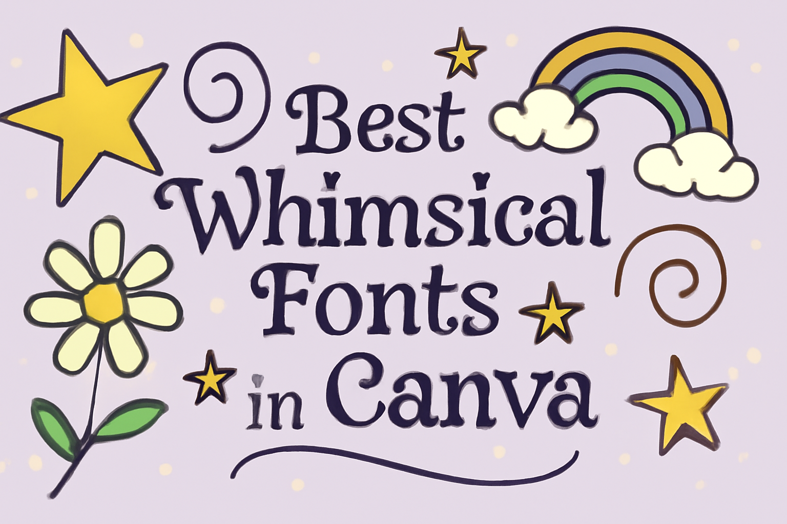
Finding the right font can truly enhance any design project.
When it comes to adding a touch of fun and creativity, whimsical fonts are an excellent choice in Canva. These fonts not only catch the eye but also bring a playful spirit to various designs, making them perfect for personal projects or professional branding.
From bold and quirky styles to elegant handwritten looks, Canva offers a range of whimsical fonts that can fit any aesthetic.
Designers can easily find options that suit children’s book covers, party invitations, or even social media graphics.
With so many choices available, it’s easy to transform ordinary text into something magical.
This blog post will explore some of the best whimsical fonts in Canva. Readers will uncover unique options to enhance their designs and inspire creativity in their projects. Whether looking for something energetic or charmingly elegant, this guide has them covered.
Unveiling Canva’s Whimsical Font Wonderland
Canva offers a vibrant selection of whimsical fonts that spark creativity. These fonts have a playful charm that makes designs feel more personal and engaging.
Individuals can enhance their projects with fun and unique typography.
Why Whimsical Fonts Capture Our Imagination
Whimsical fonts stand out because they evoke emotions. They are often inspired by childhood, fairy tales, and creativity.
Their quirky shapes and playful styles tap into nostalgia. This brings an inviting feel to designs, making them memorable.
Using whimsical fonts can set the tone for various projects, from children’s books to festive invitations.
For example, Comic Sans is widely recognized for its friendly appearance. Meanwhile, fonts like Bangers add energy with their bold, rounded letters.
When selected thoughtfully, these fonts enhance storytelling. They draw attention and keep audiences engaged, turning simple text into eye-catching visuals.
The Secret Sauce of Canva
Canva makes it easy to explore whimsical fonts by offering a user-friendly interface.
Users can quickly browse a rich variety of fonts, many of which are free. The platform allows for easy filtering, making it simple to find the perfect font for any project.
Additionally, Canva supports customization. Users can adjust sizes, colors, and styles to match their designs.
This flexibility helps create unique text that aligns with any theme.
Canva’s unique collection includes fonts like Amatic SC, known for its hand-drawn style. This font is perfect for casual designs. With these tools, anyone can unleash their creativity and craft visually appealing projects.
Crafting Your Story with Fonts
Fonts play a crucial role in storytelling by enhancing the mood and message. Choosing the right font can transform the way an audience perceives the content.
Here are some key factors to consider when crafting a visual narrative with fonts.
Matching Mood to Message
Selecting a font that matches the mood of the message is essential.
For example, whimsical fonts like Freckle Face add a sense of playfulness to designs. In contrast, elegant scripts such as Parisienne evoke sophistication.
When designing, consider using a list to organize font choices by mood:
- Playful: Freckle Face, Comic Sans
- Elegant: Parisienne, Great Vibes
- Retro: Brush Script, Pacifico
This matching helps in effectively conveying the intended emotion and can capture the audience’s attention.
Combining Fonts for Dramatic Effect
Combining different fonts can create visual interest and emphasize key messages.
A good approach is to use a serif font for headings and a sans-serif font for body text. This contrast enhances readability.
A successful combination often follows general guidelines:
- Limit to Two or Three Fonts: Too many can be distracting.
- Differentiate Styles: Mix serif with sans-serif for balance.
- Consider Hierarchy: Use size and style changes to guide the reader’s eye.
For example, pairing a whimsical font with a bold sans-serif can produce a vibrant design perfect for a fun announcement or creative project.
Knowing Your Audience
Understanding the audience is fundamental in font selection. Different groups respond to different styles.
A more youthful audience may appreciate fun and colorful fonts, while a professional audience might prefer clean, traditional choices.
Consider creating a survey to gauge preferences, focusing on font styles. Using the insights gained, designers can tailor their work to resonate with specific groups, ensuring the content engages effectively.
By knowing who will view the work, fonts can be selected to maximize impact and connection.
Top Picks for Whimsical Fonts in Canva
Choosing the right whimsical font can add a fun touch to any design. In this section, specific fonts are highlighted along with their unique qualities to help make the right choice.
Font Showcase and Mini Reviews
-
Comic Sans
This font is well-known for its friendly, handwritten style. It’s a great choice for casual projects, especially those aimed at kids. Comic Sans works well in invitations or playful posters. -
Bangers
Bangers has a bold and rounded appearance. It is perfect for headlines and adds energy to any design. This font is great for kids’ events or playful social media posts. -
Caveat Brush
With its brush script style, Caveat Brush brings spontaneity to designs. It shines in titles or quotes, making them stand out with a lively feel. -
Megrim
This whimsical sans-serif font features irregular letterforms. It’s suited for artistic projects and adds creativity to any text.
Personalizing Your Choices
When selecting a whimsical font, consider the project’s audience and purpose.
For instance, a playful font like Comic Sans suits children’s content. For more elegant designs, Caveat Brush offers a good balance of whimsy and style.
Testing different fonts helps in choosing the best fit. Canva allows users to preview how text looks with various styles and sizes. Adjusting color and spacing can enhance the whimsical effect.
Using whimsical fonts can bring joy to designs. It’s important to keep readability in mind while ensuring the text aligns with the design theme.
Tips and Tricks for Font Pairing
Finding the right font pairings is essential for creating engaging designs. The right combination enhances the message and improves readability. Here are some helpful tips to ensure effective font pairings.
Creating Harmony
To create harmony in font pairings, it is important to choose fonts with similar styles or moods.
For example, combining a script font with a sans-serif font can create a balanced and pleasing look.
One effective method is to use contrast. A bold heading paired with a lighter body font can draw attention. A good rule is to use fonts from the same family to maintain consistency.
Another approach is to limit the number of fonts. Stick to two or three fonts to avoid clutter. This keeps the design focused and makes it easier for the audience to read the text.
Testing font combinations on a design tool like Canva can help visualize how they work together.
Avoiding Common Pitfalls
When pairing fonts, avoiding certain mistakes can make a big difference.
One common issue is choosing fonts that are too similar. This can confuse the reader and weaken the design’s impact.
In addition, clashing fonts should be avoided. For example, pairing a modern sans-serif font with a decorative serif font can create a chaotic feel.
It’s also crucial to consider readability. Using overly decorative fonts in body text can make it hard to read. Always test text at various sizes to ensure clarity.
Finally, paying attention to spacing and alignment helps create a clean and organized look. Correct spacing between lines and letters can enhance overall presentation.
Designing with Accessibility in Mind
Creating designs that are accessible ensures that everyone can enjoy the content. By focusing on legibility and thoughtful color choices, designers can make their work more inclusive.
Legibility Over Style
When choosing fonts, legibility should come before style.
This means selecting fonts that are clear and easy to read. Sans-serif fonts like Arial, Helvetica, or Roboto are great options. They typically have clean lines that make text more readable on screens.
It’s important to consider font size as well. A minimum of 12-14 points is advisable for most text.
Additionally, spacing between letters and words plays a crucial role. Adequate letter spacing can reduce confusion for readers, especially for those with dyslexia.
Incorporating line height of at least 1.5 times the font size can also improve readability.
Color Choices That Work
Color is essential in design, but it must be used wisely to ensure accessibility.
High-contrast combinations, like black text on a white background, are most readable. Avoid color schemes that can cause strain, such as light text on a light background.
Using colors with proper contrast ratios helps those with visual impairments. Tools like the Web Content Accessibility Guidelines (WCAG) can assist in checking color combinations.
It’s also helpful to avoid using color alone to convey information. Adding patterns or labels can enhance clarity and inclusivity.
Maximizing Canva’s Features
Canva offers many tools that can help users create stunning designs. By effectively using templates and customization tools, anyone can enhance their projects and bring their ideas to life.
Utilizing Templates
Canva provides a variety of pre-made templates for different projects. Users can find templates for social media posts, flyers, and presentations. This saves time and ensures a professional look.
To use a template, they can simply choose one that fits their style.
After selecting a template, it is easy to customize colors, fonts, and images. The templates are designed with various themes, such as whimsical, formal, or playful.
This allows for more creativity. Users can mix and match elements from different templates to create something unique. By starting with a solid foundation, they can focus on making their designs stand out without starting from scratch.
Exploring Customization Tools
Canva’s customization tools allow users to personalize their designs further.
Once they choose a template, they can adjust elements like size, color, and layout.
Here are some key tools to explore:
- Text Features: Change font styles and sizes, or add effects like shadows.
- Image Editor: Adjust brightness, contrast, and filters on images.
- Elements: Add shapes, icons, and lines to enhance the design.
Layers can be used to arrange elements in a desired order. Users can group items, align them, or even lock certain layers to avoid accidental changes.
This level of customization helps create a balance in the design, making it visually appealing.
With these tools, users can create designs that truly reflect their vision.
Inspiring Real-World Whimsical Font Applications
Whimsical fonts bring a fun and creative touch to various designs. They are especially useful in areas like invitations and branding. The right font can make a project stand out and connect with an audience in a unique way.
From Invitations to Branding
Whimsical fonts are perfect for invitations and branding. They add personality and flair to any design.
For event invitations, fonts like Bangers and Comic Sans create a playful vibe. They work well for birthday parties, baby showers, and casual weddings. Fonts with a handwritten feel can also make invitations feel more personal.
In branding, companies often use whimsical fonts to attract a younger audience. For instance, a child-focused brand might use Amatic SC or Megrim. These fonts echo playfulness and creativity, making products memorable.
User-Created Design Spotlight
Many Canva users showcase their creativity through whimsical font combinations.
By using unique fonts alongside bright colors and fun illustrations, they make eye-catching designs.
For instance, a recent project featured Kingred Youth paired with vibrant graphics. The result was a striking poster for a local festival.
Users often post their designs on social media, inspiring others to experiment.
Another example is the use of fonts like Tan Meringue for blog headers.
They create an inviting and friendly atmosphere for readers. This makes content more engaging and encourages people to read more.