Psychedelic fonts can add a vibrant touch to any design project. These lively and unique typefaces are inspired by colorful art and the free spirit of the 1960s and 70s.
These fonts are perfect for making bold statements in banners, social media posts, and personal projects.
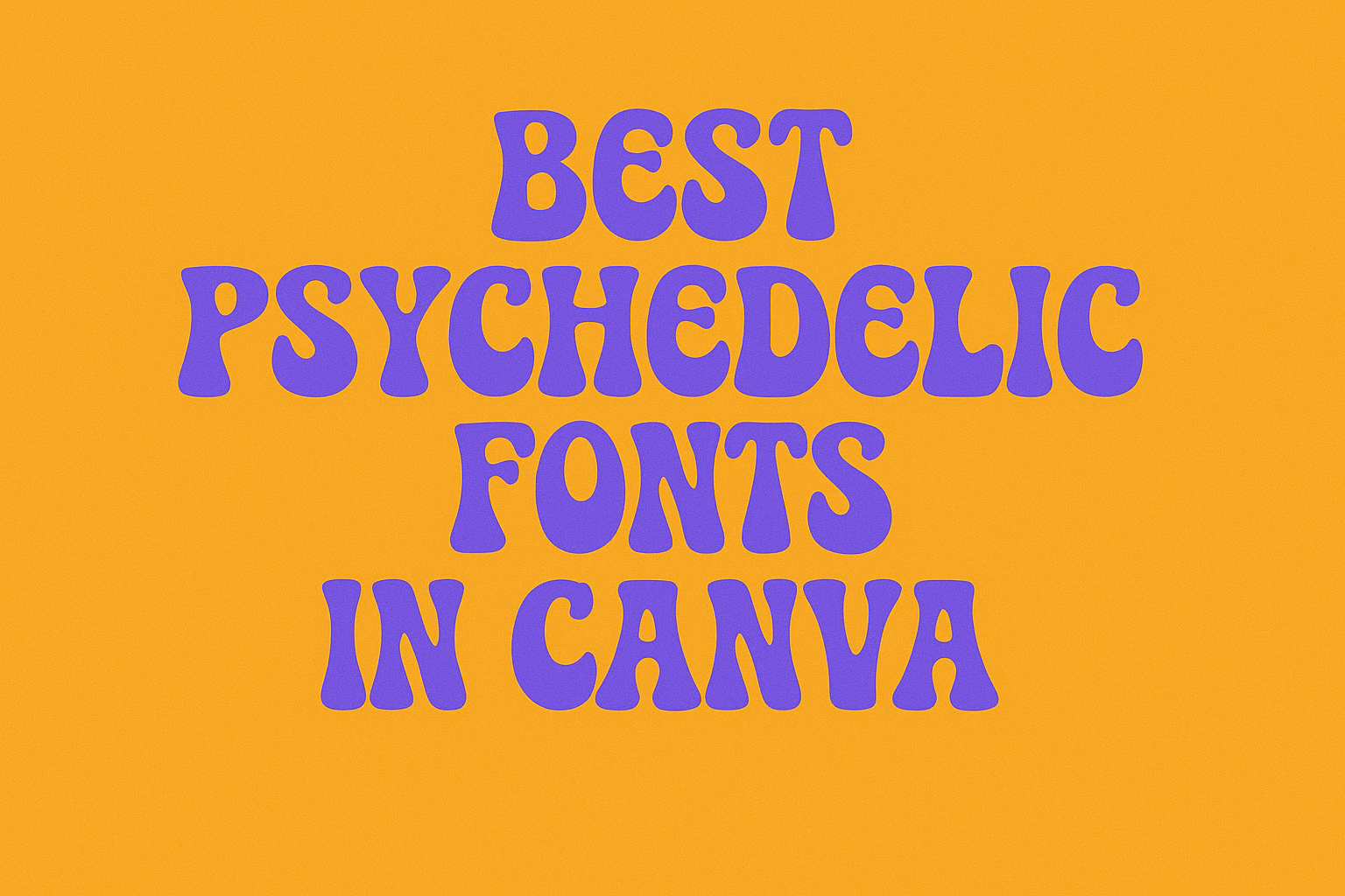
Canva offers a fantastic selection of psychedelic fonts that can help unleash creativity. From wavy styles to playful designs, these fonts bring energy and fun to any text.
Designers looking to capture attention will find that using these stunning fonts makes their work stand out.
In a world where visuals matter more than ever, choosing the right font is crucial. Psychedelic fonts not only add flair but also convey a message of freedom and creativity. This article will explore the best psychedelic fonts available in Canva and show how they can enhance any design.
What Are Psychedelic Fonts?
Psychedelic fonts are a unique style of typography that captures a sense of creativity and vibrant expression. They draw inspiration from art movements and cultural themes that emphasize fun, color, and imaginative designs.
Understanding these fonts involves looking into their history and identifying their key characteristics.
History and Origins
Psychedelic fonts emerged in the 1960s alongside the counterculture movement. This period was marked by a rise in experimental art, music, and social change.
Graphic designers influenced by the psychedelic scene began creating fonts that reflected the bold visuals of poster art from that era. These fonts were often seen in concert posters, album covers, and various art forms linked to the hippie lifestyle.
The playful, swirling designs communicated a sense of freedom and altered perception, correlating with the themes of love and peace prevalent in the culture.
Characteristics
Psychedelic fonts are known for their striking and often whimsical styles. They typically feature:
- Bold Colors: Bright, vibrant hues that grab attention.
- Unique Shapes: Curving and twisting letterforms that seem to move.
- Layering Effects: Sometimes, multiple shadows or outlines add depth.
These fonts are designed to evoke emotion and imaginative thought. Because of their decorative nature, they work best for headlines or graphics where readability is less critical.
While they can be fun and retro, users should consider their application carefully. They shine in creative projects such as posters, album art, and social media graphics.
Finding the Best Psychedelic Fonts in Canva
Choosing the right psychedelic font in Canva can elevate any design. With many options available, making the best choice involves exploring Canva’s library and identifying popular psychedelic styles that stand out.
Navigating Canva’s Font Library
Canva offers a wide range of fonts, including unique psychedelic styles. To find these, users can access the font library by clicking on the text tool.
In the search bar, they can type keywords like “psychedelic” or “trippy.” This narrows down the choices.
Users can also filter results by style, popularity, or new additions. Experimenting with different font sizes and styles on sample text helps in visualizing how they fit the overall design.
Popular Psychedelic Fonts
Several fonts consistently attract attention for their psychedelic flair. Here are a few favorites:
- Lucid Dream: A bold font that captures a fun, 70s-inspired look, perfect for posters and greeting cards.
- Klose Slab: This serif font combines elegance with a modern twist, making it eye-catching yet readable.
- Bublest: Known for its whimsical design, it brings a playful touch to any project.
These fonts can be well-suited for headlines, logos, and other prominent text where readability can be a secondary priority.
Using Psychedelic Fonts in Your Designs
Psychedelic fonts can add a unique touch to any design. Understanding how to use these fonts effectively can elevate the overall impact. Here are some practical tips for typography and combining fonts to create beautiful designs.
Typography Tips
When using psychedelic fonts, readability is key. These fonts often feature intricate designs that can make text hard to read at smaller sizes.
It’s best to reserve them for headlines or focal points.
Choosing the right color scheme can enhance their effect. Bright colors work well but make sure there is enough contrast with the background.
For clearer communication, pair a psychedelic font with more traditional fonts for body text. This balance maintains the aesthetic while ensuring legibility.
Consider the space around the text. Ample white space can make the design less overwhelming and help the playful nature of psychedelic fonts shine through. Testing different sizes and placements can also help determine what works best.
Combining Fonts
Combining psychedelic fonts with simpler fonts can create dynamic designs.
One effective approach is to use the psychedelic font for headings and a clean sans-serif font for body text. This keeps the focus on essential information while the headline grabs attention.
When choosing combination fonts, aim for contrast in style. A decorative psychedelic font pairs well with a straightforward, no-frills typeface.
It’s important to limit the number of different fonts to two or three. Too many styles can confuse the viewer and dilute the psychedelic vibe.
Experiment with font weights and sizes when mixing styles. A bold psychedelic title can work well with normal weight text, creating a cohesive look.
Always remember to preview designs in different formats to ensure they communicate effectively.