Selecting the right font for a postcard can make all the difference in capturing the attention and conveying the message effectively. Canva offers a variety of fonts that designers and non-designers alike can use to create memorable and visually appealing postcards. The platform provides options ranging from elegant scripts to more rustic, textured styles that add character to any design.
When creating a postcard in Canva, one may consider fonts like Georgia for its readability and touch of elegance, suitable for a professional or classic look. Avenir, with its versatile sans-serif appeal, offers a contemporary feel perfect for modern designs. For a touch of sophistication, script fonts such as Shintia provide a classic and vintage vibe, ideal for invitations or boutique marketing. Each font choice sets the tone for the postcard, whether it’s for a business promotion, a personal event, or a special announcement.
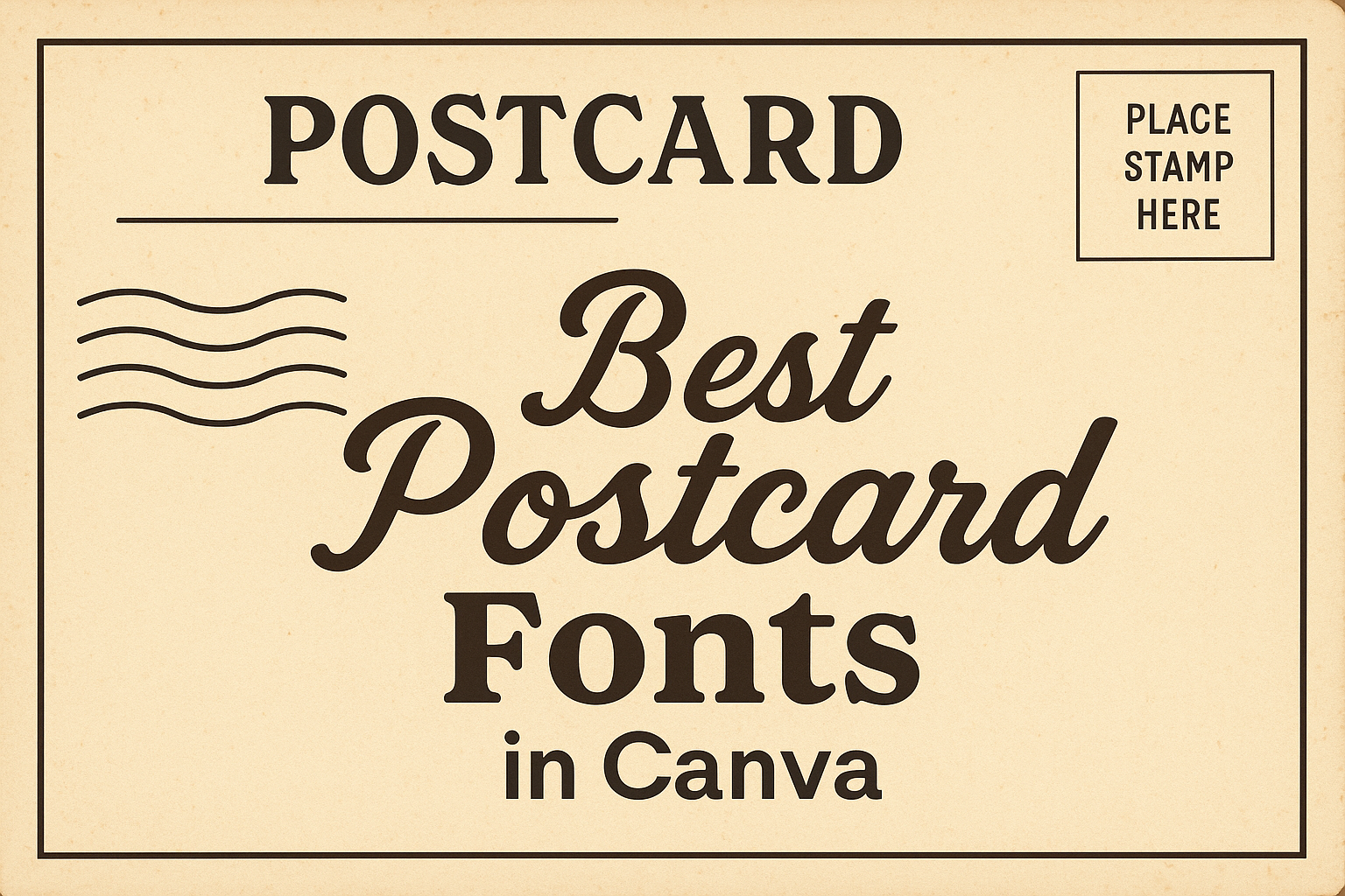
Understanding Typography in Postcard Design
Typography in postcard design plays a crucial role in conveying a message effectively and aesthetically. The right choice of font can evoke the appropriate emotional response, whether it’s nostalgia from a vacation or celebration from a saved date. They prioritize legibility—ensuring that the message is easy to read at a glance.
When selecting a font for a postcard, one should consider the following elements:
- Font Type: Serif fonts are often associated with professionalism and tradition, while sans-serif fonts offer a more modern and clean look.
- Size and Scaling: The font should be scaled appropriately for visibility. Postcards are typically small, so font size matters.
- Color and Contrast: The color of the font should have high contrast with the background for readability.
Below are some additional tips for typography in postcard design:
- Align the font style with the mood of the message.
- Balance the font with other design elements on the postcard.
- Utilize the space well, adjusting line-spacing and letter-spacing when necessary.
Incorporating these typography principles helps ensure the postcard’s design is not only eye-catching but also communicates the intended message clearly and memorably.
Top Serif Fonts for Postcards
In the realm of postcard design, the choice of serif fonts is crucial for setting the tone and conveying the message. They should know that serif fonts often bring a touch of sophistication or a traditional feel to their cards, depending on the style chosen.
Elegant Serifs for Formal Cards
For formal postcards, an elegant serif like Roxborough CF offers a modern yet timeless look. This font is perfect for conveying sophistication in wedding invitations or upscale event announcements. Lora is another excellent choice, as it combines the classic serif touch with an added flair for readability on screens and print, which can make any formal postcard stand out.
Traditional Serif Choices
When it comes to traditional serif fonts, Times New Roman remains a steadfast choice for its universal recognition and ease of reading. Georgia can also be used for its great legibility and slightly bolder character, which echoes the print of classic newspapers. They give postcards a more grounded and time-honored appearance.
Leading Sans-Serif Fonts for Postcards
Choosing the right font can significantly enhance a postcard’s visual appeal and readability. Sans-serif fonts give a clean and modern look, which is perfect for designs that require a fresh and uncluttered aesthetic.
Modern Sans-Serif Selections
Canva offers a selection of modern sans-serif fonts that are ideal for creating contemporary postcard designs. They ensure an up-to-date and stylish finish that resonates with today’s audience. Here are two notable picks:
- Century Gothic: Known for its geometric shapes and even weighting, Century Gothic is visually appealing for a variety of postcard themes.
- Verdana: Designed for clarity on screen, Verdana also translates well into print, offering excellent readability for postcard messages.
Classic Sans-Serif Options
For postcard designs that aim for timelessness, classic sans-serif fonts provide the necessary sophistication. These fonts are characterized by their enduring style and ultimate legibility. Below are two classic selections from Canva:
- Helvetica: An iconic font that spells professional and classic, Helvetica is universally appealing across various design projects.
- Arial: Often used as a Helvetica alternative, Arial is versatile and widely recognized, making it a safe choice for any postcard.
Decorative and Display Fonts for Impact
Selecting the right decorative or display font can turn a simple postcard into a memorable piece that captures the essence of the message and visually engages the receiver.
Bold Display Types
Bodoni FLF and Rockwell are top choices when it’s about making a statement. Bodoni FLF stands out with its bold, high-contrast characters that bring sophistication to headlines. In contrast, Rockwell offers sturdy and confident letterforms, perfect for titles that demand attention.
Quirky Decorative Scripts
For a touch of playfulness, Cinzel Decorative provides an ancient Rome inspired typeface with distinctive stylings. It effortlessly blends the traditional with the modern. Additionally, Julius Sans One offers clean, uniform lines in a whimsical approach, ideal for postcards that require a hint of elegance without the formality.
Handwriting and Script Fonts for Personal Touch
Selecting the right font is crucial for creating a postcard with a personal touch. Handwriting and script fonts can add individuality and a sense of intimacy to your design.
Authentic Handwritten Looks
For those seeking a genuine handwritten appearance, Beautifully Delicious and Amsterdam offer an authentic feel. Their casual and unrefined edges resemble true penmanship, making them perfect for postcards that require a personal, approachable vibe.
- Beautifully Delicious: A casual, free-flowing font great for friendly notes.
- Amsterdam: Mimics natural handwriting with an easy, free-spirited style.
Sophisticated Script Fonts
In contrast, sophisticated script fonts like Great Vibes and Authenia provide a more refined touch. These fonts feature elegant strokes and a polished finish, ideal for formal or celebratory postcards where a touch of class is desired.
- Great Vibes: Offers fluid, connected letters with a touch of sophistication.
- Authenia: Resembles traditional calligraphy with its smooth and elegant form.
Combining Fonts for Design Harmony
When creating a postcard in Canva, the art of pairing fonts is crucial for achieving visual appeal and design harmony. The right font combinations can elevate the message and emotion intended for the recipient.
Pairing Techniques
In Canva, designers should choose fonts that complement each other’s style and weight. A common technique involves pairing a serif font with a sans-serif to blend traditional and modern feels. For example, League Spartan paired with Libre Baskerville creates a sophisticated match often used in design publications. Additionally, combining a playful script font like Yellowtail with a simple sans-serif such as Open Sans can lead to a dynamic and engaging design, suitable for creative postcards.
Balance and Contrast
To achieve balance, one must weigh the visual impact of each font against the other. Designers should consider font weight, size, and style. A font with a heavier weight like Anton can be effectively counterbalanced by a lighter font like Livvic Thin, ensuring the postcard’s text is readable yet aesthetically varied. Contrast, on the other hand, can be achieved through the use of distinct styles – for example, a modern font such as Open Sauce can serve well as a heading, while a neutral font like Aileron Regular works as body text, providing clear contrast and readability.
Font Size and Legibility Tips
When designing a postcard in Canva, one’s choice of font size is crucial for ensuring that the message is easily readable. A general rule is to use larger font sizes for headings and smaller ones for body text. However, even the body text should be large enough to read comfortably; this typically means not going below 8 points in size.
Here’s a quick reference for font sizes:
- Headings: 14-16 points
- Subheadings: 12 points
- Body Text: 8-12 points
In addition to size, the legibility of a font also depends on its structure. Sans-serif fonts, with their clear and straightforward lines, are often easier to read, especially at smaller sizes or from a distance. Fonts like ‘Zico Sans‘ and ‘Bree Serif‘ balance style with readability, making them excellent choices for postcard design.
Remember these key tips:
- Contrast is important; choose a font color that stands out against the background.
- For longer blocks of text, line spacing can greatly improve legibility. A good starting point is 120%-150% of the font size.
- Mixing fonts: If using multiple fonts, limit the selection to two or three to maintain a cohesive design.
Following these guidelines will help to create a visually appealing and legible postcard using Canva’s diverse typographic options.
Color Psychology in Font Selection
When selecting fonts for postcards in Canva, one must consider the color psychology behind each choice. Colors carry emotional weight and can significantly influence the recipient’s perception. Bold hues like red and orange can evoke strong emotions such as excitement or urgency, while cooler tones like blue or green tend to have a calming effect.
Incorporating color into fonts isn’t just about aesthetics; it’s about conveying the right message. For instance, italic pastel tones are often used for invitations or announcements, subtly implying softness and warmth. A designer should match the color of the font with the tone of the communication, ensuring a harmonious design.
Here’s a quick reference guide:
| Color | Emotion | Use Case |
|---|---|---|
| Red | Excitement | Sales, Urgent Announcements |
| Orange | Enthusiasm | Events, Informal Gatherings |
| Yellow | Optimism | Friendly Notices, Cheerful Posts |
| Green | Tranquility | Eco-friendly, Health-related |
| Blue | Trust | Corporate, Legal, Medical Fields |
| Purple | Creativity | Artistic, Children’s Events |
| Pink | Playfulness | Celebrations, Gender Reveals |
| Black | Sophistication | Formal Invitations, Luxury Brands |
| White | Purity | Weddings, Minimalist Designs |
One should carefully select font colors, keeping in mind that these associations are cultural and can vary across different regions and audiences. A designer’s thoughtful consideration of color psychology can enhance the communicative power of postcard fonts in Canva.
Licensing and Font Attribution in Canva
Canva provides users with a diverse range of fonts that can enhance the design of their postcards. When selecting fonts for commercial purposes, one should understand the licensing terms associated with their use. Every font used in Canva comes with a license, which grants the user certain rights and limitations.
Free Fonts:
- Users can access Free Content licenses at no cost.
- These fonts can be used across various designs without additional fees.
Pro Fonts:
- Pro Content licenses are included for users with a valid Canva subscription.
- Non-subscribers may acquire a license for these fonts by purchasing them.
License details ensure users respect copyrights associated with the fonts, with certain fonts potentially requiring attribution. Canva’s interface simplifies this process, automatically providing the correct licensing for the fonts as they are used in designs. Users are encouraged to check their project requirements against a font’s license to guarantee compliance.