Creating eye-catching designs is all about choosing the right fonts.
When it comes to adding a bit of adventure to your projects, pirate fonts can be just the thing you need.
Whether you’re designing a party invitation or a themed poster, pirate fonts can bring that touch of mystery and excitement.
Canva offers a variety of pirate-themed fonts that capture the essence of the high seas.
Fonts like Sailors and Pirata One are popular choices. These fonts use nautical elements that mimic the look of waves and ropes, adding an authentic pirate feel to your designs.
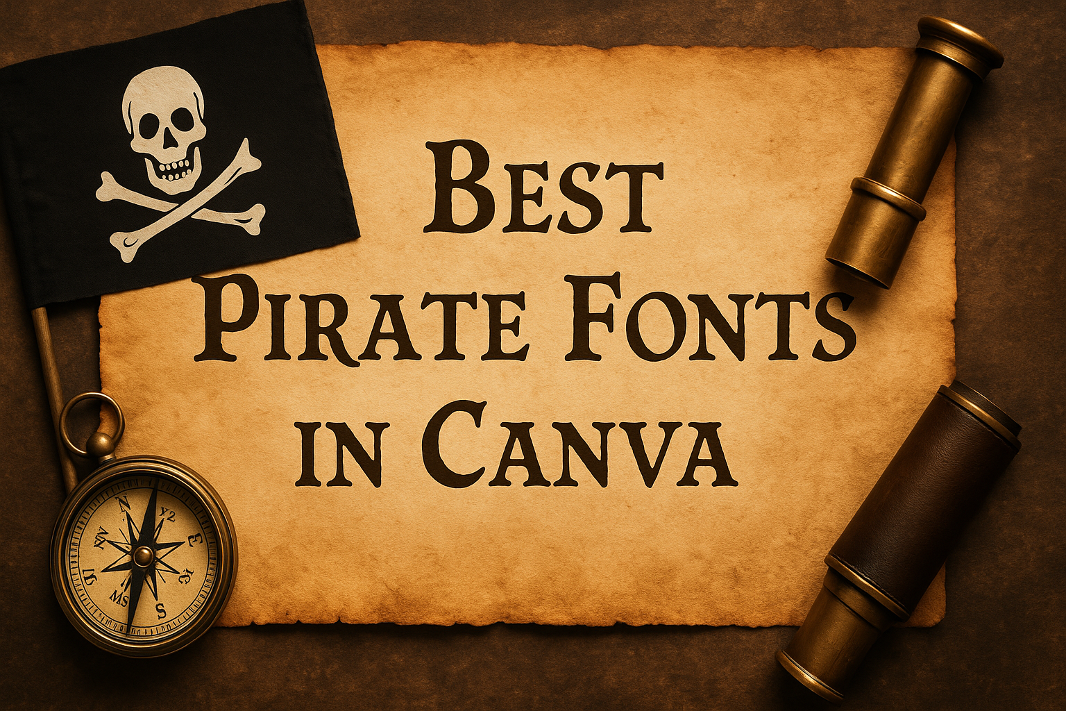
You can find more about these options through resources like the Best Pirate Fonts in Canva.
For those who love bold and dramatic fonts, options like Furius Title are ideal. This font, known for its sharp edges and striking appeal, creates a memorable impression, perfect for impactful headlines.
Explore how it can enhance your projects at 15 Pirate Fonts on Canva for Epic Adventure Posters.
What Are Pirate Fonts?
Pirate fonts are typefaces inspired by the adventurous and nautical themes associated with pirates. These fonts often evoke images of the sea, ships, and treasure maps.
They can add a playful or vintage touch to designs, making them perfect for parties, posters, and themed projects.
Pirate fonts typically feature bold strokes, sharp edges, and decorative elements. They might include swirls, anchors, or skulls.
Many pirate fonts are inspired by historical styles, like old letterforms used in the 1700s and 1800s.
Some popular pirate fonts include Sailors and Pirata One. These give a classic sea-faring look and feel.
Fonts like Black Shepherd bring a whimsical and slightly spooky vibe, great for Halloween themes.
Features of Pirate Fonts:
- Nautical Elements: Waves, ropes, and anchors.
- Decorative Accents: Swirls and flourishes.
- Bold and Dramatic: Sharp lines and distinct shapes.
These fonts are versatile and suitable for many design projects, including logos, posters, and invites.
They capture the imagination and transport the viewer to a world of adventure and mystery on the high seas.
Why Pirate Fonts Are Popular in Design
Pirate fonts bring a sense of adventure and mystery that attracts many designers. Their unique style captures the imagination and transports people to a different world.
These fonts often evoke images of treasure maps, the open sea, and daring escapades.
Nostalgia: Pirate fonts tap into a sense of nostalgia, harkening back to stories of swashbucklers and hidden treasures. This can make them appealing for projects aimed at capturing the imagination.
Versatility: These fonts can range from bold and dramatic to whimsical and fun. This versatility allows designers to use pirate fonts in various contexts, from children’s books to themed events or branding.
- Bold Designs
- Adventurous Themes
- Historical Appeal
Visual Impact: The bold lines and stylized letters of pirate fonts help them stand out, making them an excellent choice for attention-grabbing headlines and logos. This strong visual presence can help convey excitement and intrigue.
How to Access Pirate Fonts in Canva
Accessing pirate fonts in Canva is easy and fun. Users can find a variety of swashbuckling fonts to create exciting designs. Here’s how to start:
Begin by opening Canva and logging into an account.
Once on the dashboard, click on the “Create a Design” button to start a new project.
In the design editor, navigate to the text tool by selecting the “Text” button on the left sidebar. This allows users to add text boxes to their design.
To explore pirate fonts, click on the font selection dropdown menu at the top of the screen. Type keywords like “pirate” or “nautical” into the search bar to find themed fonts.
Users can also look for popular pirate fonts like Furius Title, which adds a bold and fierce look to any design.
Additionally, El Piratos offers a classic pirate style with a tattoo-like appearance, perfect for thematic projects.
Experiment with these fonts in different text boxes to decide which best suits the design.
Options like size, color, and spacing can be adjusted for customization.
Canva’s wide selection makes it simple to give designs a pirate-themed flair. Whether creating a poster, invitation, or logo, these fonts make the project come to life.
Top Pirate Fonts in Canva
When looking for pirate fonts in Canva, there are several standout options that can add a touch of adventure to any project. These fonts bring a vintage and adventurous look, perfect for themed posters or party invitations.
Blackbeard is a bold choice with a rugged look, ideal for grabbing attention. It’s great for projects requiring a strong visual impact. Its sharp lines mimic the fierce nature of pirate tales.
29LT Makina, inspired by mechanical and industrial designs, offers a unique blend of geometric shapes. This makes it perfect for headlines needing a touch of boldness and distinctiveness. Discover more about 29LT Makina.
Also of note is Furius Title, notable for its striking and sharp lettering. It suits high-energy themes and works well in settings meant to evoke the wild side of the pirate era. Check out more on Furius Title.
El Piratos offers a clean, classic tattoo-like style with three weights available. It’s a versatile choice for both strong headline text and blocks of body text. This font can be explored more at El Piratos.
These fonts provide a range of styles and effects, making them popular choices for anyone looking to add a pirate-themed flair to their designs.
Choosing the Right Pirate Font for Your Project
When picking a pirate font for your design project, it’s important to consider the mood and tone you want to convey, ensure the text is legible, and make sure the font aligns with your brand identity. These factors help create an effective and cohesive design.
Considering the Mood and Tone
Selecting the right pirate font starts with thinking about the mood and tone of your project.
Some pirate fonts have a bold and adventurous feel, reminiscent of sea voyages and treasure maps. Fonts like “Pirata One” often bring a vintage and traditional look.
If you’re aiming for a playful or cartoonish style, fonts such as “Black Shepherd” can add a fun twist to your design.
Different projects call for different moods. A serious historical document may require something more authentic, while party invitations might benefit from a more whimsical font.
Knowing your audience and the purpose of your content is key to setting the right atmosphere.
Understanding Font Legibility
Legibility is crucial when choosing a pirate font, especially for text-heavy projects.
While some fonts look fantastic, they might not be easy to read in longer texts or at smaller sizes.
It’s important to test fonts in different contexts—headlines, paragraphs, and captions—to ensure they are clear.
Avoid fonts with overly intricate details if the text needs to be read quickly or from a distance.
Instead, try fonts like “29LT Makina,” which combines style with readability. Balancing style with clarity ensures that your audience can engage with your message without struggling to decipher the text.
Matching Fonts with Your Brand Identity
Your brand identity should influence the choice of fonts.
A pirate font can be a quirky addition to a brand that’s playful or adventurous, but it must align with the overall image you want to present.
If your brand uses bold colors and imagery, complement it with a striking font.
In contrast, a sleek and modern brand might prefer a more subtle pirate-inspired font.
Pay attention to how the font interacts with other design elements.
For instance, the mechanical and geometric feel of “29LT Makina,” highlighted on sites like those featuring pirate fonts for epic adventure posters, can suit brands looking for a unique twist.
Selecting the right font ensures consistency and reinforces brand messages effectively.
Using Pirate Fonts Effectively
When working with pirate fonts, it’s crucial to combine them smartly for a cohesive look. Understanding how to pair fonts, create a visual hierarchy, and apply proper alignment and spacing will make designs stand out. These tips ensure that pirate-themed designs remain bold, clear, and engaging.
Best Practices for Font Pairing
Choosing the right combination of fonts can elevate a design.
Pirate fonts are often bold and decorative, making them perfect for headlines or titles. Pair these with simpler fonts for body text to maintain readability.
Think of using a classic serif or a clean sans-serif to complement the pirate vibe.
To find great pairings, consider tools like the ones provided on Lettermine that showcase various aesthetic combinations.
Playing with contrast in size and weight between the fonts can make sections stand out, adding depth without cluttering the design.
It’s all about balance and ensuring that each font serves its purpose in the design.
Incorporating Visual Hierarchy
Visual hierarchy helps guide the viewer’s eye through the design.
Pirate fonts, with their dramatic and eye-catching forms, are excellent for drawing attention to important elements. Use larger, bold pirate fonts for titles to create a clear entry point to the text.
Subheadings or supporting text can use a more neutral font to complement the theme while keeping the overall layout clean.
By using size, color, and spacing wisely, designs can lead the audience naturally from one part to another. Consistent use of these principles ensures the message is conveyed effectively.
Alignment and Spacing Tips
Proper alignment and spacing are crucial for any design, particularly those using elaborate fonts.
Ensuring text is well-aligned enhances readability and gives a polished appearance. For pirate-themed designs, keeping alignment left or centered often works best due to the decorative nature of the fonts.
Pay attention to spacing between lines (line height) and letters (kerning) to avoid a crowded look.
Adequate spacing can help make even the most intricate font more legible.
Utilizing grid guides in design tools can aid in maintaining consistent alignment and spacing, resulting in a cohesive and attractive design layout.
Customizing Pirate Fonts
Customizing pirate fonts in Canva allows designers to create unique and themed visuals. Users can adjust font size, color, and style to suit the design needs of posters, invitations, and more.
Font Color and Effects:
- Change the font color to match your theme. Bold reds, ocean blues, or sandy yellows can enhance the pirate look.
- Add effects like shadows or outlines for a more dramatic effect.
Font Pairing:
- Pair a bold pirate font with a simple sans-serif for contrast. This can make headings stand out while keeping body text readable.
Text Layout:
- Use text alignment to shape your design. Centered text can create a balanced look, while justified text can mimic traditional print styles.
Creative Uses:
- Incorporate pirate fonts like Jack Skull into maps for treasure hunts.
- Design logos using the El Piratos family for a classic touch.
By exploring these customization options, designers can create engaging and visually compelling pirate-themed designs.
Licensing and Usage Rights Concerns
When using fonts in Canva, understanding licensing and usage rights is essential. Each font comes with different conditions that dictate how it can be used.
Personal vs. Commercial Use
- Personal Use: Free for personal projects like school assignments, crafts, or gifts.
- Commercial Use: Involves selling or promoting a product. Always check if the font license covers commercial use.
Canva provides details about the licensing of each font available on its platform. They recommend reviewing Canva’s Content License Agreement to ensure proper usage.
Stock Images and Fonts
Using fonts alongside stock images? Make sure the licensing terms of both the font and images align with your project goals. Mismatched licenses could cause issues.
Legal Protection
To stay safe legally, always follow the licensing rules. Ignoring them could lead to penalties or fines. A cautious approach helps keep your designs free from legal troubles.
For more on navigating font licenses, check out the guide on font licensing.