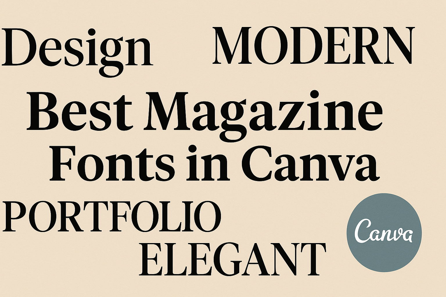
Selecting the right fonts for your magazine can make a big difference in its overall appeal and readability.
Canva offers a wide range of fonts that can bring your design ideas to life. From classic serif styles to modern sans-serifs, Canva’s collection provides something for every magazine style.
The best magazine fonts in Canva are not only varied in style but also offer the versatility needed for both headlines and body text.
For instance, fonts like Lato and Alegreya Sans are praised for their balanced tones and readability, making them ideal for creating both engaging and accessible layouts. These font choices ensure your content is easy on the eyes while still looking stylish.
Using attractive and readable fonts can help make any magazine stand out, drawing readers into the stories you want to share.
Whether you aim for a contemporary look or a more traditional feel, Canva’s extensive font library supports your vision, catering to different themes and moods.
The Importance of Choosing the Right Font
Selecting the right font for a magazine can make a huge difference. It helps in building a recognizable brand identity and ensures the text is easy to read for all audiences.
Branding and Magazine Identity
Fonts play a big role in how a magazine is perceived. A well-chosen font can communicate the essence of the magazine’s brand.
For instance, a bold, modern font can give a magazine a trendy and forward-thinking vibe. On the other hand, classic serif fonts may convey a sense of tradition and authority.
This is why selecting the right font is crucial in establishing a strong magazine identity.
The choice of font affects how memorable the magazine is to readers. When readers see consistent font usage across covers and articles, they associate it with the magazine’s overall theme.
Magazines often use unique fonts in their logos to stand out. This approach ensures that readers can quickly recognize the publication amidst a sea of options.
Readability and Audience Comfort
Readability is key to keeping readers engaged. If the font is too complex or decorative, it can be hard for readers to follow along.
Simple, clean fonts ensure that the audience can easily consume the content without straining their eyes. Sans-serif fonts like Lato are often used for this reason.
Comfort in reading also depends on the size and spacing of the font.
Well-spaced letters and lines make longer articles more inviting. A font that is readable and comforting encourages readers to spend more time absorbing the content of the page.
Therefore, balancing style with readability is essential for satisfying diverse audiences.
Top Serif Fonts in Canva for Magazines
Choosing the right serif font for a magazine is crucial for creating a sophisticated and stylish look. Serif fonts can add elegance and clarity, making them perfect for both headings and body text. Below are some of the top serif fonts in Canva that magazines can use to stand out.
Elegant Serif
Elegant Serif is known for its refined and classic appearance, which makes it a great choice for luxurious magazine layouts. This font offers a smooth reading experience due to its balanced spacing and clean design.
It’s often used for articles or sections where readability is key, yet a touch of sophistication is desired.
This font works well with various themes, whether it’s fashion, lifestyle, or travel magazines. It can be combined with images and other graphic elements to create stunning page layouts. Elegant Serif also pairs nicely with other fonts, providing flexibility in design.
Playfair Display
Playfair Display is a popular choice for magazines looking to incorporate a vintage yet modern feel. Its high-contrast design adds drama and style, making it ideal for headlines and titles.
This font’s origins are in the transitional typefaces of the 18th century, giving it a timeless charm.
Playfair Display can be used in diverse types of magazines, from art to culture and beyond. It provides an impactful first impression to readers, drawing them into the content. The font’s decorative curves and strong presence make it a standout choice for editors who want to create a memorable look.
Times New Roman
Times New Roman is one of the most well-known serif fonts, loved for its legibility and classic style. Despite its traditional roots, it remains relevant for magazines, especially those aiming for a professional or academic tone.
This font excels in delivering clear and organized content.
Times New Roman is versatile, suitable for both text-heavy articles and short feature pieces. It maintains clarity at different sizes, ensuring that the text is easy to read. This font continues to hold a place in the magazine world because of its balance between tradition and functionality.
Leading Sans Serif Fonts for Magazine Layouts
Sans serif fonts are popular in magazine design for their clean and modern appeal. They offer simplicity and readability, which make them ideal for both headlines and body text.
Lato
Lato is a versatile sans serif font that suits various magazine styles. It blends classic elements with a touch of modernism.
This makes it suitable for both formal and casual themes. Lato has semi-rounded details that add warmth, enhancing the reader’s experience. Its wide letter spacing improves readability, especially in smaller sizes.
For designers working on a magazine layout, Lato is perfect for maintaining a harmonious balance between headings and body text. Its flexibility allows for creative freedom while ensuring text remains engaging and clear.
Montserrat
Montserrat draws inspiration from the urban typography of Buenos Aires, offering a contemporary feel. Its clean lines and even strokes make it stand out in magazine designs, especially for titles and headings.
The font’s geometric shapes are appealing and ensure clarity in any setting. Montserrat also supports multiple weights, offering designers different variations for layouts.
This versatility helps it fit both edgy and sophisticated themes, making it a go-to choice for magazines looking to leave an impression. Montserrat is perfect for highlighting key sections without overwhelming other elements, creating an elegant yet modern look.
Open Sans
Known for its readability, Open Sans is frequently used for digital and print formats. Its simple and neutral design makes it adaptable to various themes, from serious to playful.
Open Sans features wide letters and open forms, contributing to its legibility. This is crucial in magazine layouts to keep readers attentive and engaged.
The font supports a vast range of languages and styles, making it suitable for global publications. This adaptability ensures that Open Sans can handle both dense paragraphs and standout headlines efficiently. Open Sans fits seamlessly into any magazine theme aiming for clarity and professionalism.
Best Display Fonts for Captivating Headlines
Display fonts are designed to grab attention and make headlines stand out. Some fonts bring a classic touch, while others offer a contemporary look. The following fonts are popular choices for creating eye-catching headlines.
League Gothic
League Gothic is a classic font with a touch of modernity. Its tall and slender structure makes it perfect for headlines that need to be bold and noticeable.
This font is particularly good for both print and digital media.
With its clean lines, League Gothic adds a professional look to any magazine cover. It pairs well with more subdued body text, letting the headline shine without overwhelming the rest of the design.
Raleway
Raleway is a versatile font that can adapt to many design themes. It’s known for its elegant and thin lines, which add a touch of sophistication.
Raleway works well when you want to create a refined but impactful headline.
This font comes in multiple weights, providing flexibility for various magazine styles. Designers appreciate its ability to maintain readability even in bold or italic forms. It’s an ideal choice for those seeking a balance between simplicity and elegance.
Anton
Anton is a sans-serif font that is bold and striking. Its thick lines and tight spacing make it a great choice for strong headlines that demand attention.
This font is excellent for magazines that aim to leave a strong first impression. It’s best used in larger sizes where its bold nature can truly stand out. With Anton, headlines become the centerpiece of the page.
Script and Handwritten Fonts for Unique Applications
Script and handwritten fonts add a fun, personal touch to any magazine design. Each font has its own personality and style, offering different ways to connect with readers. Here’s a closer look at some popular options for unique applications.
Pacifico
Pacifico is a popular script font known for its playful and bold character. This font is great for titles or headlines that need to grab attention with a friendly vibe.
The letters are smooth and rounded, giving it a casual appearance that’s perfect for lifestyle or fashion magazines. Because of its boldness, Pacifico works best on a simple background where it can stand out.
Despite being eye-catching, it remains easy to read, making it a versatile choice for design.
When using Pacifico, remember to keep other design elements simple to ensure the text remains the focus. Pair it with plain or lightly textured backgrounds. It’s also useful to balance Pacifico with a more neutral font for body text to prevent the overall design from becoming too busy.
Great Vibes
Great Vibes is another stylish script font that offers elegance and flair. This font is characterized by its sweeping, fluid lines, making it suitable for invitations, special announcements, or feature sections in a magazine.
It adds a touch of sophistication, making the text look refined and graceful.
Due to its delicate and connected lettering, Great Vibes works well for short headlines or subheadings that need to have a bit of flair. It’s important to maintain a balance, as its intricate design can become overwhelming if overused.
To highlight its beauty, pair it with simpler elements and use plenty of white space around it.
Alex Brush
Alex Brush is a classic script font that provides both readability and elegance. It is ideal for body text in sections where a script style is preferred.
The font is designed with a clean and connected flow, making it easy on the eyes. This balance between style and function makes Alex Brush a reliable choice for more formal magazine content.
Its versatility allows it to be used in diverse magazine types, from fashion to home decor articles. The smooth, flowing nature of Alex Brush ensures that it enhances the reading experience without sacrificing clarity. For best results, use Alex Brush in medium to large sizes to emphasize its stylish character.
Creating a Balanced Font Palette
Creating a balanced font palette is key for making a magazine look cohesive and professional. Choosing the right combination of fonts, ensuring contrast, and maintaining consistency across various issues will guide readers smoothly through content.
Combining Fonts
Combining fonts effectively starts with selecting two or three that complement each other.
Using a variety of font styles like serif, sans-serif, and script can add interest. For instance, a bold serif for headlines paired with a clean sans-serif for body text provides a nice balance.
Experimenting with different combinations can reveal pairings that enhance the magazine’s theme.
It’s beneficial to use tools like Canva to experiment with various font pairings. Features available on these platforms aid in visualizing how fonts interact.
Contrast and Font Pairing
Contrast is crucial in creating visual appeal. This often involves pairing fonts that differ in weight, size, or style.
For example, mixing a thick, bold headline with a light and airy body text increases readability. Readers find it easier to focus on text that has clear distinctions between different types.
Using contrasting fonts also helps highlight important information. It’s effective in steering the reader’s attention to key content areas.
Consider contrasting a stylish script with a straightforward sans-serif in subtitles to create interest while maintaining legibility.
Consistency Across Issues
Maintaining consistency across issues builds brand identity and enhances reader recognition.
Once a balanced font palette is chosen, it should serve as a template for future publications. This continuity ensures the magazine remains visually consistent, no matter the topic or theme of the issue.
Setting a style guide is a practical approach. It can include details like specific font sizes, styles for different sections, and spacing instructions.
This guide acts as a helpful reference for anyone involved in design, ensuring that every edition adheres to the planned visual standard.
Consistency reinforces the magazine’s style, making it easily identifiable to readers. A consistent approach helps foster a connection with readers, encouraging them to return for future issues.
Accessibility Considerations for Font Selection
Choosing fonts for a magazine involves more than style and appearance; it’s also about ensuring readability and inclusivity.
Different audiences have varying needs, and accommodating these requires careful consideration.
Legibility for Various Audiences
It is crucial to select fonts that are easy to read for everyone. Factors like font size, spacing, and contrast play a major role.
Fonts with clear, distinct letters prevent confusion and strain, especially important for readers with visual impairments. For instance, Canva offers dyslexia-friendly fonts, which help by making letters more distinguishable for individuals with dyslexia.
Serif fonts like Alegreya are often praised for their readability in texts, offering a warm and accessible look.
Adequate spacing between lines and letters helps prevent the text from looking crowded, making reading smoother. High contrast between text and background also enhances legibility, ensuring the content is accessible to those with low vision.
Inclusive Design
Inclusive design means crafting experiences that welcome all users, including those with cognitive disabilities.
Accessible design in typography means picking fonts that do not rely heavily on creative styles, which might confuse some readers.
Simple fonts with clear letterforms are often the best choice. Designing with accessibility means focusing on what improves understanding for a wider audience.
Tools like Canva’s design accessibility features assist designers in identifying potential accessibility issues in their work.
These tools highlight problems before they reach the reader, ensuring the font choice supports inclusive design goals.
Accessible design is a commitment to providing equal access, enabling everyone to enjoy the content with ease.
Tips for Customizing Fonts in Canva
Customizing fonts in Canva can enhance the visual appeal of any magazine design. Users can upload unique fonts, apply different effects, and adjust font sizes to make text more engaging.
Using Custom Fonts
Using custom fonts in Canva allows designers to incorporate their unique style into magazine layouts.
Canva Pro users can upload their own fonts to use in designs, providing a personalized touch. To upload a font, users need to open the Brand Kit on Canva and select the “Upload a Font” option.
It’s important to ensure any fonts uploaded are licensed for commercial use.
Once uploaded, these fonts can be accessed via the text tool while designing.
Using unique fonts can help establish a consistent brand identity across all magazine issues. It also ensures the typography reflects the magazine’s tone and mood.
Experimenting with different fonts can lead to unexpected and creative results, giving the designer more control over the magazine’s aesthetics.
Font Modifiers and Effects
Font modifiers and effects in Canva can dramatically change the look of text.
Users can alter font size, color, spacing, and alignment. This helps in making text more visually appealing or fitting it into complex layouts.
Canva offers text effects like shadow, lift, and hollow, which add depth and dimension.
Modifying line spacing and letter spacing adjusts how text fits into the design and affects readability. Effects such as bold and italic offer weight and emphasis, guiding the reader’s focus to key points.
By playing around with these settings, designers can ensure their text stands out, adding to the overall impact of the magazine design.
Licensing and Font Rights
When using fonts in Canva, it’s important to understand the licensing terms that apply.
Canva provides fonts through its content library, which means users should be aware of the terms under the Content License Agreement. This ensures that users are following the proper rights when incorporating fonts into their projects.
Fonts from Canva can be used in a variety of designs such as websites, social media posts, and printed materials. However, care must be taken to ensure that any non-licensed use, especially commercially, aligns with Canva’s rules.
Here’s a helpful list of things to consider:
- Personal Use: Most fonts on Canva can be freely used for personal projects.
- Commercial Use: Check Canva’s agreement to see if additional permissions are needed for business purposes.
- Redistribution: Do not redistribute or sell the fonts themselves.
Consulting the Content License Agreement provides users with full details on usage rights and limitations.
It’s crucial for anyone using these fonts to stay updated with Canva’s latest terms to avoid potential issues.
Utilizing Canva Pro for an Expanded Font Library
With Canva Pro, users have access to a vast collection of fonts, making design projects more versatile.
This wide range of fonts allows for creative freedom, especially when designing magazines. The library includes various styles, ensuring that there is a perfect fit for every theme and tone.
To enhance the range of choices, Canva Pro also enables users to upload custom fonts. This feature is ideal for those who want unique typography that isn’t available in the default library.
The process to upload is simple and user-friendly.
Here are a few steps:
- Select Brand Kit in the Canva dashboard.
- Click Upload a font.
- Choose the desired font file from your device.
Benefits of Using Canva Pro’s Expanded Font Library:
- Variety: Access to thousands of fonts beyond what’s available in the free version.
- Customization: Ability to upload and use custom fonts for personalized designs.
- Convenience: Easy-to-navigate interface helps finding and applying fonts efficiently.
Having a diverse range of fonts at one’s fingertips can transform a mundane magazine layout into an engaging and professional publication.
Whether it’s serif fonts like Century Expanded for a classic feel, or modern sans-serif options like TT Common Pro Expanded, the choices are abundant. Users can explore these options further by visiting the Best Magazine Fonts in Canva.