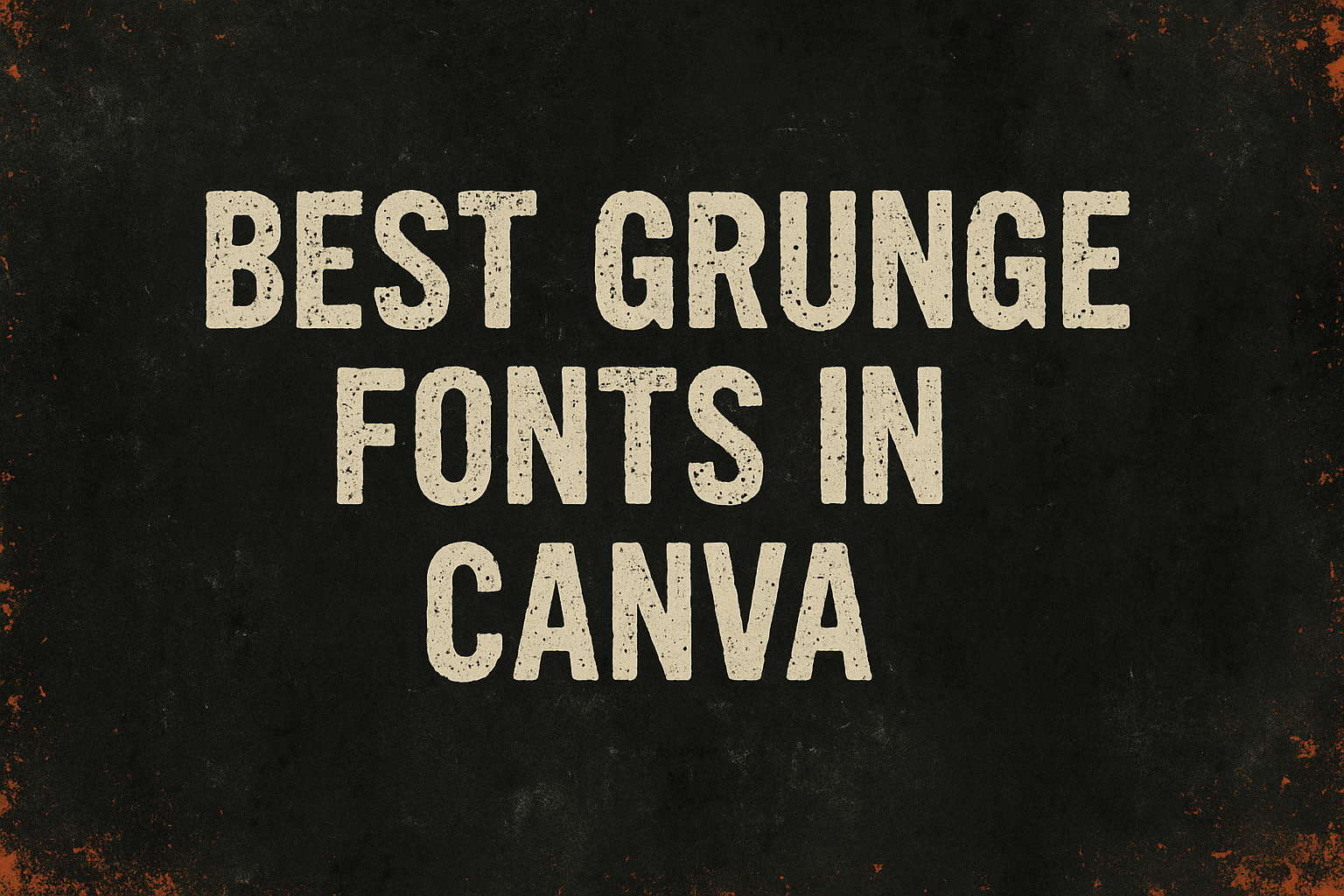
In the world of design, finding the right font can make all the difference.
Grunge fonts bring a rugged, edgy feel to projects with their unique, distressed styles.
Designers often use these fonts to add a raw, artistic edge to posters, flyers, or even digital art.
Some of the best grunge fonts available on Canva can transform a standard design into something truly eye-catching.
From the worn and vintage look of Rundeck Texture to the sleek yet grunge-infused Glassure, these fonts offer a range of styles that can match any creative vision.
Whether you are working on a rebellious rock-themed project or a subtle grunge concept, the variety available ensures there’s something for everyone.
For those eager to explore, fonts like Greenth Grunge bring a handwritten, organic feel that’s perfect for more personal designs.
Meanwhile, choices such as Kust present a cleaner, minimalist approach with geometric elements.
These fonts on Canva offer a fantastic way to experiment with different moods and aesthetics, providing both professional designers and hobbyists with plenty of creative flexibility.
The History of Grunge Typography
Grunge typography emerged in the 1990s alongside the grunge music scene. It is known for its rough, edgy look that breaks away from traditional design norms.
This style reflects the rebellious spirit and cultural shifts of that era.
Roots in Music and Culture
Grunge typography has its roots deeply embedded in the 1990s music scene. Bands like Nirvana and Pearl Jam were at the forefront, with their music albums and posters displaying a gritty and raw visual style.
This design choice mirrored the music’s rebellious nature.
Grunge typography broke the rules by using uneven, distressed letters that looked rough and untamed. The use of these fonts conveyed a sense of authenticity and nonconformity.
This style quickly became a cultural symbol, embodying the spirit of a generation questioning the norm and expressing individuality.
Evolution of Grunge Aesthetics
As grunge music gained popularity, so did its distinct visual style. Designers began experimenting with unconventional printing techniques and layouts to create grunge typography.
The aesthetics evolved from photocopied and hand-drawn elements to digital adaptations, keeping the raw and rugged feel.
This change coincided with the rise of digital design tools, allowing for more complex and varied designs.
Grunge typography became a staple in various media, influencing graphic design trends.
Its rough edges and layered textures were embraced widely, showing how grunge could be both chaotic and artistic, making a lasting impact on design.
Characteristics of Grunge Fonts
Grunge fonts are known for their unique and artistic flair, making them ideal for creating edgy designs. These fonts often feature rough textures, irregular shapes, and distinctive color schemes that capture attention and evoke emotion.
Textures and Edges
Grunge fonts typically feature gritty textures and rough edges that give them a worn or antique look. This texture adds depth and character, making any design feel more dynamic and engaging.
Whether it’s a distressed, scratchy, or smudged appearance, these textures create an organic feel that stands out.
Unlike clean, smooth fonts, grunge fonts often appear to have been weathered by time, like JA Jayagiri Sans Rough, known for its readable yet rugged design.
This characteristic makes them perfect for projects that aim to convey authenticity and raw, unpolished charm.
Irregular Shapes and Baselines
Fonts in the grunge family often boast irregular shapes and uneven baselines, creating a spontaneous and unpredictable feel. The letters may appear as if they’ve been hand-drawn, contributing to their unique personality.
These inconsistencies in shape and alignment can make the text feel more personal and less mechanical.
For instance, Greenth Grunge offers a distressed, handwritten look that adds to its organic style.
This unpredictability can give designs an edgy and artistic impression, suitable for creative or unconventional projects.
Typical Color Schemes
When it comes to color schemes, grunge fonts often pair well with muted or dark tones, accentuating their gritty and raw appearance. Earthy hues like browns, blacks, and grays reinforce the vintage and rugged aspects.
Bright colors can sometimes be used to create contrast, but these tones generally maintain a subdued presence.
Designers may choose to integrate colors that enhance the grunge effect, heightening the text’s visual impact.
This approach helps draw the viewer’s eye and complements the distressed style typically associated with grunge fonts.
How to Choose the Right Grunge Font
Picking the right grunge font can transform a design by giving it the perfect edgy feel. It’s important to consider the mood of the project, ensure the font is readable, and make sure it pairs well with other design elements.
Considering the Project’s Mood
When choosing a grunge font, the project’s mood is essential.
A font like Rundeck Texture provides a worn, vintage look which works well for projects needing a rugged feel.
Another option is Greenth Grunge, giving a raw, handwritten appearance that’s ideal for an organic vibe.
Each font has its distinct feel, so matching it with the overall theme of the design is critical.
For example, a music poster might benefit from bold, distressed fonts to convey energy and creativity.
Legibility and Readability
Legibility is crucial, especially if the text is crucial to the message. Some grunge fonts can be quite decorative, which might affect readability.
It’s important to test how the text looks at various sizes.
For instance, a font that appears clear on a large poster might not be suitable for smaller text on invitations.
Choosing a font that maintains readability without losing its grunge appeal is key.
Fonts like Bowl offer a minimalist touch, ensuring clarity while still enhancing the design’s character.
Matching with Other Design Elements
The right grunge font should complement other design elements, not clash with them.
Consider the color scheme, graphics, and overall style when selecting a font.
A bold, gritty font might overpower delicate graphics, but can be perfect with strong, bold visuals.
Balancing these elements ensures a cohesive design.
For example, if the design features soft, pastel colors, a less intense grunge font might work better.
It’s about harmony and enhancing the design’s impact.
Top Grunge Fonts in Canva
Grunge fonts are popular for adding a rough, edgy look to designs. In this section, you’ll find three standout options on Canva: the Nirvana Font Family, Seattle Sans, and Streetwise Script. Each offers unique style elements that enhance their appeal for different design needs.
Nirvana Font Family
The Nirvana Font Family brings a touch of nostalgia with its iconic style reminiscent of the 90s grunge music scene.
It’s perfect for designs that aim to capture a rebellious feel.
The font features slightly rough edges and an uneven baseline, creating an authentic, lived-in vibe.
Designers often choose Nirvana for music-themed covers, posters, or any project seeking a vintage rock aesthetic.
Its strong identity makes any text stand out, providing a distinctive flair to various graphic works.
Whether for a digital project or print, Nirvana adds character and history to the piece through its bold, raw imagery.
Seattle Sans
Seattle Sans offers a minimalist approach to the grunge aesthetic. This font maintains clean lines with slight textures that give it an understated edge.
It is favored for its simplicity and versatility, making it a suitable choice for a range of design projects from website headers to branded merchandise.
Its strong readability ensures text remains clear, even from a distance.
Seattle Sans is perfect for communicating edgy or informal messages without compromising legibility.
The subtle grunge elements present in the font prevent it from overpowering the content, allowing it to support a variety of creative themes effectively.
Streetwise Script
Streetwise Script combines grunge textures with a flowing, cursive style. This unique fusion results in a font that feels both rebellious and artistic.
It’s ideal for projects that require a personal touch, like event flyers or fashion-focused graphics.
Its design includes varied stroke weights and charming loops, imitating the messy yet purposeful art of graffiti writing.
This quality makes Streetwise Script a great choice for adding a touch of urban authenticity to designs.
By balancing chaos and elegance, it gives designers the flexibility to introduce an urban, handwritten feel while maintaining an overall stylish appearance.
Using Grunge Fonts in Your Designs
Grunge fonts bring a rough, edgy feel to any design. They can highlight important elements, create a contrast with clean backgrounds, and be combined with other fonts for a striking result.
Creating a Focal Point
Using grunge fonts as a focal point in a design is a powerful way to grab attention.
These fonts are naturally eye-catching due to their unique textures and rugged appearance.
When placed strategically, they can draw the viewer’s eye to the most important part of your design, like a title or a special offer.
To enhance the focal point effect, consider using bold or italic styles. This adds emphasis and helps the text stand out even more.
Limited use of color can also accentuate the grunge font, making it pop against the rest of the design.
Choose colors that contrast well with the background but don’t overwhelm the overall aesthetic. This ensures the message remains clear while utilizing the natural appeal of the grunge style.
Balancing with Subdued Backgrounds
Pairing grunge fonts with subdued, simple backgrounds can enhance readability and artfully emphasize the text.
The rough texture of the fonts can be beautifully set off by a plain or minimalistic backdrop, adding sophistication to the design without sacrificing clarity.
Tips for perfect balance:
-
Color Harmony: Use neutral shades in the background to let the grunge font take center stage.
-
Texture Coordination: Consider backgrounds that are smooth to contrast with the grunge font’s texture, ensuring the text remains readable.
-
Simple Elements: Avoid busy patterns behind the font so as not to distract from the text’s impact.
This approach creates a striking visual hierarchy, guiding the viewer through the design effortlessly.
Combining Fonts for Impact
Mixing grunge fonts with other styles can amplify their impact and add a modern twist.
Pairing them with simple sans-serif fonts often works well, as it brings clarity and elegance to the design.
Combination guide:
-
Contrast in Style: Use grunge fonts for headings and clean fonts for body text to highlight important information.
-
Variation in Size: Different sizes can create layers of information, making the design dynamic.
Grunge fonts should be the star, so limit additional styles to avoid clutter. With careful coordination, these fonts can produce stunning results.
Experiment with different pairings to see what fits best with your project’s vibe.
Tips and Tricks for Grunge Font Pairing
When choosing grunge fonts in Canva, it’s important to mix styles creatively. Pair a bold, rugged font with a more muted, simple one. This balance lets the unique features of each stand out.
List of Tips:
-
Contrast: Combine bold grunge fonts like Edo with cleaner options. This makes text pop and keeps the design balanced.
-
Hierarchy: Use larger, grunge fonts for headings and simpler fonts for body text. This guides readers easily through your content.
-
Experimentation: Try various combinations before finalizing a design. This allows for creative discoveries.
Pairing Example:
| Grunge Font | Complementary Font |
|---|---|
| Rundeck Texture | Arial |
| Villagers Grunge | Helvetica |
Grunge fonts have a lot of texture and character. To keep it readable, pair them with fonts that don’t compete for attention.
A smoother, sans-serif font can highlight the gritty nature of the grunge choice.
Visual Weight: Keep an eye on the visual heaviness of the fonts. Too much of a heavy font together can overwhelm a design.
Incorporating Grunge Fonts in Logo Design
Grunge fonts can give a unique, edgy feel to a logo. They often look worn or textured, which helps convey a sense of history or authenticity.
This style can make a logo stand out, especially in industries that value creativity and individuality.
When using grunge fonts for a logo, it’s important to consider legibility. Some grunge fonts have intricate details that might make them hard to read, especially at smaller sizes.
Ensure the text remains clear and recognizable.
Mixing grunge fonts with other design elements can create a striking contrast. For example, pairing them with sleek, modern visuals or clean lines can highlight the boldness of the font.
This technique helps balance the design and draws attention to the logo’s message.
Here’s a simple list of tips for using grunge fonts in logos:
- Use high contrast for better readability
- Combine with modern elements for a balanced look
- Keep the design simple to avoid clutter
Certain grunge fonts in Canva like Rundeck Texture Font offer vintage vibes, perfect for brands aiming for a rustic or retro feel. They work well for music bands, fashion brands, or craft businesses.
Choosing the right grunge font can transform a brand’s identity. It reflects a raw, artistic confidence that appeals to many audiences, leaving a memorable impression.
Maintaining Readability with Grunge Textures
Grunge fonts in Canva can add an edgy, artistic touch to designs. Yet, it’s important to ensure the text remains easy to read. Choosing a grunge font with good legibility is crucial.
JA Jayagiri Sans Rough is a great example. This font has a stunning letter style and excellent readability, making it visible even from afar.
When working with grunge fonts, consider the font size. Larger text sizes help maintain clarity, especially when using more textured fonts.
- Small Text: Use clearer grunge fonts.
- Large Text: Textures are more visible but still readable.
Contrast is also key. Pairing grunge fonts with backgrounds that offer a good contrast can enhance readability. Dark text on a light background or vice versa works well.
Italicizing or bolding grunge fonts can sometimes help in making the text stand out more. This is particularly useful in headings or titles.
For versatile font options, consider using fonts like Janmeid, known for its clear shapes and modern vibe, or Villagers Grunge, which balances a worn look with readability.
Grunge Fonts and Brand Identity
Grunge fonts are a great choice for brands looking to express uniqueness and boldness. Their textured and rugged look can help create a distinct identity that stands out in a crowded marketplace.
These fonts add personality, making designs appear more authentic and relatable.
A brand using grunge fonts often conveys a rebellious and edgy image. They are perfect for brands that focus on alternative music, extreme sports, or rebellious fashion. By using these fonts, a brand can instantly connect with audiences who value creativity and authenticity.
Here are some examples of how grunge fonts enhance brand identity:
- Emotion: They evoke strong emotions and can communicate a sense of nostalgia or raw energy.
- Texture: The rough and textured look adds depth, making the design feel more dynamic.
- Uniqueness: Brands can stand out with their one-of-a-kind appearance.
Some popular grunge fonts include Rundeck Texture and Edo, each offering different levels of distress and texture.
Depending on the brand message, designers can choose the level of edge they want to portray.
When incorporating grunge fonts, it’s crucial to ensure that the overall design remains readable and the message clear. Pairing these fonts with simpler ones can help achieve balance.
Brands can experiment with different combinations to find what best represents their identity.