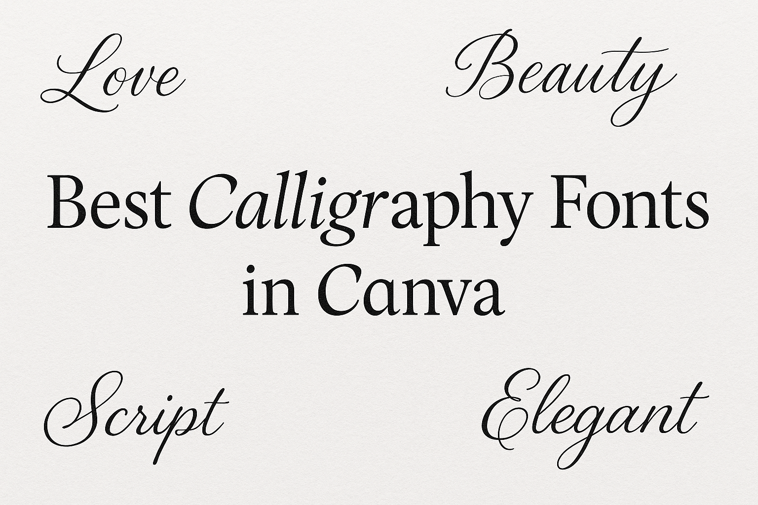
Calligraphy can transform any project with its elegant curves and artistic flair.
For anyone looking to add this touch of beauty to their designs, Canva offers a wide array of calligraphy fonts. The journey to finding the perfect font is simple with this versatile platform.
Choosing the right calligraphy font can enhance your project’s readability and style.
Whether it’s for a wedding invitation, a business logo, or a personal art project, the right font can make all the difference.
From traditional script fonts to modern, playful styles, there is something for everyone.
Some popular choices include Great Vibes and Angella White.
Fonts like these balance sophistication with creativity, making them perfect for various occasions.
Browsing through Canva’s selections, designers can easily find a font that matches their vision, ensuring their projects stand out.
Exploring Canva’s Font Library
Canva’s font library offers a wide range of options, perfect for any design need.
Accessing these fonts and understanding their impact on design are crucial steps for creating eye-catching projects.
How to Access Canva’s Fonts
Accessing fonts in Canva is straightforward.
Users can find fonts by clicking on the text tool within the design editor. This opens up a dropdown with all available fonts, including both free options and those available with Canva Pro.
For those with a Canva Pro subscription, there are exclusive fonts like “Dr Sugiyama” and “Great Vibes” that offer more variety for design projects.
Searching for specific styles such as calligraphy fonts is easy by using the search bar within the font library.
To make font selection smoother, Canva allows users to filter fonts by categories such as “sans serif,” “handwriting,” or “calligraphy.” This helps in quickly locating desired fonts without sifting through the entire selection.
Bookmarking frequently used fonts is another feature that saves time for frequent projects.
The Importance of Font Choice
Selecting the right font can significantly impact a design’s effectiveness. Fonts convey emotions and set the tone for the overall design.
For instance, Lucida Calligraphy is perfect for formal certificates due to its prestigious appeal, while fonts like “Pinyon Script” add a touch of elegance suitable for wedding invitations.
Font choice also affects readability. A bold, easy-to-read font is best for headlines, while decorative fonts are great for adding flair to invitations or announcements. Misused fonts can clutter the design, so it’s vital to balance style and clarity.
For branding, a consistent use of fonts helps in creating a strong visual identity. Designers need to pay attention to font compatibility with their chosen color scheme and other design elements to achieve a harmonious look.
Top Calligraphy Fonts for Professional Use
Selecting the right calligraphy font can give your projects a polished look.
Sophisticated script fonts add elegance and style, while elegant handwritten fonts bring a personal touch without sacrificing professionalism.
Sophisticated Script Fonts
When aiming for sophistication, fonts like Angella White stand out. Known for stylish strokes and refined curves, this font is ideal for logos and luxury invitations. Its ability to elevate a simple design makes it a favorite among professionals seeking a modern yet classic feel.
Another excellent option is Lucida Calligraphy. Valued for its traditional vibe, it’s perfect for formal certificates and upscale branding. It exudes prestige and formality, making any document or project feel important.
-
Angella White
- Ideal for: Logos, invitations
- Style: Modern, elegant
-
Lucida Calligraphy
- Ideal for: Certificates, formal documents
- Style: Traditional, prestigious
Elegant Handwritten Fonts
Elegant handwritten fonts leave a unique impression with their graceful designs.
Lavonia Classy is a great choice for luxury branding. It features delicate strokes that are both charming and timeless, suited for upscale cosmetic labels and fashion design.
Yellowtail is another font that balances elegance with a touch of modern style. Its flowing curves and connected letters create a personalized feel that works well for invitations and greeting cards.
-
Lavonia Classy
- Ideal for: Luxury branding
- Style: Elegant, timeless
-
Yellowtail
- Ideal for: Invitations, greeting cards
- Style: Modern, lively
These fonts offer a range of styles and uses, making them invaluable tools in professional design.
Popular Calligraphy Fonts for Personal Projects
When working on personal projects, selecting the right calligraphy font can make your designs stand out.
Whether it’s a playful design or a more relaxed style, there’s a calligraphy font that can bring your ideas to life.
Whimsical and Fun Fonts
Whimsical fonts add a playful touch to personal projects. These fonts are perfect for making greeting cards, invitations, or social media posts that need a little flair.
Fonts like Lobster and Pacifico are popular choices. Lobster offers bold strokes and a vintage feel, while Pacifico brings a softer, cursive look that speaks to a carefree spirit.
These fonts are easy to read and can effectively convey a sense of joy and creativity. Using them can bring a sense of fun to any project, making the design feel less formal and more inviting. Designers recommend using these fonts for headlines or standalone text to make the most impact.
Casual Brush Script Fonts
Casual brush script fonts are great for personal projects that need a relaxed, informal vibe.
Brush Script and Kristi are popular picks that look like they were handwritten with a brush pen. These fonts work well for scrapbooking, DIY projects, and personal blogs where a laid-back style is desired.
Their flowing lines and natural look make them perfect for creating a personal touch. These fonts are usually bold enough to stand out but maintain a softness that keeps them approachable. Using them as main titles or large text elements can give any project an easygoing feel that resonates with the audience.
Pairing Calligraphy Fonts with Other Styles
Pairing calligraphy fonts with other styles can add elegance and interest to any design.
Choosing complementary fonts maintains balance, while contrasting them with serif and sans serif fonts creates dynamic visuals.
Complementary Fonts for Balance
When selecting fonts to pair with calligraphy styles, it’s important to choose complementary ones that create visual harmony.
Look for fonts that share similar characteristics, such as stroke thickness and height. For example, if using a delicate calligraphy font, a light or thin sans serif can complement it beautifully.
This helps maintain a cohesive look without overwhelming the viewer.
To provide an example, Tex Gyre Pagella works well when used as a body text font that complements more ornate calligraphy styles. This combination allows the calligraphy font to remain the focal point while supporting text flows smoothly around it.
Experimenting with different combinations can help find the perfect balance that enhances the overall aesthetic.
Contrast with Serif and Sans Serif Fonts
Adding contrast to designs by pairing calligraphy fonts with serif or sans serif fonts can make text more visually engaging.
Using contrasting styles highlights important information and enhances readability.
For instance, placing a calligraphy font as a headline can draw attention, while a clean serif or sans serif font for body text ensures clarity.
When pairing, it’s crucial to make sure the contrast isn’t too jarring.
A flowing script, like Black Mango, when paired with a simple sans-serif font, makes the calligraphy stand out without losing the message’s clarity.
Creating such contrast not only adds visual interest but also guides the reader’s eye throughout the design.
Design Tips for Using Calligraphy Fonts
Using calligraphy fonts can make any design pop when done right.
- Adjusting font weight and size is crucial to balance elegance and readability.
- The choice of color also plays a significant role in how easy the text is to read and the mood it conveys.
Adjusting Font Weight and Size
When working with calligraphy fonts, adjusting the font weight is essential to achieve the desired impact.
A heavier weight can make a bold statement, ideal for titles or headings. On the contrary, a lighter weight offers a more delicate look, suited for subtle text.
Size also matters. Larger fonts grab attention and are clearer from a distance. They work well for main titles on invitations or posters.
Smaller sizes should be avoided for lengthy text, as calligraphy can become hard to read with intricate detailing at small sizes.
Designers should pair calligraphy with simpler fonts to create a harmonious layout. This combination ensures the primary message is conveyed clearly.
Color Considerations and Readability
Choosing the right color can elevate the vibe of a calligraphy design.
Contrasting colors enhance readability, such as dark text on a light background or vice versa. Bright colors should be used cautiously, as they can overwhelm the delicate nature of calligraphy.
Neutral tones like black, white, or gray maintain elegance, while pastels bring a softer touch. Accents in gold or silver can add a touch of luxury.
Readability should always be prioritized, so consider testing color combinations on various screens to ensure everyone has a pleasant reading experience.
Proper use of color not only captures attention but keeps the audience engaged with the text.
Licensing and Usage Rights for Fonts
Navigating font licensing can feel tricky, but it’s important for using fonts legally and creatively. When designers use fonts, they are often guided by licenses that outline how fonts can be used. This ensures respect for creators’ rights.
Free vs. Pro Content on Canva
Fonts on platforms like Canva are categorized as either Free or Pro. Free fonts can be used without cost, while Pro fonts are included in a subscription plan. Each comes with its own set of rules and limitations.
Understanding EULAs
An End User License Agreement (EULA) details the rights and restrictions related to font usage. Designers should look at these agreements to ensure they are using fonts within legal boundaries.
Legal Compliance and Creativity
When designing on platforms such as Canva, it’s crucial to align font choices with legal stipulations given in their EULAs. This ensures that designs comply with the law while using calligraphy fonts creatively.
Different Mediums, Different Rules
Font licenses vary across media. Whether designing for print, digital, or social platforms, always make sure that font usage complies with the specific stipulations associated with each format.
Checking clear guidelines for licensing helps avoid legal issues and lets users fully enjoy the wide array of fonts available. Following these guidelines allows for fun and creative projects without the worry!
Customizing Calligraphy Fonts in Canva
Customizing calligraphy fonts in Canva is a great way to make any design unique. Users can change different elements to match their personal style or the project’s needs.
One simple method is to adjust letter spacing. This involves changing the space between characters, which is also known as kerning. It can make text look more open or tight, depending on the design.
Font Pairing
Pairing calligraphy fonts with other font styles can enhance a design. Mixing a bold sans-serif font with a delicate calligraphy style can create a strong contrast that draws attention.
Color Adjustments
Changing the font color can also have a big impact. Designers often choose colors that match or complement elements in their design. Canva offers a wide palette to select from, making it easy to find just the right shade.
Text Effects
Using text effects can add depth to calligraphy fonts. Canva provides options like shadows or outlines. Applying these effects can make fonts stand out and look more polished.
Size and Alignment
Lastly, adjusting the font size is crucial. Larger fonts can make a statement, while smaller ones work well for details. Alignment is also key to maintaining a balanced look in any design.
For more inspiration on using these techniques, have a look at helpful resources like this guide on fonts in Canva.
Adding Personal Touches with Calligraphy
Calligraphy can add a unique and personal touch to any project. This style of writing brings elegance and creativity to various designs.
People can use calligraphy on invitations, art projects, and more.
A table of calligraphy fonts available on Canva could look like this:
| Font Name | Best For | Style |
|---|---|---|
| Allura | Invitations, Branding | Graceful |
| Edwardian | Wedding Events | Elegant |
| Pacifico | Fun Projects | Casual and Bold |
Wedding Invitations: Many choose calligraphy for wedding stationery because it adds sophistication. The flowing letters help set a romantic mood for the special day.
Crafters: Artists enjoy using calligraphy in handmade cards and decor. The personal touch comes from each unique stroke and style.
For businesses, logos often use calligraphy to convey elegance and refinement. This approach can highlight a brand’s luxury appeal, contributing to an impression of high quality.
Pieces of artwork can become more personal with handwritten calligraphy. Whether creating a quote or a decorative piece, the artistic flair of calligraphy makes every creation special.
Using calligraphy fonts like those available on Canva allows creativity without needing advanced skills. These fonts offer a wide range of styles for any occasion or purpose.