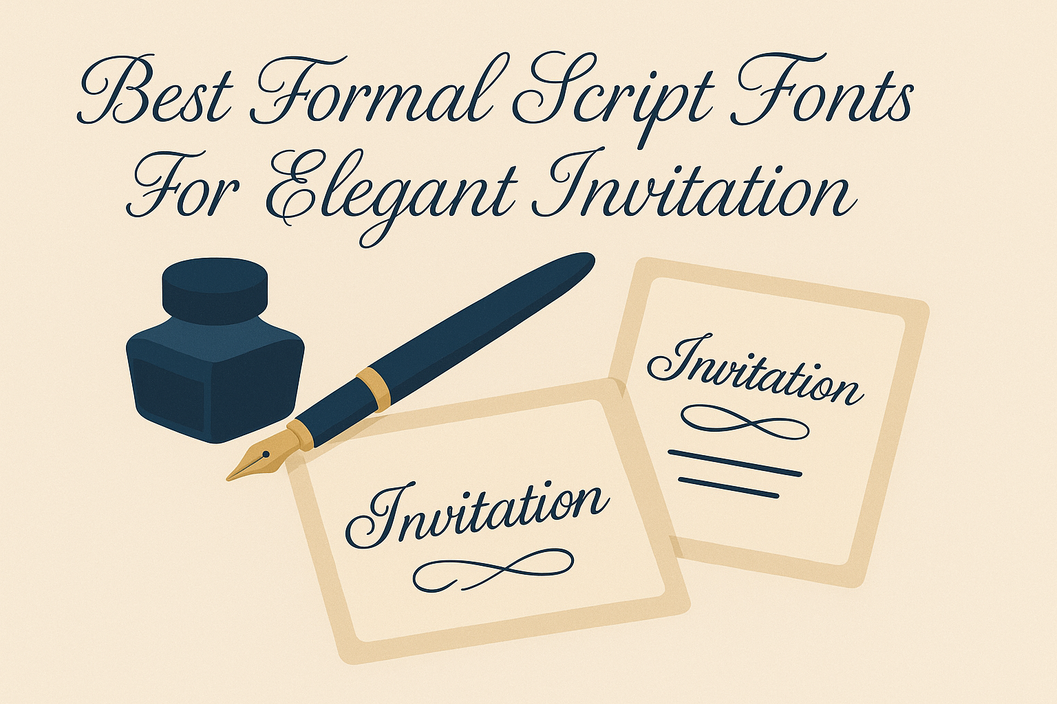
Choosing the right formal script font can make invitations feel truly elegant and special. The best formal script fonts combine readability with graceful, flowing letters to give invitations a timeless, sophisticated look. These fonts work well for weddings, galas, and any event that calls for a touch of class.
Many fonts offer different styles of formality, from delicate flourishes to bold script designs. Finding the right one depends on the mood the event wants to set and how clear the text needs to be. A carefully selected script font helps invitations stand out while keeping the message easy to read.
What Are Formal Script Fonts?
Formal script fonts are designed to bring a polished and graceful look to printed materials. They often feature flowing lines and carefully crafted letterforms to add sophistication to invitations and other formal documents. These fonts offer a balance of style and readability that works well in elegant settings.
Key Traits of Formal Script Fonts
Formal script fonts usually have smooth curves and connected letters, mimicking elegant handwriting. They maintain consistent stroke widths, which keeps text clear and easy to read. They also tend to include flourishes like loops and swirls but keep them controlled to avoid clutter.
Most formal script fonts come with uppercase and lowercase characters that flow naturally when typed together. They support multiple languages and often feature alternate glyphs to add variety without sacrificing clarity.
A typical formal script font will blend beauty with legibility, making it perfect for invitations where both style and communication matter.
Formal Script Fonts vs. Calligraphy Fonts
Although similar, formal script fonts and calligraphy fonts differ mainly in style and usage. Formal script fonts are digital typefaces that imitate neat, polished handwriting. They are designed for consistent character spacing and smooth reading.
Calligraphy fonts, on the other hand, are inspired directly by hand-drawn artwork. They often have more irregular strokes and varied thickness, reflecting the pressure and angle of a calligrapher’s pen.
While calligraphy fonts can appear more artistic and personal, formal script fonts are usually cleaner and better suited for formal invitations where readability is key.
Historical Context and Inspiration
Formal script fonts draw inspiration from traditional handwriting styles used in the 17th and 18th centuries. These styles evolved from copperplate and roundhand scripts, techniques once taught for penmanship in official documents and invitations.
The fonts emphasize elegance and formality, reflecting how people wanted to present themselves in written form during historical times. Today, designers recreate these classic letterforms using modern digital tools to give projects a timeless yet fresh look.
These fonts carry a sense of tradition that adds a refined touch to wedding invitations and other special announcements.
For examples and more about formal scripts, see Best Formal Script Fonts.
Top Formal Script Fonts for Elegant Invitations
Choosing the right formal script font can set the tone for any elegant invitation. It’s important to find fonts that balance style and readability while fitting the specific event’s vibe. Popular choices range from polished classics to modern scripts with a handcrafted touch.
Most Popular Formal Script Fonts
Some of the most popular formal script fonts for invitations include Lucille, Belflower, and Santorini. These fonts have smooth, flowing lines that give an elegant and timeless look.
Lucille offers a textured calligraphy feel that adds sophistication without losing clarity. Belflower is praised for its graceful curves, making it great for wedding invitations. Santorini is a modern script with a fresh style that works well for branding as well as invitations.
Premium and Free Options
There are plenty of both premium and free script fonts available. Premium fonts usually have more ligatures and symbols, offering better customization. For example, Neo Serenity and Florentina are premium fonts known for their detailed letter connections and elegant style.
Free fonts like Arnitta Callina and Amira offer simplicity with a refined touch. Amira stands out with very thin lines suited for names or small text on invitations. Using a mix of premium and free fonts can keep designs stylish and budget-friendly.
Fonts with Handcrafted Feel
Fonts that look handcrafted give a personal touch to wedding invitations. Neo Serenity is famous for its natural and artistic ligatures that resemble hand lettering.
My Love and On Time are free fonts with flowing tails and brush stroke effects that add warmth and uniqueness. Such fonts often carry more personality, making invitations feel more intimate and special.
Fonts for Different Invitation Styles
Different invitation styles call for different font choices. For formal weddings, fonts like Lady Clementine with a paired serif and script offer a classic look.
For modern or casual events, Salmon Queen and Besotted Love bring a playful yet elegant vibe. Canberra, often used by photographers or event planners, suits minimalistic or chic invitations. Picking fonts that match the event’s tone helps create invitations that stand out.
For a wide collection of elegant fonts perfect for invitations, visiting a list of best elegant script fonts is helpful.
Choosing the Right Font for Your Invitation
Picking the perfect font involves more than just liking how it looks. It needs to fit the event’s style, be easy to read, and work well with other fonts on the invitation. These factors help the invitation feel polished and clear.
Matching Font Style with Event Theme
The font should match the tone of the event. For a wedding invitation, elegant script fonts with flowing strokes and modern calligraphy styles usually fit best. They bring a touch of romance and formality.
For more formal events, classic serif fonts or refined calligraphy fonts work well. These fonts suggest tradition and sophistication.
Casual or outdoor events might call for simpler, less ornate scripts to keep the mood light. The font choice sets the first impression of the event’s vibe.
Readability and Legibility Considerations
Even the most beautiful script font can frustrate guests if it’s hard to read. It’s important to pick fonts that balance style with clear letter shapes.
Fonts with ornate swirls or tightly connected letters might look fancy but can confuse the reader. Choosing a script with moderate flourishes and open letter forms helps maintain legibility.
Font size matters too. Invitations should use at least 12-16 point size to ensure details are easy to see. Checking how the font looks when printed can catch problems early.
Pairing Script Fonts with Other Typefaces
Pairing fonts can create visual interest and hierarchy. A popular choice is combining a formal script font with a clean serif or sans-serif font.
The script font is usually the hero — used for names or headings. A serif font complements by providing easy-to-read body text. This keeps the invitation elegant but functional.
Be careful to avoid pairing fonts with similar weight or style, as they may clash. Limiting font varieties to two or three max keeps the design cohesive without overwhelming the reader.
Design Features That Enhance Script Fonts
Formal script fonts gain their charm from details that balance style and readability. These include special font features, ways to customize text, and design updates that keep them fresh for today’s projects.
OpenType Features and Glyphs
OpenType features add variety and finesse to script fonts. They include stylistic alternates, swashes, ligatures, and contextual alternates that help letters connect smoothly.
Designers can use ligatures to join letter pairs like “th” or “st” in a natural way. Swashes add decorative strokes at the start or end of letters, elevating invitations with elegance.
Many formal scripts also come with multiple glyph options for each letter. This flexibility makes the text look less repetitive and handcrafted, perfect for wedding invitations or branding materials that need a polished finish.
Customization and Personalization
Personalization is key to making invitations stand out. Script fonts often include features that allow users to tweak letter shapes and spacing to fit the design.
Designers can adjust kerning, line height, and letter forms to fit the tone of the event. Some fonts support alternate characters that give a unique look without changing the overall style.
Using a font with these options lets creators make logos, signatures, or invites that feel more personal and less generic. This kind of customization is essential for formal events where every detail matters.
Modern Touches in Formal Scripts
Modern script fonts blend classic elegance with clean, simple lines. They often include minimalist swashes and improved readability, which suit digital and print designs alike.
Some modern fonts use subtle curves and balanced spacing to keep the script fresh but still formal. This helps invitations look stylish but easy to read on screens and paper.
Designers now create fonts with multilingual support and extra glyphs for global audiences. These touches make formal scripts more versatile for different languages and cultural styles.
For more on formal and elegant script fonts, explore options with advanced OpenType features.
Creative Uses of Formal Script Fonts Beyond Invitations
Formal script fonts bring a touch of elegance and personality to more than just invitations. They are versatile design tools that add style and sophistication to various types of branding and printed materials.
Branding and Logos
Formal script fonts are popular in branding because they convey elegance and uniqueness. They help brands stand out by giving logos a graceful, handcrafted feel. This style works especially well for luxury brands, beauty products, and boutique businesses where a refined appearance matters.
Using script fonts in logos can express warmth and creativity while maintaining professionalism. It’s important to choose fonts that remain clear when scaled, so the logo looks good on both large displays and small labels. Combining script fonts with simpler typefaces can improve readability and create visual balance in branding.
Stationery and Business Cards
In stationery and business cards, formal script fonts add charm and a lasting impression. They bring sophistication to names, job titles, and contact details, making the cards feel more personal and memorable.
Designers often pair these fonts with clean, modern text to keep information easy to read. Script fonts work well for signature-style names or company logos on business cards. Their stylish curves can also be used on letterheads, envelopes, and personalized notes to reinforce a brand’s identity without overwhelming the layout.
Packaging and Product Labels
Product packaging benefits from formal script fonts by gaining an upscale, artistic look. They are widely used on labels for cosmetics, gourmet foods, and handmade items to communicate quality and care.
Script fonts can highlight product names or special features, drawing attention through elegant strokes and flourishes. When designing packaging, it’s key to balance decorative script with legible fonts for essential details like ingredients or instructions. This mix ensures both a beautiful appearance and practical use on product packaging.
For more ideas on how script fonts enhance design, see Best Formal Script Fonts – Find Your Font.
Tips for Using Formal Script Fonts Successfully
Using formal script fonts well means finding the right balance between beauty and readability. Designers must choose tools carefully and avoid mistakes that can make invitations hard to read or look cluttered. Clear spacing, proper font pairing, and testing how the font appears on different devices all matter.
Balancing Aesthetic and Functionality
Formal script fonts are elegant but can be tricky to read if overused. Designers should adjust the font’s spacing, known as kerning and tracking, to make text look balanced and avoid cramped letters.
Pairing script fonts with simple serif or sans-serif fonts helps keep the design clear. It’s best to reserve script fonts for headings or names, while using plain fonts for body text.
Testing the font at different sizes is important. Too small can be hard to read, while too large may overpower the design.
Software and Tools for Font Selection
Designers often use tools like Figma or Adobe Illustrator to explore and apply script fonts. These programs allow easy adjustment of spacing and size, making it simple to improve legibility.
Font libraries within these tools offer search filters to find fonts based on style and weight. Previewing fonts with the actual invitation text helps visualize how the script will look in the final design.
Some tools also support accessibility features, helping designers test how the font performs with color contrast and on multiple devices. This ensures the invitation is attractive and readable across platforms.
Avoiding Common Design Mistakes
A common mistake is overcrowding script fonts with too many flourishes or using multiple scripts in one design. This can confuse the reader and reduce readability.
Designers should avoid dark backgrounds with thin script fonts as this lowers contrast and makes text hard to read. Always maintain strong contrast between font color and background.
Another error is neglecting hierarchy. Using bold or larger script for titles with simpler fonts for details can guide the reader smoothly through the invitation text.