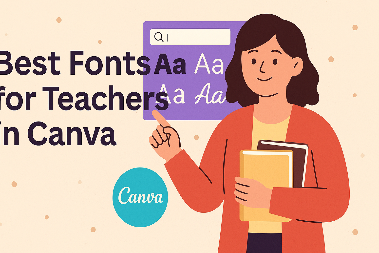
Finding the right fonts can greatly enhance teaching materials. For teachers using Canva, the best fonts improve readability and engagement with students.
This is especially important in creating presentations, handouts, and other classroom materials that connect with learners.
Whether looking for playful options for younger students or more professional styles for older grades, teachers have many choices.
Fonts like Poppins offer clarity in smaller sizes, making them ideal for various formats. Meanwhile, others, such as Lexend, are designed to boost reading performance, which can be incredibly helpful for all students.
With a little creativity and the right fonts, educators can make their materials more appealing and effective. From classic choices to modern designs, there is a font to fit every teaching style. This article will explore some of the best fonts available for teachers in Canva, helping them choose the perfect style for their needs.
Understanding Font Choices in Education
Font selection plays a significant role in educational settings. Choosing the right typeface can influence student engagement, comprehension, and even retention of information. Below are key aspects of how font choices affect learning environments.
Font Psychology in Learning Environments
Different fonts evoke various emotions and responses. For instance, a playful font like Comic Sans may be suitable for younger students, creating a fun and inviting atmosphere. In contrast, a more traditional font, like Times New Roman, can lend a serious tone appropriate for older students or formal assignments.
Fonts can also affect how students perceive the material. A friendly font can make learning feel approachable, while a more serious font might signal the importance of the content.
Thus, understanding font psychology is crucial for tailoring materials to specific grade levels and learning contexts.
Readability for Diverse Age Groups
Readability is essential in educational materials. Younger students benefit from simple, sans-serif fonts like Arial or Helvetica. These fonts are easier to read and help children with developing literacy skills.
For older students, a combination of serif and sans-serif fonts may be effective, depending on the complexity of the text.
Consideration of line spacing, font size, and contrast also plays a significant role in readability. For example, a font size of at least 12-14 points is recommended for classroom materials.
Keeping these factors in mind makes a big difference in how students interact with the content.
The Impact of Typography on Retention
Typography affects how well students retain information. Studies show that legible fonts improve focus and minimize distractions. When students can easily read the text, they are more likely to engage with the material and remember what they learn.
Furthermore, the layout along with font choice matters. Using headings and bullet points can break up text and help highlight key information.
Engaging typography not only attracts attention but also aids memory recall, helping students perform better in assessments.
Top Fonts for Educational Use
Choosing the right font can greatly enhance teaching materials. The right font not only helps with readability but also keeps students engaged. Here are some top choices for various educational purposes.
Classic Fonts That Encourage Reading
Classic fonts are timeless choices that promote readability. Fonts like Georgia are widely recognized for their clarity. Georgia is a serif font, making it easy on the eyes, especially in printed materials like study notes and assignments.
Another great option is Times New Roman. This font is often used in academic documents thanks to its formal appearance. Both fonts create a familiar experience for students, which can help to make learning smoother.
Key benefits of classic fonts:
- Readability: Easy to read in various sizes.
- Familiarity: Recognizable to students.
Modern Fonts for Engaging Presentations
Modern fonts add a fresh touch to presentations, making them visually appealing. Poppins is an excellent choice. This font is clear and legible, ensuring that students can easily follow along during lessons.
Lato is another modern option known for its friendly character. It works well in many educational contexts, providing warmth and approachability. Using these fonts can help keep students focused and interested.
Benefits of modern fonts include:
- Engagement: Draws attention during presentations.
- Versatility: Suitable for various educational materials.
Handwriting-Inspired Fonts for Personal Touch
Handwriting-inspired fonts can make materials more inviting. Bryndam Write is a lovely option that mimics a handwritten style. It can be especially effective for informal notes, class announcements, or creative projects.
Another good choice is Dancing Script. This font adds a playful element while remaining readable. Using these fonts can foster a personal connection between the teacher and students.
Advantages of handwriting-inspired fonts:
- Personality: Adds a personal touch to messages.
- Creativity: Encourages a fun learning environment.
How to Access and Use Fonts in Canva
Canva offers a wide variety of fonts that teachers can use to enhance their materials. Understanding how to navigate this library and customize fonts effectively can help in achieving a consistent and engaging look in their projects.
Navigating Canva’s Font Library
To start using fonts in Canva, users must first open a design. They can find the text tool on the left sidebar.
Clicking on this tool allows users to add a text box to their design.
Once the text box is in place, they can access the font options by clicking on the font dropdown menu in the toolbar at the top. This will reveal all available fonts.
Users can also filter fonts by categories such as Serif, Sans Serif, or Script. Searching for specific fonts by name in the search bar is another quick way to find favorites.
Customizing Fonts for Brand Consistency
After selecting a font, teachers can customize it to align with their brand. Adjusting the font size, color, and spacing are essential steps.
For consistency, Canva allows users to save their custom font styles. This is particularly helpful when designing multiple materials.
They can click on the “Styles” feature to create and save combinations of colors and fonts that reflect their aesthetic.
To ensure easy access later, teachers can also create brand kits in Canva Pro. This feature stores preferred fonts for effortless use in all future projects.
Design Tips for Teachers in Canva
Using the right design techniques can help teachers create visually appealing materials in Canva. Simple adjustments in font pairing and careful selection of sizes and colors enhance clarity and engagement.
Pairing Fonts Effectively
When selecting fonts, it’s essential to pair them in a way that promotes readability and visual interest.
A good rule of thumb is to combine a decorative font with a simpler sans-serif font. For example, using a bold display font like Norwester with a clean font like Poppins can draw attention while keeping the text easy to read.
Teachers should also consider contrast. If one font is heavy and bold, pairing it with a lighter font creates balance.
Always limit font combinations to two or three to avoid a cluttered look. Finally, maintaining a consistent style across all materials helps establish a professional appearance.
Balancing Font Sizes and Colors
Font size and color are critical elements in design. Size should vary to create a clear hierarchy.
For titles, a larger size grabs attention, while body text should be smaller yet legible. For instance, a title at 24pt and body text at 12pt creates a strong contrast.
Color choices also play an important role. Stick to a color palette of two to three complementary colors. This keeps materials attractive without overwhelming the viewer.
Use bold colors for titles and subtle shades for body text. It’s essential that the font colors are readable against the background. For instance, dark text on a light background is a classic, effective choice.