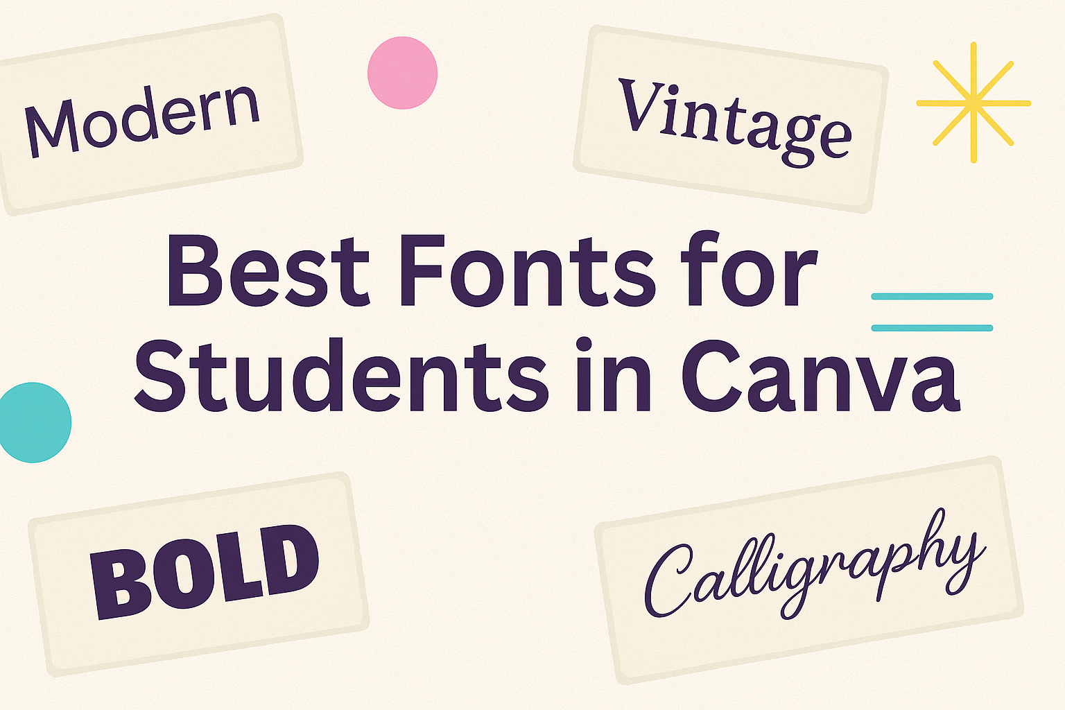
Choosing the right font can make a big difference in school projects.
Students using Canva can benefit from fonts that are not only visually appealing but also easy to read.
The right font can enhance presentations, essays, and even creative projects, helping ideas to stand out.
With so many options available in Canva, it can be overwhelming to select the best ones.
It’s important to consider factors like legibility, style, and the tone of the project.
Each font has its own personality, and finding one that fits the content can help capture the audience’s attention and convey the right message.
This blog post will explore the best fonts for students in Canva, highlighting choices that work well for various academic needs.
Whether it’s for a formal report or a fun presentation, the right font can elevate the work and make it more engaging.
Understanding Typography in Education
Choosing the right fonts is essential in an educational setting. It affects readability and comprehension, which can significantly influence a student’s learning experience.
Importance of Font Choices
Font choice plays a crucial role in how students engage with text. Clear, legible fonts help students read more efficiently.
Fonts like Poppins and Nunito offer modern designs that maintain readability, even in smaller sizes.
Using a mix of sans-serif and serif fonts can enhance learning materials. Serif fonts, such as Georgia, are often easier to read in long texts. Meanwhile, sans-serif fonts, like Lato, give a clean look that works well for presentations.
Teachers should consider the age and reading level of students when selecting fonts. For younger students, fun and friendly fonts can make learning more appealing.
The Impact of Fonts on Learning
Fonts can significantly impact a student’s ability to learn and retain information. Studies show that certain fonts can improve reading speed and help reduce reading fatigue.
For instance, using Lexend has shown promise in enhancing reading performance. This font is specifically designed to aid students with reading difficulties.
Fonts that are too fancy or difficult to read can confuse students, leading to frustration.
Moreover, font size and spacing are just as important as the font itself. Proper spacing between letters and lines supports better comprehension, ensuring students can focus on the content.
Adopting the right typography can create a positive learning environment for all students.
Exploring Canva for Students
Canva offers a range of features tailored for students, making design accessible and enjoyable. Its user-friendly interface and helpful tools empower students to create visually appealing projects with ease.
Features and Tools
Canva includes various tools to help students design confidently. The drag-and-drop feature allows users to place elements exactly where they want them. This makes it easy to add images, text, and graphics to any project.
Students can choose from thousands of templates specifically made for school projects. Whether it’s posters, presentations, or social media posts, there’s something to fit every need.
Moreover, Canva provides access to a wide variety of fonts, including those ideal for young students, making text clear and engaging.
Users can also collaborate with classmates on projects in real time, which enhances teamwork and creativity.
Accessibility and User Experience
Canva is designed to be accessible for everyone, including students. The platform can be used on various devices, such as laptops, tablets, and smartphones. This flexibility allows students to work from anywhere, whether at home or in the classroom.
Its intuitive interface makes navigation simple, even for beginners. Students can quickly learn how to use the features and tools without feeling overwhelmed.
Canva also offers tutorials and support to help users develop their design skills. This ensures that students can maximize their use of the platform while completing school assignments and projects.
Criteria for Selecting Fonts
Choosing the right font for student projects in Canva involves careful consideration of several important factors. These factors help ensure the selected font aligns with the project’s goals and enhances communication.
Readability and Legibility
Readability is crucial when selecting fonts for educational materials. A font should be easy to read, especially in longer texts like essays and reports.
Sans-serif fonts like Lato or Arial are excellent choices for creating clear and concise text.
Legibility, on the other hand, refers to how easily individual characters can be distinguished. A font like Georgia is widely recognized for its clarity on screens. When designing, it’s important to avoid overly decorative fonts that can distract from the content.
To ensure legibility, consider factors such as font size and line spacing. A larger size with ample spacing between lines can enhance the reading experience.
Font Personality and Tone
The personality of a font sets the mood of the design. For academic projects, a more formal font, such as Times New Roman, conveys professionalism and seriousness.
Conversely, a playful font, like Pacifico, might be fitting for projects aimed at a younger audience or creative subjects. It’s essential to match the font’s personality with the tone of the content.
Students should also consider how the chosen font impacts the message. A font that portrays confidence and clarity can enhance the viewer’s perception of the project.
Compatibility with Visual Content
Fonts should seamlessly integrate with any visual elements in a design. Ensuring compatibility means matching the font style with images, colors, and overall layout.
For example, a bold font may work well with minimal visuals, while a lighter font complements colorful graphics. This balance aids in maintaining a cohesive appearance.
Students can experiment with pairing fonts. For example, using a bold font for headings and a simple font for body text creates visual interest. Make sure to test different combinations to see what works best for the project.
Top Fonts for Student Projects
Choosing the right font can make a big difference in student projects. Specific fonts enhance readability and communicate ideas effectively. Here are some excellent font choices for various student needs.
Serif Font Recommendations
Serif fonts are known for their classic style and readability. They include small lines or decorations at the ends of letters, which guide the reader’s eye.
-
Georgia: This font offers a warm and welcoming feel, perfect for essays or reports. It’s easy to read both on screens and in print.
-
Merriweather: Designed for clarity on digital screens, Merriweather balances stability and modern appearance. It’s great for longer texts like research papers.
-
Libre Baskerville: This font adds a touch of elegance. Its traditional look works well for formal presentations or literary assignments.
These serif options help students present their work clearly and professionally.
Sans-Serif Font Recommendations
Sans-serif fonts are modern and clean, making them very popular for student projects. They lack the decorative elements of serif fonts, which can improve focus.
-
Lato: Versatile and friendly, Lato is ideal for both headings and body text. Its balanced appearance is great for any type of project.
-
Nunito: This rounded sans-serif font combines a modern look with great readability. It suits various types of presentations and documents.
-
Roboto: Known for its geometric shapes and clean lines, Roboto works well in digital formats. It’s a good choice for slideshows or posters.
These sans-serif fonts offer a clean aesthetic that helps keep attention on the content.
Display Fonts for Creative Impact
For projects that require a bit of flair, display fonts can add creativity and personality. These fonts are bold and eye-catching, perfect for grabbing attention.
-
Oregano: This whimsical script font has playful curves, making it suitable for invitations or creative displays.
-
Pacifico: With its casual, handwritten look, Pacifico is great for informal projects like posters for school events.
-
Lobster: Known for its bold style, Lobster adds a retro vibe. It works well on flyers or any creative work that needs to stand out.
Using display fonts allows students to express their unique ideas while maintaining clarity.
Guidelines for Combining Fonts
When creating designs in Canva, combining fonts should enhance readability and visual appeal. It’s important to consider how different fonts work together while ensuring the message remains clear.
Pairing Fonts Effectively
To pair fonts effectively, contrasting styles lead to the best results. Choose one font for headlines that catches the eye, and another for body text that is easy to read.
For example, a bold sans-serif font can be paired with a clean serif font. This combination draws attention while maintaining clarity.
A good rule of thumb is to limit font pairs to two or three. Too many fonts can lead to a cluttered look. Sticking to a simple palette keeps designs professional and cohesive.
Balancing Font Weights and Styles
Balancing font weights and styles is crucial for visual harmony. A strong headline can use a bold weight, while the body text should be lighter. This contrast helps guide the reader’s eyes.
When using decorative or unique fonts, limit their use to headings or emphasis. Body text should remain simple to ensure readability.
For instance, using a script font for a quote alongside a neat sans-serif for regular text can create interest without overwhelming the viewer. It’s all about finding a balance that works for the design’s purpose.
Practical Tips for Font Usage
When using fonts in Canva, attention to detail can elevate any project. Students should focus on sizing, color, and accessibility to ensure their design is both appealing and practical. Here are some important tips for effective font usage.
Font Sizing and Hierarchy
Font size plays a crucial role in creating a clear hierarchy. Headings should be larger to draw attention, while subheadings can be slightly smaller.
Typically, a font size of 24-32 pt for headings works well, while 16-20 pt is good for subheadings.
Using bold font for headings can enhance visibility. Make sure to maintain a consistent size throughout the document. This helps viewers easily identify sections.
For body text, a size of 12-14 pt is usually effective. It ensures comfort during reading. Always keep in mind that legibility is key, especially in educational materials.
Color and Contrast Considerations
Choosing the right colors can make a big difference. Contrast between the font color and background is essential for readability.
Dark text on a light background is easier to read than light text on a dark background.
For example, using black or dark blue text on a white background is a classic choice. Avoid colors that clash, such as red text on a green background, which can be hard to read.
When picking colors, use a tool to test the contrast ratio. This ensures that the text stands out sufficiently. Adjusting colors can enhance both appearance and clarity.
Maximizing Font Accessibility
Accessibility is vital for ensuring that all students can read the content. Choosing fonts that are easy to read helps communicate ideas clearly.
Fonts like Arial or Calibri are good choices since they are straightforward.
Additionally, consider using larger font sizes for those who may struggle with visual impairments. A line spacing of 1.5 can make the text easier to follow.
Avoid overly decorative fonts, as they can confuse readers. Simple and clean fonts tend to be more effective. Ensuring accessibility makes learning inclusive for everyone.
Implementing Fonts in Canva
Selecting the right fonts in Canva is just the beginning. It’s important to know how to effectively use and customize these fonts to meet specific needs and preferences. This section focuses on key techniques for maximizing font potential in designs.
Using the Text Tab
The Text Tab in Canva is where the magic begins. Users can find it on the left side of the screen. Here, they can add headings, subheadings, and body text.
-
Adding Text: Click on the “Text” section and choose from pre-designed text combinations or add your own.
-
Font Selection: After adding text, users can easily select different fonts from the dropdown menu. Popular options like Lato, Georgia, and Nunito are excellent for academic projects.
-
Adjusting Size: Users can modify the font size by dragging the slider or typing in a specific number.
-
Text Positioning: It’s simple to move text by clicking and dragging it into place on the design.
Customizing Fonts for Branding
Customizing fonts helps to create a unique brand identity. To achieve a cohesive look, it’s essential to choose fonts that reflect the brand’s personality.
-
Font Pairing: Users should choose two to three complementary fonts. A good practice is to pair a serif font with a sans-serif font for a balanced design.
-
Color Schemes: Font colors should align with brand colors. Canva allows users to apply color palettes, ensuring brand consistency.
-
Spacing and Alignment: Adjust line spacing and letter spacing to enhance readability and aesthetics. This can make a big difference in the overall look.
-
Style Variations: Users can make use of bold, italics, and underline to highlight important text.
Creating Text Templates
Creating text templates can save time and ensure consistency. It’s a useful approach for students or teachers working on multiple projects.
-
Design a Template: Start by designing a template layout that includes headings, subheadings, and body text areas.
-
Save as Template: After finalizing the design, click “File” and choose “Make a Template.” This will allow easy access in future projects.
-
Reuse Fonts: By creating a template with chosen fonts, users can maintain the same style across different documents and presentations.
-
Edit as Needed: Users can alter the content without changing the overall layout, making it a flexible option for varied projects.
Advanced Techniques
In Canva, students can enhance their designs using advanced techniques. These methods allow for creative expression and clearer communication of ideas, making projects more engaging and visually appealing.
Animating Text for Impact
Animating text can bring excitement to designs. When used sparingly, animations help capture attention without overwhelming the viewer. Canva provides simple tools for adding animations to text.
To animate text, users should first select the text box. Then, they can click on the “Animate” button in the top menu. From there, various animation options appear, such as “Fade,” “Rise,” or “Pan.” Choosing an appropriate animation can make a big difference.
A good rule of thumb is to select animations that match the tone of the project. For instance, a fun project could use a playful animation, while a serious presentation might require a more subdued option. Keeping animations consistent throughout the presentation helps with flow.
Using Grids and Alignment
Grids and alignment in Canva help organize designs effectively.
Proper alignment ensures that elements are visually balanced and easy to read.
Using grids makes it simple to create layouts for text and images.
Students can access grids by going to the “Elements” tab and searching for “grids.”
Once a grid is chosen, they can drag and drop images or text into the grid sections. This method allows for streamlined designs and keeps materials neat.
Alignment tools are also crucial.
Canva offers guidelines and a snap-to-grid feature. This makes it easier to align text boxes, images, and other elements.
Using these features provides a polished look to the project and enhances overall clarity.