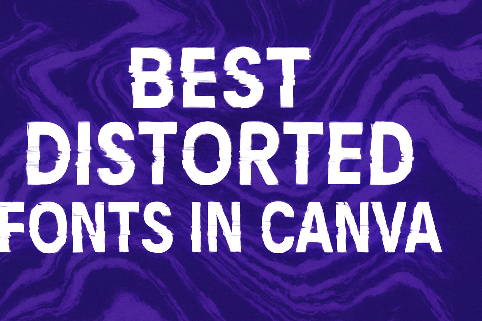
Exploring fonts can be like discovering a new toolbox for creative projects. Distorted fonts offer a unique twist to design work, making text stand out in a bold, artsy way.
These fonts can transform simple messages into eye-catching artwork, perfect for posters, social media graphics, or any project needing a spark of flair.
When searching for the top distorted fonts in Canva, several standout choices catch the eye. Petapon, a decorative font with playful and whimsical shapes, is a great example. This hand-drawn style adds a fun touch, ideal for projects aimed at children or for whimsical themes.
Another option with a futuristic feel is Mokoto Glitch 2, which is perfect for digital-themed designs due to its glitchy, uneven lines and rough texture.
For those into edgier or modern aesthetics, fonts like Glassure and Battery Park provide dynamic options to enhance their designs with a sense of movement or intensity. These fonts bring character and individuality to projects, helping them make a mark with strong visual appeal.
What Are Distorted Fonts?
Distorted fonts are unique typefaces that feature irregular shapes and creative designs. They add personality to various projects and are commonly used in creative and modern contexts.
These fonts can range from playful to edgy, making them versatile in graphic design.
Defining Distorted Fonts
Distorted fonts break away from traditional rules of typography. They can include warped or twisted letters, uneven baselines, and varied weights within the same font family.
This unconventional style creates visually striking text that captures attention.
Such fonts often combine elements of artistic expression and handwriting. This results in a look that is both raw and engaging. Distorted fonts are used to convey emotion and add a creative flair that standard fonts cannot.
Uses in Design
Distorted fonts are popular in designs that need to stand out. They are often used in logos, posters, and social media graphics where a creative touch is necessary.
These fonts help reflect specific themes, such as a playful atmosphere for children’s events or an edgy vibe for modern brands.
In platforms like Canva, designers have access to many distorted fonts that suit different projects. Fonts like Petapon add a whimsical feel, while more intense types provide a modern edge.
This flexibility allows designers to convey the right message through their text design.
How to Access Distorted Fonts in Canva
To access distorted fonts in Canva, users need to know how to navigate the interface efficiently and locate the font library.
Navigating Canva’s Interface
Upon logging into Canva, users arrive at the main dashboard. Here, they can select a project or start a new design. The search bar helps in finding templates or existing projects quickly.
On the left side, a toolbar presents options like Photos, Elements, and Text.
For distorted fonts, clicking on the “Text” tab is essential. This opens a range of text styles and options.
By selecting “Add a heading” or similar text box options, users can begin customizing text.
An understanding of this intuitive layout makes accessing fonts straightforward and user-friendly, even for beginners.
Finding the Font Library
Once the text box is added, users can explore the font library. Clicking on the font name in the upper toolbar reveals a drop-down list of available fonts.
This comprehensive library includes a wide variety of fonts, including edgy and creative distorted styles that can add a unique flair to any design.
To streamline the search for a specific style, typing keywords such as “distorted” in the search bar can help. This targets specific font types quickly and efficiently.
With this knowledge, designers can easily select and apply the best distorted fonts to enhance their Canva creations.
Top Distorted Fonts in Canva
Distorted fonts offer a unique appeal, adding creativity and personality to various designs. The styles in this section highlight diverse options, from grungy textures to eroded and abstract looks, each bringing its own flair to your projects.
Grungy Styles
Grungy fonts often have a rugged and edgy character, perfect for designs that need a bold, rebellious look. These fonts typically feature rough edges and uneven shapes that give a distressed appearance.
An example is the JA Jayagiri Sans Rough, known for its standout style and legibility, making it a great choice for logos where visibility is key.
Adding a grungy font can make any design pop, giving it an urban or punk feel that’s hard to miss. In Canva, there are numerous options to explore, allowing designers to match the grunge vibe precisely.
Eroded Text Looks
Eroded fonts create an impression of wear and tear, as if they’ve been weathered over time. They are excellent for projects aiming for a vintage or antique style. The worn-out appearance gives a sense of history or nostalgia, appealing for certain creative concepts.
Fonts like Hellprint can give the text a striking, aged look that captivates audiences. These fonts are often used in posters or retro-themed designs, where evoking the past plays a significant role. The variability in erosion provides depth and authenticity, making them a designer’s favorite for an aged effect.
Abstract and Artistic
Abstract fonts defy regular design conventions by playing with shapes, curves, and lines. They infuse creativity and surprise into projects. Fonts such as Petapon offer playful, whimsical shapes that are great for creative fields and children’s designs.
These fonts bring a level of uniqueness and artistry, making each letter a mini artwork. They work well in settings where originality is prized, like art exhibits, children’s books, or modern branding initiatives.
By choosing abstract and artistic fonts, designers can ensure their work stands out and captures attention with its creativity and flair.
Choosing the Right Distorted Font
Selecting the best distorted font can transform a design project by adding character and depth. It involves understanding how to align the font with the theme and ensuring it remains easy to read.
Matching Fonts to Your Project
A successful design begins with matching the font to the project’s theme. Each distorted font carries its own mood and style, which can significantly impact the overall vibe of your design.
For playful or child-friendly designs, fonts like Petapon could be ideal due to their whimsical shapes.
For projects aimed at creating an edgy or modern look, consider using fonts such as Glassure or Battery Park. They bring a sense of boldness and innovation.
When designing for a holiday or seasonal event, like Halloween, fonts with themes like dripping or spooky effects will make the design stand out.
Choosing a font that aligns with the purpose of the project ensures the final product resonates well with its audience.
Considering Readability
Readability is crucial when using distorted fonts, even though style is key. A font might look visually appealing, but if the audience struggles to read it, the message will be lost.
It’s essential to balance creativity with clarity.
Keeping this balance means choosing fonts that don’t overpower the text’s message but still add visual interest.
Generally, distorted fonts should be used for headings or short statements rather than large blocks of text. Incorporating clear and simple fonts alongside distorted ones can also help maintain readability.
Ensuring enough contrast with the background is another factor that aids readability, allowing the text to remain legible, regardless of the design’s complexity.
Using Distorted Fonts Effectively
Distorted fonts can add a creative twist to any project, giving them a unique and memorable look. It’s important to think about how these fonts interact with other elements in your design and maintain a pleasing visual balance.
Pairing with Other Fonts
When using distorted fonts, it’s essential to consider how they pair with other fonts in your design.
A distorted font often has a bold and unique style, making it perfect for headlines or titles. Pairing it with a simpler, more readable font for body text ensures clarity and comprehension.
Using contrasting font styles in your design can create a dynamic and engaging look.
For instance, combining a playful distorted font like “Petapon” with a clean sans-serif font can highlight the differences and enhance your design’s visual interest.
The important thing is to ensure that the fonts complement each other, maintaining balance between creativity and readability.
Creating a cohesive look involves paying attention to the mood and tone of the fonts used. Whether aiming for a casual, edgy design or something more elegant, the choice of complementary fonts should reflect and support the overall design theme.
Maintaining Visual Harmony
Visual harmony involves balancing all design elements to create an attractive and cohesive look.
While using a distorted font can bring energy to your design, ensuring it doesn’t overpower other elements is crucial.
Balance the distorted text with whitespace to maintain a clean and organized appearance.
Consider the use of colors and shapes surrounding your text to keep the design from becoming chaotic. Consistent spacing and alignment help create a structured and polished appearance.
A distorted font like the Gyanko Stencil might work well to draw attention, but it needs thoughtful placement and spacing to avoid visual clutter.
It’s helpful to evaluate the overall layout and test various elements’ positioning to find what works best. Whether for a poster, social media post, or presentation, maintaining visual harmony ensures that every design component works together to enhance its impact.
Customizing Fonts in Canva
Customizing fonts in Canva allows users to enhance their designs by adjusting font size, spacing, effects, and colors. These options make designs more engaging and tailored to specific needs.
Adjusting Font Size and Spacing
In Canva, users can easily modify the font size to suit different design goals.
To change the font size, they just need to select the text box and adjust it using the size toolbar at the top.
Spacing is another important aspect. Canva lets users alter the letter spacing and line height.
By tweaking these, they can make text more readable or create a unique look.
For instance, increasing letter spacing can give a more open, airy feel, while adjusting line height can ensure that text fits well within a design.
Applying Effects and Colors
Canva offers a variety of text effects that can truly make fonts pop.
Users can add shadows, outlines, or even apply a glow to their text. These effects provide depth and can highlight specific parts of a design.
Each effect can be fine-tuned with sliders to get just the right look.
Changing font color is straightforward in Canva. The color palette provides a range of hues to choose from, or users can enter a specific color code for brand consistency.
Combining colors with effects can create dynamic, eye-catching text that stands out in any project.
Examples of Distorted Fonts in Action
Distorted fonts bring a fun and creative touch to various design projects. They can transform ordinary designs into eye-catching pieces. From brand logos to marketing materials and social media graphics, these fonts are quite versatile.
Brand Logos
Distorted fonts can give brand logos a unique edge. By using fonts like Petapon, brands can create logos that express playfulness or creativity. This is ideal for companies in industries such as children’s products or entertainment.
The Glassure Font can add a modern, edgy feel to tech-focused brands, making them stand out in a competitive market.
Such fonts can make a company’s logo more memorable. This helps in establishing a strong brand identity, especially for businesses that want to show they think outside the box. Distorted fonts give the impression of innovation and originality.
Marketing Materials
In marketing, distorted fonts can make brochures, flyers, and posters pop.
Using the Mokoto Glitch 2 font, designers can create a futuristic look that attracts attention. These fonts work well for events related to technology or gaming, where a digital and modern look is desired.
Distorted fonts highlight key information on marketing materials effectively.
They can differentiate between headings and body text, making the material visually appealing. This can enhance the overall impact of the marketing message and keep audiences engaged.
Social Media Graphics
On social media, standing out is crucial.
Distorted fonts can add personality and character to graphics, making them more shareable.
A font like Jeepers from Creative Ultra’s list can create an edgy vibe perfect for reaching younger audiences.
Social media posts using these fonts are more likely to grab attention and encourage interactions.
They can be used in memes, announcements, or inspirational quotes, providing a creative touch that aligns with the platform’s dynamic nature.
Through strategic use of distorted fonts, brands can enhance engagement and foster a community.