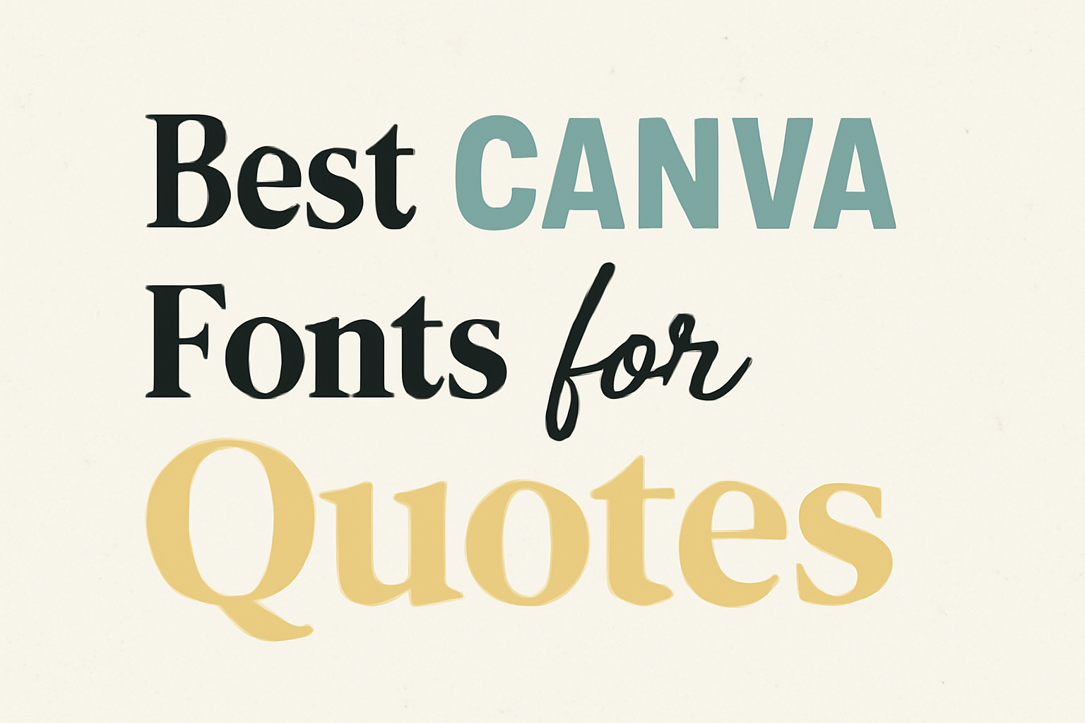
Choosing the right font can greatly impact the message of any quote.
The best Canva fonts for quotes enhance the meaning and make them stand out, whether for social media, posters, or personal projects.
This selection of fonts can help convey feelings and ideas in a visually appealing way.
From bold styles to elegant scripts, there are numerous options available in Canva that cater to different tastes and themes.
Each font plays a crucial role in setting the tone of the message, making it essential to pick one that matches the sentiment of the quote.
Readers will discover several top fonts that not only look great but also elevate their quotes to new heights. Engaging with these fonts can inspire creativity and make quotes more memorable.
Understanding Typography in Design
Typography is a key element in design that influences how a message is conveyed. The choice of fonts can shape the visual appeal, meaning, and effectiveness of quotes.
This section explores how fonts impact visual hierarchy, reader perception, and how to choose complementary fonts for layered quotes.
The Role of Fonts in Visual Hierarchy
Fonts play a major role in establishing visual hierarchy. They help guide the viewer’s eye and emphasize important information.
Different font sizes, weights, and styles create contrast and alignment, making certain elements stand out.
Examples include:
- Bold fonts draw attention.
- Lighter fonts can provide a subtle effect.
By varying font sizes and styles, designers can make key quotes pop, ensuring they capture the audience’s interest quickly.
For instance, using a large, bold font for the main idea and a smaller, lighter font for supporting details helps communicate the message clearly.
Font Psychology and Reader Perception
Font choice affects how readers perceive a message. Each font carries different emotions and characteristics.
For example, a playful font may convey joy, while a serif font may communicate tradition or reliability.
Key points include:
- Playful fonts (like handwritten styles) can create a friendly tone.
- Serif fonts (like Times New Roman) often feel classic and formal.
Understanding these associations helps designers select the right font to match the message being shared. A motivational quote might benefit from an energetic font, while a love quote could use a softer, more romantic font.
Complementary Fonts for Layered Quotes
Using complementary fonts can enhance layered quotes, making them visually appealing and easier to read.
It’s important to combine fonts that complement each other without clashing.
Tips for pairing fonts include:
- Mixing serif and sans-serif styles to add contrast.
- Pairing a bold headline font with a subtle body font.
For example, a bold display font works well for the main quote, while a clean sans-serif font serves as a secondary text for attribution. This contrast not only adds interest but also improves readability, helping the viewer absorb the message effortlessly.
Selecting the Right Font for Your Quote
Choosing the right font for a quote can greatly impact how the message is received. Factors like font style, readability, and pairing can make a significant difference in effectiveness.
Serif vs Sans Serif
Serif fonts have small lines or embellishments at the ends of letters. These fonts often convey tradition and reliability. Popular serif options include Times New Roman and Georgia. They work well for quotes that aim for an elegant or classic feel.
On the other hand, sans serif fonts are clean and modern. They lack the small lines, making them look straightforward and accessible. Fonts like Arial and Helvetica are common choices. They are perfect for quotes that want to convey simplicity and clarity.
The choice between serif and sans serif should match the tone of the quote and the feelings it seeks to evoke.
Considering Readability and Legibility
Readability refers to how easy it is to read a block of text. Legibility focuses on how clear individual letters and characters are. For quotes displayed on social media or posters, both aspects are vital.
Fonts that are too ornate can hinder readability. It is often best to choose fonts with a good balance of style and simplicity.
Avoid overly decorative fonts when the quote is long. Instead, opt for fonts that are easy to read from a distance. This ensures the message is clear and impactful to every viewer.
Font Pairing Strategies
Font pairing involves using two different fonts in one design. This can enhance the visual appeal of quotes.
A good strategy is to combine a bold font for the main quote and a simpler font for the author’s name.
For instance, using a font like Anton for the quote can add impact, while a clean font like Noto Serif for attribution keeps it classy.
Keep within a family of fonts to maintain harmony throughout the design. Remember to ensure that the fonts contrast enough so that each part stands out without clashing. This thoughtful combination will make the quote more engaging and easier to read.
Top Canva Fonts for Inspirational Quotes
Choosing the right font can greatly enhance the impact of an inspirational quote. Different styles can convey various emotions and attract attention effectively. Here are some excellent options to consider.
Elegant Script Fonts
Elegant script fonts offer a touch of sophistication to any quote. They are ideal for topics that inspire creativity or romance. Fonts like Dancing Script and Great Vibes are popular choices because of their flowing, cursive style.
These fonts are perfect for adding personal flair to social media posts or printables. The soft curves and artful connections make quotes stand out beautifully. However, it is essential to ensure that the text remains readable, especially at smaller sizes.
Consider using these fonts for quotes about love, art, or motivation. Elegant script fonts can transform simple words into a heartfelt message.
Bold and Impactful Display Fonts
For those looking to make a strong statement, bold display fonts are the way to go. Fonts like Anton and Bebas Neue grab attention instantly with their thick strokes and strong presence.
These fonts are ideal for motivational quotes that need to uplift and energize the audience. Their bold nature creates a sense of urgency, making it perfect for eye-catching posters or social media graphics.
Using these fonts helps ensure that the message is loud and clear. They work particularly well in environments where competition for attention is high, such as on social media feeds.
Modern Sans Serif Choices
Modern sans serif fonts bring a clean and polished look to quotes. Fonts such as Noto Sans and Montserrat are excellent for clear communication. Their simplicity ensures that the focus remains on the words themselves.
These fonts are versatile, making them suitable for various themes. Modern sans serif fonts work well for quotes on innovation, technology, or personal growth.
They are clear and easy to read, which makes them a popular choice for both digital and print designs. Their straightforward appearance allows the message to shine without distractions.
Popular Canva Fonts for Business and Branding Quotes
There are many fonts in Canva that are perfect for business and branding quotes. Choosing the right font can help create a professional image and enhance the message being conveyed. Here are some top choices to consider.
Professional Serif Selections
Serif fonts are known for their elegant and traditional appearance. These fonts are often used in formal branding and corporate materials.
1. Noto Serif
This font is clean and easy to read. It works well for longer quotes and adds a touch of class. Noto Serif promotes a feeling of reliability, making it great for professional settings.
2. Merriweather
This font combines style with legibility. With its slightly condensed letters, it stands out well in both print and digital formats. It’s a solid choice for businesses looking to convey a serious message without losing warmth.
Minimalist Sans Serif Fonts
Sans serif fonts offer a modern and clean look. They are often used in tech or contemporary branding to project clarity and simplicity.
1. Montserrat
This versatile font has a geometric style. It’s bold enough for headlines but works just as well for quotes. Montserrat adds a modern touch to any design, making it ideal for startups.
2. Open Sans
This font is approachable and friendly. It has excellent readability and works nicely in various contexts. Open Sans is popular for its neutral design, which helps messages feel accessible.
Stylish Slab Serif Options
Slab serif fonts are known for their thick and bold strokes. They bring a unique character to business quotes.
1. Roboto Slab
With its strong presence, Roboto Slab commands attention. It balances a professional look with a bit of flair. This font is suitable for making impactful statements in branding.
2. Arvo
Arvo stands out thanks to its contemporary design. This font has a slightly playful touch while remaining professional. It’s ideal for businesses wanting to showcase creativity in their quotes.
Each of these font styles serves a different purpose while maintaining a strong visual appeal.
Creative Use of Canva Fonts for Personal Quotes
Using the right fonts can greatly enhance the emotional impact of personal quotes. Different font styles contribute unique feelings and aesthetics, making quotes stand out. Below are some exciting styles to consider.
Handwritten and Calligraphy Styles
Handwritten and calligraphy fonts give quotes a personal touch. These fonts mimic natural handwriting, often creating a cozy and intimate vibe. They work well for heartfelt messages or personal reflections.
Popular options include Dancing Script and Pacifico. These fonts offer fluid lines and charming loops. They can evoke feelings of warmth and authenticity, making readers feel connected to the message.
These styles are perfect for social media posts or personal art projects. They can also be used in cards or invitations, making them special. Using these fonts can transform a simple quote into a cherished keepsake.
Decorative and Novelty Fonts
Decorative and novelty fonts add creativity and playfulness to quotes. They often feature unique designs, patterns, or shapes, capturing attention instantly. They are suitable for fun and light-hearted quotes aimed at motivation or encouragement.
Fonts like Lobster and Bebas Neue showcase bold designs and eye-catching styles. These options stand out in posters and digital graphics. They bring personality to motivational messages, making them memorable.
These fonts work well in casual settings, such as brunch invites or social media graphics. They can elevate a simple quote, ensuring it resonates with the audience. Their visual flair can spark joy and excitement.
Unique Typewriter and Vintage Choices
Typewriter and vintage fonts offer a classic and timeless look. They can bring nostalgia to quotes, making them feel significant. This style often appeals to those who appreciate a retro aesthetic.
Fonts like Courier New and Vintage Dreams provide a unique flair. They add a sense of history and seriousness, perfect for thoughtful quotes or literary references. Using these fonts can create an atmospheric feel.
These styles are great for creative projects like scrapbooking or book covers. They can elevate the design while adding depth to the message. Many enjoy the comforting vibe these fonts convey, making them perfect for thoughtful sharing.
Customization Techniques in Canva
Canva offers various tools to customize fonts effectively. By adjusting font size and line height, choosing the right color and contrast, and applying text effects, users can create visually appealing and impactful quotes.
Adjusting Font Size and Line Height
Adjusting font size is crucial for making quotes stand out. Users should select a size that is easy to read. For social media, larger sizes often work better, while smaller sizes can be used for prints.
Line height also plays a vital role. Increasing line height can improve readability, especially for longer quotes. A common practice is to set line height between 1.2 to 1.5 times the font size. This creates a balanced look.
To adjust these settings, users can find options in the text panel. There, they can easily modify the size and line height until achieving their desired effect.
Color and Contrast Best Practices
Choosing the right color and contrast enhances a quote’s visual impact. Bright colors can grab attention, while softer tones can evoke calmness. It’s essential to consider the background color.
High contrast between text and background improves readability. Dark text on a light background or vice versa works well. Consider using a color wheel to find complementary colors.
Testing different color combinations can lead to a more appealing design. Users may also want to apply a transparent overlay to maintain text visibility against busy backgrounds.
Applying Text Effects and Custom Styles
Canva allows users to apply various text effects to create unique styles. Shadow and outline effects can help make text pop against backgrounds. These effects add depth and can make quotes more eye-catching.
Users can also experiment with styles like bold, italic, or uppercase letters. These styles can emphasize important words and convey emotions.
For a cohesive look, pairing fonts that complement each other is essential. Canva provides many font combinations, but users should ensure they align with their message’s tone. Experimentation with these tools can lead to impressive designs for any quote.
Incorporating Graphics and Elements with Text
Adding graphics and elements alongside text can make quotes stand out more. Using icons, shapes, and images can enhance the appeal and message of the design.
Using Icons and Shapes to Enhance Quotes
Icons and shapes can bring life to quotes. They help to create visual interest and guide the viewer’s eye.
For example, a heart icon can complement a quote about love, while a lightbulb can enhance a quote about ideas.
Using simple shapes like circles or squares as backgrounds can also make text more readable. This technique allows the text to pop against busy backgrounds.
Icons should be chosen carefully to match the tone of the quote. This ensures the overall message feels cohesive.
Layering with Backgrounds and Frames
Layering can add depth to a design. By placing text over interesting backgrounds or using frames, quotes become more engaging.
For instance, a soft gradient behind the text can increase readability without overpowering it.
Frames can help to highlight quotes, drawing immediate attention. It’s best to keep the frames subtle to maintain focus on the text.
Different textures, like a canvas or wood background, can add a unique touch to the design.
Balancing Text with Imagery
Balancing text and images is essential for a harmonious look.
The text should not be overshadowed by images but should instead complement them.
Choosing clean and simple images allows quotes to take center stage.
When using images, it helps to maintain a consistent color scheme.
This creates unity in the design.
He or she can place quotes within images, aligning them naturally to enhance readability without cluttering the visual space.