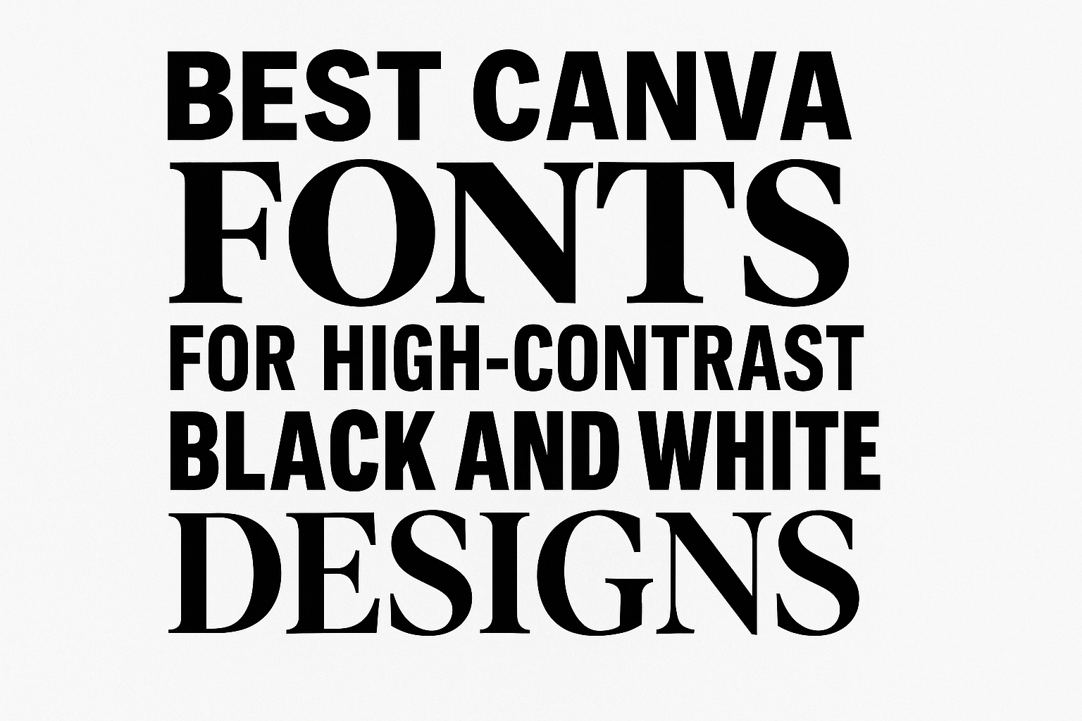
High-contrast black and white designs rely on fonts that stand out clearly and add style without overwhelming the message. The best Canva fonts for this kind of design are bold, clean, and easy to read, making sure the text catches the eye immediately. Fonts like Luthier, Work Sans, and Montserrat offer sharp serifs, geometric shapes, and strong lines that work perfectly in black and white layouts.
Using the right font can make all the difference in creating a striking and professional look. These fonts balance modern style with readability, so they suit everything from headlines to body text. Designers can easily find these and other great options to elevate any black and white project on Canva.
Getting the perfect font combination helps keep the look sharp and balanced without losing clarity. Fonts such as Alegreya Sans and Cabrito add personality while staying easy to read in high-contrast settings.
Learn more about the best free fonts on Canva to explore all the options.
What Makes a Font High-Contrast in Black and White Designs?
High-contrast fonts use sharp differences in stroke thickness to make text stand out clearly in black and white designs. This difference improves visual impact and helps readers quickly grasp key messages. Choosing the right font affects both how striking and how easy the text is to read.
Defining High-Contrast Typography
High-contrast typography features letters with thick and thin strokes that vary dramatically. For example, some parts of a letter might be very bold while others are slender lines. This sharp contrast creates a striking look, making the text pop against a plain black or white background.
Fonts like Bodoni and Didot are classic examples. They have strong, elegant lines that give a sophisticated feel. The difference between thick and thin parts draws the eyes and adds personality to headings or logos.
Benefits of High-Contrast Fonts
High-contrast fonts improve legibility by clearly separating letter shapes from the background. In black and white designs, this contrast helps prevent eye strain and makes reading easier. It also creates a strong visual hierarchy, guiding viewers to important information first.
These fonts add drama and style too. They work well in branding, posters, and titles where grabbing attention is key. The bold strokes highlight words or phrases, aiding quick comprehension. Accessibility is also better with high-contrast fonts, especially for people with visual challenges.
Considerations for Monochrome Projects
When using high-contrast fonts in black and white, balancing readability with style is essential. Too much contrast can cause fine strokes to disappear or blend together, reducing clarity. Spacing between letters should be adjusted to avoid crowding.
The font choice should complement the overall design theme. A modern layout might use sleek sans-serif high-contrast fonts, while traditional styles lean on serif fonts for elegance. Testing font sizes and weights on your actual background ensures the text remains clear and visually appealing.
For support in picking and activating these fonts, users can explore tools like Canva’s font collections with high contrast options to find the best fit for their design goals (see more about high contrast fonts).
Key Features of the Best Canva Fonts for Black and White
High-contrast black and white designs demand fonts that stand out clearly and hold strong visual interest. The best fonts for these designs focus on clean shapes, clear distinctions between thick and thin parts, and styles that suit the mood, whether bold or elegant. Understanding these features helps in picking the perfect typeface for any project.
Geometric Construction and Clarity
Fonts with geometric construction use simple shapes like circles, squares, and triangles. This makes letters look clean and easy to read, which is key for black and white designs where clarity matters most. Sans-serif fonts often use geometric forms. For example, condensed sans-serif fonts in Canva work well when space is tight but readability can’t be lost.
Clear letter shapes reduce visual noise and prevent the text from blending into the background. This feature suits display fonts that need to grab attention in bold, high-contrast projects. Geometric fonts also keep designs balanced and modern, making them common in branding and headlines.
Font Weight and Stroke Contrast
Font weight is about how thick or thin the letters appear. Fonts with bold weights are great in black and white because they hold strong against the sharp color contrast. Stroke contrast refers to differences between thick and thin parts of letters. A font with subtle stroke contrast keeps the text elegant while staying visible.
Many serif fonts excel in stroke contrast, adding a classic feel to a design. On the other hand, bold display fonts with uniform weights create a striking and powerful look. Canva users often mix font weights to add hierarchy, making headings bold and body text lighter for better flow.
Serif vs Sans-Serif Characteristics
Serif fonts have small lines or decorations at the ends of letters. These details add sophistication and help guide the eye across words. Serif fonts are great for black and white designs needing a traditional or refined vibe. They also work well in print or formal projects.
Sans-serif fonts lack these extra details and appear simpler and cleaner. This makes them ideal for digital designs and modern aesthetics. In Canva, sans-serif fonts, especially condensed versions, save space and maintain strong presence in tight layouts. Each style fits different moods, so choosing between serif or sans-serif depends on the design goal and audience.
Top Serif Canva Fonts for High-Contrast Designs
High-contrast black and white designs need fonts that stand out with clean lines and clear details. Serif fonts with strong shapes and thoughtful accents work best to create sharp, elegant looks. These fonts also bring style and readability to both bold headings and subtle body text.
Playfair Display: Elegant Serif Impact
Playfair Display is perfect for those wanting a touch of sophistication in their high-contrast designs. It features strong thick and thin strokes that create dramatic contrast, making black and white layouts pop. The font’s elegant serif details and stylish ligatures add personality to headlines or logos.
This font shines particularly in large sizes. Its stylistic alternates offer unique letter shapes, giving designs an artistic feel without losing clarity. Playfair Display suits projects that need a classic but noticeable serif presence.
Merriweather: Versatile and Readable
Merriweather balances readability with style, making it great for both headings and body text in black and white designs. It uses moderate contrast between thick and thin strokes that remain easy on the eyes, even on screens.
Designed for clear reading, Merriweather helps maintain sharpness in high-contrast settings. It features traditional serifs that add subtle elegance without overwhelming. Its versatility means it fits well in modern or classic design themes, especially when text legibility is a priority.
Bodoni: Timeless High-Contrast Style
Bodoni is known for its intense contrast between thick and thin strokes, creating a bold and memorable serif look. The font’s thin serifs and clean lines highlight the sharp division between black and white elements, making it ideal for dramatic designs.
With its refined shapes and elegant ligatures, Bodoni adds a timeless and formal feel. It works well for fashion brands, editorial layouts, or any design that needs a stylish highlight. Designers must use it with care at smaller sizes due to its delicate thin lines.
Cormorant: Classic Editorial Flair
Cormorant offers a vintage flair inspired by traditional book typefaces. Its strong serifs and distinct letterforms provide a classic look that works well in sharp black and white contrasts.
This font includes beautiful ligatures and stylistic alternates, enhancing its handcrafted appeal. Cormorant is a good choice for editorial projects or sophisticated branding that wants to convey trust and elegance. Its bold strokes keep designs readable without sacrificing style.
Best Sans-Serif Canva Fonts for Maximum Impact
Choosing the right sans-serif font can make a black and white design stand out. Fonts that are clear, bold, and well-shaped help deliver strong messages without distractions. Different fonts bring unique strengths for headlines and body text.
Montserrat: Modern Geometric Versatility
Montserrat features clean, geometric shapes inspired by urban signage. Its simple structure offers a modern feel that works well in black and white designs. It has many weights, making it a versatile choice for both headlines and subtext.
The font balances style with readability. It’s great for projects that need a contemporary, polished look. Designers often pick Montserrat to create a strong presence without feeling too formal or stiff.
Bebas Neue: Bold Display for Commanding Presence
Bebas Neue is known for its tall, all-caps letters that grab attention. It has a bold and condensed style, perfect for headlines that need to stand out. This font’s clean lines and even spacing keep text clear and easy to read from a distance.
Because Bebas Neue is designed for display, it works best in large sizes. It doesn’t have many weights, so it’s often paired with softer fonts for balance. It’s a favorite when a strong statement is needed in black and white designs.
Raleway: Sophisticated Minimalism
Raleway offers a sleek, thin-lined style with elegant curves. It is well-suited for space-conscious layouts where sophistication is key. The font has many weights, allowing for subtle emphasis without overwhelming the design.
Its minimalist style works beautifully in black and white, giving a refined look to headings and subheadings. Designers appreciate Raleway for projects that want a clean but not harsh appearance.
Oswald: Condensed Power for Headlines
Oswald brings a sturdy, condensed style that fits well in narrow spaces. Its strong vertical lines and clear shapes make it ideal for impactful headlines. Oswald maintains excellent legibility even when text is tight or small.
This font stands out in black and white layouts needing boldness without bulk. It pairs well with softer sans-serifs to create balanced designs. Oswald is perfect for projects that want power and clarity in headline text.
Optimal Canva Fonts for Body Text in Monochrome Layouts
Choosing the right body text font for black and white designs means focusing on clear, easy-to-read fonts that work well on screens and in print. These fonts need to maintain legibility in high-contrast settings and support long-form reading without causing eye strain.
Roboto: Readability Across Platforms
Roboto is a highly versatile sans-serif font often chosen for body text because it balances modern style with excellent clarity. Its letter shapes are open and well-spaced, making it easy to read on different screen sizes and resolutions.
This font works well in black and white layouts because it avoids overly thin strokes, so the text stays sharp and distinct against both light and dark backgrounds. Roboto’s consistent character width also helps maintain comfortable reading speeds, especially for long-form content like articles or reports.
Work Sans: Adaptable and Clean
Work Sans is designed with simplicity and legibility in mind, which makes it a great option for body text in monochrome designs. It features a clean appearance with slightly rounded edges that soften its look without losing professionalism.
Its adaptability makes it suitable for various devices, from desktop monitors to smartphones. Work Sans performs well in designs where the contrast between black and white can sometimes make reading difficult, because it has enough weight and space to keep letters distinct.
Open Sans: User-Friendly Legibility
Open Sans is renowned for being friendly on the eyes, which helps enhance the reading experience in black and white layouts. It has a neutral, approachable style with balanced letterforms that work well for extended text blocks.
The font’s wide apertures and simple line structure ensure clear character recognition, reducing fatigue during long reading sessions. Open Sans also pairs easily with different headline fonts, making it a flexible choice when designing cohesive monochrome projects.
Advanced Tips for Using Canva Fonts in Black and White Projects
Using Canva fonts well in black and white projects means focusing on clear contrast, style balance, and sometimes leveraging extra features like custom fonts.
Effective Font Pairings for Contrast
When working with black and white, pairing fonts that differ in weight and style is crucial. Combining a bold sans-serif font with a thin script or serif font creates clear visual separation.
For example, Impact + Dream Avenue offers a strong headline with a delicate touch for subtext. Another option, Margin + Marline, pairs a modern sans-serif with an elegant script, balancing simplicity and flair.
Choosing fonts with different spacing or letter shapes also helps keep readability high. Avoid using two fonts that look too similar, or the design can feel flat and confusing.
Using free fonts or those included in Canva’s font collection can provide many good options without extra cost.
Custom Fonts with Canva Pro
Canva Pro users can upload custom fonts to better match brand style or unique project needs. This is especially useful for black and white projects that require a signature look.
Uploading custom fonts lets designers move beyond the standard library to find unique styles that pair well with Canva’s free fonts.
With Canva Pro, users can also save font combinations in brand kits. This keeps font pairings consistent across multiple black and white projects, simplifying design work.
Editorial and Academic Use Cases
Black and white designs often appear in editorial layouts and academic publications. In these cases, font choice affects both clarity and tone.
For editorial projects, fonts that combine strong headlines with elegant body text work best. Fonts like Maglite + Julius Sans One offer a polished, readable combo that suits articles and reports.
Academic publications need fonts with high legibility and clean lines. Sans-serif fonts like Montserrat pair well with simple serif fonts to create hierarchy without distractions.