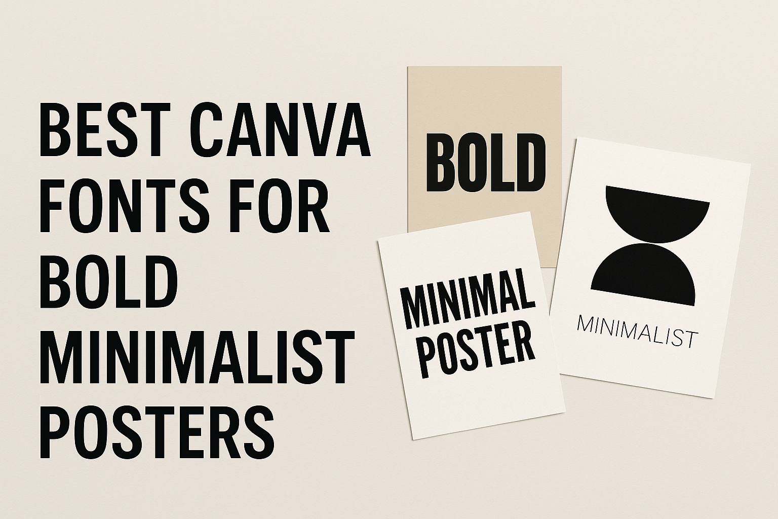
Creating bold minimalist posters in Canva is all about choosing the right fonts that catch attention without overcrowding the design. The best fonts for this style are clean, simple, and strong—like Lato Bold, Mont Bold, and Lot—which make your message clear and impactful. These fonts work well because they combine thick strokes with minimal details to keep the look modern and easy to read.
Designers looking to make their posters stand out should focus on fonts that balance boldness with simplicity. Using fonts with straightforward shapes and strong lines helps keep the poster’s message powerful without being busy or confusing. Whether for events, branding, or personal projects, these choices can make all the difference.
Minimalist fonts do more than just look good—they set the tone for the whole poster. By picking the right bold typefaces, anyone can create a design that is both eye-catching and easy to understand, perfect for sharing any message clearly and quickly. For more options and details, exploring the best bold fonts in Canva can help unlock the ideal look.
Key Qualities of Bold Minimalist Poster Fonts
Bold minimalist poster fonts rely on clear and simple design features that grab attention quickly. They balance strong shapes with easy readability, making sure the message is both striking and clear. These fonts use form and weight to create high visual impact without extra decoration.
Clean Lines and Geometric Shapes
Fonts for bold minimalist posters usually have clean, sharp lines that avoid unnecessary curves or flourishes. These clean lines make each letter easy to recognize and give the text a modern, sleek look.
Geometric shapes are common in these fonts, lending structure and balance. Circles, squares, and triangles in letterforms create a consistent, neat appearance. This simplicity helps viewers focus on the message without distraction.
Using clean, geometric fonts supports minimalist design principles by removing clutter. It makes the poster feel organized and professional, which is important when the goal is clear communication.
Legibility in Minimalist Design
Legibility is crucial in bold minimalist posters because the message must be clear at a glance. Fonts chosen for these posters have distinct letter shapes that avoid confusion, especially in larger sizes or from a distance.
Simple strokes and open spacing between letters enhance readability. Fonts like Sego or Futura are examples that maintain clarity while fitting minimalist style.
In minimalist design, avoiding overly decorative fonts helps the viewer quickly understand the content. Balanced letter spacing and a clean typeface make the text easy to scan, which is essential for posters meant to deliver fast information.
Visual Impact and Typeface Weight
Bold minimalist fonts use heavy weight to create strong visual impact. This thick style makes the text stand out against plain backgrounds and grabs viewers’ attention immediately.
The weight of the typeface adds emphasis without the need for extra elements like shadows or outlines. This keeps the design simple but powerful.
A font’s boldness paired with minimalist form helps key points pop on the poster, guiding the viewer’s eye efficiently. Fonts like Impact or Gotham are popular because they combine bold weight with clean, straightforward design that suits bold minimalist posters.
Essential Canva Fonts for Bold Minimalist Posters
Choosing the right font for a bold minimalist poster means striking a balance between simplicity and impact. The fonts highlighted here offer strong visual presence without clutter. Each font carries a distinct style that helps convey messages clearly while keeping designs clean and modern.
Impact
Impact is a classic choice for bold posters. Its thick strokes and compressed letterforms make text stand out instantly. This font works well for headlines that need to grab attention quickly.
Because it’s designed for maximum legibility, Impact keeps letters close but clear. It excels in short phrases or titles, especially when paired with minimalist backgrounds. In Canva, Impact is easy to apply for quick, dramatic results.
The font’s no-frills style aligns perfectly with minimalist design principles. It avoids extra decoration, focusing on strength and clarity. This makes it one of the best Canva fonts for creating posters that command attention without overwhelm.
Sego
Segoe is a clean sans-serif font favored for its smooth lines and balanced proportions. It offers modernity and elegance while maintaining readability in bold weights. This makes Segoe a great option for bold minimalist posters that need a refined look.
In Canva, Segoe’s simplicity works well with both digital and print designs. It supports various design styles by being adaptable and approachable. The font provides enough presence to stand out but still fits into minimalist layouts without adding clutter.
Segoe often appears in branding and professional materials because it communicates trust and clarity. Its versatility makes it a solid pick for designers wanting a quiet but powerful impact on a poster.
Garamond
Garamond is a serif font that brings a touch of classic style to minimalist posters. Despite its traditional roots, Garamond’s elegant strokes and distinctive serifs help create bold statements when used with strong weight.
This font adds a bit of sophistication and heritage, which contrasts nicely with minimalist simplicity. In Canva, Garamond allows designers to mix classic typography with modern design, offering a unique look that stands out for event posters or branding.
Its readability remains high even in bold, making it suitable for both headlines and short blocks of text. Garamond is ideal for anyone wanting to combine boldness with timeless style in their minimalist poster designs.
Standout Minimalist Canva Fonts
Some fonts make bold minimalist posters truly catch the eye. These fonts balance strong presence with clean shapes to create striking yet simple designs. Their unique features help designers make clear statements without clutter.
Giaza
Giaza offers a bold and geometric style that stands out in any minimalist poster. Its sharp edges and balanced letterforms make text easy to read while giving it a modern, assertive look.
Giaza works well for headlines and titles, where impact matters most. It’s also good for branding that wants to feel both strong and sleek. Its minimalistic approach keeps the design uncluttered but powerful.
Using Giaza helps emphasize key messages without overwhelming the viewer. This font fits best in posters focused on clarity and strength.
Brasika
Brasika is a distinctive sans-serif font with smooth curves and bold lines. It adds some personality while staying clean and readable. The subtle roundness softens its strong presence, making it friendly but confident.
This font works beautifully in designs targeting creative or casual audiences. Brasika can be used in both large headings and shorter text blocks because it maintains legibility.
Its straightforward style helps deliver messages clearly without extra decoration, perfect for minimalist posters where simplicity meets charm.
Gliker
Gliker brings a mix of modern sleekness and slight vintage flair to minimalist designs. It has clean, straight lines with a touch of softness in its curves. This balance makes it versatile for many poster styles.
It’s especially useful when a designer wants to add a bit of character without losing minimalist purity. Gliker fits well in bold titles but can also complement smaller text without losing sharpness.
This font gives posters a polished and professional feel while still standing out with subtle unique shapes.
Lucky Bones
Lucky Bones is a bold and condensed typeface that is great for making a statement. With its narrow letter spacing and thick strokes, it draws attention and fits well in minimal layouts where space is limited.
It works best for headlines that need to be clear and impactful, especially when paired with simple backgrounds. Lucky Bones adds energy without extra design elements.
This font is ideal for designers looking to maximize impact in minimalist posters, making messages jump out while keeping a clean look.
Unique and Modern Typeface Choices
Choosing a typeface that stands out while keeping a clean look can make a bold minimalist poster more effective. The right font balances style and readability, helping to highlight key messages without clutter. Below are three typefaces that offer both uniqueness and modern appeal for such designs.
Railey
Railey is a slender serif font known for its elegance and warmth. It adds a sentimental and personal touch, great for posters that need a softer, more romantic mood.
Its thin strokes create a delicate look, so it works best in larger sizes where details can be appreciated. Railey is often used for wedding invitations or boutique advertisements but fits nicely in minimalist posters needing a unique charm.
The font’s legibility remains solid despite the thin lines, making it a strong choice for headlines or short text blocks. It stands out without overpowering the overall design.
Break
Break is a modern sans-serif typeface that combines simplicity with sharp edges. This font offers a bold presence without extra decoration or flourishes, perfect for minimalist posters wanting a contemporary feel.
It’s excellent for making strong statements because of its geometric letter shapes and even weight distribution. Break holds up well in both large headlines and smaller text, maintaining clarity and impact.
The clean style of Break works well with stark color contrasts and plenty of white space. This makes it a go-to font for tech, fashion, or any project aiming for a sleek, stylish look.
Lovelo
Lovelo stands out with its strong, uppercase sans-serif design. It’s thick and bold but still feels clean and modern, making it ideal for posters that need attention without busy details.
This font has tight spacing between letters, creating a compact, solid appearance. It delivers high readability, even at a glance, and works well for both headings and branding elements.
Lovelo’s straightforward style pairs well with minimalist layouts that emphasize shape and form. It’s a favorite among designers creating impactful posters that need a fresh, confident voice.
For more font options suited for modern designs, explore the list of best Canva fonts for posters.
Sans-Serif and Rounded Sans-Serif for Posters
Choosing the right font style is crucial for bold minimalist posters. Fonts need to be clean, clear, and visually impactful. Both geometric and rounded sans-serif fonts deliver on these needs while offering slightly different vibes.
Geometric Sans-Serif Picks
Geometric sans-serif fonts are built on simple shapes like circles and squares. This gives them a modern and balanced look, perfect for bold poster headlines. Their clean edges and uniform structure create strong, clear text that stands out without extra decoration.
Fonts like Hero and Calama Sans offer narrow, tall letterforms, making them great for commanding attention in a minimalist layout. These fonts often work well for print and digital use because they keep text legible even at large sizes. Their straightforward design fits well with sharp, uncluttered poster styles where the message needs to be direct and powerful.
Rounded Sans-Serif Options
Rounded sans-serif fonts have smooth, curved edges that make designs feel friendly and approachable. They soften the hard look of typical sans-serif fonts without losing clarity. This style is excellent for posters that want to appear warm but still maintain a fresh, modern feel.
Popular rounded fonts like Ambiguity Rounded and Comfortaa Bold blend boldness with playfulness. Their rounded corners enhance readability, especially in large text, while giving a welcoming vibe. These fonts work well for brands or events aiming to connect personally with their audience while keeping a clean, minimalist design. Rounded fonts are flexible for various uses, from logos to headlines, making them a valuable choice for impactful poster design.
More about these fonts can be found in guides like the 10 Best Rounded Fonts in Canva.
Font Selection Tips for Poster Design Success
Choosing the right font shapes how a poster looks and how easy it is to read. It takes careful thought to pick fonts that fit a minimalist style but still grab attention. Clear, strong letters help the message stand out without cluttering the design.
Balancing Typography and Minimalist Aesthetics
Minimalist posters focus on simplicity, so font choices should avoid extra decoration. Fonts like Gotham, Sego, or Futura work well because they have clean lines and simple shapes.
The weight of the font matters. Bold fonts give impact, while lighter versions can support details or subtext. Using too many font styles can make things busy. Sticking to one or two fonts helps keep the minimalist look balanced and easy to follow.
Spacing between letters and lines also affects readability. Wider spacing can make bold fonts feel less heavy and improve clarity, especially for posters viewed from a distance.
Pairing Fonts for Maximum Impact
Choosing two fonts that complement each other can create a strong, clear message. A common approach is to combine a bold, eye-catching font for titles with a simpler font for smaller text.
For example, Impact works well for headlines because it’s thick and condensed. Pair it with Garamond or Railey for body text, which adds a touch of elegance without distracting the viewer.
Pairing should focus on contrast. Mixing a sans-serif font with a serif font creates a visual difference that guides the eye naturally. Avoid pairing fonts that look too similar because they can blend together and confuse the reader.