Choosing the right font for a book cover can make a big difference in attracting readers.
Canva offers a variety of fonts that are both appealing and functional, making it easier for authors to create eye-catching designs.
Whether it’s a bold serif for a romance novel or a playful sans-serif for a children’s book, the right typeface can set the tone for the entire work.
Many writers may wonder which fonts work best for their specific genre. With so many options available, having a curated list can save time and help in making design decisions.
This blog post will explore the best book cover fonts in Canva and provide tips on how to choose the perfect font for any project.
Importance of Choosing the Right Font
Selecting the right font for a book cover is crucial. It can influence how potential readers perceive the book. The font sets the tone and conveys important messages about the content.
Emotional Impact of Fonts
Fonts can evoke emotions and create an atmosphere that resonates with readers. For example, a sleek, modern font may attract a younger audience, while a classic serif font might appeal to those looking for historical or literary fiction.
Certain styles, like script fonts, can suggest romance or elegance, drawing in specific target groups.
It’s vital to choose a font that aligns with the mood and themes of the book. If the font matches the genre and story, it creates a stronger connection with the reader.
Font Legibility and Readability
Legibility is key when selecting fonts for book covers. A font should be easy to read, both from a distance and up close.
Using overly decorative or complex fonts may make it difficult for potential readers to understand the title or author’s name.
Fonts like sans-serif are often clear and modern, making them suitable for various genres. Heavier fonts can stand out more but must remain readable.
Ensuring that the font size is appropriate is also essential, especially when viewed on screens or in print.
Branding and Font Consistency
Font choice contributes to author branding. A consistent font style across multiple book covers helps establish a recognizable identity. This makes it easier for readers to associate certain fonts with their favorite authors.
Using the same font or a complementary style in marketing materials further strengthens this connection.
Readers often feel a sense of familiarity with brands they recognize, enhancing their interest in new releases. Thus, maintaining font consistency is an effective way to build a lasting brand image.
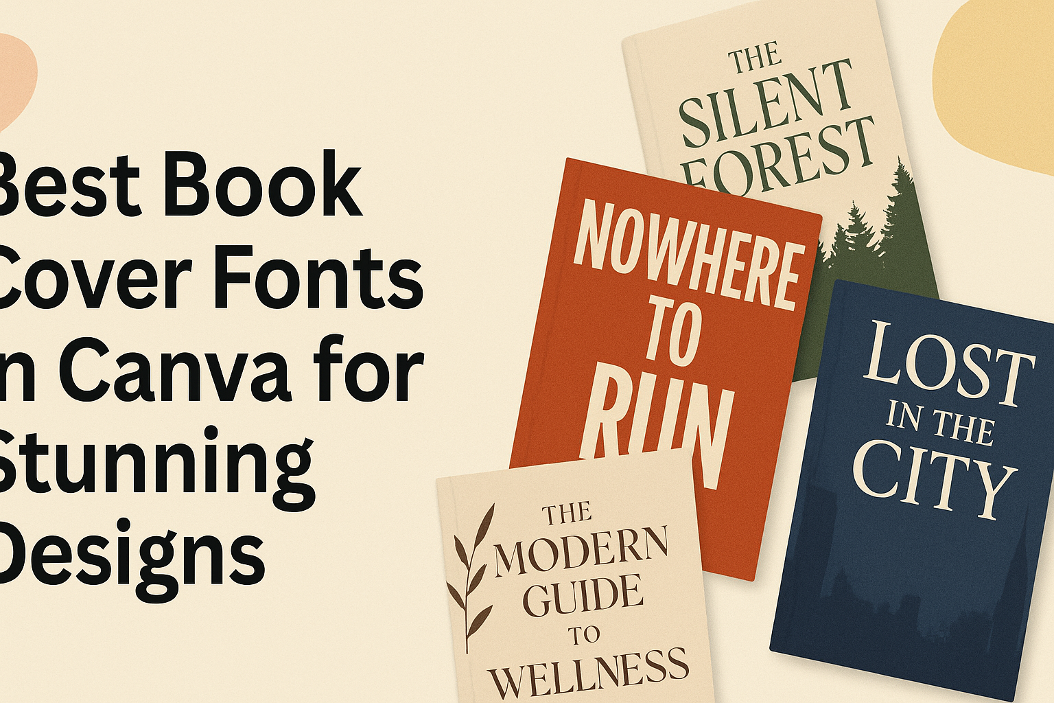
Popular Fonts for Book Covers on Canva
Canva offers a variety of fonts that suit different book genres and styles. Choosing the right font can enhance the cover’s appeal, making it more inviting to potential readers.
Here are some popular options categorized into serif, sans serif, and display fonts.
Serif Fonts Showcase
Serif fonts are known for their classic and traditional appearance. They work well for genres like fiction and historical books.
-
Merriweather: This font has a warm, readable style, making it great for longer texts. Its letterforms are slightly condensed, which helps fit more text on a cover.
-
Playfair Display: This elegant serif font adds sophistication. It is perfect for romance novels or literary works, as its high contrast makes titles stand out beautifully.
-
Cormorant Garamond: Inspired by old-style typefaces, this font adds a vintage touch. It’s suitable for classical literature or historical fiction, creating an inviting feel.
Serif fonts generally suggest trust and reliability, appealing to a wide audience.
Sans Serif Fonts Showcase
Sans serif fonts have a clean and modern look. They are versatile and suitable for various genres, from thrillers to self-help books.
-
Avenir: Known for its geometric shapes, Avenir is clean and professional. It’s ideal for non-fiction, where clarity and straightforwardness are key.
-
Zico Sans: This font combines modern design with excellent readability. Its simplicity makes it a strong choice for book covers that aim for a contemporary vibe.
-
Raleway: As a stylish and elegant sans serif, Raleway is great for a range of genres. Its unique character adds a special touch while keeping it easy to read.
Sans serif fonts appeal to modern readers, making them a popular choice for today’s book designers.
Display Fonts for Impact
Display fonts are designed to capture attention and convey personality. They can set the tone of a book right from the cover.
-
Fonseca: An art deco-inspired font, Fonseca features all-caps letters that draw the eye. It’s excellent for thrillers or action novels needing a bold presence.
-
Lobster: This cursive font adds a creative flair and can enhance the romantic feel of book covers. It works well in genres that emphasize personal connections.
-
Bebas Neue: A strong and condensed typeface, Bebas Neue stands out with its bold letters. It’s perfect for titles that need to make a strong first impression.
Display fonts are unique and can communicate the book’s mood effectively, attracting readers’ attention.
How to Select the Perfect Font
Choosing the right font is essential for creating an eye-catching book cover. Important factors include font pairing strategies and ensuring the selected font matches the book’s genre.
Font Pairing Strategies
Font pairing is about combining different fonts to create a cohesive look. It’s important to find a balance so that the fonts complement each other.
A common strategy is to pair a serif font with a sans-serif font. For example, a bold serif headline can contrast nicely with a clean sans-serif body text.
Another tip is to limit pairs to two or three different fonts. This keeps the design clean and easy to read.
It helps to use variations of a single font family. For instance, using different weights (bold, regular) from the same family can maintain harmony while adding interest.
Matching Fonts with Book Genre
The genre of a book heavily influences font choice. Fiction often benefits from creative and decorative fonts. For a romance novel, a script font may evoke a sense of emotion and elegance.
In contrast, non-fiction works usually require clean and professional fonts. A sans-serif font, like Arial or Helvetica, can convey clarity and reliability.
Consider the feelings that a genre aims to evoke. Mystery and thriller books might use bold, sharp fonts to create tension, while children’s books may feature playful, fun fonts.
Ultimately, aligning the font with the book’s theme helps attract the right audience and communicates what the reader can expect.
Design Tips for Book Cover Typography
Choosing the right typography for a book cover is essential for capturing readers’ attention. Effective typography can enhance the visual appeal and readability of the cover, making it more appealing to potential readers.
Typography Hierarchy Essentials
Typography hierarchy helps guide the viewer’s eye and emphasizes the most important elements. This can be achieved through font size, weight, and style.
- Title: The title should be the largest element, standing out clearly. A bold or stylized font is often effective here.
- Subtitle: If included, the subtitle should be smaller than the title and can use a different style to create contrast.
- Author Name: Placing the author’s name in a smaller size can still make it prominent. It is usually located at the bottom or top of the cover.
Using varied font styles creates a clear structure. This way, readers can quickly identify key information.
Color and Contrast in Typography
Color plays a significant role in making the text legible and appealing. High contrast between the text and background is crucial for readability.
- Light Backgrounds: Darker fonts work well, like deep blue or black. These colors stand out and are easy to read.
- Dark Backgrounds: Consider lighter colors like white or pastel shades for text. This approach maintains visibility.
Additionally, complementary colors can add visual interest without overwhelming the viewer. Using a color palette that aligns with the book’s theme can also enhance overall design appeal.
Spacing and Layout Considerations
Proper spacing contributes to clean and effective typography.
This includes line spacing (also known as leading) and letter spacing (kerning).
- Line Spacing: Adequate space between lines improves readability. Too little space can create a cramped look.
- Letter Spacing: Adjusting the space between letters can enhance legibility, especially in titles.
A balanced layout also matters.
Aligning text along predictable lines provides structure.
Arranging elements consistently across the cover makes for a visually appealing design.
Using grids in design software can help maintain organization.