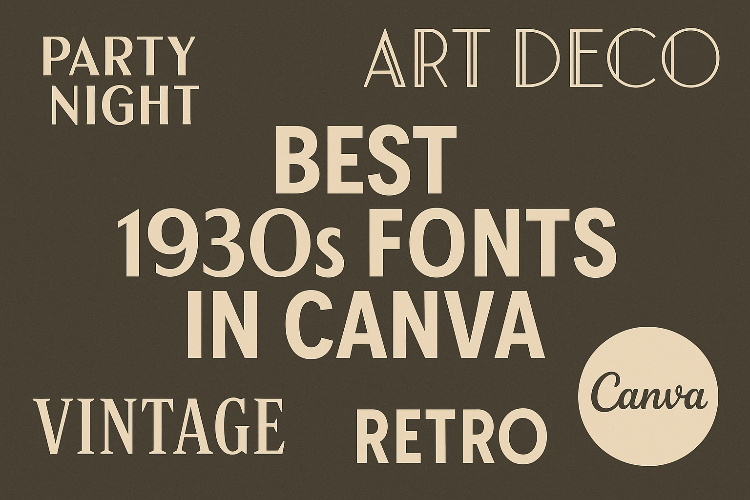
The 1930s marked a unique period in design, characterized by bold choices and a distinctive style. Canva offers a range of stunning fonts from this era that can elevate any project, capturing the essence of vintage design.
Whether for a retro-themed event or a creative project, choosing the right font can make all the difference.
From stylish sans-serifs to elegant serif fonts, the 1930s provided inspiration for many classic typefaces. Each font carries its own personality, adding charm and character to designs.
Using these fonts in Canva allows creators to tap into this historic aesthetic with ease.
Exploring the best 1930s fonts can transform ordinary designs into eye-catching works of art. With suitable options available in Canva, anyone can bring a touch of nostalgia to their projects.
Overview of 1930s Fonts
The 1930s brought about unique fonts that reflected creativity and elegance. Many typefaces from this era showcased bold designs and intricate details, influenced by cultural movements and technological advances.
Characteristics of 1930s Typefaces
1930s typefaces are known for their boldness and stylishness. They often have clean lines and geometric shapes.
Many fonts feature rounded edges, giving a softer appearance.
Serif fonts became common, adding a classic touch to printed materials. These typefaces were designed to be both eye-catching and legible, making them suitable for various uses, from advertising to newspapers.
Additionally, the fonts often included decorative elements. This added flair and richness to their appearance. Many designs also took inspiration from the emerging modernist movement.
Influence of Art Deco on Font Styles
Art Deco played a significant role in shaping fonts of the 1930s. This design style embraced luxury, glamour, and modernity.
Fonts from this period often featured sharp angles and intricate patterns.
The influence of Art Deco is evident in the way letters are formed. Many typefaces incorporated stylized letterforms that conveyed a sense of elegance. Fonts like “Bottleneck” and “Cochin” exemplify this trend.
This style also emphasized decorative aspects, such as unique serifs and elongated shapes. The attention to detail made these fonts stand out in various mediums. As a result, they remain popular choices for vintage design projects today.
Popular 1930s Fonts in Canva
In Canva, several fonts capture the distinctive style of the 1930s. This section highlights three popular fonts: Metropolis, Bifur, and Broadway. Each font brings a unique flair that can elevate designs inspired by this iconic decade.
Metropolis
Metropolis is a striking font that embodies the geometric design trends of the 1930s. Characterized by its clean lines and modern aesthetic, it is perfect for bold headlines and impactful statements.
The font features sharp angles and a condensed structure. This makes it a popular choice for posters, advertisements, and branding where clarity is key.
Using Metropolis adds a sophisticated touch to any design. It works well in both light and dark backgrounds, maintaining its readability and charm.
Bifur
Bifur is a unique typeface that showcases the stylish flair of the 1930s. It is known for its unusual, decorative letterforms that create a vibrant visual appeal.
This font was inspired by the Art Deco movement and can be used effectively in both titles and graphic elements. Its distinctive look can catch the viewer’s eye quickly.
Bifur is a great choice for projects that require an artistic touch. It pairs well with simpler fonts, making it versatile for various design applications.
Broadway
Broadway is a classic font that reflects the glamour and excitement of the 1930s. With its bold, curved characters, it is often associated with theater and entertainment.
This font is ideal for capturing attention in headlines, posters, and promotional materials. Its striking appearance makes it hard to overlook.
Broadway’s charming details give it a retro feel, perfect for projects aiming to evoke nostalgia. This font easily enhances any creative endeavor linked to this iconic era.
Using Vintage Fonts in Modern Designs
Vintage fonts bring charm and nostalgia to modern designs. They can add character and style, enhancing branding and personal projects alike. Here are ways to effectively use these fonts in today’s designs.
Incorporating Retro Fonts in Contemporary Projects
When using retro fonts, it’s important to match the font style with the project’s theme. For example, fonts from the 1930s, like Gill Sans, provide a clean look that works well for professional designs. They give a timeless appeal while remaining relevant.
Designers should also consider legibility. Choose bold weights for headlines and lighter styles for body text. This helps maintain clarity.
Combining these fonts with modern graphics creates an interesting contrast. For instance, using a vintage font with bright colors and sleek images can make a design stand out. This blend can attract attention while delivering a fresh feel.
Pairing 1930s Fonts with Other Elements
To make the most of 1930s fonts, pairing is key. They can complement various design elements such as icons, photographs, and shapes. This creates balance in a layout.
Texture and color also play significant roles. Pairing a vintage font with textured backgrounds gives depth. Soft pastels or muted tones highlight the font’s vintage vibe without overwhelming it.
Consider using simple geometric shapes alongside these fonts. They add structure to design and highlight the font’s elegance. This approach keeps the design modern while respecting its vintage roots.
Tips for Choosing the Right 1930s Font
When selecting a 1930s font for a project, it helps to consider the style and mood.
Fonts from this era often reflect elegance and nostalgia. Here are some tips to guide the choice:
1. Match the Theme
Choose a font that complements the subject matter.
For vintage projects, fonts like Cochin add a classic touch. For a bold statement, Harold Harper captures the spirit of the automotive industry.
2. Consider Readability
It is essential that the font is easy to read.
Many 1930s fonts have elegant curves but ensure they are not overly ornate. A good balance between style and clarity is crucial.
3. Use a Mix of Fonts
Combining different fonts can create visual interest.
For instance, pair a bold header font with a more straightforward body font. This approach helps in maintaining focus on important elements.
4. Test Variations
Try out different styles and weights.
Seeing how fonts look in various sizes can influence the final choice. Adjustments may enhance the overall design.