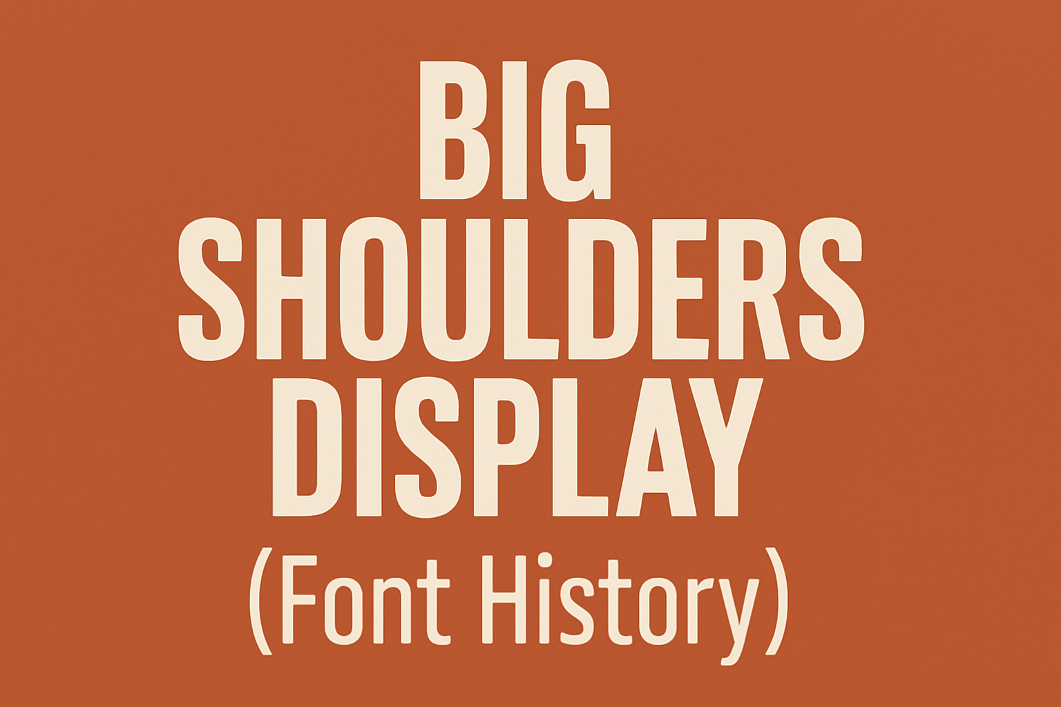
Big Shoulders Display is an intriguing font family rich in history and purpose. This typeface, known for its tall, sans-serif letters, draws inspiration from Chicago’s diverse heritage. From railway transport to public political action, its design tells a story. Big Shoulders Display was crafted for the Chicago Design System, celebrating the city and its people. …
Lindsey Becker
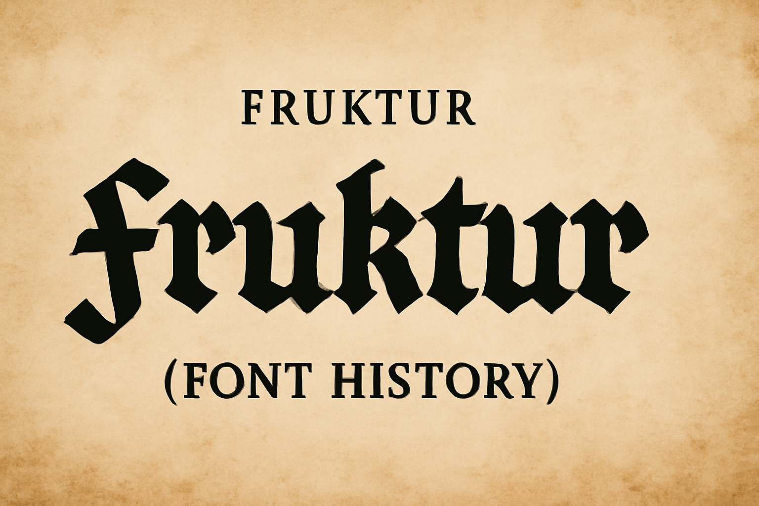
Fraktur is a typeface with a rich history and unique design. Originating in the early 16th century, it was commissioned by Emperor Maximilian I. This font is notable for its intricate and bold style, which captures the cultural heritage of its time. Fraktur is often associated with historical documents and books printed in Germany. Its …
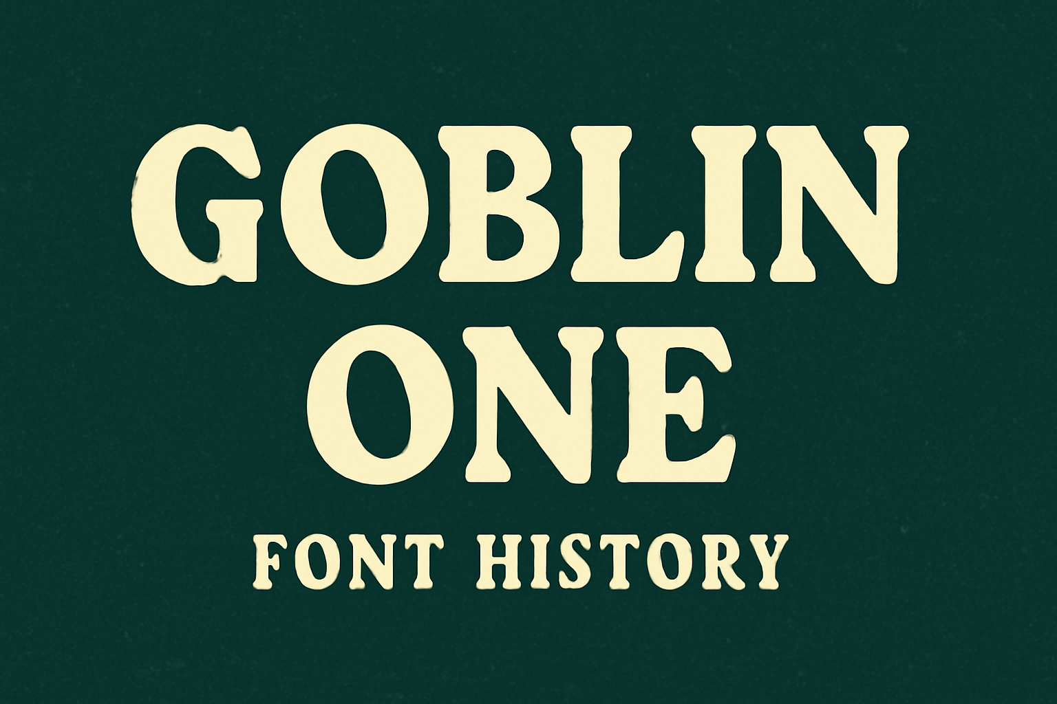
Goblin One is a fascinating font with a unique history. This playful sans-serif typeface was designed by Sorkin Type Co., combining quirky and playful elements with inspiration from vintage signage. Its wide design and large x-height make it stand out, making it ideal for headlines and attention-grabbing text. The font draws people in with its …
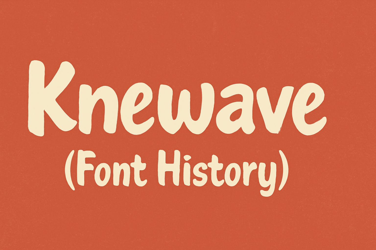
Knewave is not just a font; it’s a piece of art created by Tyler Finck. Born out of inspiration to capture a casual and energetic style, Knewave stands out with its hand-drawn feel, marked by irregular strokes and a playful design. This font offers a lively impression with characters bouncing across your screen, perfect for …
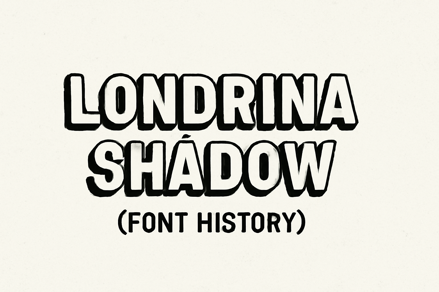
Londrina Shadow is a unique typeface with origins that trace back to the bustling streets of São Paulo, Brazil. This font is part of a larger super-family that includes styles like Solid, Outline, and Sketch. The hand-drawn letters of Londrina Shadow were inspired by everyday signs typically seen in street markets and cafes. Designed by …
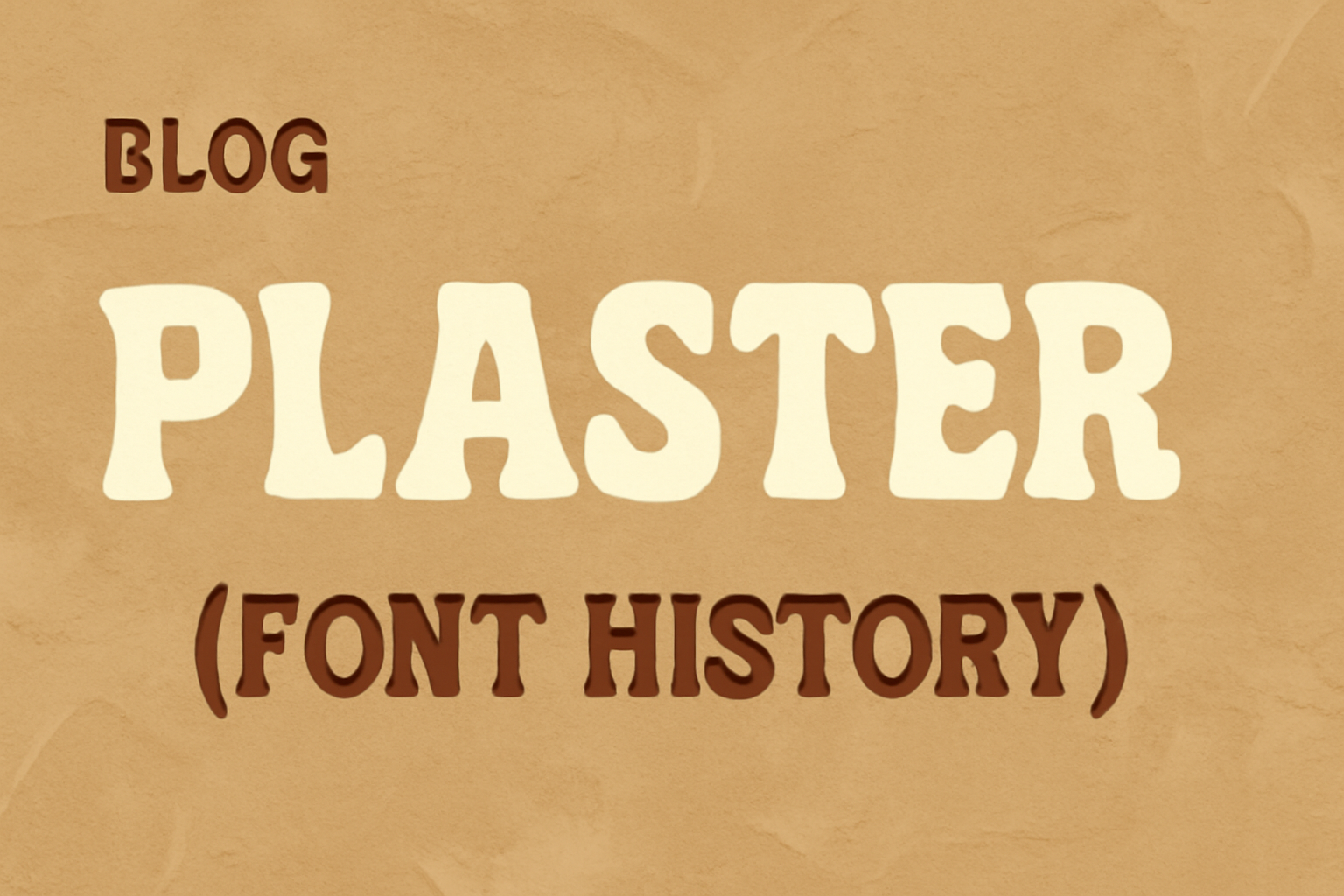
Plaster is a unique font that draws inspiration from the geometric designs of Joseph Albers. It stands out for its low contrast and geometric structure, making it ideal for use in medium to large sizes such as headlines. This design deviates from similar fonts because it has wider spacing between letters, giving it a distinctive …
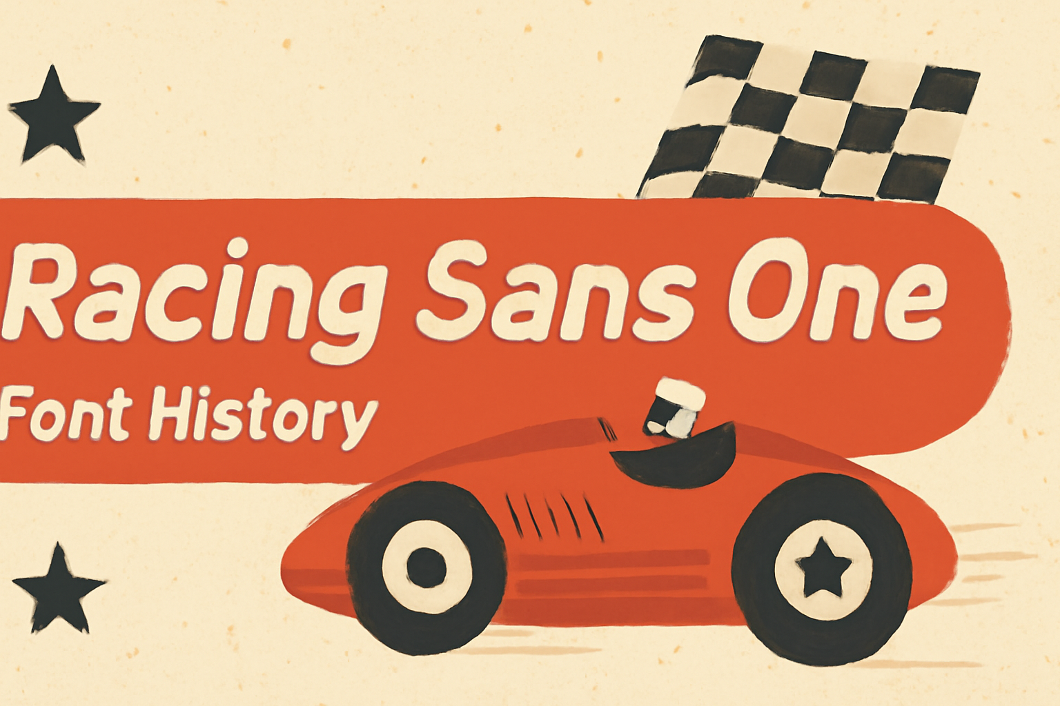
Racing Sans One is a unique font known for its sleek, dynamic design that captures attention. Created by Impallari Type and released in 2012, it takes inspiration from the thrilling world of motorsports, reflecting a sense of motion and energy. Its sharp angles and streamlined curves set it apart, giving a modern twist to traditional …
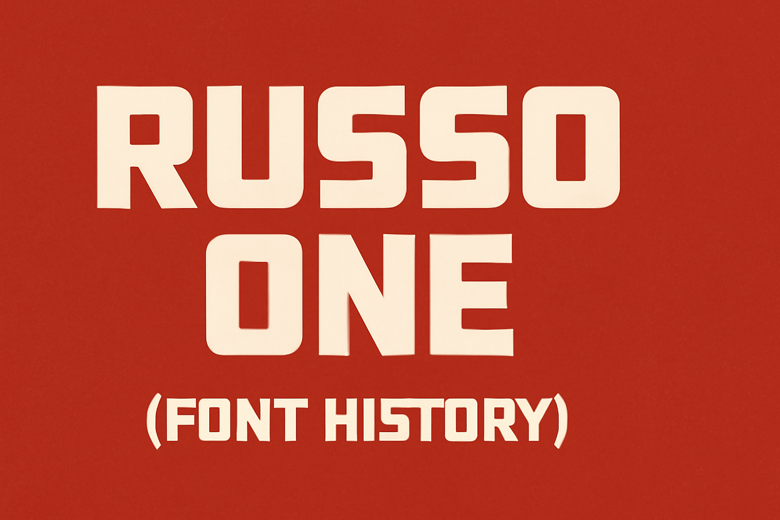
Russo One is more than just a font; it’s a blend of modern style and classic design. Created by Jovanny Lemonad, this sans-serif typeface emerged in the early 2010s and quickly gained attention. Its bold and geometric shapes make it perfect for headlines and logotypes. The font’s versatility is one of its strongest features. It …

Designing user flows in Figma is a vital step in creating intuitive app navigation. By crafting well-thought-out user flows, designers ensure that users can move through an app smoothly and find what they need without frustration. A user flow maps out the journey from start to finish, highlighting each interaction a user may have. Figma …

Designing responsive user interfaces can be a daunting task, but with Figma’s Auto Layout, it becomes much easier to create adaptable designs. Figma Auto Layout allows designers to quickly arrange and organize elements with minimal manual adjustments, saving time and reducing effort. This tool helps make UI elements consistently responsive across various devices. Auto Layout …