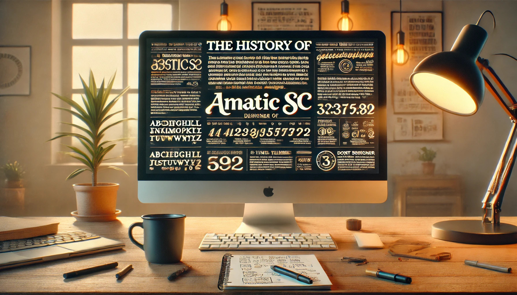
The Amatic SC font has an enchanting charm that catches the eye of many designers and casual users alike. Designed by Vernon Adams, this hand-drawn font makes text look like it’s been written with care and a personal touch. The quirky, narrow strokes give it an inviting, approachable vibe, making it a great choice for titles and small text sections.
Starting its journey in 2011, Amatic SC quickly became a favorite for digital creatives. Its friendly and relatable style caters to those wanting a casual and laid-back aesthetic. This font’s versatility, with support for both Latin and Hebrew alphabets, adds to its broad appeal, allowing for diverse applications.
In addition to its captivating design, Amatic SC’s availability through platforms like Google Fonts and Adobe Fonts makes it easily accessible for designers worldwide. Whether used for a personal blog header or a professional project, Amatic SC brings a unique touch to any creative endeavor.
Creation and Designer
Amatic SC is a unique font known for its hand-drawn style, perfect for both titles and small text runs. It reflects the creative vision of its designer who wanted a font with a casual yet distinct feel.
Vernon Adams and His Vision
Vernon Adams, the creative mind behind Amatic SC, was a British type designer known for his engaging and original designs. He aimed to create typefaces that stood out in the digital age. Amatic SC was born from this vision, combining simplicity with a hand-crafted look. Vernon sought to make typography accessible and appealing on various platforms, from web browsers to mobile devices. His passion for type design was evident in his ability to craft fonts that not only served functional purposes but also added a touch of personality to digital communication. Vernon’s dedication and innovative spirit were pivotal in making Amatic SC a beloved choice for designers worldwide.
Design Philosophy Behind Amatic SC
The design of Amatic SC emphasizes a casual aesthetic with its narrow, slightly irregular letterforms. It mimics hand-drawn letters, offering a charming and approachable feel. The font was crafted to be versatile, suitable for headers, titles, and brief text segments. Its small caps give it a distinct character, helping text stand out in a crowd. Adams’s design approach focused on readability across various screens, ensuring that the typeface was user-friendly and visually appealing. The inclusion of both Latin and Hebrew alphabets further highlights its adaptability, catering to diverse language needs and expanding its usability in different contexts. The thoughtfulness in its design ensures Amatic SC remains a lasting favorite.
Font Characteristics
Amatic SC is known for its unique handwritten style and small caps lettering. It is a favorite for projects needing a casual yet striking typeface. This section explains its key features in detail.
Handwritten Style
Amatic SC is recognized for its quirky and narrow letterforms. Each character looks slightly irregular, giving the font a casual, hand-drawn vibe. This makes it a popular choice for creative projects like posters, artwork, and crafts. The simplicity of the design allows it to stand out without being too overwhelming.
The handwritten appearance of Amatic SC provides a personal touch, which can make text feel more inviting and friendly. It’s often used in settings where warmth and approachability are important.
Small Caps and Glyph Variants
The font is only available in a small caps style, which gives it a distinct and uniform look. This feature makes it ideal for headlines or attention-grabbing text. Having small caps can lend a sturdy and consistent feel to any design project.
Amatic SC includes two styles: regular and bold. These variants provide more flexibility for design choices, making it easy to create contrast and emphasis in text. Designers often appreciate the versatility that these options offer.
Language Support and Unicode
Amatic SC supports both the Latin and Hebrew alphabets. This broad range of language support makes it suitable for a variety of international projects. The font is designed to work well across different scripts, ensuring that it remains legible.
Additionally, it includes a wide range of Unicode characters. This means that it can handle special symbols and characters beyond basic alphabets, making it useful for many types of written communication across the web.
Usage and Applications
Amatic SC is a versatile font that stands out for its hand-drawn style. It’s perfect for creative projects as it adds a unique touch to digital and print designs.
Web and Graphic Design
Amatic SC is widely used by web designers to create engaging content. Its quirky style can give personality to websites and draw attention effectively. Because it features both Latin and Hebrew alphabets, it’s a good option for multilingual sites.
In graphic design, it is often used for headlines or logos where a casual, handmade look is desired. The font’s narrow letterforms make it suitable for fitting longer text into tight spaces without compromising on readability.
Printed Materials
In printed materials, Amatic SC adds an artistic flair that works well on posters, flyers, and invitations. Its hand-drawn look helps in making printed content feel personal and inviting.
For people looking to create something with a homemade vibe, like recipe cards or craft project labels, this font proves to be an excellent choice. It enhances visual interest and can set a specific mood or tone for the material.
Branding and Identity Design
Amatic SC is popular in branding and identity design for companies aiming to look friendly and approachable. Its casual style can convey warmth and authenticity, which can be appealing to modern audiences.
Small businesses and start-ups may use it in their logos or promotional materials to make their brand stand out. Because it is uniquely styled, it can help set a brand apart while maintaining a down-to-earth image.
Technical Details
Amatic SC is an engaging handwritten font with a unique style that supports multiple languages. This section covers crucial information about the font’s file attributes, licensing, and compatibility.
Font File Information
Amatic SC is available in a few different formats, such as TTF and OTF. These flexible formats allow users to choose what best fits their projects. The font comes in two styles: regular and bold, providing options for varying visual emphases.
Each style retains the signature quirky, narrow letterforms. The font size is compact but still clear, bringing a hand-drawn charm to any text. Optimized for both web and print, the file sizes are efficient, making them quick to load on digital platforms.
Licenses and Distribution
Amatic SC uses the Open Font License (OFL), which allows for free use and distribution. It provides a great benefit to designers who want to integrate this font into both personal and commercial projects without worrying about fees.
The OFL encourages sharing and improvements, so users can modify the font’s design if needed. Amatic SC can be easily accessed through platforms like Google Fonts and Adobe Fonts. This wide distribution ensures that designers across the globe can effortlessly incorporate it into their creative work.
Compatibility and Integration
Designed for versatility, Amatic SC works seamlessly across various digital platforms. It supports both Latin and Hebrew alphabets, making it suitable for a wider audience. Additionally, the font now includes Cyrillic characters.
With compatibility in mind, Amatic SC performs well on desktops, laptops, and mobile devices. Whether it’s a website heading or a printed title, this font delivers a consistent look. It integrates smoothly into graphic design software and web builders, making it a handy tool for designers looking for a creative edge.
Community and Development
Amatic SC has grown as a popular font partly because of its active community. Open-source contributions and regular updates have kept it relevant and versatile for various design needs.
Open-Source Contributions
Amatic SC is an open-source font, which means developers and designers can contribute to its ongoing development. This encourages a diverse range of improvements and bug fixes. Many contributors actively work on expanding its features, such as adding new glyphs or refining existing ones.
Through platforms like GitHub, community members have made significant progress in language support, including Hebrew and Cyrillic scripts. These collaborations ensure that Amatic SC remains versatile and adaptable for a wide audience. Open collaboration enhances the font’s utility and increases its global reach.
Updates and Version History
Amatic SC has seen several updates since its initial release. Regular updates have improved its compatibility with different browsers and devices. The addition of features and adjustments in its typography help maintain its functionality and appeal. Updates include widening letter spacing and enhancing readability across languages.
Version history is well-documented on the project’s GitHub repository, providing insights into each update. This transparency helps users keep track of changes and improvements. Keeping the font updated ensures it meets modern design standards and user expectations.
Design Analysis
Amatic SC stands out with its unique look, popular among designers for its informal, hand-drawn style. Its narrow and quirky letterforms make it versatile and appealing for creative projects.
Comparative Study With Other Handwritten Fonts
Amatic SC shares similarities with other handwritten fonts like Comic Sans and Pacifico. Unlike Comic Sans, which often faces criticism, Amatic SC is valued for its artistic charm. Both fonts feature irregular shapes, but Amatic SC is narrower and more stylish, appealing to projects needing a modern, casual touch.
Pacifico offers a smoother, more fluid script compared to Amatic SC’s angular appearance. While both evoke a friendly and informal vibe, the choice between them often depends on the desired formality and tone.
Reception by the Design Community
The design community appreciates Amatic SC for its artistic flair and adaptability across projects. Many web designers choose it for titles and short text segments because of its readability and stylish appearance.
Amatic SC has been widely adopted in contexts where a playful or informal touch is needed. Its versatility across languages, like Latin and Hebrew alphabets, further boosts its popularity. Designers often pair it with clean, simple fonts to create balanced compositions in both print and digital media.
Tips and Best Practices
Amatic SC is a versatile font that adds a unique touch to creative and playful designs. Understanding where to use it and how to pair it well can enhance the appeal of any project.
Selecting the Right Context for Use
Amatic SC is ideal for projects that call for a casual, handcrafted feel. It works best in titles, logos, and headlines. This font shines in creative settings like event posters, artisanal branding, or digital content that benefits from a handwritten aesthetic.
While it can be used for body text in certain cases, such as short bursts, its distinct style may not be suitable for long paragraphs. It’s important to consider readability and choose large sizes to ensure clarity.
Pairing Amatic SC With Other Fonts
Pairing Amatic SC with complementary fonts can create a balanced and engaging design. A great combination is using Amatic SC for headers and a more traditional font for body text. For example, Josefin Sans is an excellent choice. It offers an elegant contrast to Amatic SC’s playful vibe.
Another option is to pair it with sans-serif fonts like Lato or Inconsolata, which provide a clean and modern look. These combinations can be used to maintain a structured layout while adding a touch of whimsy.