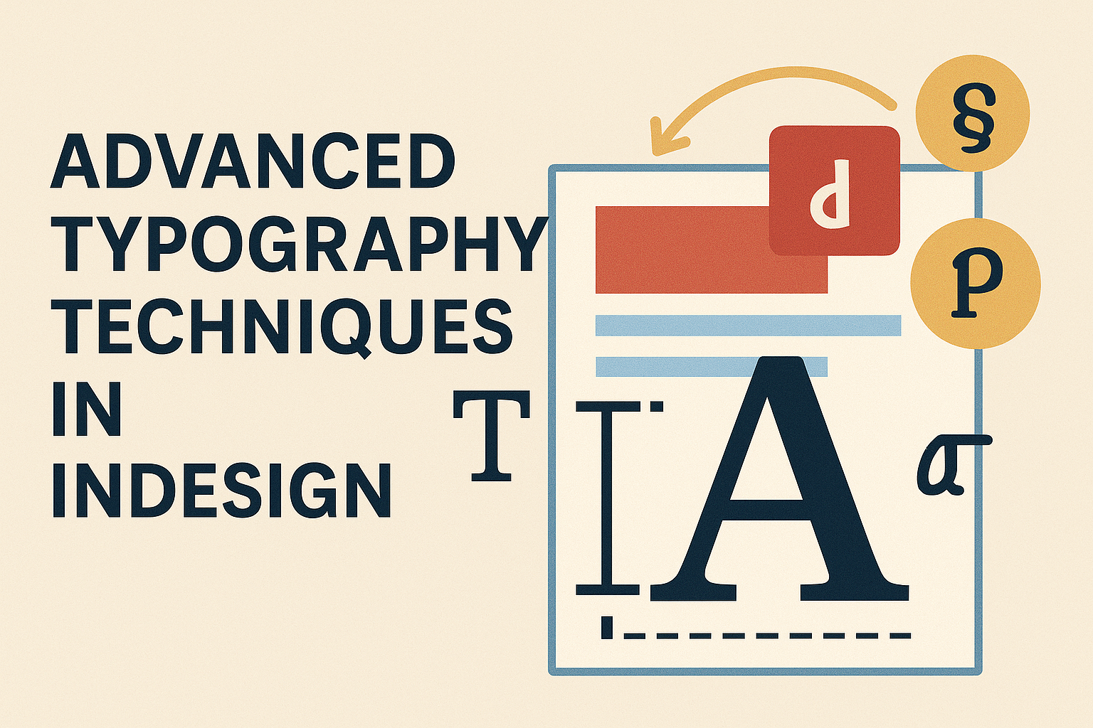
Typography plays a crucial role in design, especially when using InDesign.
Mastering advanced typography techniques can enhance the clarity and visual appeal of documents.
Whether it’s adjusting leading, kerning, or utilizing styles, these methods are key to professional-looking text.
With the right skills, designers can create layouts that stand out and effectively communicate their message.
Techniques like fixing rivers in justified text or exploring OpenType features can elevate any project. A solid understanding of these advanced tools can set a designer apart in a competitive field.
Understanding the Basics of Typography in InDesign
Typography plays a crucial role in design, affecting both readability and visual appeal.
Knowing the fundamentals allows designers to create more engaging and effective documents in InDesign.
The Importance of Typography
Typography is more than just selecting a pretty font. It sets the tone and conveys the message of any piece of design.
Well-chosen typography enhances clarity, making text easy to read. This helps keep the audience engaged.
Consistent use of typography creates a professional look that builds credibility.
Key elements include font choice, size, line spacing (leading), and letter spacing (tracking). Each element impacts how the viewer experiences the text.
Understanding these fundamentals helps designers make thoughtful choices. These choices can significantly elevate the quality of their work in InDesign.
Typeface vs. Font: Knowing the Difference
Many people use the terms typeface and font interchangeably, but there is a difference.
A typeface is the overall design, like Arial or Times New Roman. A font refers to a specific style within that family, such as Arial Bold or Times New Roman Italic.
Understanding this distinction helps designers select the right elements for their projects.
For example, choosing a typeface that matches the project’s mood is vital. It enhances the communication goals and ensures coherence in documents.
Designers should also be aware of variations in a typeface. These include weight, style, and size, which can affect the text’s overall appearance and impact.
Setting up a Typographic Workflow in InDesign
Creating an effective typographic workflow in InDesign starts with setting preferences.
Designers can customize settings for fonts, sizes, and styles. This saves time during the design process and ensures consistency.
Using Paragraph and Character Styles allows for quick adjustments. These styles help maintain uniformity in text throughout the document.
Designers can apply these styles to different sections, making changes easy.
InDesign also has tools like the Type on a Path and Text Wrap functions. These features allow text to flow around shapes or images, adding creativity to layouts.
By understanding these basic typography principles in InDesign, designers can create documents that are not only visually appealing but also functionally effective.
Mastering Font Pairing and Text Hierarchy
Font pairing and text hierarchy are key elements in graphic design. By choosing the right fonts and organizing text effectively, designers can enhance readability and create visual interest.
Tips for Effective Font Pairing
Effective font pairing can elevate a design. It helps create harmony while ensuring clarity.
When selecting fonts, look for styles that complement each other.
Consider these tips:
- Contrast: Combine a bold font with a lighter one. This difference creates visual interest.
- Mood: Pair fonts that convey similar feelings, like playful or serious.
- Limit Choices: Stick to two or three fonts. Too many can confuse the reader.
Testing combinations can help in finding the best fit. Always ensure the fonts work well together in various sizes and contexts.
Creating a Visual Hierarchy with Typeface Selection
Establishing a visual hierarchy guides the reader’s eye through the content. It helps present information in a logical order.
Here are some strategies:
- Headings: Use larger, bolder fonts for headings. This grabs attention and marks sections clearly.
- Body Text: Choose simpler fonts for body text. They should be easy to read in smaller sizes.
- Consistent Styles: Maintain consistent styles for similar text elements. This provides a unified look.
By implementing these techniques, designers can make their work not just attractive, but also effective.
Incorporating Advanced Typography Features
Incorporating advanced typography features in InDesign can significantly enhance the visual appeal of any project. By utilizing specific techniques, designers can refine text for better readability and artistic expression. Here are some effective methods to take text to the next level.
Utilizing OpenType Features
OpenType fonts come with a range of advanced features that can elevate typography.
Designers should explore options like ligatures, which connect letters for a smoother flow. For instance, using stylistic sets can offer different looks for the same word, enhancing variety in design.
Additionally, small caps can be employed for an elegant touch in headings or emphasized text.
Advanced Kerning and Tracking Techniques
Kerning and tracking are essential for spacing between letters and words.
Effective kerning adjusts the space between specific letter pairs for improved readability. InDesign provides tools to adjust this with precision.
Tracking involves spacing across a group of letters. Designers can use tracking to condense or expand text based on the design’s needs. This adjustment enhances legibility and gives a polished look to the typography.
Fine-Tuning with Baseline Shift and Glyph Scaling
Baseline shift is a valuable feature that allows for modifying the vertical position of text. This technique is useful for aligning text with graphics or adjusting the appearance of subscripts and superscripts.
Glyph scaling provides another layer of customization by altering the width or height of specific characters. This feature can help create emphasis on key words.
Together, these tools enable designers to achieve a tailored text appearance that aligns with their creative vision.