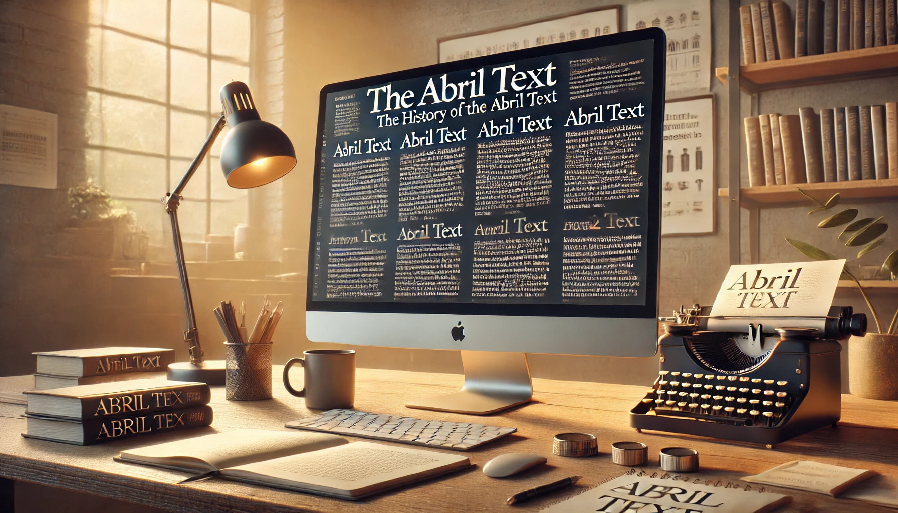
Abril Text is an intriguing typeface with a rich history that draws from a blend of 19th-century influences. Designed by Veronika Burian and José Scaglione, this font is part of the broader Abril family, known for its versatility across various design applications. Abril Text offers a darker and more robust style compared to its sibling, Abril Display, making it ideal for elegant, readable text.
The creators of Abril Text engineered the letterforms from scratch to suit modern needs, while still maintaining a touch of classic charm. This attention to detail makes Abril Text stand out in the world of typography, providing designers with a unique alternative to more common typefaces. As a result, Abril Text has gained popularity among those seeking to add a bit of historic flair to digital and print projects.
Abril Text’s ability to capture both tradition and contemporary style allows it to shine in various settings. Whether used in long-form text or eye-catching headlines, its distinct character offers a fresh yet timeless aesthetic. If you’re a designer looking for a typeface that balances history with modernity, Abril Text could be just what you need.
Origins of Abril Text
Abril Text was created by Veronika Burian and José Scaglione as a response to the need for versatile serif typefaces. They drew from historical fonts to craft a modern typeface that excels in both print and digital media. This section explores the minds behind the creation and the historical fonts inspiring the design.
Typeface Designers
Abril Text was designed by Veronika Burian and José Scaglione. They established TypeTogether in 2006 with the goal of developing unique and functional typefaces. Their expertise in typography led them to focus on creating typefaces that serve both modern and traditional needs.
Both designers have an impressive background with experience in various aspects of type design and an understanding of global typography trends. Veronika and José aimed to bridge the gap between historical influences and contemporary demands. Their collaboration on Abril Text reflects their shared passion for enhancing readability while maintaining aesthetic appeal.
Inspirational Sources
Abril Text draws inspiration from 19th-century design. It blends characteristics of slab serifs and Scotch Roman typefaces. While many might associate the Didone style with elegant and high contrast shapes, Abril Text chooses to explore other historical roots that focus on practicality.
The heritage of these styles influences its darker character and reduced contrast. This focus makes Abril Text ideal for large volumes of text, enabling easy reading. Designers aimed to reflect the rich history of print typography while providing a suitable alternative for modern digital uses.
Design Characteristics
Abril Text is known for its modern design that combines aesthetics with functionality. It features well-defined serifs and is praised for being easy to read in various formats, both print and digital.
Serif Style
Abril Text exhibits a classic serif style that draws inspiration from traditional font designs. The serifs are slightly thickened, providing a robust and solid appearance. These features make the font stand out in editorial use, giving it a sense of authority and elegance.
The design has subtle curves and sharp edges. This creates a balance between tradition and modernity. There’s a noticeable influence of Didone typefaces, known for their high contrast and thin lines. This gives Abril Text a timeless feel.
The serif design contributes heavily to the font’s identity. It helps bring a sense of clarity and refinement to any text, making it ideal for serious publications like newspapers and magazines.
Legibility in Print and Digital
Abril Text excels in legibility, making it a reliable choice for various media environments. The font’s structure is clear. This ensures long articles and documents remain readable, even when printed in small sizes.
In digital settings, Abril Text adapts well. The firm strokes and distinct letter shapes make text easily readable on screen. Whether viewed on a tablet, phone, or computer, the design retains its clarity, avoiding any congestion or confusion.
Thanks to its versatile style, Abril Text offers a consistent reading experience across different platforms. This adaptability makes it popular among editors and graphic designers who require flexibility without sacrificing readability.
Font Family and Variations
Abril Text is known for its versatile collection of styles and weights, making it suitable for various design needs. It offers an array of weights and an extended character set that enhances its usability across different languages and platforms.
Typeface Weights and Styles
Abril Text is designed with a range of weights that cater to different visual preferences and design contexts. The family includes five Text weights, each with matching italics. These weights start from Light and go up to Extra Bold, providing choices for both subtle and striking text.
Each weight maintains a consistent style, ensuring readability and elegance. This gives designers flexibility to use Abril Text for both body text and headlines, especially in print and digital publishing. The Abril family also spans several Display weights, offering additional options for impactful designs.
Extended Character Set
The Abril Text font family supports a broad character set to cater to multilingual use. This includes accented characters and symbols needed for various European languages. Such an extensive set ensures that Abril Text can be used effectively in international publications without losing consistency in visual appearance.
Alongside standard letters and numbers, Abril Text includes ligatures and typographic features that enhance aesthetic appeal. This makes it ideal for editorial use in newspapers and magazines where text diversity is key. Its comprehensive design accommodates diverse typographic needs, making it versatile for professionals working in multilingual settings.
Usage and Applications
Abril Text is a versatile font known for its adaptability in various contexts. Its unique design makes it suitable for both print and digital media, offering elegant and readable typography options for different uses.
Editorial Contexts
In editorial settings, Abril Text is a popular choice for newspapers and magazines. The typeface is designed for readability, which makes it ideal for long articles and heavy text environments. Its roots in 19th-century slab serifs and Scotch Roman typefaces also lend a classic touch, enhancing the aesthetic appeal of text in print.
The font handles well across different sizes, ensuring clarity whether in a large headline or the small, dense columns of a newspaper. Abril Text’s balance of traditional elements and modern design principles ensures that publications stay stylish while maintaining a professional tone. Publications seeking a robust yet classic typeface often turn to this option.
Branding Impressions
For branding, Abril Text delivers a sophisticated yet approachable look. Brands aiming for a blend of classic and modern aesthetics often utilize this typeface to convey reliability and elegance. The font’s structure adds an air of professionalism to business materials, from logos to print advertisements.
Abril Text supports brand identity development by providing consistency across different media forms. Its elegance in branding applications makes it a preferred choice for companies in various sectors, helping them establish a timeless and trustworthy brand image. The typeface’s ability to capture attention while remaining readable further enhances its effectiveness in promotional content.
Digital Media Environments
In digital spaces, Abril Text excels in providing a clear and pleasant reading experience. Its adaptability to screen environments helps it stand out in web design and digital publications. The font maintains legibility across device sizes, from desktop monitors to mobile screens, making it a reliable option for web content creators.
Abril Text’s distinctive characteristics make it suitable for headlines, body text, and more. It offers a refreshing alternative to common screen-safe fonts, adding elegance and readability to websites and digital interfaces. The typeface shines particularly in platforms seeking to balance aesthetic appeal with user experience.
Technical Details
Abril Text offers flexibility across different platforms and uses due to its adaptable file formats and licensing options. This section breaks down the technical aspects that make it an appealing choice for designers and developers.
File Formats and Compatibility
Abril Text comes in several file formats to ensure broad compatibility. The most common formats include OpenType (OTF) and TrueType (TTF). These formats are widely used and work with most modern design software, making it easy for designers to incorporate the font into various projects.
Abril Text also supports webfont formats like WOFF and WOFF2, enabling seamless integration into websites. This ensures it maintains its quality and readability across different browsers. The choice of format depends on the platform in use, catering to both print and digital environments.
Licensing and Distribution
The licensing options for Abril Text are designed to accommodate different types of users. It is available under the SIL Open Font License, which allows for free usage in personal, educational, and some commercial projects. For other commercial uses, additional licenses might be needed and can be obtained from TypeTogether.
Distribution of Abril Text is straightforward, with easy access through sites like Adobe Fonts. Designers can directly sync the font to their Adobe Creative Cloud applications, streamlining the design process. This helps ensure that the font is readily available whenever needed.
Impact and Reception
Abril Text has carved a niche both in the design community and among everyday users. It has received praise for its distinct style and usability across varied platforms.
Critics and Design Community
Within the design community, Abril Text is recognized for its modern yet classic appeal. Critics appreciate its ability to blend contemporary design elements with the elegance of traditional news fonts. Designed by José Scaglione and Veronika Burian, this typeface effortlessly combines the past and present trends.
Abril Text’s aesthetics make it a favorite among designers aiming for professional yet appealing projects. Its versatility extends to both print and digital media. Professional typography experts often commend its balance of readability and style, which contributes significantly to its popularity.
User Experience Feedback
User feedback highlights Abril Text’s effectiveness in enhancing readability and engagement in both body text and headlines. Its range of weights and styles provides flexibility, making it suitable for various design needs. Users find it particularly useful for creating content that requires a professional appearance while maintaining visual interest.
The typeface’s clear lines and legibility, even at smaller sizes, contribute to a positive reading experience. Many users also appreciate the aesthetic appeal of Abril Text, noting that it enhances the overall look and feel of their projects. The blend of functionality and design has made it a go-to choice for many publications and online platforms.